CSS border 속성은 요소 상자 주위에 선을 그립니다. border: 2px solid #4f46e5에서와 같이 너비, 스타일, 색상의 세 가지 값을 사용합니다.
스타일이 가장 중요합니다. 그것이 없으면 너비와 색상을 설정하더라도 테두리가 전혀 그려지지 않습니다.
슬라이더를 이동하고 스타일을 선택합니다. 미리보기 아래의 코드는 복사할 CSS입니다.
<!doctype html>
<html lang="en">
<head>
<meta charset="utf-8">
<meta name="viewport" content="width=device-width, initial-scale=1">
<title>CSS border builder</title>
<style>
  * { box-sizing: border-box; }
  body { margin: 0; padding: 14px; font-family: system-ui, sans-serif; background: #f4f5f7; color: #1d2330; }
  .stage { height: 150px; display: grid; place-items: center; background: #fff; border-radius: 12px; }
  #box {
    width: 150px; height: 96px; background: #eef2ff;
    display: grid; place-items: center; font-size: 13px; color: #4b5563;
  }
  .controls { display: grid; grid-template-columns: 1fr 1fr; gap: 8px 14px; margin-top: 12px; font-size: 13px; }
  label { display: flex; flex-direction: column; gap: 3px; }
  label span { display: flex; justify-content: space-between; }
  select, input[type=color] { width: 100%; height: 30px; font: inherit; }
  .presets { grid-column: 1 / -1; display: flex; gap: 6px; flex-wrap: wrap; }
  .presets button { font: inherit; padding: 5px 10px; border: 1px solid #c9cdd4; border-radius: 8px; background: #fff; cursor: pointer; }
  pre { margin: 12px 0 0; padding: 10px 12px; background: #1d2330; color: #e5e7eb; border-radius: 10px; font-size: 12.5px; white-space: pre-wrap; }
</style>
</head>
<body>
<div class="stage"><div id="box">preview</div></div>

<div class="controls">
  <label><span>Width <b id="wv"></b></span><input id="w" type="range" min="0" max="16" value="3"></label>
  <label><span>Style</span>
    <select id="s">
      <option>solid</option><option>dashed</option><option>dotted</option>
      <option>double</option><option>groove</option><option>ridge</option><option>none</option>
    </select>
  </label>
  <label><span>Colour</span><input id="c" type="color" value="#4f46e5"></label>
  <label><span>Top-left <b id="tlv"></b></span><input id="tl" type="range" min="0" max="80" value="12"></label>
  <label><span>Top-right <b id="trv"></b></span><input id="tr" type="range" min="0" max="80" value="12"></label>
  <label><span>Bottom-right <b id="brv"></b></span><input id="br" type="range" min="0" max="80" value="12"></label>
  <label><span>Bottom-left <b id="blv"></b></span><input id="bl" type="range" min="0" max="80" value="12"></label>
  <div class="presets">
    <button data-r="0,0,0,0">Square</button>
    <button data-r="80,80,80,80">Pill</button>
    <button data-r="40,0,40,0">Leaf</button>
  </div>
</div>

<pre id="out"></pre>

<script>
  const $ = (id) => document.getElementById(id);
  const box = $('box');
  const corners = ['tl', 'tr', 'br', 'bl'];  // same order as border-radius

  function update() {
    const r = corners.map((k) => $(k).value + 'px');
    // one value if all four corners match, otherwise four
    const radius = r.every((v) => v === r[0]) ? r[0] : r.join(' ');
    const border = $('w').value + 'px ' + $('s').value + ' ' + $('c').value;
    box.style.border = border;
    box.style.borderRadius = radius;
    $('wv').textContent = $('w').value + 'px';
    corners.forEach((k) => { $(k + 'v').textContent = $(k).value + 'px'; });
    $('out').textContent = 'border: ' + border + ';\nborder-radius: ' + radius + ';';
  }

  document.querySelectorAll('input, select').forEach((el) => el.addEventListener('input', update));
  document.querySelectorAll('[data-r]').forEach((b) => b.addEventListener('click', () => {
    b.dataset.r.split(',').forEach((v, i) => { $(corners[i]).value = v; });
    update();
  }));
  update();
</script>
</body>
</html>
border-radius는 4개의 값을 사용할 수 있으므로 모든 모서리에는 자체 슬라이더가 있습니다. 4개가 모두 일치하면 빌더는 하나의 값으로 짧은 형식을 인쇄합니다.
세 부분: 너비, 스타일, 색상
border는 border-width, border-style 및 border-color의 약어입니다. 세 가지 값은 어떤 순서로든 올 수 있으며 그 중 두 개는 생략할 수 있습니다.
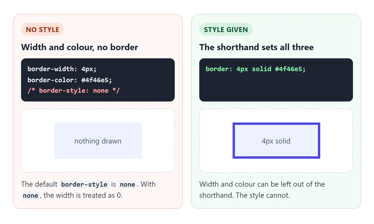
스타일은 none로 시작하고, none 스타일의 테두리는 너비가 0인 것으로 처리됩니다. 이것이 바로 border-width: 4px; border-color: red; 자체가 아무것도 표시하지 않는 이유입니다. 스타일을 입력하면 테두리가 나타납니다.
| 가치 | 빠져 있다는 뜻은 | 예 |
|---|---|---|
| 폭 | medium(몇 픽셀) |
1px, 0.2em, thin, thick |
| 스타일 | none이므로 테두리가 없습니다. |
solid, dashed, dotted, double |
| 색상 | currentcolor, 텍스트 색상 |
#e5e7eb, rgb(0 0 0 / .1), transparent |
색상 기본값이 편리합니다. 링크나 버튼의 border: 1px solid는 텍스트 색상을 사용하므로 텍스트 색상에 따라 테두리도 변경됩니다.
점선, 점선, 이중 및 나머지
solid는 대부분의 작업을 다룹니다. 다른 스타일은 몇 가지 위치에서 유용합니다.
dashed: 놓기 영역, 자리 표시자 및 "새 추가" 상자. 브라우저가 대시 길이를 결정합니다. 사용자 정의 대시의 경우 대신repeating-linear-gradient배경 또는 SVG를 사용하여 선을 그립니다.dotted: 약어에 대한 빛 구분 기호 및 밑줄.double: 간격이 있는 두 줄. 너비는 선과 간격을 모두 포함하므로 3px 이상으로 지정하지 않으면 두 선이 들어갈 공간이 없습니다.groove,ridge,inset,outset: 테두리 색상에서 음영 처리된 3D 경사 효과.hidden:none와 비슷하지만 접힌 테이블에서 인접한 셀의 경계를 넘어섭니다.
한 번에 한 쪽씩
각 측면에는 border-top, border-right, border-bottom 및 border-left라는 고유한 속성이 있습니다. 그들은 동일한 세 가지 값을 취합니다.
.note {
  border: 1px solid #e1e4ea;       /* all four sides */
  border-left: 5px solid #4f46e5;  /* then override one */
}
주문이 중요합니다. 속기는 네 면을 모두 재설정하므로 먼저 쓰고 한 면은 뒤에 씁니다.
헤어라인 칸막이는 한쪽 면만 존재합니다. 목록의 경우 첫 번째 항목을 제외한 각 항목에 위쪽 테두리를 지정합니다.
.list li + li { border-top: 1px solid #eceef2; }
<hr>에도 동일한 라인이 작동합니다. 브라우저는 자체 테두리 스타일로 <hr>를 그리므로 먼저 hr { border: 0; border-top: 1px solid #e5e7eb; }로 재설정하세요.
border-radius: 둥근 모양, 알약 모양, 원형 모양
border-radius는 상자의 모서리를 둥글게 만들고 테두리는 곡선을 따릅니다. 배경과 상자 그림자도 마찬가지입니다.
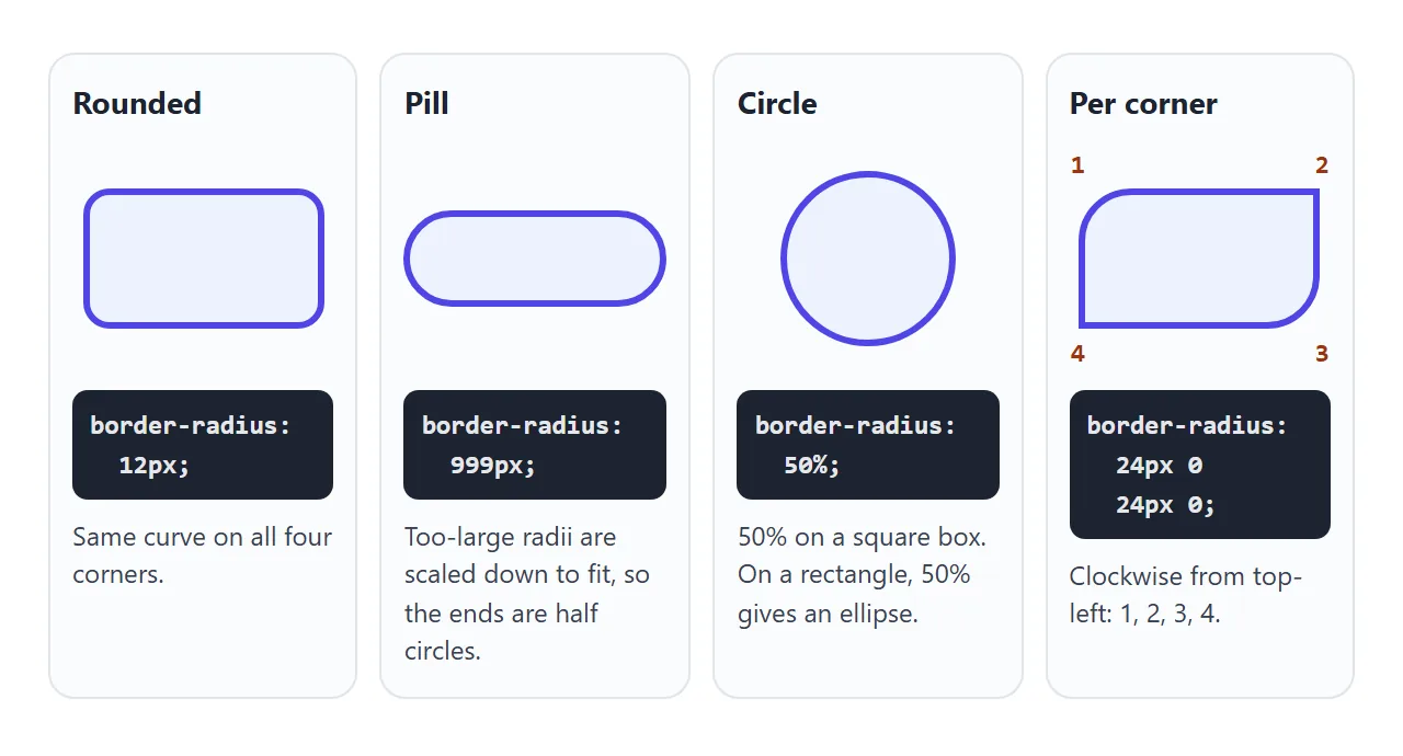
- 하나의 값은 네 모서리를 모두 동일하게 둥글게 만듭니다.
- 4개 값은 왼쪽 상단부터 시계 방향으로 왼쪽 상단, 오른쪽 상단, 오른쪽 하단, 왼쪽 하단으로 이동합니다.
- 알약:
999px와 같이 매우 큰 값입니다. 반지름이 상자에 비해 너무 크면 브라우저는 상자에 맞게 크기를 축소하여 끝이 둥글게 남습니다. - 원: 너비와 높이가 동일한 요소의
50%. 직사각형에서50%는 타원을 제공합니다.
타원형 모서리에 대해 수평 및 수직 반경을 별도로 설정하는 슬래시 형식 border-radius: 40px / 20px도 있습니다.
테두리가 크기를 더해줍니다
기본 box-sizing: content-box를 사용하면 width가 콘텐츠만 설정합니다. 테두리와 패딩이 바깥으로 나갑니다. 10px 테두리가 있는 width: 200px 상자는 화면에서 너비가 220px입니다.
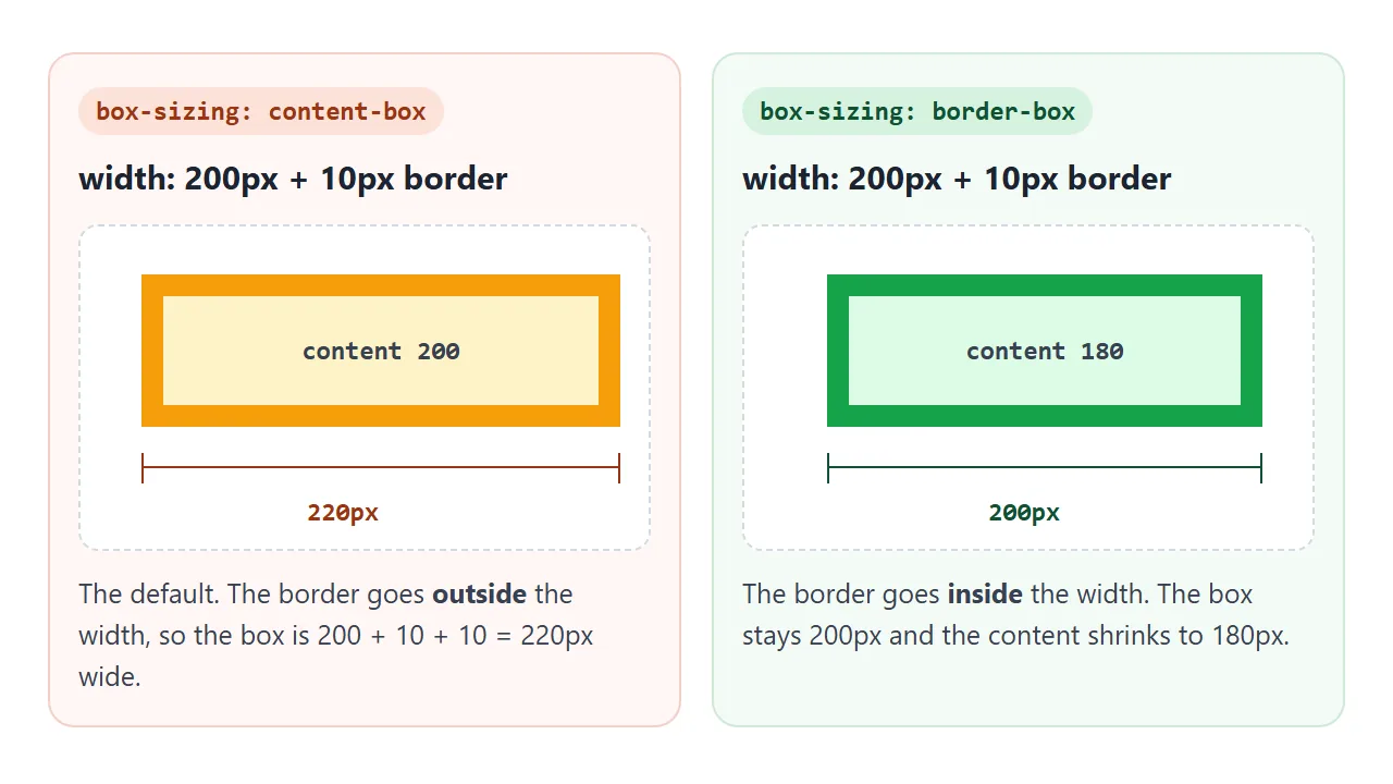
box-sizing: border-box는 너비 안쪽에 테두리와 패딩을 넣습니다. 상자는 200px로 유지되고 콘텐츠 영역은 줄어듭니다. 스타일시트 상단의 모든 요소에 설정되는 경우가 많습니다. 박스 크기 조정 가이드에서는 표준 오프닝 블록에 대해 설명합니다.
테두리 상자 수정은 너비를 설정합니다. width가 없는 버튼과 같이 콘텐츠에서 너비가 결정되는 요소에는 도움이 되지 않습니다. 해당 버튼에 나타나는 테두리는 여전히 버튼을 더 크게 만듭니다.
윤곽선과 테두리
outline는 테두리처럼 보이지만 테두리 외부에 그려지며 레이아웃에서 공간을 차지하지 않습니다. 하나를 추가해도 그 주위에는 아무것도 움직이지 않습니다. 각 버튼에 마우스를 올리거나 전화기에서 확인란을 선택하세요.
<!doctype html>
<html lang="en">
<head>
<meta charset="utf-8">
<meta name="viewport" content="width=device-width, initial-scale=1">
<title>Border vs outline on hover</title>
<style>
  body { margin: 0; padding: 14px; font-family: system-ui, sans-serif; background: #f4f5f7; color: #1d2330; font-size: 13px; }
  .row { background: #fff; border-radius: 10px; padding: 10px 12px; margin-bottom: 10px; }
  .row h3 { margin: 0 0 8px; font-size: 13px; }
  .row h3 code { background: #eef1f5; padding: 0 4px; border-radius: 4px; }
  button {
    font: inherit; padding: 8px 14px; border-radius: 8px; cursor: pointer;
    background: #4f46e5; color: #fff; border: 0;
  }
  .after { color: #6b7280; }

  /* 1. bad: the border only exists on hover, so the button grows */
  .grow:hover, .on .grow { border: 3px solid #f59e0b; }

  /* 2. outline is drawn outside the box and takes no space */
  .ring:hover, .on .ring { outline: 3px solid #f59e0b; }

  /* 3. the border is always there, only its colour changes */
  .keep { border: 3px solid transparent; }
  .keep:hover, .on .keep { border-color: #f59e0b; }

  .toggle { display: flex; align-items: center; gap: 6px; margin-top: 4px; }
</style>
</head>
<body>
<div id="rows">
  <div class="row"><h3>1. <code>border</code> added on hover</h3>
    <button class="grow">Hover me</button> <span class="after">this text moves</span></div>
  <div class="row"><h3>2. <code>outline</code> on hover</h3>
    <button class="ring">Hover me</button> <span class="after">this text stays</span></div>
  <div class="row"><h3>3. transparent border, colour on hover</h3>
    <button class="keep">Hover me</button> <span class="after">this text stays</span></div>
</div>
<label class="toggle"><input type="checkbox" id="all"> Show the hover state on all three (for touch screens)</label>

<script>
  // a checkbox that applies the hover look, so it can be compared on a phone too
  document.getElementById('all').addEventListener('change', (e) => {
    document.getElementById('rows').classList.toggle('on', e.target.checked);
  });
</script>
</body>
</html>
border |
outline |
|
|---|---|---|
| 공간을 차지함 | 예, 상자에 추가됩니다 | 아니요 |
| 한쪽만 | 예, border-left 등 |
아니요, 사방 모두 |
| 상자와의 간격 | 아니요 | outline-offset |
| 일반적인 사용 | 카드, 분배기, 입력 | 초점 링, 호버 하이라이트 |
호버 테두리가 레이아웃을 이동하지 못하도록 하는 두 가지 방법: 요소에 처음부터 동일한 너비의 transparent 테두리를 제공하고 색상만 변경하거나 호버 모양에 outline를 사용합니다.
퍼짐이 있고 흐림이 없는 box-shadow는 공간을 차지하지 않는 링으로도 작동합니다.
다른 가시적 포커스 스타일을 추가하지 않고 버튼과 링크에서 포커스 윤곽선을 제거하지 마십시오. 키보드 사용자는 키보드를 사용하여 자신의 위치를 확인합니다.
테두리로 완성된 세트
이 카드 세트의 모든 것은 테두리입니다. 회색 카드 가장자리, 강조선, 행 구분선, 점선 드롭 영역, 알약 태그 및 원형 아바타입니다.
<!doctype html>
<html lang="en">
<head>
<meta charset="utf-8">
<meta name="viewport" content="width=device-width, initial-scale=1">
<title>Cards built with borders</title>
<style>
  * { box-sizing: border-box; }
  body { margin: 0; padding: 14px; font-family: system-ui, sans-serif; background: #f4f5f7; color: #1d2330; font-size: 14px; }
  .grid { display: grid; grid-template-columns: repeat(auto-fit, minmax(240px, 1fr)); gap: 12px; }
  h3 { margin: 0 0 6px; font-size: 15px; }
  p { margin: 0; color: #4b5563; line-height: 1.45; }

  /* plain card: a 1px border in a light grey does most of the work */
  .card { background: #fff; border: 1px solid #e1e4ea; border-radius: 12px; padding: 14px 16px; }

  /* accent: a thick left border, the other three stay thin */
  .accent { border-left: 5px solid #4f46e5; }

  /* hairline divider between rows: one side only, so lines never double */
  .list { list-style: none; margin: 8px 0 0; padding: 0; }
  .list li { padding: 7px 0; }
  .list li + li { border-top: 1px solid #eceef2; }

  /* drop area: dashed border, turns solid while a file is over it */
  .drop {
    border: 2px dashed #a8b0bd; border-radius: 12px; padding: 22px 16px;
    text-align: center; color: #5b6270; background: #fafbfc;
  }
  .drop.over { border-style: solid; border-color: #16a34a; color: #0f5132; background: #f4fbf6; }

  /* pill tags: a radius larger than half the height makes round ends */
  .tags { display: flex; flex-wrap: wrap; gap: 6px; margin-top: 10px; }
  .tag {
    border: 1px solid #c7d2fe; border-radius: 999px; padding: 3px 11px;
    font-size: 12.5px; color: #3730a3; background: #eef2ff; cursor: pointer; user-select: none;
  }
  .tag.picked { background: #4f46e5; border-color: #4f46e5; color: #fff; }

  /* avatar: 50% radius on a square gives a circle; overflow clips the child */
  .who { display: flex; align-items: center; gap: 10px; margin-top: 12px; }
  .avatar {
    width: 38px; height: 38px; border-radius: 50%; overflow: hidden;
    border: 2px solid #fff; outline: 1px solid #e1e4ea;
  }
  .avatar div { width: 100%; height: 100%; background: linear-gradient(135deg, #f59e0b, #4f46e5); }
</style>
</head>
<body>
<div class="grid">
  <div class="card">
    <h3>Plain card</h3>
    <p>One grey 1px border and a 12px radius.</p>
    <ul class="list"><li>Hairline between rows</li><li>Border on one side only</li><li>No doubled lines</li></ul>
  </div>

  <div class="card accent">
    <h3>Accent card</h3>
    <p>A thicker left border marks it as a note.</p>
    <div class="tags" id="tags">
      <span class="tag">design</span><span class="tag">css</span><span class="tag">borders</span><span class="tag">tips</span>
    </div>
    <div class="who"><div class="avatar"><div></div></div><p>Tap a tag to pick it.</p></div>
  </div>

  <div class="drop" id="drop">Drop a file here<br><small>(or tap to preview the active state)</small></div>
</div>

<script>
  // tags toggle on click
  document.querySelectorAll('.tag').forEach((t) =>
    t.addEventListener('click', () => t.classList.toggle('picked')));

  // drop area: solid border while a file is dragged over it
  const drop = document.getElementById('drop');
  drop.addEventListener('dragover', (e) => { e.preventDefault(); drop.classList.add('over'); });
  drop.addEventListener('dragleave', () => drop.classList.remove('over'));
  drop.addEventListener('drop', (e) => {
    e.preventDefault();
    drop.classList.remove('over');
    const f = e.dataTransfer.files[0];
    drop.textContent = f ? 'Got ' + f.name : 'Dropped';
  });
  drop.addEventListener('click', () => drop.classList.toggle('over'));
</script>
</body>
</html>
파일이 위에 있으면 드롭 영역이 border-style: dashed에서 solid로 전환됩니다. 스타일을 변경하면 너비가 유지되므로 아무것도 점프하지 않습니다. 아바타는 overflow: hidden를 사용하므로 내부의 사각형 그라데이션이 원에 잘립니다.
표와 텍스트의 테두리
테이블에서는 <table>의 border가 바깥쪽만 그립니다. 각 <td> 및 <th>에는 자체 테두리가 필요합니다.
그러면 이웃 셀에 border-collapse: collapse가 하나로 병합되는 두 줄이 나란히 표시됩니다. 테이블 테두리 축소는 이에 대해 설명하고 둥근 테이블 모서리에 separate가 필요한 이유를 설명합니다.
테두리는 둥근지 여부에 관계없이 항상 상자 주위의 직사각형입니다. 글자의 모양을 따라갈 수 없습니다. 텍스트 주위의 윤곽선에는 -webkit- 접두사로 작성된 -webkit-text-stroke: 1px #1d2330를 사용합니다. 평면 색상 대신 그라데이션에 대해서는 CSS 그라데이션 테두리를 참조하세요.
작동하지 않을 때
| 당신이 보는 것 | 원인 | 수정 |
|---|---|---|
| 국경이 전혀 없음 | border-style가 없으므로 none입니다. |
스타일에 속기를 사용하세요: border: 1px solid |
| 호버 시 레이아웃 점프 | 테두리는 요소의 크기를 증가시킵니다. | 처음부터 투명 테두리 또는 outline |
| 둥근 모서리에서 튀어나오는 아이들 | border-radius가 콘텐츠를 자르지 않습니다. |
둥근 요소의 overflow: hidden |
| 인라인 테두리가 여러 줄에서 이상하게 끊어집니다. | 테두리가 분할되어 있으며 왼쪽 및 오른쪽 가장자리는 끝 부분에만 있습니다. | display: inline-block 또는 box-decoration-break: clone |
| 두 상자가 만나는 2px 선 | 각 상자는 자체적인 1px 테두리를 그립니다. | li + li { border-top }와 같이 한쪽에만 테두리가 있습니다. |
double는 solid처럼 보입니다. |
두 줄을 쓰기에는 너비가 너무 얇습니다. | 3px 이상 |
| 한쪽은 국경을 잃었다 | 사이드 룰 다음에 속기가 나왔습니다. | border를 먼저 넣고 옆을 뒤에 놓는다. |
<span>와 같은 인라인 요소 또는 두 줄로 래핑되는 링크는 테두리가 여러 줄로 분할됩니다. 왼쪽 가장자리는 첫 번째 줄에만 나타나고 오른쪽 가장자리는 마지막 줄에만 나타납니다.
box-decoration-break: clone는 각 줄에 전체 테두리를 그립니다. 일부 브라우저는 해당 이름만 읽기 때문에 접두사가 붙은 -webkit-box-decoration-break: clone 행도 추가합니다.
인라인 요소의 상단 및 하단 테두리도 선을 분리하지 않으므로 위 또는 아래 선과 겹칠 수 있습니다.
링크로 공유하세요
테두리와 반경은 스크린샷보다 브라우저에서 판단하기가 더 쉽습니다. 특히 호버 상태와 드롭 영역은 더욱 그렇습니다. 라이브 버전을 표시하려면 페이지를 NOS 문서에 붙여넣고 공유 링크 만들기를 선택하세요. 링크할 HTML이 이를 안내합니다.
페이지는 작성된 대로 렌더링되고 해당 스크립트가 실행되므로 페이지를 받는 사람은 버튼을 가리키고 태그 자체를 탭할 수 있습니다. 나중에 코드를 변경하면 동일한 링크에 새 버전이 표시됩니다.