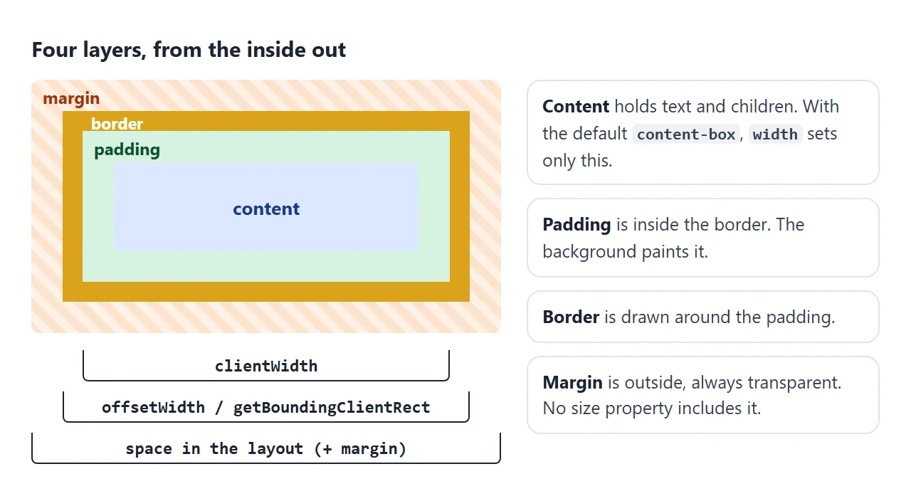
CSS 상자 모델에서는 모든 요소가 콘텐츠, 그 주위의 패딩, 테두리, 외부의 여백 등 4개의 중첩된 직사각형으로 그려집니다.
기본적으로 width 및 height는 내용만 설정합니다. 패딩과 테두리가 맨 위에 추가되고 여백은 모든 것 바깥에 위치합니다.
시도해 보세요. 슬라이더를 이동하고 두 box-sizing 값 사이를 전환합니다. 표는 브라우저가 실제로 그린 크기를 읽습니다.
<!doctype html>
<html lang="en">
<head>
<meta charset="utf-8">
<meta name="viewport" content="width=device-width, initial-scale=1">
<title>CSS box model playground</title>
<style>
  body { margin: 0; padding: 14px; font-family: system-ui, sans-serif; background: #f4f5f7; color: #1d2330; }
  .controls { display: grid; grid-template-columns: repeat(auto-fit, minmax(160px, 1fr)); gap: 6px 16px; font-size: 13px; }
  .controls label { display: flex; align-items: center; gap: 8px; }
  .controls input[type=range] { flex: 1; min-width: 0; }
  .controls b { width: 42px; text-align: right; font-variant-numeric: tabular-nums; }
  .sizing { margin: 10px 0; display: flex; gap: 6px; flex-wrap: wrap; }
  .sizing button { font: inherit; font-size: 13px; padding: 6px 10px; border-radius: 8px; border: 1px solid #c9cdd4; background: #fff; cursor: pointer; }
  .sizing button[aria-pressed=true] { background: #1d2330; color: #fff; border-color: #1d2330; }

  /* The orange area is the margin: this wrapper shrinks to the box's margin edge */
  .margin-area { display: flow-root; width: max-content; background: repeating-linear-gradient(45deg, #fde2cc 0 6px, #fff1e6 6px 12px); }
  #box {
    width: 160px; height: 50px;
    padding: 16px; border: 6px solid #d9a31a; margin: 12px;
    /* blue = content box, green = padding box */
    background: linear-gradient(#dbe8ff, #dbe8ff) content-box, #d6f2df padding-box;
    font-size: 12px; overflow: hidden;
  }
  .legend { display: flex; flex-wrap: wrap; gap: 10px; font-size: 12px; margin: 10px 0 6px; }
  .legend i { display: inline-block; width: 12px; height: 12px; border-radius: 3px; vertical-align: -2px; margin-right: 4px; }
  table { border-collapse: collapse; font-size: 13px; width: 100%; max-width: 460px; background: #fff; }
  td { padding: 5px 8px; border-top: 1px solid #e5e7eb; }
  td:last-child { text-align: right; font-weight: 700; font-variant-numeric: tabular-nums; }
  code { font: 12px ui-monospace, Consolas, monospace; }
</style>
</head>
<body>
<div class="controls">
  <label>width <input type="range" id="w" min="60" max="200" value="160"><b id="wv"></b></label>
  <label>padding <input type="range" id="p" min="0" max="30" value="16"><b id="pv"></b></label>
  <label>border <input type="range" id="bd" min="0" max="12" value="6"><b id="bdv"></b></label>
  <label>margin <input type="range" id="m" min="0" max="20" value="12"><b id="mv"></b></label>
</div>
<div class="sizing">
  <button id="cb" aria-pressed="true">box-sizing: content-box</button>
  <button id="bb" aria-pressed="false">box-sizing: border-box</button>
</div>

<div class="margin-area"><div id="box">content</div></div>

<div class="legend">
  <span><i style="background:#dbe8ff"></i>content</span>
  <span><i style="background:#d6f2df"></i>padding</span>
  <span><i style="background:#d9a31a"></i>border</span>
  <span><i style="background:#fde2cc"></i>margin</span>
</div>

<table>
  <tr><td>CSS <code>width</code> you wrote</td><td id="r-css"></td></tr>
  <tr><td><code>clientWidth</code> (content + padding)</td><td id="r-client"></td></tr>
  <tr><td><code>offsetWidth</code> (+ border)</td><td id="r-offset"></td></tr>
  <tr><td><code>getBoundingClientRect().width</code></td><td id="r-rect"></td></tr>
  <tr><td>Space taken, with margin</td><td id="r-space"></td></tr>
</table>

<script>
  const box = document.getElementById('box');
  const $ = (id) => document.getElementById(id);
  let sizing = 'content-box';

  function update() {
    const w = $('w').value, p = $('p').value, bd = $('bd').value, m = $('m').value;
    box.style.width = w + 'px';
    box.style.padding = p + 'px';
    box.style.borderWidth = bd + 'px';
    box.style.margin = m + 'px';
    box.style.boxSizing = sizing;
    $('wv').textContent = w; $('pv').textContent = p; $('bdv').textContent = bd; $('mv').textContent = m;

    // Measure what the browser actually drew
    const rect = box.getBoundingClientRect();
    const cs = getComputedStyle(box);
    const space = rect.width + parseFloat(cs.marginLeft) + parseFloat(cs.marginRight);
    $('r-css').textContent = w + 'px';
    $('r-client').textContent = box.clientWidth + 'px';
    $('r-offset').textContent = box.offsetWidth + 'px';
    $('r-rect').textContent = rect.width + 'px';
    $('r-space').textContent = space + 'px';
  }

  function setSizing(value) {
    sizing = value;
    $('cb').setAttribute('aria-pressed', value === 'content-box');
    $('bb').setAttribute('aria-pressed', value === 'border-box');
    update();
  }

  document.querySelectorAll('input').forEach((i) => i.addEventListener('input', update));
  $('cb').addEventListener('click', () => setSizing('content-box'));
  $('bb').addEventListener('click', () => setSizing('border-box'));
  update();
</script>
</body>
</html>
시작 값을 사용하면 width: 160px에 16px 패딩과 양쪽에 6px 테두리를 더해 너비가 204px인 상자를 제공합니다. 12px 여백을 추가하면 요소는 레이아웃에서 228px를 차지합니다.
상자의 4개 층
각 레이어에는 고유한 속성이 있으며 각 레이어는 조금씩 다르게 작동합니다.
| 레이어 | 재산 | 배경쇼? | 메모 |
|---|---|---|---|
| 내용 | width, height |
예 | 텍스트 및 하위 요소를 보유합니다. |
| 패딩 | padding |
예 | 음수일 수 없습니다. |
| 국경 | border |
테두리 색상 | 필요한 스타일(예: solid |
| 여백 | margin |
아니요, 항상 투명합니다. | 음수 또는 auto일 수 있습니다. |
outline와 box-shadow라는 두 가지는 공간을 전혀 차지하지 않습니다. 아무것도 움직이지 않고 테두리 바깥쪽에 그려지기 때문에 디버깅에 편리합니다. 테두리에 대해서는 CSS 테두리에서 자세히 다룹니다.
너비 계산 방법. 기본 box-sizing: content-box에서 그려진 너비는 다음과 같습니다.
width + padding-left + padding-right + border-left + border-right
box-sizing: border-box에서 그려진 너비는 단순히 width이고 콘텐츠는 공간을 만들기 위해 축소됩니다. 일반적인 재설정은 모든 요소를 테두리 상자로 전환합니다. box-sizing은 해당 규칙과 기본값이 무엇인지 설명합니다.
데모에서는 테두리 상자와 푸시 패딩을 30으로, 테두리를 12로 설정하고 너비는 60입니다. 상자 너비는 84픽셀로 유지됩니다. 패딩과 테두리는 줄어들 수 없으므로 테두리 상자 요소는 두 요소를 합친 것보다 결코 좁지 않습니다.
패딩 대 여백
둘 다 공간을 추가하지만 위치가 다릅니다. 패딩은 콘텐츠를 요소의 가장자리에서 멀리 밀어냅니다. 여백은 다른 요소를 밀어냅니다.
| 패딩 | 여백 | |
|---|---|---|
| 어디에 | 국경 내부 | 국경 밖 |
| 배경 | 요소의 배경으로 채워짐 | 투명 |
| 클릭 가능한 영역 | 요소의 일부 | 요소의 일부가 아닙니다. |
| 음수 값 | 허용되지 않음 | 허용됨 |
auto |
허용되지 않음 | 여유 공간을 차지합니다 |
| 수직 붕괴 | 절대로 | 일반 흐름의 블록 사이 |
둘 다 동일한 약어를 사용합니다. 하나의 값이 네 면을 모두 설정합니다. 두 개의 값은 위쪽과 아래쪽을 설정한 다음 왼쪽과 오른쪽을 설정합니다. 네 가지 값은 위에서부터 시계 방향으로 이동합니다.
.box {
  margin: 20px;              /* all four sides */
  margin: 10px 24px;         /* top and bottom 10, left and right 24 */
  padding: 8px 16px 12px 4px; /* top, right, bottom, left */
  margin-top: 32px;          /* one side only */
}
퍼센트는 너비를 사용합니다. padding-top: 10%는 포함 블록 높이가 아닌 너비의 10%입니다. 마진도 마찬가지다. 이것은 수직 백분율이 높이를 따라갈 것이라고 기대하는 사람들을 놀라게 합니다.
margin: auto는 블록 중앙에 배치됩니다. 너비가 설정되어 있고 margin: 0 auto가 있는 블록은 왼쪽과 오른쪽 여백이 동일하므로 중앙에 위치합니다.
일반 흐름에서 위쪽 및 아래쪽 여백의 auto는 0으로 계산됩니다. Center a div는 세로 케이스를 다루고 max-width는 읽을 수 있는 열의 자동 여백과 잘 어울립니다.
음수 여백이 발생합니다. margin-top: -20px는 요소를 위로 20px 이동하고 그 뒤의 내용을 따릅니다.
너비가 설정되지 않은 블록의 음수 왼쪽 및 오른쪽 여백은 이미지가 패딩된 카드의 가장자리까지 실행되도록 하는 한 가지 방법으로 부모보다 넓어집니다.
수직 여백이 붕괴되는 이유
두 개의 블록 요소가 일반 흐름에서 서로 위에 있으면 수직 여백이 합산되지 않습니다. 그것들은 하나의 여백, 즉 더 큰 여백의 크기로 접어집니다. 수평 여백은 결코 붕괴되지 않습니다.
<!doctype html>
<html lang="en">
<head>
<meta charset="utf-8">
<meta name="viewport" content="width=device-width, initial-scale=1">
<title>Margin collapse lab</title>
<style>
  body { margin: 0; padding: 14px; font-family: system-ui, sans-serif; background: #f4f5f7; color: #1d2330; }
  .lab { display: grid; gap: 12px; }
  .panel { background: #fff; border: 1px solid #e1e4ea; border-radius: 12px; padding: 12px; }
  h3 { margin: 0 0 4px; font-size: 14px; }
  .note { margin: 0 0 10px; font-size: 12px; color: #5b6270; }
  .opts { display: flex; flex-wrap: wrap; gap: 4px 12px; font-size: 13px; margin-bottom: 10px; }
  .readout { font-size: 13px; margin-top: 10px; padding: 8px; border-radius: 8px; background: #f4f5f7; }
  .readout b { font-variant-numeric: tabular-nums; }

  /* The test area is its own formatting context, so nothing leaks out of it */
  .area { display: flow-root; background: #fafbfc; border: 1px dashed #c9cdd4; }

  /* Case 1: two siblings */
  .first  { margin: 0 0 30px; background: #dbe8ff; padding: 6px; font-size: 13px; }
  .second { margin: 20px 0 0; background: #d6f2df; padding: 6px; font-size: 13px; }
  .as-flex { display: flex; flex-direction: column; }

  /* Case 2: parent and first child */
  .above  { background: #e5e7eb; padding: 6px; font-size: 13px; }
  .parent { background: #fde2cc; }
  .child  { margin-top: 30px; background: #d6f2df; padding: 6px; font-size: 13px; }
  .fix-padding { padding-top: 1px; }
  .fix-border  { border-top: 1px solid #c2410c; }
  .fix-root    { display: flow-root; }
  .fix-flex    { display: flex; flex-direction: column; }
</style>
</head>
<body>
<div class="lab">
  <div class="panel">
    <h3>1. Two paragraphs</h3>
    <p class="note">Blue has margin-bottom: 30px. Green has margin-top: 20px.</p>
    <div class="opts">
      <label><input type="checkbox" id="sib-flex"> put them in a flex column</label>
    </div>
    <div class="area" id="sib-area">
      <p class="first" id="p1">First paragraph</p>
      <p class="second" id="p2">Second paragraph</p>
    </div>
    <div class="readout">Measured gap: <b id="sib-gap"></b></div>
  </div>

  <div class="panel">
    <h3>2. Parent and first child</h3>
    <p class="note">Only the green child has margin-top: 30px. The orange parent has none.</p>
    <div class="opts" id="fixes">
      <label><input type="radio" name="fix" value="" checked> no fix</label>
      <label><input type="radio" name="fix" value="fix-padding"> padding-top: 1px</label>
      <label><input type="radio" name="fix" value="fix-border"> border-top</label>
      <label><input type="radio" name="fix" value="fix-root"> display: flow-root</label>
      <label><input type="radio" name="fix" value="fix-flex"> display: flex</label>
    </div>
    <div class="area">
      <div class="above" id="above">Element above</div>
      <div class="parent" id="parent"><div class="child" id="child">Child</div></div>
    </div>
    <div class="readout">
      Gap above the parent: <b id="gap-out"></b><br>
      Gap inside, parent top to child: <b id="gap-in"></b>
    </div>
  </div>
</div>

<script>
  const $ = (id) => document.getElementById(id);
  // Distance in px between one element's bottom edge and another's top edge
  const gap = (a, b) => Math.round(b.getBoundingClientRect().top - a.getBoundingClientRect().bottom);
  const topGap = (outer, inner) => Math.round(inner.getBoundingClientRect().top - outer.getBoundingClientRect().top);

  function measure() {
    const g = gap($('p1'), $('p2'));
    $('sib-gap').textContent = g + 'px' + (g === 30 ? ' (collapsed: the larger margin wins)' : ' (30 + 20, not collapsed)');

    const out = gap($('above'), $('parent'));
    const inside = topGap($('parent'), $('child'));
    $('gap-out').textContent = out + 'px' + (out >= 30 ? ' (the child’s margin escaped)' : '');
    $('gap-in').textContent = inside + 'px' + (inside >= 30 ? ' (margin stays inside)' : '');
  }

  $('sib-flex').addEventListener('change', (e) => {
    $('sib-area').classList.toggle('as-flex', e.target.checked);
    measure();
  });

  document.querySelectorAll('input[name=fix]').forEach((r) => r.addEventListener('change', () => {
    $('parent').className = 'parent ' + r.value;
    measure();
  }));

  measure();
</script>
</body>
</html>
데모에서는 두 가지 사례를 보여줍니다.
- 형제자매.
margin-bottom: 30px다음에margin-top: 20px가 오면 50px가 아닌 30px 간격이 제공됩니다. 하나의 여백이 음수이면 두 개가 추가됩니다. 30px 및 -10px는 20px를 제공합니다. - 부모와 첫 번째 자식. 이들을 분리하는 것이 없으면 자식의 상단 여백은 부모의 상단 여백과 함께 축소됩니다. 여백은 부모 위에 나타나고 자식은 부모의 위쪽 가장자리에 닿습니다.
부모의 높이가 자동인 경우 마지막 자식의 아래쪽 여백에서도 마찬가지입니다.
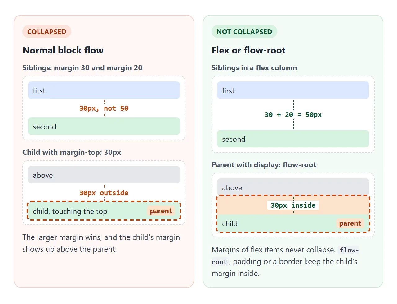
다음 중 하나라도 해당되면 축소가 중지됩니다.
- 상위 항목에는 해당 측면에 패딩 또는 테두리가 있습니다. 1픽셀이면 충분합니다.
- 상위는 **
display: flow-root**입니다. 새로운 블록 형식화 컨텍스트를 시작하고 여백은 이를 통해 축소되지 않습니다. - 상위는 플렉스 또는 그리드 컨테이너입니다. 플렉스 및 그리드 항목의 여백은 절대 축소되지 않습니다.
- 요소가 부동, 절대 위치 또는
inline-block입니다.
간단한 습관으로 이러한 대부분을 피할 수 있습니다. 플렉스 또는 그리드 컨테이너에서 gap가 있는 공간 형제를 사용하거나 모든 블록에 margin-bottom와 같이 한 방향으로만 여백을 제공하는 것입니다.
인라인 요소 및 세로 간격
<span>, <a> 및 <strong>와 같은 요소는 기본적으로 인라인입니다. 텍스트 줄 안에 흐르며 상자 모델은 부분적으로만 적용됩니다.
width및height는 무시됩니다.- 왼쪽 및 오른쪽 패딩, 테두리 및 여백이 작동하고 인접한 텍스트를 밀어냅니다.
- 위쪽 및 아래쪽 여백은 레이아웃에 영향을 주지 않습니다.
- 상하 패딩과 테두리가 칠해져 있는데 그에 맞게 선이 늘어나지 않아 위와 아래의 선이 겹쳐지게 됩니다.
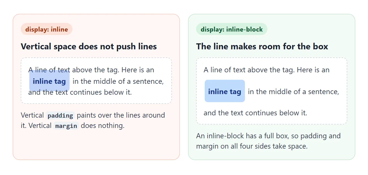
인라인 요소에 실제 수직 공간을 제공하려면 display: inline-block를 설정하세요. 여전히 텍스트 줄에 있지만 전체 상자가 있습니다. CSS 표시는 표시 값을 비교하고 범위 태그는 인라인 래퍼가 유용한 위치를 보여줍니다.
DevTools 및 JavaScript에서 상자 측정
브라우저 개발자 도구는 선택한 요소에 대한 상자 모델을 그립니다.
Chrome 및 Edge에서 요소 패널을 열고 계산됨 탭을 확인하세요. Firefox에서 Inspector를 열고 레이아웃을 살펴보세요. 요소 트리에서 요소를 마우스로 가리키면 페이지의 여백, 테두리, 안쪽 여백 및 콘텐츠가 다양한 색상으로 강조 표시됩니다.
JavaScript에서 대부분의 요구 사항을 충족하는 네 가지 판독값은 다음과 같습니다.
| 독서 | 포함 | 메모 |
|---|---|---|
el.clientWidth |
콘텐츠 + 패딩 | 테두리와 스크롤바는 제외됩니다. 정수로 반올림됩니다. 인라인 요소에 0 |
el.offsetWidth |
콘텐츠 + 패딩 + 테두리 | 스크롤바가 포함되어 있습니다. 반올림. 변환을 무시합니다. |
el.getBoundingClientRect().width |
콘텐츠 + 패딩 + 테두리 | 분수. scale()와 같은 변환을 포함합니다. |
getComputedStyle(el).marginLeft |
한 개의 여백 | "12px"와 같은 문자열 |
그 중 어느 것도 마진을 포함하지 않습니다. 레이아웃에서 요소가 차지하는 공간을 얻으려면 다음을 수행하십시오.
const rect = el.getBoundingClientRect();
const cs = getComputedStyle(el);
const outerWidth = rect.width + parseFloat(cs.marginLeft) + parseFloat(cs.marginRight);
첫 번째 데모에서는 슬라이더를 움직일 때마다 정확히 이 코드를 실행합니다.
완성된 예: 간격이 균형 잡힌 카드
각 유형의 공간에 하나의 작업이 있으면 간격이 더 쉬워집니다. 이 카드 세트에서는 패딩이 각 카드 내부의 공간을 만들고, gap는 카드 사이와 카드의 부품 사이의 공간을 만들고, margin-top: auto는 버튼을 아래쪽으로 밀어줍니다.
<!doctype html>
<html lang="en">
<head>
<meta charset="utf-8">
<meta name="viewport" content="width=device-width, initial-scale=1">
<title>Cards with balanced spacing</title>
<style>
  *, *::before, *::after { box-sizing: border-box; }
  body { margin: 0; padding: 16px; font-family: system-ui, sans-serif; background: #f4f5f7; color: #1d2330; }
  .toggle { font-size: 13px; margin-bottom: 12px; display: flex; gap: 8px; align-items: center; }

  /* Outside spacing: the container's gap, never margins on the cards */
  .cards { display: flex; flex-wrap: wrap; gap: 16px; }

  /* Inside spacing: padding on the card, gap between its children */
  .card {
    flex: 1 1 140px;  /* wrap onto a new row below 140px */
    display: flex; flex-direction: column; gap: 10px;
    padding: 18px; border: 1px solid #e1e4ea; border-radius: 14px; background: #fff;
  }
  .card h3, .card p { margin: 0; }  /* the flex gap does the spacing */
  .card h3 { font-size: 16px; }
  .card p { font-size: 13px; line-height: 1.5; color: #4b5563; }
  .thumb { height: 56px; border-radius: 10px; background: linear-gradient(135deg, #93c5fd, #a7f3d0); }
  .card a {
    margin-top: auto;  /* auto margin pushes the button to the bottom */
    align-self: start; padding: 8px 14px; border-radius: 8px;
    background: #1d2330; color: #fff; font-size: 13px; text-decoration: none;
  }

  /* Overlay: paint each layer so you can see which property made which space */
  .show .cards { background: repeating-linear-gradient(45deg, #fde2cc 0 6px, #fff1e6 6px 12px); }
  .show .card { background: linear-gradient(#dbe8ff, #dbe8ff) content-box, #d6f2df padding-box; border-color: #d9a31a; }
  .show .card > * { outline: 1px dashed #2563eb; }
  .legend { display: none; flex-wrap: wrap; gap: 10px; font-size: 12px; margin-top: 12px; }
  .show .legend { display: flex; }
  .legend i { display: inline-block; width: 12px; height: 12px; border-radius: 3px; vertical-align: -2px; margin-right: 4px; }
</style>
</head>
<body>
<label class="toggle"><input type="checkbox" id="layers"> Show box layers</label>

<div class="cards">
  <article class="card">
    <div class="thumb"></div>
    <h3>Padding</h3>
    <p>Space inside the border. The background fills it.</p>
    <a href="#padding">Read more</a>
  </article>
  <article class="card">
    <div class="thumb"></div>
    <h3>Gap</h3>
    <p>Space between items in a flex or grid container. It never collapses.</p>
    <a href="#gap">Read more</a>
  </article>
  <article class="card">
    <div class="thumb"></div>
    <h3>Margin</h3>
    <p>Here only margin-top: auto, which pushes the button down.</p>
    <a href="#margin">Read more</a>
  </article>
</div>

<div class="legend">
  <span><i style="background:#dbe8ff"></i>card content</span>
  <span><i style="background:#d6f2df"></i>card padding</span>
  <span><i style="background:#d9a31a"></i>card border</span>
  <span><i style="background:#fde2cc"></i>gap between cards</span>
  <span><i style="border:1px dashed #2563eb"></i>each child box</span>
</div>

<script>
  document.getElementById('layers').addEventListener('change', (e) => {
    document.body.classList.toggle('show', e.target.checked);
  });
</script>
</body>
</html>
- 카드 내부: 카드의
padding: 18px. 콘텐츠가 테두리에 닿지 않습니다. - 카드 사이: 컨테이너 위의
gap: 16px. 카드에는 여백이 없으므로 붕괴되거나 가장자리가 두 배로 늘어나는 것은 없습니다. - 카드 부분 사이: 카드는
gap: 10px가 포함된 플렉스 열이며h3및p의 기본 여백은 0으로 설정됩니다. - 하단에 있는 버튼: 플렉스 열의
margin-top: auto는 버튼 위의 여유 공간을 모두 차지하므로 버튼은 다양한 길이의 카드에 걸쳐 정렬됩니다.
작동하지 않을 때
| 당신이 보는 것 | 원인 | 수정 |
|---|---|---|
요소가 width보다 넓습니다. |
content-box는 패딩과 테두리를 추가합니다. |
box-sizing: border-box |
| 100% 너비 상자가 상위 상자를 넘깁니다. | 동일, 상단 패딩 및 테두리 100% | box-sizing: border-box |
| 블록 사이의 간격은 두 여백을 합친 것보다 작습니다. | 세로 여백이 축소됨 | 플렉스나 그리드에서 gap를 사용하거나 한 방향으로만 여백을 사용하세요. |
자식의 margin-top가 대신 부모를 아래로 밀어냅니다. |
부모-자식 축소 | 부모의 패딩, 테두리 또는 display: flow-root |
스팬 또는 링크의 margin-top는 아무 작업도 수행하지 않습니다. |
인라인 요소는 수직 여백을 무시합니다. | display: inline-block |
padding-top: 10%가 예상보다 키가 큽니다. |
백분율은 너비에서 가져옵니다. | 비율에는 고정 길이 또는 aspect-ratio를 사용하세요. |
margin: 0 auto가 중앙에 위치하지 않음 |
블록에 설정된 너비가 없거나 인라인입니다. | width 또는 max-width 및 display: block 설정 |
백분율 패딩은 상자를 고정 비율로 유지하는 오래된 방법이었습니다. CSS 가로 세로 비율은 동일한 작업을 직접 수행합니다.
링크로 공유하세요
간격 문제는 설명하는 것보다 보여주는 것이 더 쉽습니다. 스크린샷은 검사할 수 없으며, 스크린샷을 받는 사람은 레이어를 전환하거나 측정된 크기를 읽을 수 없습니다.
작업 버전을 보내려면 페이지를 NOS 문서에 붙여넣고 공유 링크 만들기를 선택하세요. 링크할 HTML이 이를 안내합니다.
페이지는 작성된 대로 렌더링되고 스크립트가 실행되므로 페이지를 받는 사람은 슬라이더를 이동하고 수정 사항을 직접 뒤집을 수 있습니다. 나중에 코드를 변경하면 동일한 링크에 새 버전이 표시됩니다.