HTML 및 CSS로 버튼을 보기 좋게 만들려면 실제 <button> 요소에서 시작하여 브라우저의 기본 모양을 재설정한 다음 패딩, 테두리 반경 및 색상을 추가합니다.
그 다음에는 호버, 누름, 키보드 포커스, 비활성화 상태가 나타납니다. 각각은 하나의 짧은 규칙입니다.
먼저 시도해 보세요. 상자를 한 번에 하나씩 선택하고 버튼이 변경되는 것을 지켜보세요. 각 레이어의 CSS가 아래에 나타납니다.
<!doctype html>
<html lang="en">
<head>
<meta charset="utf-8">
<meta name="viewport" content="width=device-width, initial-scale=1">
<title>Button CSS, one layer at a time</title>
<style>
  body { margin: 0; padding: 16px; font-family: system-ui, sans-serif; background: #f4f5f7; color: #1d2330; }
  .controls { display: flex; flex-wrap: wrap; gap: 6px 14px; font-size: 14px; }
  .controls label { display: flex; align-items: center; gap: 6px; cursor: pointer; }
  .stage { display: grid; place-items: center; height: 96px; margin: 12px 0; border-radius: 12px; background: #fff; }
  pre { margin: 0; padding: 12px; border-radius: 10px; background: #1d2330; color: #e5e7eb;
        font: 12.5px/1.5 ui-monospace, Consolas, monospace; white-space: pre-wrap; min-height: 40px; }

  /* The six layers. Each one only applies while its box is ticked. */
  .reset .btn  { appearance: none; border: 0; background: none; font: inherit; }
  .pad .btn    { padding: 12px 22px; border-radius: 10px; }
  .colour .btn { background: #2563eb; color: #fff; font-weight: 600; cursor: pointer; }
  @media (hover: hover) {
    .hover .btn:hover { background: #1d4ed8; }
  }
  .active .btn:active { transform: translateY(1px) scale(.97); }
  .focus .btn:focus-visible { outline: 3px solid #93c5fd; outline-offset: 2px; }
</style>
</head>
<body>
<div class="controls" id="controls">
  <label><input type="checkbox" value="reset"> 1 Reset</label>
  <label><input type="checkbox" value="pad"> 2 Padding</label>
  <label><input type="checkbox" value="colour"> 3 Colour</label>
  <label><input type="checkbox" value="hover"> 4 Hover</label>
  <label><input type="checkbox" value="active"> 5 Pressed</label>
  <label><input type="checkbox" value="focus"> 6 Focus</label>
</div>

<div class="stage" id="stage">
  <button class="btn" type="button">Save changes</button>
</div>

<pre id="css"></pre>

<script>
  // The CSS each layer adds, shown under the button
  const rules = {
    reset:  '.btn { appearance: none; border: 0; background: none; font: inherit; }',
    pad:    '.btn { padding: 12px 22px; border-radius: 10px; }',
    colour: '.btn { background: #2563eb; color: #fff; font-weight: 600; cursor: pointer; }',
    hover:  '@media (hover: hover) { .btn:hover { background: #1d4ed8; } }',
    active: '.btn:active { transform: translateY(1px) scale(.97); }',
    focus:  '.btn:focus-visible { outline: 3px solid #93c5fd; outline-offset: 2px; }'
  };
  const stage = document.getElementById('stage');
  const css = document.getElementById('css');

  function update() {
    const on = [...document.querySelectorAll('#controls input:checked')].map(i => i.value);
    stage.className = 'stage ' + on.join(' ');
    css.textContent = on.length ? on.map(k => rules[k]).join('\n') : '/* No CSS yet: this is the browser default button. */';
  }
  document.getElementById('controls').addEventListener('change', update);
  update();
</script>
</body>
</html>
아무것도 선택하지 않으면 브라우저 자체 버튼이 표시됩니다. 작고 회색이며 페이지와 다른 글꼴로 표시됩니다. 6가지 짧은 규칙을 통해 이를 출시할 수 있는 제품으로 바꿉니다.
버튼 또는 링크: 요소를 먼저 선택하세요.
스타일을 지정하면 링크와 버튼이 동일하게 보일 수 있습니다. 여전히 다르게 동작하므로 모양이 아닌 클릭 동작에 따라 선택하십시오.
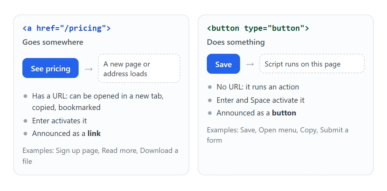
- 어디로 이동(다른 페이지, 파일, 섹션):
<a href="...">를 사용하세요. 새 탭에서 열어서 복사할 수 있습니다. - 작업 수행(저장, 메뉴 열기, 복사, 제출): 양식 내에서
<button type="button">또는type="submit"를 사용합니다.
버튼처럼 보이도록 링크 스타일을 지정하는 방법은 링크가 있는 HTML 버튼에서 다룹니다. CSS가 동일하므로 아래의 모든 내용은 두 가지 모두에 적용됩니다.
브라우저 기본값 재설정
브라우저는 자체 테두리, 배경 및 글꼴을 사용하여 버튼을 그립니다. 일부는 운영 체제의 기본 컨트롤 모양을 적용하기도 합니다. 다음 세 줄을 사용하면 스타일이 무에서 시작되도록 정리됩니다.
.btn {
  appearance: none;   /* drop the native control look */
  border: 0;
  font: inherit;      /* use the page font, not the browser's button font */
}
font: inherit는 잊기 가장 쉬운 라인입니다. 이것이 없으면 페이지의 나머지 부분에 스타일이 지정되더라도 버튼 텍스트는 브라우저의 기본 크기와 계열로 유지됩니다.
패딩, 모양 및 색상
고정된 너비와 높이가 아닌 패딩을 사용하여 버튼 크기를 조정합니다. 패딩은 라벨과 함께 커지므로 더 긴 단어가 쏟아지는 일이 없습니다.
.btn {
  padding: 12px 22px;
  border-radius: 10px;
  background: #2563eb;
  color: #fff;
  font-weight: 600;
  cursor: pointer;
}
텍스트와 배경의 대비를 높게 유지하세요. 중간 또는 진한 파란색 바탕에 흰색이 잘 읽혀집니다. 옅은 색의 흰색은 그렇지 않습니다. cursor: pointer는 선택 사항입니다. 설정하지 않으면 버튼에 기본 화살표가 표시되기 때문입니다.
상태: 호버, 누름, 포커스, 비활성화
전혀 반응하지 않는 버튼은 고장난 느낌이 듭니다. 각 상태는 하나의 선택자입니다.
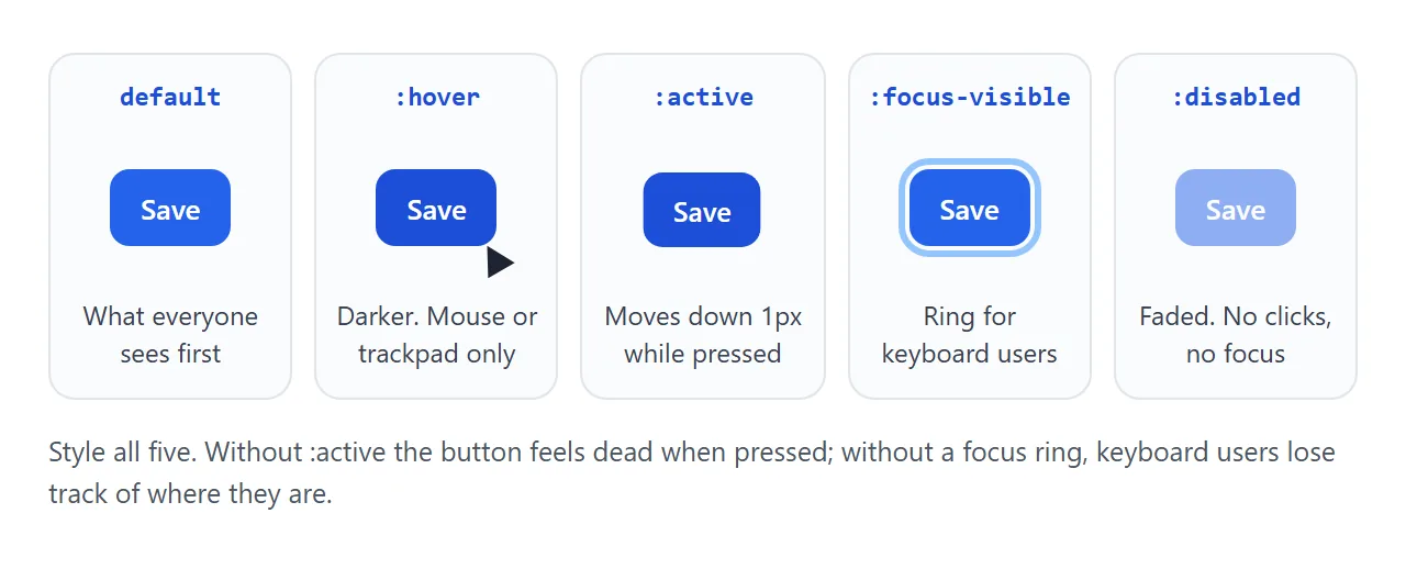
@media (hover: hover) {
  .btn:hover { background: #1d4ed8; }
}
.btn:active { transform: translateY(1px) scale(.97); }
.btn:focus-visible { outline: 3px solid #93c5fd; outline-offset: 2px; }
.btn:disabled { opacity: .5; cursor: not-allowed; }
:hover마우스 아래의 버튼을 어둡게 만듭니다.@media (hover: hover)래퍼는 호버링할 수 있는 장치로 제한하므로 휴대폰을 탭한 후에도 달라붙지 않습니다.:active버튼을 누르고 있는 동안 적용됩니다. 한 픽셀만 움직여도 누르는 듯한 느낌이 들 정도로 충분합니다.- **
:focus-visible**는 포커스가 표시되어야 한다고 브라우저가 결정할 때 링을 표시합니다. 이는 Tab 키를 누르는 키보드 사용자를 포함합니다. 버튼을 마우스로 클릭해도 일반적으로 버튼이 실행되지 않습니다. - **
:disabled**는 버튼을disabled속성과 일치시킵니다. 클릭하거나 초점을 맞출 수 없으므로 명확하게 페이드됩니다.
색상 변경을 전환하는 대신 애니메이션으로 적용하려면 전환을 추가하세요. CSS 호버 전환이 이에 대해 다룹니다.
변형: 기본, 개요, 고스트, 위험
여러 작업이 포함된 페이지에는 두 가지 이상의 버튼이 필요합니다. 크기와 모양에 대해 하나의 기본 .btn 규칙을 유지하고 각 변형이 색상만 변경하도록 합니다.
<!doctype html>
<html lang="en">
<head>
<meta charset="utf-8">
<meta name="viewport" content="width=device-width, initial-scale=1">
<title>Button variants</title>
<style>
  body { margin: 0; padding: 18px; font-family: system-ui, sans-serif; background: #fff; color: #1d2330; }
  .row { display: flex; flex-wrap: wrap; gap: 12px; }

  /* Shared base for every variant */
  .btn {
    appearance: none; font: inherit; font-weight: 600;
    display: inline-flex; align-items: center; justify-content: center; gap: 8px;
    min-height: 44px; padding: 10px 18px;
    border: 2px solid transparent; border-radius: 10px;
    cursor: pointer;
  }
  .btn svg { width: 18px; height: 18px; }
  .btn:focus-visible { outline: 3px solid #93c5fd; outline-offset: 2px; }
  .btn:not(:disabled):active { transform: translateY(1px); }
  .btn:disabled { opacity: .5; cursor: not-allowed; }

  /* Variants only change colours */
  .primary { background: #2563eb; color: #fff; }
  .outline { background: #fff; color: #2563eb; border-color: #2563eb; }
  .ghost   { background: transparent; color: #2563eb; }
  .danger  { background: #dc2626; color: #fff; }
  .icon    { padding: 10px; min-width: 44px; background: #f1f5f9; color: #334155; }

  /* Hover only where a mouse or trackpad can hover */
  @media (hover: hover) {
    .primary:not(:disabled):hover { background: #1d4ed8; }
    .outline:not(:disabled):hover, .ghost:not(:disabled):hover { background: #eff6ff; }
    .danger:not(:disabled):hover  { background: #b91c1c; }
    .icon:not(:disabled):hover    { background: #e2e8f0; }
  }

  #out { margin: 16px 0 0; font-size: 14px; color: #4b5563; }
</style>
</head>
<body>
<div class="row" id="row">
  <button class="btn primary" type="button">Primary</button>
  <button class="btn outline" type="button">Outline</button>
  <button class="btn ghost" type="button">Ghost</button>
  <button class="btn danger" type="button">Delete</button>
  <button class="btn primary" type="button">
    <svg viewBox="0 0 24 24" fill="none" stroke="currentColor" stroke-width="2.4" stroke-linecap="round" aria-hidden="true"><path d="M12 4v11M7 10l5 5 5-5M5 20h14"/></svg>
    Download
  </button>
  <button class="btn icon" type="button" aria-label="Settings">
    <svg viewBox="0 0 24 24" fill="none" stroke="currentColor" stroke-width="2.4" stroke-linecap="round" aria-hidden="true"><path d="M4 7h10M18 7h2M4 17h2M10 17h10"/><circle cx="16" cy="7" r="2"/><circle cx="8" cy="17" r="2"/></svg>
  </button>
  <button class="btn primary" type="button" disabled>Disabled</button>
</div>
<p id="out">Click a button, or press Tab to see the focus ring.</p>

<script>
  // Report which button was pressed. Disabled buttons never fire click.
  document.getElementById('row').addEventListener('click', (e) => {
    const btn = e.target.closest('button');
    if (btn) document.getElementById('out').textContent =
      'You clicked: ' + (btn.getAttribute('aria-label') || btn.textContent.trim());
  });
</script>
</body>
</html>
| 변형 | 다음 용도로 사용하세요. | 변화하는 CSS |
|---|---|---|
| 기본 | 화면에 나타나는 하나의 주요 작업 | 단색 브랜드 배경, 흰색 텍스트 |
| 개요(보조) | 기본 선택 옆에 있는 두 번째 선택 | 흰색 배경, 색상 테두리 및 텍스트 |
| 유령 | 취소 또는 건너뛰기와 같은 간단한 작업 | 배경이나 테두리 없음, 컬러 텍스트 |
| 위험 | 삭제 및 실행 취소할 수 없는 기타 작업 | 단색 빨간색 배경 |
| 아이콘만 | 친숙한 기호가 있는 도구 모음 | 정사각형 패딩 및 aria-label |
텍스트 옆에 있는 아이콘의 경우 align-items: center 및 gap를 사용하여 버튼 display: inline-flex를 만듭니다. 모든 변형의 텍스트 색상을 따르도록 stroke="currentColor"로 아이콘을 그립니다.
아이콘 전용 버튼에는 화면 판독기에서 알릴 텍스트가 없습니다. aria-label로 이름을 지정하십시오.
<button class="btn icon" type="button" aria-label="Settings">
  <svg aria-hidden="true" ...></svg>
</button>
예 및 아니오와 같이 동일해 보이는 한 쌍의 선택 사항은 HTML 예 아니오 버튼에서 다룹니다.
로드 및 성공 상태
클릭이 느리게 시작되면 버튼에 그렇게 표시되어야 합니다. 그렇지 않으면 사람들이 다시 클릭하고 작업이 두 번 실행됩니다.
<!doctype html>
<html lang="en">
<head>
<meta charset="utf-8">
<meta name="viewport" content="width=device-width, initial-scale=1">
<title>Button with loading and success states</title>
<style>
  body { margin: 0; padding: 18px; font-family: system-ui, sans-serif; background: #f4f5f7; color: #1d2330; }
  form { max-width: 420px; padding: 18px; border-radius: 12px; background: #fff; }
  label { display: block; font-size: 14px; margin-bottom: 12px; }
  input { display: block; width: 100%; box-sizing: border-box; margin-top: 6px; padding: 10px;
          font: inherit; border: 1px solid #cbd5e1; border-radius: 8px; }

  .btn {
    appearance: none; font: inherit; font-weight: 600;
    display: inline-flex; align-items: center; justify-content: center; gap: 8px;
    min-width: 160px; min-height: 44px; padding: 10px 20px;
    border: 0; border-radius: 10px; background: #2563eb; color: #fff; cursor: pointer;
    transition: background-color .2s;
  }
  @media (hover: hover) { .btn:not(:disabled):hover { background: #1d4ed8; } }
  .btn:not(:disabled):active { transform: translateY(1px); }
  .btn:focus-visible { outline: 3px solid #93c5fd; outline-offset: 2px; }
  .btn:disabled { cursor: progress; }
  .btn.done { background: #15803d; }

  /* Spinner: a ring with one coloured side, rotating */
  .spin { display: none; width: 16px; height: 16px; border-radius: 50%;
          border: 2px solid rgba(255, 255, 255, .4); border-top-color: #fff;
          animation: turn .7s linear infinite; }
  .btn.loading .spin { display: inline-block; }
  @keyframes turn { to { transform: rotate(360deg); } }
  @media (prefers-reduced-motion: reduce) { .spin { animation-duration: 2s; } }

  /* On phones, the main button fills the width */
  @media (max-width: 480px) { .btn { width: 100%; } }

  #status { min-height: 1.4em; margin: 10px 0 0; font-size: 14px; color: #15803d; }
</style>
</head>
<body>
<form id="form">
  <label>Display name <input name="name" value="Ada Lovelace"></label>
  <button class="btn" id="save" type="submit">
    <span class="spin" aria-hidden="true"></span><span class="label">Save changes</span>
  </button>
  <p id="status" role="status"></p>
</form>

<script>
  const form = document.getElementById('form');
  const btn = document.getElementById('save');
  const label = btn.querySelector('.label');
  const status = document.getElementById('status');

  form.addEventListener('submit', (e) => {
    e.preventDefault();  // no server here: the save is simulated below
    btn.disabled = true;               // blocks a second click while saving
    btn.classList.add('loading');
    label.textContent = 'Saving…';
    status.textContent = '';

    setTimeout(() => {                 // pretend the server answered after 1.5 s
      btn.classList.replace('loading', 'done');
      label.textContent = '✓ Saved';
      status.textContent = 'Saved "' + form.elements.name.value + '".';

      setTimeout(() => {               // back to normal after 2 s
        btn.classList.remove('done');
        btn.disabled = false;
        label.textContent = 'Save changes';
      }, 2000);
    }, 1500);
  });
</script>
</body>
</html>
패턴에는 세 단계가 있습니다.
- 클릭 시: 두 번째 클릭이 아무 작업도 수행하지 않도록
disabled를 설정하고 스피너를 표시하는loading클래스를 추가한 다음 레이블을 "저장 중..."으로 변경합니다. - 작업이 완료되면:
loading를done로 교체하고 확인 표시와 녹색 배경을 표시합니다. - 잠시 후:
done를 제거하고 버튼을 다시 활성화한 후 라벨을 복원합니다.
버튼의 min-width는 라벨이 변경될 때 버튼이 축소되는 것을 방지합니다. 그 아래의 상태 줄에는 role="status"가 있으므로 화면 판독기가 결과를 알려줍니다. 동일한 확인 후 재설정 아이디어가 HTML 복사 버튼을 구동합니다.
휴대폰 크기 조정 버튼
손가락 끝은 마우스 포인터보다 훨씬 큽니다. 나란히 배치된 작은 버튼이 잘못 탭되는 경우가 있습니다.
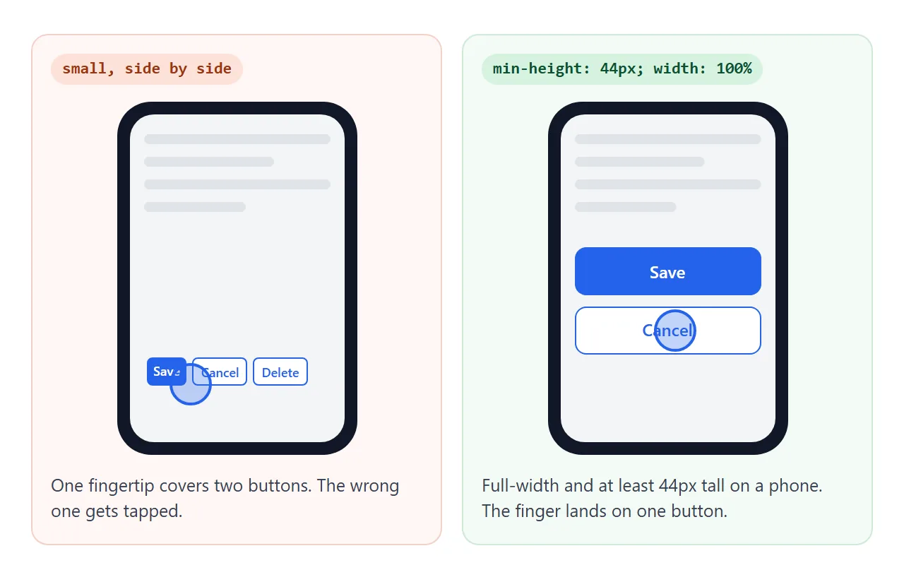
WCAG 2.2에서는 레벨 AA에서 최소 24 x 24 CSS 픽셀, 레벨 AAA에서 44 x 44의 터치 대상을 요구합니다. min-height: 44px는 두 가지 높이를 모두 충족합니다. 좁은 화면에서는 기본 버튼이 행을 채우도록 합니다.
.btn { min-height: 44px; }
@media (max-width: 480px) {
  .btn { width: 100%; }
}
작동하지 않을 때
| 당신이 보는 것 | 원인 | 수정 |
|---|---|---|
| 당신의 스타일은 버튼을 거의 바꾸지 않습니다 | 브라우저의 기본 버튼 모양과 글꼴이 계속 적용됩니다. | appearance: none, border: 0, font: inherit |
| 버튼 텍스트의 글꼴이나 크기가 다릅니다. | 버튼은 기본적으로 페이지 글꼴을 상속하지 않습니다. | 버튼의 font: inherit |
| 키보드 사용자는 어떤 버튼이 선택되었는지 알 수 없습니다. | outline: none는 그 자리에 아무것도 없는 포커스 링을 제거했습니다. |
:focus-visible 윤곽선 추가 |
| 버튼을 클릭하면 페이지가 다시 로드되거나 양식이 제출됩니다. | 양식의 <button>는 기본적으로 type="submit"입니다. |
type="button" 추가 |
| 새 탭에서 열거나 주소를 복사해도 작동하지 않습니다 | 스크립트가 있는 <button>가 링크 작업을 수행 중입니다. |
<a href> 스타일을 버튼으로 사용 |
| 전화기에서는 탭한 후에도 버튼이 어두운 상태로 유지됩니다. | :hover는 터치 스크린을 탭한 후에도 활성 상태를 유지할 수 있습니다. |
@media (hover: hover)에서 호버 규칙 래핑 |
| 클릭해도 아무 일도 일어나지 않습니다 | 무언가가 버튼을 덮고 있거나 비활성화되어 있습니다. | HTML 버튼을 클릭할 수 없음을 참조하세요. |
링크로 공유하세요
버튼 상태는 호버, 누른 효과 또는 로딩 스피너를 표시할 수 없는 스크린샷을 보는 것보다 버튼을 눌러 판단하는 것이 더 쉽습니다.
작업 버전을 보내려면 페이지를 NOS 문서에 붙여넣고 공유 링크 만들기를 선택하세요. 링크할 HTML이 이를 안내합니다.
페이지는 작성된 대로 렌더링되고 스크립트가 실행되므로 페이지를 받는 사람은 버튼을 직접 클릭하고 탭하고 탭할 수 있습니다. 나중에 스타일을 변경하면 동일한 링크에 새 버전이 표시됩니다.