CSS 배경 이미지를 추가하려면 요소에 크기를 지정하고 background-image: url("photo.jpg")를 설정하세요. 그림은 요소의 콘텐츠 뒤에 그려집니다. 세 가지 추가 속성이 이를 제어합니다. background-size는 얼마나 큰지, background-position는 부분이 표시되고, background-repeat는 타일링입니다.
.hero {
  min-height: 300px;
  background-image: url("images/photo.jpg");
  background-size: cover;
  background-position: center;
  background-repeat: no-repeat;
}
상자에 세 가지 속성을 사용해 보세요. 값을 변경하면 상자 아래의 CSS가 업데이트됩니다.
<!doctype html>
<html lang="en">
<head>
<meta charset="utf-8">
<meta name="viewport" content="width=device-width, initial-scale=1">
<title>background-image builder</title>
<style>
  :root {
    /* a landscape drawn in SVG; in your own page use url("images/photo.jpg") */
    --scene: url("data:image/svg+xml,%3Csvg xmlns='http://www.w3.org/2000/svg' width='1200' height='600' viewBox='0 0 1200 600' preserveAspectRatio='none'%3E%3Cdefs%3E%3ClinearGradient id='s' x1='0' y1='0' x2='0' y2='1'%3E%3Cstop offset='0' stop-color='%23ffe3a3'/%3E%3Cstop offset='1' stop-color='%23f59e62'/%3E%3C/linearGradient%3E%3C/defs%3E%3Crect width='1200' height='600' fill='url(%23s)'/%3E%3Ccircle cx='900' cy='230' r='70' fill='%23fffbea'/%3E%3Cpath d='M0 420L220 250L420 400L640 220L900 420L1200 280V600H0Z' fill='%23b07aa1'/%3E%3Cpath d='M0 500L300 380L600 480L900 360L1200 470V600H0Z' fill='%235b4a7a'/%3E%3Crect y='540' width='1200' height='60' fill='%232f2a4a'/%3E%3C/svg%3E");
  }
  body { margin: 0; padding: 16px; font-family: system-ui, sans-serif; background: #f4f5f7; color: #1d2330; }
  .box {
    height: 220px;                 /* no height = no background to see */
    border-radius: 12px;
    border: 2px dashed #9aa3b2;
    background-color: #e8ebf0;     /* shows wherever the image does not cover */
    background-image: var(--scene);
    background-size: cover;
    background-position: center;
    background-repeat: no-repeat;
  }
  .controls { display: grid; grid-template-columns: repeat(3, 1fr); gap: 10px; margin: 14px 0 10px; }
  label { font-size: 13px; font-weight: 600; display: grid; gap: 4px; }
  select { font: inherit; font-weight: 400; padding: 6px; border-radius: 8px; border: 1px solid #c9ced6; background: #fff; }
  pre { margin: 0; padding: 12px 14px; border-radius: 10px; background: #1d2330; color: #e5e9f0; font-size: 13px; line-height: 1.5; overflow-x: auto; }
  @media (max-width: 480px) { .controls { grid-template-columns: 1fr 1fr; } .box { height: 170px; } }
</style>
</head>
<body>
<div class="box" id="box"></div>

<div class="controls">
  <label>background-size
    <select id="size">
      <option>cover</option><option>contain</option><option>auto</option>
      <option>50%</option><option>200px</option><option>100% 100%</option>
    </select>
  </label>
  <label>background-position
    <select id="position">
      <option>center</option><option>left top</option><option>right bottom</option>
      <option>75% 38%</option><option>20px 40px</option>
    </select>
  </label>
  <label>background-repeat
    <select id="repeat">
      <option>no-repeat</option><option>repeat</option><option>repeat-x</option>
      <option>space</option><option>round</option>
    </select>
  </label>
</div>

<pre id="css"></pre>

<script>
  const box = document.getElementById('box');
  const out = document.getElementById('css');
  const pick = (id) => document.getElementById(id).value;

  function update() {
    box.style.backgroundSize = pick('size');
    box.style.backgroundPosition = pick('position');
    box.style.backgroundRepeat = pick('repeat');
    out.textContent =
      '.box {\n' +
      '  height: 220px;\n' +
      '  background-image: url("landscape.svg");\n' +
      '  background-size: ' + pick('size') + ';\n' +
      '  background-position: ' + pick('position') + ';\n' +
      '  background-repeat: ' + pick('repeat') + ';\n' +
      '}';
  }

  document.querySelectorAll('select').forEach((s) => s.addEventListener('change', update));
  update();
</script>
</body>
</html>
여기 그림은 페이지 내부에 그려진 SVG이므로 예제에는 이미지 파일이 필요하지 않습니다. 자신의 페이지에서 url()를 JPG, PNG, WebP 또는 SVG 파일로 지정하세요.
background-size: 표지, 포함 또는 숫자
기본적으로 배경 이미지는 자체 픽셀 크기로 그려집니다. 작은 상자에 담긴 큰 사진에는 왼쪽 상단 모서리만 표시됩니다. background-size가 이를 변경합니다.
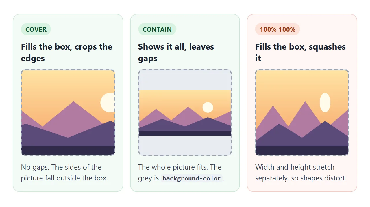
| 가치 | 기능 | 다음 용도로 사용하세요. |
|---|---|---|
auto |
이미지 자체 크기(기본값) | 작은 아이콘과 타일 |
cover |
상자를 채우고 튀어나온 부분을 자릅니다. | 영웅 섹션, 카드, 전체 화면 사진 |
contain |
전체 이미지에 맞지만 간격이 남습니다. | 자르면 안되는 로고 및 도표 |
200px |
너비를 설정하고 높이는 비율을 따릅니다. | 타일과 패턴 |
50% |
상자 너비의 일부 | 상자에 맞춰 확장되는 이미지 |
100% 100% |
너비와 높이를 별도로 설정 | 드물게: 사진이 왜곡됩니다. |
contain를 사용하면 간격에 요소의 background-color가 표시됩니다. 그림의 가장자리에 맞는 것을 설정하세요. CSS background-color는 색상 측면을 다룹니다.
배경 위치 및 초점
cover가 그림을 자르면 background-position가 어떤 부분이 살아남는지 결정합니다. center, left top 및 right bottom와 같은 키워드가 작동합니다. 백분율을 사용하면 더 세밀하게 제어할 수 있습니다.
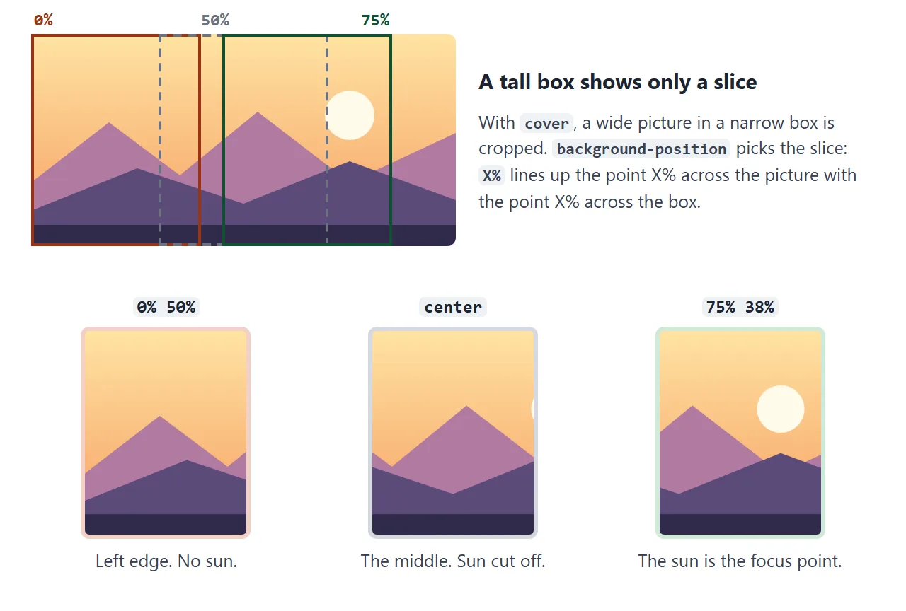
백분율은 핀처럼 작동합니다. 75% 38%는 그림의 가로 75%, 세로 38%, 상자 가로 75%, 세로 38%에 지점을 배치합니다. 상자의 모양이 무엇이든 그 지점은 계속 보입니다.
그러니 얼굴이나 제품 등 사진에서 중요한 부분을 찾아 그 위치를 백분율로 적어보세요. 그것이 초점 포인트입니다. 좁은 휴대폰 화면에서는 가장자리가 잘리고 초점 포인트가 계속 보입니다.
픽셀 값은 다르게 동작합니다. 20px 40px는 이미지의 왼쪽 상단 모서리를 오른쪽으로 20px, 아래로 40px 이동합니다. 상자 크기가 변경되면 그림의 내용을 따르지 않습니다.
배경 반복 및 패턴
배경 이미지는 기본적으로 양방향으로 반복됩니다. 사진의 경우 상자가 이미지보다 클 때 옆에 복사본이 표시되므로 no-repeat를 설정하세요.
패턴의 경우 반복이 핵심입니다. 하나의 작은 타일을 그리고 브라우저가 이를 복사하도록 합니다.
.pattern {
  background-image: url("tile.svg");
  background-size: 40px 40px;
  background-repeat: repeat;
}
repeat-x 및 repeat-y는 한 방향으로만 반복됩니다. space는 전체 복사본을 간격을 두고 분산시키고, round는 전체 복사본 수가 맞도록 타일 크기를 약간 조정합니다.
여러 레이어 및 그라데이션 오버레이
background-image는 쉼표로 구분된 목록을 사용합니다. 첫 번째 이미지는 맨 위에 그려지고 background-color는 모든 레이어 아래에 배치됩니다.
밝은 사진의 흰색 텍스트는 읽기 어려운 경우가 많습니다. 일반적인 수정 방법은 사진 위에 투명 그라데이션을 배치하는 것입니다.
.hero {
  color: #fff;
  background-image:
    linear-gradient(rgba(20, 16, 40, 0.1), rgba(20, 16, 40, 0.6)),
    url("images/photo.jpg");
  background-size: cover;
}
오버레이를 켜고 끄고 어두워지는 정도를 변경합니다.
<!doctype html>
<html lang="en">
<head>
<meta charset="utf-8">
<meta name="viewport" content="width=device-width, initial-scale=1">
<title>Gradient overlay for readable text</title>
<style>
  :root {
    /* a landscape drawn in SVG; in your own page use url("images/photo.jpg") */
    --scene: url("data:image/svg+xml,%3Csvg xmlns='http://www.w3.org/2000/svg' width='1200' height='600' viewBox='0 0 1200 600' preserveAspectRatio='none'%3E%3Cdefs%3E%3ClinearGradient id='s' x1='0' y1='0' x2='0' y2='1'%3E%3Cstop offset='0' stop-color='%23ffe3a3'/%3E%3Cstop offset='1' stop-color='%23f59e62'/%3E%3C/linearGradient%3E%3C/defs%3E%3Crect width='1200' height='600' fill='url(%23s)'/%3E%3Ccircle cx='900' cy='230' r='70' fill='%23fffbea'/%3E%3Cpath d='M0 420L220 250L420 400L640 220L900 420L1200 280V600H0Z' fill='%23b07aa1'/%3E%3Cpath d='M0 500L300 380L600 480L900 360L1200 470V600H0Z' fill='%235b4a7a'/%3E%3Crect y='540' width='1200' height='60' fill='%232f2a4a'/%3E%3C/svg%3E");
    --shade: 0.6;  /* how dark the overlay gets at the bottom */
  }
  body { margin: 0; padding: 16px; font-family: system-ui, sans-serif; background: #f4f5f7; color: #1d2330; }
  .hero {
    min-height: 240px; padding: 28px; border-radius: 12px;
    display: flex; flex-direction: column; justify-content: flex-end;
    color: #fff;
    background-image: var(--scene);
    background-size: cover;
    background-position: center;
  }
  /* the first layer is painted on top: a see-through gradient over the picture */
  .hero.overlay {
    background-image:
      linear-gradient(rgba(20, 16, 40, 0.1), rgba(20, 16, 40, var(--shade))),
      var(--scene);
  }
  .hero h2 { margin: 0 0 6px; font-size: 30px; }
  .hero p { margin: 0; font-size: 16px; max-width: 30em; }
  .controls { display: flex; flex-wrap: wrap; gap: 14px; align-items: center; margin: 14px 0 10px; font-size: 14px; }
  button { font: inherit; font-weight: 600; padding: 8px 14px; border-radius: 8px; border: 0; background: #1d2330; color: #fff; cursor: pointer; }
  input[type=range] { width: 150px; }
  pre { margin: 0; padding: 12px 14px; border-radius: 10px; background: #1d2330; color: #e5e9f0; font-size: 13px; line-height: 1.5; overflow-x: auto; }
</style>
</head>
<body>
<div class="hero" id="hero">
  <h2>Evening walks</h2>
  <p>White text straight on a bright photo is hard to read. A dark gradient layer fixes it.</p>
</div>

<div class="controls">
  <button id="toggle" type="button">Overlay: off</button>
  <label>Darkness <input id="shade" type="range" min="0.2" max="0.9" step="0.05" value="0.6"></label>
</div>

<pre id="css"></pre>

<script>
  const hero = document.getElementById('hero');
  const toggle = document.getElementById('toggle');
  const shade = document.getElementById('shade');
  const out = document.getElementById('css');

  function update() {
    const on = hero.classList.contains('overlay');
    toggle.textContent = 'Overlay: ' + (on ? 'on' : 'off');
    document.documentElement.style.setProperty('--shade', shade.value);
    out.textContent = on
      ? 'background-image:\n  linear-gradient(rgba(20,16,40,.1), rgba(20,16,40,' + shade.value + ')),\n  url("photo.jpg");'
      : 'background-image: url("photo.jpg");';
  }

  toggle.addEventListener('click', () => { hero.classList.toggle('overlay'); update(); });
  shade.addEventListener('input', () => {
    hero.classList.add('overlay');  // moving the slider turns the overlay on
    update();
  });
  update();
</script>
</body>
</html>
그라디언트는 이미지로 간주되므로 다른 파일과 마찬가지로 레이어가 될 수 있습니다. CSS 그래디언트 배경에서는 그래디언트 구문을 자세히 다룹니다. 다른 배경 속성도 동일한 순서로 레이어당 하나의 값으로 목록을 가져옵니다.
전체 화면 배경 이미지
화면을 채우는 영웅의 경우 min-height: 100vh 섹션을 제공하고 위의 모든 항목(cover, 초점, no-repeat 및 오버레이)을 결합합니다. 그 아래의 두 번째 섹션에서는 반복되는 SVG 타일을 사용합니다.
<!doctype html>
<html lang="en">
<head>
<meta charset="utf-8">
<meta name="viewport" content="width=device-width, initial-scale=1">
<title>Full-screen background image</title>
<style>
  :root {
    /* a landscape drawn in SVG; in your own page use url("images/photo.jpg") */
    --scene: url("data:image/svg+xml,%3Csvg xmlns='http://www.w3.org/2000/svg' width='1200' height='600' viewBox='0 0 1200 600' preserveAspectRatio='none'%3E%3Cdefs%3E%3ClinearGradient id='s' x1='0' y1='0' x2='0' y2='1'%3E%3Cstop offset='0' stop-color='%23ffe3a3'/%3E%3Cstop offset='1' stop-color='%23f59e62'/%3E%3C/linearGradient%3E%3C/defs%3E%3Crect width='1200' height='600' fill='url(%23s)'/%3E%3Ccircle cx='900' cy='230' r='70' fill='%23fffbea'/%3E%3Cpath d='M0 420L220 250L420 400L640 220L900 420L1200 280V600H0Z' fill='%23b07aa1'/%3E%3Cpath d='M0 500L300 380L600 480L900 360L1200 470V600H0Z' fill='%235b4a7a'/%3E%3Crect y='540' width='1200' height='60' fill='%232f2a4a'/%3E%3C/svg%3E");
    /* a 40px tile: one dot and a thin grid line, repeated */
    --tile: url("data:image/svg+xml,%3Csvg xmlns='http://www.w3.org/2000/svg' width='40' height='40'%3E%3Ccircle cx='20' cy='20' r='4' fill='%23c7d2fe'/%3E%3Cpath d='M0 0h40v40' fill='none' stroke='%23e0e7ff'/%3E%3C/svg%3E");
    --fx: 75%;  /* focus point: where the sun is in the picture */
    --fy: 38%;
  }
  body { margin: 0; font-family: system-ui, sans-serif; color: #1d2330; }

  .hero {
    position: relative;
    min-height: 100vh;             /* the full screen, whatever its size */
    box-sizing: border-box; padding: 24px;
    display: flex; flex-direction: column; justify-content: flex-end;
    color: #fff;
    background-color: #5b4a7a;     /* shows while the image loads */
    background-image:
      linear-gradient(rgba(20, 16, 40, 0.05) 40%, rgba(20, 16, 40, 0.7)),
      var(--scene);
    background-size: cover;
    background-position: var(--fx) var(--fy);
    background-repeat: no-repeat;
  }
  .hero h1 { margin: 0 0 6px; font-size: clamp(28px, 7vw, 44px); }
  .hero p { margin: 0 0 8px; max-width: 32em; }

  .focus {
    position: absolute; top: 12px; right: 12px;
    display: grid; gap: 4px; padding: 10px 12px; border-radius: 10px;
    background: rgba(255, 255, 255, 0.92); color: #1d2330; font-size: 13px;
  }
  .focus b { font-size: 12px; }
  .focus input { width: 130px; }

  .pattern {
    padding: 40px 24px;
    background-color: #f5f7ff;
    background-image: var(--tile);
    background-size: 40px 40px;    /* one tile */
    background-repeat: repeat;     /* the default, written out for clarity */
  }
  .pattern .card { max-width: 420px; margin: 0 auto; padding: 18px 20px; border-radius: 12px; background: #fff; box-shadow: 0 6px 20px rgba(0, 0, 0, .08); }
  .pattern h2 { margin: 0 0 6px; font-size: 20px; }
  .pattern p { margin: 0; line-height: 1.5; }
</style>
</head>
<body>
<section class="hero">
  <div class="focus">
    <b id="readout">background-position: 75% 38%</b>
    <label>X <input id="fx" type="range" min="0" max="100" value="75"></label>
    <label>Y <input id="fy" type="range" min="0" max="100" value="38"></label>
  </div>
  <h1>Evening walks</h1>
  <p>The picture always covers the screen. Narrow the window: the focus point keeps the sun in view while the edges are cropped.</p>
  <p>Scroll down for a patterned section.</p>
</section>

<section class="pattern">
  <div class="card">
    <h2>A repeating pattern</h2>
    <p>This background is one 40px SVG tile. background-repeat copies it across and down the whole section, however tall it grows.</p>
  </div>
</section>

<script>
  const root = document.documentElement.style;
  const fx = document.getElementById('fx');
  const fy = document.getElementById('fy');
  const readout = document.getElementById('readout');

  function update() {
    root.setProperty('--fx', fx.value + '%');
    root.setProperty('--fy', fy.value + '%');
    readout.textContent = 'background-position: ' + fx.value + '% ' + fy.value + '%';
  }
  fx.addEventListener('input', update);
  fy.addEventListener('input', update);
</script>
</body>
</html>
height가 아닌 min-height를 사용하세요. 작은 휴대폰에서 텍스트가 화면보다 길어지면 텍스트가 쏟아지지 않고 섹션도 함께 늘어납니다.
background-attachment: fixed는 콘텐츠가 그 위로 스크롤되도록 이미지를 창에 고정합니다. 모바일 브라우저는 이를 무시하고 페이지와 함께 이미지를 스크롤할 수 있으므로 섹션은 효과 없이 여전히 올바르게 보여야 합니다.
url()의 상대 경로
CSS 파일 내부의 상대 경로는 HTML 페이지가 아닌 CSS 파일 폴더에서 시작됩니다. 이는 배경 이미지가 한 위치에서는 작동하고 다른 위치에서는 작동하지 않는 가장 일반적인 이유입니다.
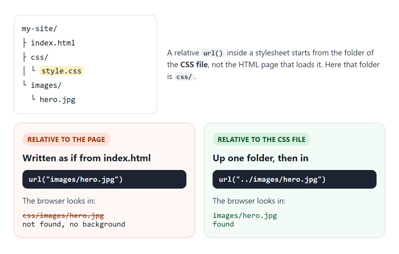
<style> 블록 또는 style 속성 내에서 경로는 대신 HTML 페이지에서 시작됩니다. 따라서 CSS를 페이지에서 별도의 파일로 이동하면 모든 이미지 경로가 손상될 수 있습니다. 상대 경로와 절대 경로에서 규칙을 설명합니다.
경로를 인용해 보세요. 따옴표가 없으면 파일 이름의 공백, 대괄호 및 따옴표를 이스케이프해야 하며, 공백이 있으면 전체 선언이 중단됩니다.
페이지를 단일 파일로 보내는 경우 상대 경로는 수신자가 가지고 있지 않은 파일을 가리킵니다. Base64 이미지는 페이지 안에 그림을 넣고 HTML에 표시되지 않는 이미지는 다른 원인을 다룹니다.
배경 이미지 또는 img?
화면 판독기는 배경 이미지를 알리지 않으며 CSS에는 이에 대한 대체 텍스트가 없습니다. 장식으로는 맞고 내용으로는 틀린 말입니다.
- 콘텐츠(제품 사진, 팀 초상화, 차트): 대체 텍스트와 함께
<img>를 사용하세요. - 장식(질감, 제목 뒤의 분위기 사진): 배경 이미지가 좋습니다.
- 그림 안의 텍스트: 대신 HTML의 텍스트를 배경 위에 놓아서 읽고, 검색하고, 번역할 수 있습니다.
작동하지 않을 때
| 당신이 보는 것 | 원인 | 수정 |
|---|---|---|
| 전혀 없음, 오류 없음 | 요소가 비어 있으므로 높이가 0입니다. | 콘텐츠, 패딩 또는 min-height 추가 |
| 인라인으로 작동하고 CSS 파일에서 중단됨 | 상대 경로는 CSS 파일의 폴더에서 시작됩니다. | 종종 ../를 사용하여 경로를 조정합니다. |
| 아무것도 없습니다. 파일 이름에 공백이나 대괄호가 있습니다. | 인용되지 않은 url() |
경로를 따옴표로 묶습니다. |
| 크기나 위치가 갑자기 기본값으로 돌아갑니다. | 나중에 background 약칭으로 재설정됩니다. |
속기를 먼저 쓰고, 뒤에 약어를 넣는다 |
| 나란히 있는 사진 사본 | 반복은 기본적으로 켜져 있습니다. | background-repeat: no-repeat |
| 휴대폰에서 중요한 부분이 잘려요 | cover 작물 및 background-position는 남아 있는 것을 선택합니다. |
background-position를 초점 포인트로 설정 |
| 휴대전화의 배경 스크롤 문제를 해결했습니다. | 모바일 브라우저는 fixed를 무시할 수 있습니다. |
그것 없이도 작동하도록 섹션을 디자인하십시오. |
속기 트랩은 다음과 같습니다. background는 언급되지 않은 모든 하위 속성을 초기 값으로 다시 설정하므로 여기서 이미지는 auto 크기로 끝납니다.
.hero {
  background-size: cover;
  background: url("photo.jpg") no-repeat;  /* resets size to auto */
}
위치와 슬래시(center / cover) 뒤에 속기 안에 크기를 쓰거나 속기를 먼저 넣습니다.
링크로 공유하세요
배경 이미지는 파일이 있는 위치에 따라 달라지므로 컴퓨터에서는 제대로 보이는 페이지가 비어 있을 수 있습니다. 페이지 내부에 SVG 또는 그라데이션으로 그려진 그림이 함께 이동합니다.
작업 버전을 보내려면 페이지를 NOS 문서에 붙여넣고 공유 링크 만들기를 선택하세요. 링크할 HTML이 이를 안내합니다.
페이지는 작성된 대로 렌더링되고 해당 스크립트가 실행되므로 페이지를 받는 사람이 직접 컨트롤을 사용해 볼 수 있습니다. 나중에 코드를 변경하면 동일한 링크에 새 버전이 표시됩니다.