햄버거 메뉴는 CSS로 세 줄이 그려진 <button>입니다. 클릭하면 "false"와 "true" 사이에서 aria-expanded가 반전됩니다. CSS는 해당 속성을 읽어 선을 X로 바꾸고 링크를 보기로 밀어 넣습니다.
미디어 쿼리는 링크가 한 행에 맞는 와이드 화면의 버튼을 숨깁니다.
아래 아이콘을 클릭한 다음 슬로우 모션을 켜서 각 선의 움직임을 지켜보세요.
<!doctype html>
<html lang="en">
<head>
<meta charset="utf-8">
<meta name="viewport" content="width=device-width, initial-scale=1">
<title>Hamburger icon to X</title>
<style>
  body {
    margin: 0; min-height: 100vh; display: grid; place-content: center; gap: 14px;
    font-family: system-ui, sans-serif; background: #f4f5f7; color: #1d2330; text-align: center;
  }
  .burger {
    position: relative; width: 48px; height: 48px; margin: 0 auto;
    border: 0; border-radius: 10px; background: #1d2330; cursor: pointer;
  }
  .burger:focus-visible { outline: 3px solid #2563eb; outline-offset: 3px; }

  /* the three lines: 24px wide, 4px tall, centres 8px apart */
  .burger span {
    position: absolute; left: 12px; width: 24px; height: 4px;
    border-radius: 2px; background: #fff;
    transform-origin: center;  /* the default, written out: each line turns around its own middle */
    transition: transform .25s ease, opacity .2s ease;
  }
  .burger span:nth-child(1) { top: 14px; }
  .burger span:nth-child(2) { top: 22px; }
  .burger span:nth-child(3) { top: 30px; }

  /* open: move the outer lines to the middle, then turn them */
  .burger[aria-expanded="true"] span:nth-child(1) { transform: translateY(8px) rotate(45deg); }
  .burger[aria-expanded="true"] span:nth-child(2) { opacity: 0; }
  .burger[aria-expanded="true"] span:nth-child(3) { transform: translateY(-8px) rotate(-45deg); }

  /* people who ask for less motion get an instant swap */
  @media (prefers-reduced-motion: reduce) {
    .burger span { transition: none; }
  }

  .slow .burger span { transition-duration: 1.2s; }
  code { font: 600 13px ui-monospace, Consolas, monospace; background: #e6e9ef; border-radius: 5px; padding: 2px 6px; }
  label { font-size: 13px; color: #5b6270; }
</style>
</head>
<body>
<button class="burger" id="burger" type="button" aria-label="Menu" aria-expanded="false">
  <span></span><span></span><span></span>
</button>
<div>aria-expanded = <code id="state">false</code></div>
<label><input type="checkbox" id="slow"> Slow motion</label>

<script>
  const burger = document.getElementById('burger');

  burger.addEventListener('click', () => {
    const open = burger.getAttribute('aria-expanded') === 'true';
    burger.setAttribute('aria-expanded', String(!open));  // the CSS reads this attribute
    document.getElementById('state').textContent = String(!open);
  });

  // only for this demo: stretch the animation so you can watch it
  document.getElementById('slow').addEventListener('change', (e) => {
    document.body.classList.toggle('slow', e.target.checked);
  });
</script>
</body>
</html>
이 페이지는 메뉴 버튼과 패널에 관한 것입니다. 바 자체를 구축하는 방법은 HTML 및 CSS navbar에서 다루고, <nav> 요소와 HTML 탐색 태그에서 랜드마크 역할을 다룹니다.
실제 버튼으로 시작하기
마크업은 짧고 모든 속성에는 작업이 있습니다.
<button class="burger" type="button" aria-label="Menu"
        aria-expanded="false" aria-controls="site-menu">
  <span></span><span></span><span></span>
</button>
<nav aria-label="Main">
  <ul class="menu" id="site-menu"> ... links ... </ul>
</nav>
- **
<button>**는 Tab을 사용하여 포커스를 얻고 Enter 및 Space에서 자체적으로click를 실행합니다. 클릭 리스너가 있는<div>는 둘 다 수행하지 않습니다. - **
aria-label="Menu"**는 아이콘에 이름을 지정합니다. 세 개의 빈 범위에는 읽을 텍스트가 없습니다. - **
aria-expanded**에는 메뉴가 열려 있는지 여부가 표시됩니다. 메뉴가 바뀔 때마다 바뀌어야 합니다. - **
aria-controls**는 버튼이 열리는 목록의id를 가리킵니다.
아이콘을 그리고 X 모양으로 애니메이션을 적용합니다.
각 줄은 position: absolute, 너비, 높이 및 배경을 포함하는 <span>입니다. 유사 요소(한 범위의 ::before 및 ::after)도 작동합니다. 별도의 범위는 읽기 쉽고 하나씩 애니메이션화하기가 더 쉽습니다.
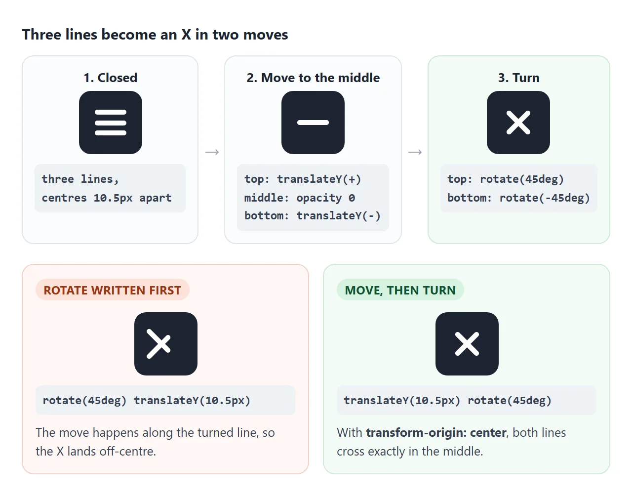
열린 상태는 두 가지 움직임입니다. 상단 라인이 중앙으로 미끄러져 내려와 45도 회전합니다. 하단 라인이 위로 미끄러져 -45도 회전합니다. 가운데 선이 희미해집니다.
.burger span { transition: transform .25s ease, opacity .2s ease; }
.burger[aria-expanded="true"] span:nth-child(1) { transform: translateY(8px) rotate(45deg); }
.burger[aria-expanded="true"] span:nth-child(2) { opacity: 0; }
.burger[aria-expanded="true"] span:nth-child(3) { transform: translateY(-8px) rotate(-45deg); }
거리(여기서 8px)는 인접한 두 선의 중심 사이의 간격입니다. 잘못하면 X가 한쪽으로 치우쳐집니다.
transform 내에서 주문이 중요합니다. translateY(8px) rotate(45deg)가 똑바로 아래로 이동한 다음 회전합니다. rotate(45deg) translateY(8px)가 회전된 선을 따라 이동하므로 X가 중심에서 벗어납니다. CSS 변환은 순서 규칙을 설명합니다.
어떤 사람들은 움직임을 줄이도록 시스템을 설정합니다. 한 가지 규칙으로 이를 존중하세요.
@media (prefers-reduced-motion: reduce) {
  .burger span { transition: none; }
}
드롭다운 또는 오프 캔버스 서랍
버튼과 스크립트는 동일하게 유지됩니다. 닫힌 목록과 열린 목록의 CSS만 변경됩니다. 여기에서 두 버전 사이를 전환하세요.
<!doctype html>
<html lang="en">
<head>
<meta charset="utf-8">
<meta name="viewport" content="width=device-width, initial-scale=1">
<title>Drop-down or drawer</title>
<style>
  body { margin: 0; padding: 14px; font-family: system-ui, sans-serif; background: #f4f5f7; color: #1d2330; }
  .pick { display: flex; justify-content: center; gap: 6px; margin-bottom: 12px; font-size: 14px; }
  .pick label { padding: 6px 12px; border: 1px solid #c9cdd4; border-radius: 99px; background: #fff; cursor: pointer; }
  .pick label:has(input:checked) { background: #1d2330; color: #fff; border-color: #1d2330; }
  .pick input { accent-color: #fff; margin: 0 4px 0 0; }

  /* a phone-sized page */
  .screen {
    position: relative; max-width: 340px; height: 310px; margin: 0 auto;
    overflow: hidden; border: 1px solid #d5d9e0; border-radius: 16px; background: #fff;
  }
  .bar {
    position: relative; z-index: 3; height: 52px; padding: 0 8px 0 16px;
    display: flex; align-items: center; justify-content: space-between;
    background: #fff; border-bottom: 1px solid #e5e7eb; font-weight: 700;
  }
  .content { padding: 16px; }
  .content i { display: block; height: 10px; margin: 0 0 10px; border-radius: 5px; background: #eceef2; }

  /* the burger from the first example, a little smaller */
  .burger { position: relative; width: 40px; height: 40px; border: 0; border-radius: 8px; background: none; cursor: pointer; }
  .burger span { position: absolute; left: 9px; width: 22px; height: 3px; border-radius: 2px; background: #1d2330; transition: transform .25s, opacity .2s; }
  .burger span:nth-child(1) { top: 12px; } .burger span:nth-child(2) { top: 18.5px; } .burger span:nth-child(3) { top: 25px; }
  .burger[aria-expanded="true"] span:nth-child(1) { transform: translateY(6.5px) rotate(45deg); }
  .burger[aria-expanded="true"] span:nth-child(2) { opacity: 0; }
  .burger[aria-expanded="true"] span:nth-child(3) { transform: translateY(-6.5px) rotate(-45deg); }

  /* closed: moved out of view AND visibility: hidden, so Tab and screen readers skip it */
  .menu {
    position: absolute; z-index: 2; margin: 0; padding: 8px 0; list-style: none; background: #fff;
    visibility: hidden;
    transition: transform .25s ease, visibility 0s .25s;  /* hide only after the slide ends */
  }
  .menu a { display: block; padding: 11px 18px; color: #1d2330; text-decoration: none; }
  .menu a:hover, .menu a:focus-visible { background: #eef2ff; }

  .menu.drop   { top: 52px; left: 0; right: 0; transform: translateY(-100%); box-shadow: 0 10px 20px rgba(0,0,0,.1); }
  .menu.drawer { top: 52px; bottom: 0; right: 0; width: 72%; transform: translateX(100%); box-shadow: -8px 0 20px rgba(0,0,0,.12); }

  .menu.open { visibility: visible; transform: none; transition: transform .25s ease, visibility 0s; }

  .shade { position: absolute; inset: 52px 0 0; z-index: 1; background: rgba(15,23,42,.35); opacity: 0; pointer-events: none; transition: opacity .25s; }
  .shade.on { opacity: 1; pointer-events: auto; }

  @media (prefers-reduced-motion: reduce) {
    .menu, .menu.open, .burger span, .shade { transition: none; }
  }
</style>
</head>
<body>
<div class="pick" role="radiogroup" aria-label="Menu style">
  <label><input type="radio" name="style" value="drop" checked>Drop-down</label>
  <label><input type="radio" name="style" value="drawer">Drawer</label>
</div>

<div class="screen">
  <div class="bar">
    Acme
    <button class="burger" id="burger" type="button" aria-label="Menu" aria-expanded="false" aria-controls="menu">
      <span></span><span></span><span></span>
    </button>
  </div>
  <ul class="menu drop" id="menu">
    <li><a href="#">Home</a></li>
    <li><a href="#">Products</a></li>
    <li><a href="#">Pricing</a></li>
    <li><a href="#">Contact</a></li>
  </ul>
  <div class="shade" id="shade"></div>
  <div class="content"><i></i><i style="width:80%"></i><i></i><i style="width:60%"></i><i></i><i style="width:70%"></i><i></i><i style="width:85%"></i></div>
</div>

<script>
  const burger = document.getElementById('burger');
  const menu = document.getElementById('menu');
  const shade = document.getElementById('shade');

  function setOpen(open) {
    burger.setAttribute('aria-expanded', String(open));
    menu.classList.toggle('open', open);
    shade.classList.toggle('on', open && menu.classList.contains('drawer'));
  }

  burger.addEventListener('click', () => setOpen(burger.getAttribute('aria-expanded') !== 'true'));
  shade.addEventListener('click', () => setOpen(false));
  menu.addEventListener('click', (e) => { if (e.target.closest('a')) { e.preventDefault(); setOpen(false); } });

  // switch between the two versions: only the class on the list changes
  document.querySelectorAll('input[name="style"]').forEach((r) => r.addEventListener('change', () => {
    setOpen(false);
    menu.className = 'menu ' + r.value;
  }));
</script>
</body>
</html>
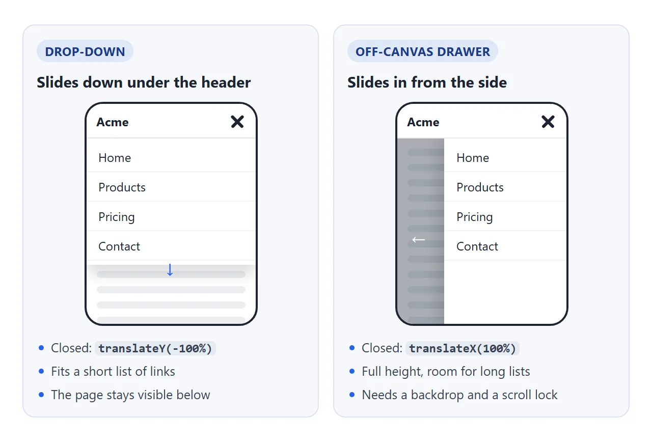
| 드롭다운 | 오프 캔버스 서랍 | |
|---|---|---|
| 닫힌 위치 | translateY(-100%) |
translateX(100%) |
| 링크를 위한 공간 | 짧은 목록 | 전체 화면 높이 |
| 페이지 뒤 | 계속 표시됨 | 배경으로 덮여 |
| 스크롤 잠금 | 화면을 덮는 경우에만 | 예 |
둘 다 닫힌 목록에는 visibility: hidden와 변환이 있습니다. 화면 밖으로 목록을 이동해도 Tab이 해당 링크에 도달하는 것이 중단되지는 않습니다. visibility: hidden는 이를 수행하며 화면 판독기에서도 숨깁니다.
나가는 중에 슬라이드를 계속 표시하려면 전환이 끝날 때까지 표시 변경을 지연하세요.
.menu      { visibility: hidden;  transition: transform .25s, visibility 0s .25s; }
.menu.open { visibility: visible; transition: transform .25s, visibility 0s; transform: none; }
좁은 화면에서만
좁은 레이아웃을 먼저 작성한 후, 링크가 한 행에 맞는 너비로 취소하세요. 완성된 예제에서는 700px를 사용합니다.
@media (min-width: 700px) {
  .burger, .backdrop { display: none; }
  .menu { position: static; display: flex; visibility: visible; transform: none; transition: none; }
}
자신의 라벨을 측정하여 숫자를 선택하세요. 중단점에 대한 일반적인 소개는 미디어 쿼리에 있습니다.
스크립트에는 동일한 번호가 필요합니다. window.matchMedia('(min-width: 700px)')는 화면이 교차할 때 change 이벤트를 발생시키며, 이때 열려 있던 메뉴를 닫습니다.
Escape, 링크 클릭 및 외부 클릭 시 닫습니다.
자체 버튼으로만 닫히는 메뉴가 멈춘 듯한 느낌을 줍니다. 버튼 외에도 4개의 종료가 예상되며 5개 모두 동일한 기능을 호출해야 합니다.
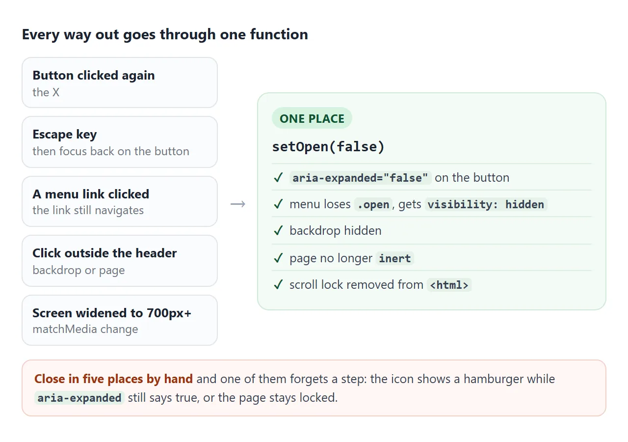
function setOpen(open) {
  burger.setAttribute('aria-expanded', String(open));
  menu.classList.toggle('open', open);
  backdrop.hidden = !open;
  main.inert = open;
  document.documentElement.classList.toggle('menu-open', open);
}
- Escape:
document의keydown리스너는e.key === 'Escape'를 확인하고 닫은 다음burger.focus()를 호출합니다. - 링크 클릭: 대상이
<a>내부에 있으면 목록의 클릭 리스너가 닫힙니다. 링크는 여전히 탐색됩니다. - 외부 클릭: 대상이 헤더 내부에 없을 때
document의 클릭 리스너가 닫힙니다. - 중단점을 지나 확장:
matchMedia변경 리스너가 닫힙니다.
초점 및 스크롤 잠금
집중력을 절대로 잃어서는 안 됩니다. Escape 후에는 포커스가 있는 요소가 사라졌기 때문에 버튼으로 돌아갑니다. 목록이 페이지의 버튼 바로 뒤에 오면 Tab이 이미 해당 버튼으로 이동하므로 열면 해당 위치에 포커스가 유지됩니다.
페이지를 덮는 패널에는 두 가지가 더 필요합니다.
- 뒤에 있는 페이지의
inert. 탭을 클릭하면 배경 아래 숨겨진 콘텐츠로 이동할 수 없으며 그곳을 클릭해도 무시됩니다. - 스크롤 잠금.
<html>의 클래스를 토글하고overflow: hidden를 지정하면 메뉴가 열려 있는 동안 뒤에 있는 페이지가 그대로 유지됩니다.
여기에 모든 것이 함께 있습니다. 본 글의 프레임은 700px보다 좁아서 휴대폰 레이아웃을 보여줍니다.
<!doctype html>
<html lang="en">
<head>
<meta charset="utf-8">
<meta name="viewport" content="width=device-width, initial-scale=1">
<title>Responsive header with a hamburger menu</title>
<style>
  body { margin: 0; font-family: system-ui, sans-serif; color: #1d2330; background: #fff; }
  html.menu-open { overflow: hidden; }  /* scroll lock while the menu is open */

  .site-header {
    position: sticky; top: 0; z-index: 10; height: 56px; padding: 0 12px 0 20px;
    display: flex; align-items: center; justify-content: space-between;
    background: #fff; border-bottom: 1px solid #e5e7eb;
  }
  .logo { font-weight: 800; color: #1d2330; text-decoration: none; }

  .burger { position: relative; width: 44px; height: 44px; border: 0; border-radius: 8px; background: none; cursor: pointer; }
  .burger:focus-visible, .menu a:focus-visible { outline: 3px solid #2563eb; outline-offset: 2px; }
  .burger span { position: absolute; left: 10px; width: 24px; height: 3px; border-radius: 2px; background: #1d2330; transition: transform .25s, opacity .2s; }
  .burger span:nth-child(1) { top: 13.5px; } .burger span:nth-child(2) { top: 20.5px; } .burger span:nth-child(3) { top: 27.5px; }
  .burger[aria-expanded="true"] span:nth-child(1) { transform: translateY(7px) rotate(45deg); }
  .burger[aria-expanded="true"] span:nth-child(2) { opacity: 0; }
  .burger[aria-expanded="true"] span:nth-child(3) { transform: translateY(-7px) rotate(-45deg); }

  /* narrow screens (the default): the list is a panel under the header */
  .menu {
    position: fixed; top: 56px; left: 0; right: 0; margin: 0; padding: 8px 0; list-style: none;
    background: #fff; border-bottom: 1px solid #e5e7eb; box-shadow: 0 12px 24px rgba(0,0,0,.12);
    visibility: hidden; opacity: 0; transform: translateY(-8px);
    transition: opacity .2s, transform .2s, visibility 0s .2s;
  }
  .menu.open { visibility: visible; opacity: 1; transform: none; transition: opacity .2s, transform .2s, visibility 0s; }
  .menu a { display: block; padding: 12px 20px; color: #1d2330; text-decoration: none; font-size: 17px; }
  .menu a:hover { background: #f1f5f9; }

  .backdrop { position: fixed; inset: 56px 0 0; z-index: 5; background: rgba(15,23,42,.4); }

  /* 700px and wider: no button, the links sit in the bar */
  @media (min-width: 700px) {
    .burger, .backdrop { display: none; }
    .menu {
      position: static; display: flex; gap: 4px; padding: 0;
      visibility: visible; opacity: 1; transform: none; box-shadow: none; border: 0; transition: none;
    }
    .menu a { padding: 8px 12px; border-radius: 8px; font-size: 15px; }
  }

  @media (prefers-reduced-motion: reduce) {
    .menu, .menu.open, .burger span { transition: none; }
  }

  main { max-width: 640px; margin: 0 auto; padding: 8px 20px 40px; line-height: 1.6; }
  h2 { margin: 26px 0 6px; font-size: 19px; scroll-margin-top: 64px; }  /* clear the sticky header */
</style>
</head>
<body>
<header class="site-header">
  <a class="logo" href="#top">Northwind</a>
  <button class="burger" id="burger" type="button" aria-label="Menu" aria-expanded="false" aria-controls="site-menu">
    <span></span><span></span><span></span>
  </button>
  <nav aria-label="Main">
    <ul class="menu" id="site-menu">
      <li><a href="#features">Features</a></li>
      <li><a href="#pricing">Pricing</a></li>
      <li><a href="#faq">FAQ</a></li>
      <li><a href="#contact">Contact</a></li>
    </ul>
  </nav>
</header>
<div class="backdrop" id="backdrop" hidden></div>

<main id="main">
  <p id="top">Open the menu, then try Tab, Escape, a link, or a click on the dark area. The page behind does not scroll while it is open.</p>
  <h2 id="features">Features</h2>
  <p>Plans, invoices and reports in one place. Everything updates as soon as someone on the team changes it.</p>
  <p>Import from a spreadsheet in one step, then keep editing in the browser.</p>
  <h2 id="pricing">Pricing</h2>
  <p>One plan for small teams, one for larger ones. Both include every feature.</p>
  <p>Pay monthly or yearly. You can switch at any time.</p>
  <h2 id="faq">FAQ</h2>
  <p>Can I export my data? Yes, to CSV at any time.</p>
  <p>Is there a free trial? Yes, fourteen days.</p>
  <h2 id="contact">Contact</h2>
  <p>Write to hello@example.com and we answer within one working day.</p>
</main>

<script>
  const burger = document.getElementById('burger');
  const menu = document.getElementById('site-menu');
  const backdrop = document.getElementById('backdrop');
  const main = document.getElementById('main');
  const wide = window.matchMedia('(min-width: 700px)');  // same value as the CSS

  function isOpen() { return burger.getAttribute('aria-expanded') === 'true'; }

  function setOpen(open) {
    burger.setAttribute('aria-expanded', String(open));
    menu.classList.toggle('open', open);
    backdrop.hidden = !open;
    main.inert = open;                                            // Tab cannot wander behind the menu
    document.documentElement.classList.toggle('menu-open', open); // scroll lock
  }

  burger.addEventListener('click', () => setOpen(!isOpen()));

  // Escape closes and puts focus back on the button
  document.addEventListener('keydown', (e) => {
    if (e.key === 'Escape' && isOpen()) { setOpen(false); burger.focus(); }
  });

  // a link was chosen: close, and let the link do its job
  menu.addEventListener('click', (e) => { if (e.target.closest('a') && isOpen()) setOpen(false); });

  // a click anywhere outside the header closes it (the backdrop counts as outside)
  document.addEventListener('click', (e) => {
    if (isOpen() && !e.target.closest('.site-header')) setOpen(false);
  });

  // widened to desktop while open: reset, or the lock and backdrop stay behind
  wide.addEventListener('change', (e) => { if (e.matches) setOpen(false); });
</script>
</body>
</html>
CSS 전용 체크박스 해킹
메뉴는 JavaScript 없이 열 수 있습니다. 숨겨진 확인란은 상태를 유지하고 <label>는 버튼 역할을 합니다.
<input type="checkbox" id="nav-toggle" class="visually-hidden">
<label for="nav-toggle">Menu</label>
<ul class="menu"> ... </ul>

<style>
  .menu { display: none; }
  #nav-toggle:checked ~ .menu { display: block; }
</style>
마우스에서는 작동하지만 접근성이 떨어집니다.
화면 판독기는 확장되거나 축소된 메뉴 버튼 대신 선택 여부에 관계없이 체크박스를 알려줍니다. 확인란에 display: none가 표시되면 키보드 사용자는 전혀 접근할 수 없습니다. 탈출, 외부 클릭 및 포커스 복귀에는 어쨌든 스크립트가 필요합니다.
빠른 프로토타입을 위해 사용하세요. 라이브 사이트의 경우 위의 버튼 버전은 거의 길지 않습니다.
작동하지 않을 때
| 당신이 보는 것 | 원인 | 수정 |
|---|---|---|
| Tab 키는 메뉴 버튼을 건너뛰고 Enter 키는 아무 작업도 수행하지 않습니다. | 버튼은 <div> 또는 <span>입니다. |
<button type="button"> 사용 |
| 링크는 숨겨져 있지만 Tab은 여전히 해당 링크에 표시됩니다. | 닫힌 목록은 화면 밖으로만 이동됩니다. | 닫힐 때 visibility: hidden 추가 |
| 데스크탑으로 확장한 후에도 메뉴가 계속 열려 있음 | 중단점에서 상태를 재설정하는 것은 없습니다. | matchMedia 변경 리스너에서 닫기 |
| 열린 서랍 뒤로 페이지가 스크롤됩니다. | 스크롤 잠금 없음 | <html>에서 overflow: hidden를 사용하여 클래스 전환 |
| X가 한쪽으로 치우쳐 있거나 선이 모퉁이에서 흔들립니다. | transform-origin가 중심이 아니거나 rotate가 translate 앞에 기록되었습니다. |
transform-origin: center를 유지하고 translateY(...) rotate(...)를 작성합니다. |
| 메뉴가 열려 있는 동안 화면 판독기에서 '접혀 있음'이라고 표시됩니다. | aria-expanded가 업데이트되지 않았습니다. |
하나의 열기/닫기 기능 내부에 설정하세요. |
| 아이콘은 바뀌지만 메뉴는 바뀌지 않습니다 | CSS는 클래스를 읽고, 스크립트는 속성을 설정합니다(또는 그 반대). | 동일한 속성 또는 클래스에서 둘 다 구동 |
링크로 공유하세요
메뉴판은 눈으로 보는 것보다 사용해 보면 더 쉽게 판단할 수 있습니다. 스크린샷은 하나의 상태를 보여주며, .html 첨부 파일은 전화기에서 일반 코드로 열릴 수 있으며, 바로 햄버거가 나타나는 위치입니다.
작업 버전을 보내려면 페이지를 NOS 문서에 붙여넣고 공유 링크 만들기를 선택하세요. 링크할 HTML이 이를 안내합니다.
페이지는 작성된 대로 렌더링되고 해당 스크립트가 실행되므로 페이지를 받는 사람은 자신의 휴대폰에서 메뉴를 열고 닫을 수 있습니다. 나중에 코드를 변경하면 동일한 링크에 새 버전이 표시됩니다.