HTML <label> 태그는 텍스트 조각을 하나의 양식 컨트롤에 연결합니다. for를 컨트롤의 id로 설정하거나 컨트롤을 레이블 안에 넣습니다.
그런 다음 텍스트를 클릭하면 컨트롤이 작동하고 화면 판독기는 텍스트를 컨트롤 이름으로 읽습니다.
시도해 보세요. 상자가 아닌 각 면에 있는 단어를 클릭하세요.
<!doctype html>
<html lang="en">
<head>
<meta charset="utf-8">
<meta name="viewport" content="width=device-width, initial-scale=1">
<title>Label click test</title>
<style>
  body { margin: 0; padding: 16px; font-family: system-ui, sans-serif; background: #f4f5f7; color: #1d2330; }
  .grid { display: grid; grid-template-columns: repeat(auto-fit, minmax(160px, 1fr)); gap: 12px; }
  .box { background: #fff; border-radius: 12px; padding: 14px; border: 2px solid #cfe9d7; }
  .box.no { border-color: #f3d1c8; }
  h2 { font-size: 13px; margin: 0 0 12px; text-transform: uppercase; letter-spacing: .4px; }
  .row { margin-bottom: 14px; }
  label, .fake { cursor: pointer; }
  input[type="text"] { display: block; width: 100%; box-sizing: border-box; margin-top: 4px; padding: 7px 9px; font: inherit; }
  #log { margin-top: 12px; padding: 10px 12px; border-radius: 10px; background: #1d2330; color: #e5e7eb; font: 13px/1.5 ui-monospace, Consolas, monospace; }
</style>
</head>
<body>
<div class="grid">
  <div class="box">
    <h2>Connected</h2>
    <!-- for="..." matches the id of the control -->
    <div class="row">
      <input type="checkbox" id="news-a">
      <label for="news-a">Send me the newsletter</label>
    </div>
    <div class="row">
      <label for="city-a">City</label>
      <input type="text" id="city-a">
    </div>
  </div>
  <div class="box no">
    <h2>Not connected</h2>
    <!-- plain text beside the control: nothing links them -->
    <div class="row">
      <input type="checkbox" id="news-b">
      <span class="fake">Send me the newsletter</span>
    </div>
    <div class="row">
      <span class="fake">City</span>
      <input type="text" id="city-b">
    </div>
  </div>
</div>
<div id="log" aria-live="polite">Click the words, not the boxes.</div>

<script>
  const log = document.getElementById('log');
  // report what each control did, so a click on the text is visible
  document.querySelectorAll('input').forEach((el) => {
    const side = el.id.endsWith('-a') ? 'Connected' : 'Not connected';
    el.addEventListener('change', () => {
      if (el.type === 'checkbox') log.textContent = side + ': checkbox is now ' + (el.checked ? 'ON' : 'OFF');
    });
    el.addEventListener('focus', () => {
      if (el.type === 'text') log.textContent = side + ': the City box has focus';
    });
  });
  document.querySelectorAll('.fake').forEach((t) => {
    t.addEventListener('click', () => { log.textContent = 'Not connected: you clicked text, the control did nothing'; });
  });
</script>
</body>
</html>
왼쪽에서 "뉴스레터 보내기"를 클릭하면 확인란이 전환되고 "도시"를 클릭하면 상자에 커서가 놓입니다. 오른쪽의 텍스트는 동일해 보이지만 컨트롤에 연결되는 것은 없습니다.
라벨을 연결하는 두 가지 방법
두 가지 방법이 있으며 둘 다 표준 HTML입니다. 컨트롤당 하나씩 선택하세요.
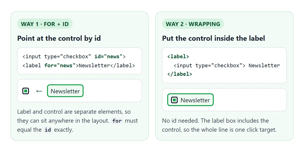
for및id: 컨트롤에id를 제공하고 라벨의for에 동일한 값을 입력합니다. 두 요소는 테이블 셀이나 그리드 열과 같이 레이아웃에서 서로 다른 위치에 배치될 수 있습니다.- 래핑:
<label>내부에 컨트롤을 넣습니다.id가 필요하지 않습니다. 이는 동일한 조각이 페이지에서 여러 번 반복될 때 도움이 됩니다.
<!-- 1. for + id -->
<input type="checkbox" id="news">
<label for="news">Send me the newsletter</label>

<!-- 2. wrapping -->
<label>
  <input type="checkbox" name="news"> Send me the newsletter
</label>
두 가지를 동시에 수행할 수도 있습니다. 즉, 래핑된 컨트롤과 일치하는 for가 포함된 래핑 라벨입니다. for가 다른 컨트롤의 이름을 지정하면 for가 승리합니다.
연결된 라벨의 역할
연결된 라벨은 세 가지를 변경하며 그 중 어느 것도 JavaScript가 필요하지 않습니다.
| 제어 | 라벨을 클릭하면 | 스크린 리더가 듣는 내용 |
|---|---|---|
| 체크박스 | 토글합니다 | "뉴스레터를 보내주세요. 확인란이 선택되어 있지 않습니다." |
| 라디오 버튼 | 선택한다 | 라벨 텍스트, '라디오 버튼' 및 해당 상태 |
| 텍스트 상자, 선택, 텍스트 영역 | 초점을 그쪽으로 옮깁니다. | 라벨 텍스트, 필드 종류 |
화면 판독기에서 사용하는 정확한 문구는 판독기마다 다릅니다. 중요한 부분은 레이블 텍스트가 컨트롤의 접근 가능한 이름, 즉 보조 기술이 컨트롤에 사용하는 이름이라는 것입니다. 레이블이 없으면 확인란은 이름 없이 표시됩니다.
음성 제어 소프트웨어에서도 동일한 이름이 사용되므로 사용자는 레이블 텍스트를 말하여 제어를 수행할 수 있습니다. aria-label은 눈에 보이는 텍스트가 없는 항목의 이름을 지정하는 방법을 다룹니다. 보이는 텍스트가 있는 양식 컨트롤의 경우 실제 레이블이 먼저 옵니다.
체크박스와 라디오의 더 큰 클릭 타겟
기본 확인란의 크기는 대략 한 글자 크기입니다. 휴대폰에서는 손가락이 정확히 해당 사각형에 닿아야 합니다. 연결된 레이블은 대상에 텍스트를 추가합니다.
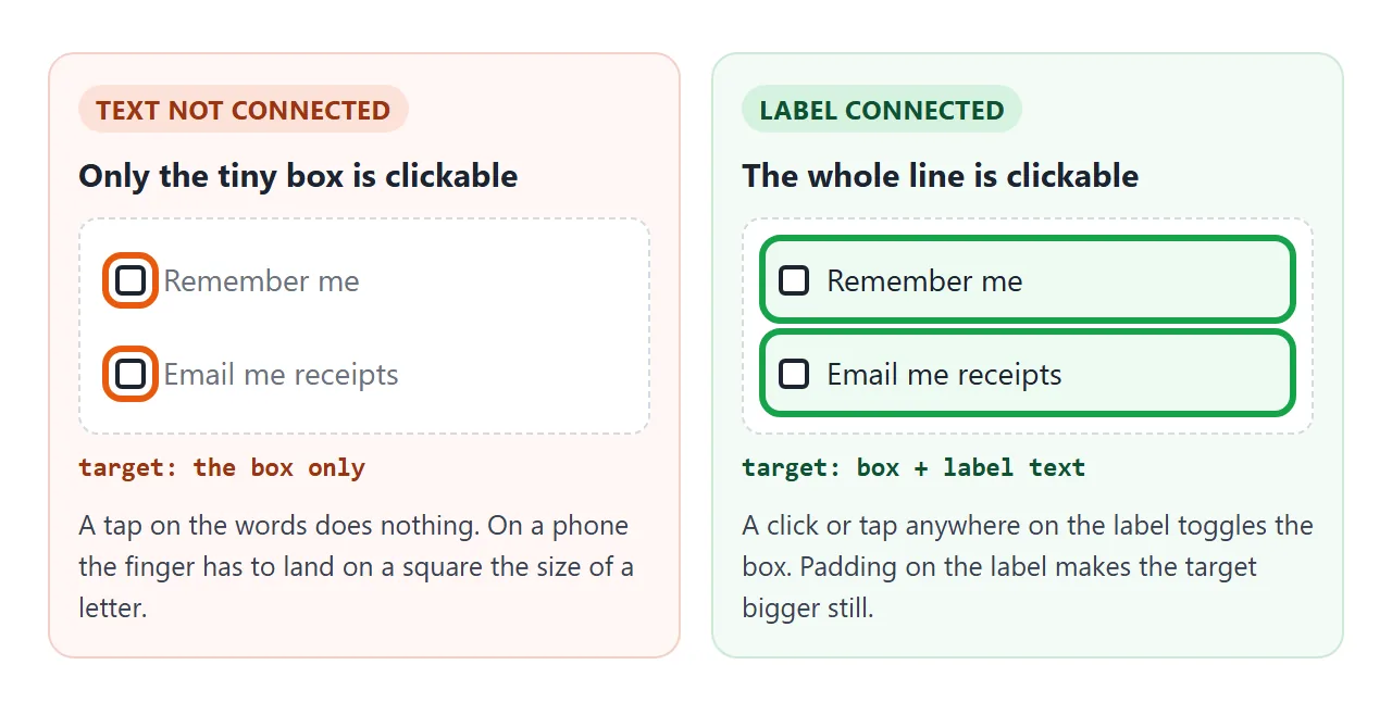
확인란을 래핑하고 레이블을 플렉스 행으로 만들면 전체 라인이 하나의 대상으로 변합니다. 패딩을 추가하면 상자 자체를 더 크게 만들지 않고 대상이 커집니다.
label.option {
  display: flex;
  align-items: center;
  gap: 8px;
  padding: 8px 0;
  cursor: pointer;
}
이는 라디오 버튼 그룹에 가장 중요합니다. 각 라디오를 자체 레이블에 넣고 세트를 필드 세트 및 범례로 그룹화하여 질문 자체도 발표됩니다.
CSS로 라벨 레이아웃하기
레이블은 기본적으로 인라인 요소이므로 다음에 오는 요소와 같은 줄에 위치합니다. 4가지 레이아웃이 대부분의 양식을 포괄합니다.
<!doctype html>
<html lang="en">
<head>
<meta charset="utf-8">
<meta name="viewport" content="width=device-width, initial-scale=1">
<title>Label layouts</title>
<style>
  body { margin: 0; padding: 16px; font-family: system-ui, sans-serif; background: #f4f5f7; color: #1d2330; }
  .grid { display: grid; grid-template-columns: repeat(auto-fit, minmax(240px, 1fr)); gap: 12px; }
  section { background: #fff; border-radius: 12px; padding: 14px; }
  h2 { font-size: 12px; margin: 0 0 10px; color: #6b7280; text-transform: uppercase; letter-spacing: .4px; }
  input[type="text"], input[type="search"], input[type="email"] {
    width: 100%; box-sizing: border-box; padding: 8px 10px; font: inherit;
    border: 1px solid #c7ccd4; border-radius: 8px;
  }

  /* 1. Stacked: the label is a block above the box */
  .stacked label { display: block; font-weight: 600; margin-bottom: 4px; }

  /* 2. Inline: the control sits inside the label, so the whole line is clickable */
  .inline label { display: flex; align-items: center; gap: 8px; padding: 6px 0; cursor: pointer; }
  .inline input { width: 18px; height: 18px; margin: 0; }

  /* 3. Floating: placeholder=" " lets :placeholder-shown tell empty from filled */
  .float { position: relative; }
  .float input { padding: 18px 10px 6px; }
  .float label {
    position: absolute; left: 11px; top: 12px; color: #6b7280;
    pointer-events: none; transition: .15s;
  }
  .float input:focus + label,
  .float input:not(:placeholder-shown) + label { top: 4px; font-size: 11px; color: #2563eb; }

  /* 4. Visually hidden: invisible on screen, still read by screen readers */
  .visually-hidden {
    position: absolute; width: 1px; height: 1px; padding: 0; margin: -1px;
    overflow: hidden; clip: rect(0 0 0 0); white-space: nowrap; border: 0;
  }
  .search { display: flex; gap: 6px; }
  .search button { padding: 0 14px; border: 0; border-radius: 8px; background: #2563eb; color: #fff; font: inherit; }
</style>
</head>
<body>
<div class="grid">
  <section class="stacked">
    <h2>1. Stacked</h2>
    <label for="full-name">Full name</label>
    <input type="text" id="full-name" autocomplete="name">
  </section>

  <section class="inline">
    <h2>2. Inline (checkbox, radio)</h2>
    <label><input type="checkbox" name="terms"> I agree to the terms</label>
    <label><input type="radio" name="plan" value="month" checked> Monthly</label>
    <label><input type="radio" name="plan" value="year"> Yearly</label>
  </section>

  <section>
    <h2>3. Floating label</h2>
    <div class="float">
      <input type="email" id="mail" placeholder=" ">
      <label for="mail">Email</label>
    </div>
  </section>

  <section>
    <h2>4. Visually hidden (search box)</h2>
    <form class="search" role="search">
      <label for="q" class="visually-hidden">Search the docs</label>
      <input type="search" id="q" placeholder="Search">
      <button type="submit">Go</button>
    </form>
  </section>
</div>

<script>
  // keep the example on this page when the search form is sent
  document.querySelector('.search').addEventListener('submit', (e) => e.preventDefault());
</script>
</body>
</html>
- 스택형: 라벨의
display: block는 텍스트 상자 위에 배치됩니다. 좁은 화면에서 읽기가 가장 쉽습니다. - 인라인: 체크박스나 라디오가 라벨 내부, 텍스트 앞에 위치합니다. 두 가지를 Flexbox로 정렬하세요.
- 플로팅: 라벨은 상자 내부에 위치하며 상자에 포커스나 텍스트가 있으면 위로 이동합니다. 텍스트 입력 가이드는 그 뒤에 숨은
:placeholder-shown트릭을 설명합니다. - 시각적으로 숨겨짐: 옆에 있는 버튼을 통해 목적이 명확한 검색창의 경우 라벨이 화면에서는 보이지 않지만 페이지에는 계속 표시됩니다.
시각적으로 숨겨진 클래스는 스타일시트에 보관할 가치가 있습니다.
.visually-hidden {
  position: absolute;
  width: 1px; height: 1px;
  margin: -1px; padding: 0; border: 0;
  overflow: hidden;
  clip: rect(0 0 0 0);
  white-space: nowrap;
}
이에 대해 display: none 또는 hidden 속성을 사용하지 마십시오. 둘 다 화면 판독기의 레이블도 제거합니다.
자리표시자는 라벨이 아닙니다.
자리 표시자는 상자가 비어 있는 동안에만 표시됩니다. 사용자가 입력하면 필드 이름이 사라지고 긴 형식에서는 상자의 용도를 확인하기 위해 텍스트를 삭제해야 합니다.
자리 표시자를 클릭하는 것도 라벨 클릭이 아닙니다. 상자 자체에 착륙합니다. <label>에 이름을 유지하고 날짜 형식과 같은 예로 자리 표시자를 사용합니다.
하나의 라벨, 하나의 컨트롤
레이블은 정확히 하나의 컨트롤에 연결됩니다. 레이블이 두 개의 입력을 래핑하는 경우 첫 번째 입력만 연결됩니다. 두 번째는 레이블이나 이름이 없습니다.
다른 방향이 허용됩니다. 여러 레이블이 동일한 id를 가리킬 수 있습니다. 그 중 하나를 클릭하면 컨트롤이 작동하고 액세스 가능한 이름이 페이지 순서대로 텍스트에 연결됩니다.
어색한 이름이 나올 수 있으므로 일부러 사용합니다. 예를 들어 숫자 상자 뒤에 "kg"과 같은 단위를 사용합니다.
라벨 안에 버튼이나 두 번째 입력을 넣지 마세요. 레이블은 자체 제어만 보유할 수 있습니다.
링크가 허용됩니다. "약관에 동의합니다"에서 링크를 클릭하면 링크가 열리고 상자가 전환되지 않습니다. 대부분의 줄이 계속 전환되도록 링크를 짧게 유지하세요.
완성된 예: 토글 스위치
토글 스위치는 다른 페인트가 포함된 확인란입니다. 실제 <input type="checkbox">를 유지하고, 시각적으로 숨기고, :checked + .track를 사용하여 해당 상태에서 스위치를 끌어옵니다. 레이블은 모든 것을 감싸므로 전체 행이 클릭 대상입니다.
<!doctype html>
<html lang="en">
<head>
<meta charset="utf-8">
<meta name="viewport" content="width=device-width, initial-scale=1">
<title>Settings toggles</title>
<style>
  body { margin: 0; padding: 16px; font-family: system-ui, sans-serif; background: #f4f5f7; color: #1d2330; }
  .panel { max-width: 420px; margin: 0 auto; background: #fff; border-radius: 14px; padding: 6px 16px; box-shadow: 0 4px 16px rgba(0,0,0,.08); }
  h1 { font-size: 16px; margin: 12px 0 4px; }

  /* the whole row is the label: text and switch are one click target */
  .toggle {
    display: flex; align-items: center; justify-content: space-between; gap: 12px;
    padding: 13px 0; border-top: 1px solid #eef0f3; cursor: pointer;
  }
  .toggle small { display: block; color: #6b7280; font-size: 12px; margin-top: 2px; }

  /* hide the real checkbox from the eye only: it stays focusable and clickable */
  .toggle input {
    position: absolute; width: 1px; height: 1px; margin: -1px;
    overflow: hidden; clip: rect(0 0 0 0); white-space: nowrap; border: 0;
  }

  /* the track and knob are drawn from the checkbox state */
  .track {
    flex: none; position: relative; width: 44px; height: 26px; border-radius: 99px;
    background: #c7ccd4; transition: background .15s;
  }
  .track::after {
    content: ""; position: absolute; left: 3px; top: 3px; width: 20px; height: 20px;
    border-radius: 50%; background: #fff; box-shadow: 0 1px 3px rgba(0,0,0,.3); transition: transform .15s;
  }
  .toggle input:checked + .track { background: #16a34a; }
  .toggle input:checked + .track::after { transform: translateX(18px); }
  .toggle input:focus-visible + .track { outline: 3px solid #2563eb; outline-offset: 2px; }
  .toggle input:disabled + .track { opacity: .45; }
  .toggle.off { cursor: not-allowed; color: #9ca3af; }

  #state { margin: 12px auto 0; max-width: 420px; box-sizing: border-box; padding: 10px 12px; border-radius: 10px; background: #1d2330; color: #e5e7eb; font: 13px/1.5 ui-monospace, Consolas, monospace; }
</style>
</head>
<body>
<form class="panel" id="settings">
  <h1>Notifications</h1>

  <label class="toggle">
    <span>Email updates<small>A summary once a week</small></span>
    <input type="checkbox" role="switch" name="email" checked>
    <span class="track" aria-hidden="true"></span>
  </label>

  <label class="toggle">
    <span>Push alerts<small>When someone replies</small></span>
    <input type="checkbox" role="switch" name="push">
    <span class="track" aria-hidden="true"></span>
  </label>

  <label class="toggle">
    <span>Sounds<small>Play a sound for new alerts</small></span>
    <input type="checkbox" role="switch" name="sound">
    <span class="track" aria-hidden="true"></span>
  </label>

  <label class="toggle off">
    <span>Text messages<small>Not available on your plan</small></span>
    <input type="checkbox" role="switch" name="sms" disabled>
    <span class="track" aria-hidden="true"></span>
  </label>
</form>
<div id="state" aria-live="polite"></div>

<script>
  const form = document.getElementById('settings');
  const state = document.getElementById('state');

  // list the switches that are on, the same way the form would send them
  function show() {
    const on = [...new FormData(form).keys()];
    state.textContent = 'On: ' + (on.length ? on.join(', ') : 'nothing');
  }
  form.addEventListener('change', show);
  show();
</script>
</body>
</html>
<label class="toggle">
  <span>Push alerts</span>
  <input type="checkbox" role="switch" name="push">
  <span class="track" aria-hidden="true"></span>
</label>
입력이 실제이기 때문에 스위치는 체크박스에 있는 모든 것을 무료로 가져옵니다. Tab이 체크박스에 도달하고, Space가 토글하고, disabled가 작동하고, 해당 값이 양식과 함께 전송됩니다.
role="switch"는 화면 판독기에 선택 여부를 선택하지 않고 켜짐 또는 꺼짐으로 알리도록 지시합니다.
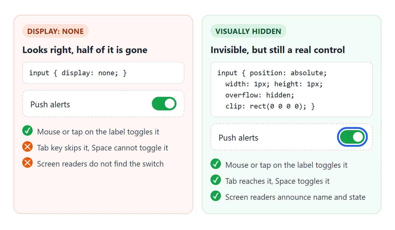
일반적인 실수는 display: none로 입력을 숨기는 것입니다. 레이블을 클릭하면 여전히 레이블이 전환되므로 마우스로 사용해도 잘 보입니다.
그러나 입력은 더 이상 포커스를 받을 수 없으므로 키보드 사용자는 입력에 접근할 수 없으며 화면 판독기가 이를 찾을 수 없습니다.
실제 입력은 보이지 않으므로 그려진 스위치에 초점을 표시합니다.
.toggle input:focus-visible + .track {
  outline: 3px solid #2563eb;
  outline-offset: 2px;
}
작동하지 않을 때
| 당신이 보는 것 | 원인 | 수정 |
|---|---|---|
| 라벨을 클릭해도 아무 일도 일어나지 않습니다 | for와 id는 대개 대소문자나 오타로 인해 다릅니다. |
동일하게 만드십시오. Email와 email는 다릅니다. |
| 레이블을 클릭하면 다른 컨트롤이 작동합니다. | 동일한 id가 두 번 사용됩니다. for가 첫 번째 것을 찾았습니다. |
모든 id를 고유하게 만드세요. |
| 텍스트를 전혀 클릭할 수 없습니다. | 텍스트가 <label>가 아닌 <span> 또는 <p>에 있습니다. |
<label>로 변경하세요 |
| 두 입력 중 첫 번째 입력만 반응합니다. | 하나의 레이블이 두 개의 컨트롤을 래핑합니다. | 컨트롤당 라벨 1개 |
| 사용자 정의 스위치는 마우스에서 작동하지만 Tab에서는 건너뜁니다. | 입력은 display: none 또는 visibility: hidden입니다. |
시각적으로 숨겨진 클래스로 숨기세요 |
| 사용자 정의 스위치 그림을 클릭해도 아무 일도 일어나지 않습니다 | 그려진 .track는 라벨 외부에 있습니다. |
라벨 내부로 이동하세요. |
| 사용자가 입력하면 필드에 이름이 없습니다. | 이름은 자리 표시자에만 있습니다. | <label> 추가 |
| 라벨 내부의 버튼은 상자를 전환하지 않습니다. | 레이블은 자체 컨트롤만 보유할 수 있으며 버튼을 클릭하면 해당 버튼이 유지됩니다. | 버튼을 라벨 밖으로 이동하세요. |
링크로 공유하세요
라벨 버그는 스크린샷이 아닌 누군가가 클릭할 때 표시됩니다. 레이블이 연결되어 있는지 여부에 관계없이 양식 그림이 올바르게 보입니다.
누군가가 실제 내용을 클릭할 수 있도록 하려면 페이지를 NOS 문서에 붙여넣고 공유 링크 만들기를 선택하세요. 링크할 HTML이 이를 안내합니다.
페이지는 작성된 대로 렌더링되고 스크립트가 실행되므로 페이지를 받는 사람이 직접 라벨과 스위치를 탭할 수 있습니다. 나중에 코드를 수정하면 동일한 링크에 새 버전이 표시됩니다.