HTML 확인란은 <input type="checkbox">입니다. name 및 value를 제공하고 선택이 시작되어야 하는 경우 checked를 추가한 다음 <label>로 래핑합니다. 양식이 제출되면 선택됨 상자가 name=value를 보냅니다. 선택 해제 상자는 아무 것도 보내지 않습니다.
<label>
  <input type="checkbox" name="sms" value="yes" checked>
  Text messages
</label>
먼저 시도해 보세요. 상자를 클릭하고 두 개의 열을 살펴보세요. .checked 속성은 클릭을 따릅니다. checked 속성은 이동하지 않습니다.
<!doctype html>
<html lang="en">
<head>
<meta charset="utf-8">
<meta name="viewport" content="width=device-width, initial-scale=1">
<title>checked attribute vs .checked property</title>
<style>
  body { margin: 0; padding: 16px; font-family: system-ui, sans-serif; background: #f4f5f7; color: #1d2330; }
  form { background: #fff; border-radius: 12px; padding: 12px 16px; box-shadow: 0 2px 8px rgba(0, 0, 0, .08); }
  label { display: flex; align-items: center; gap: 10px; padding: 8px 0; cursor: pointer; }
  input[type="checkbox"] { width: 18px; height: 18px; margin: 0; }
  .buttons { display: flex; gap: 8px; margin-top: 6px; flex-wrap: wrap; }
  button { font: inherit; padding: 6px 12px; border-radius: 8px; border: 1px solid #c9ced6; background: #fff; cursor: pointer; }
  table { width: 100%; border-collapse: collapse; margin-top: 12px; font-size: 13px; background: #fff; border-radius: 12px; overflow: hidden; }
  th, td { text-align: left; padding: 7px 8px; border-bottom: 1px solid #eceef1; }
  th { background: #f8f9fb; font-weight: 600; }
  code, pre { font-family: ui-monospace, Consolas, monospace; font-size: 12.5px; }
  pre { margin: 12px 0 0; padding: 10px 12px; background: #1e2330; color: #d6f2df; border-radius: 10px; white-space: pre-wrap; }
</style>
</head>
<body>
<form id="form">
  <!-- checked in the HTML = the starting state -->
  <label><input type="checkbox" name="newsletter" checked> Newsletter <small>(no value)</small></label>
  <label><input type="checkbox" name="sms" value="yes"> Text messages <small>(value="yes")</small></label>
  <div class="buttons">
    <button type="reset">Reset form</button>
  </div>
</form>

<table>
  <thead><tr><th>name</th><th>.checked</th><th>getAttribute('checked')</th></tr></thead>
  <tbody id="rows"></tbody>
</table>
<pre id="sent"></pre>

<script>
  const form = document.getElementById('form');
  const boxes = form.querySelectorAll('input[type="checkbox"]');

  function show() {
    // .checked = what the box shows now; the attribute = what the HTML said
    document.getElementById('rows').innerHTML = [...boxes].map((box) =>
      `<tr><td>${box.name}</td><td>${box.checked}</td><td>${JSON.stringify(box.getAttribute('checked'))}</td></tr>`
    ).join('');

    // What a submit would send: unchecked boxes are simply missing
    const entries = [...new FormData(form)].map(([k, v]) => `${k}=${v}`);
    document.getElementById('sent').textContent =
      'FormData sends: ' + (entries.length ? entries.join('&') : '(nothing)');
  }

  form.addEventListener('change', show);
  form.addEventListener('reset', () => setTimeout(show)); // reset runs after this event
  show();
</script>
</body>
</html>
확인된 속성과 .checked 속성
HTML의 checked 속성이 시작 상태입니다. JavaScript의 .checked 속성은 사용자에게 표시되는 현재 상태입니다. 클릭하면 속성이 변경되고 속성은 그대로 유지됩니다.
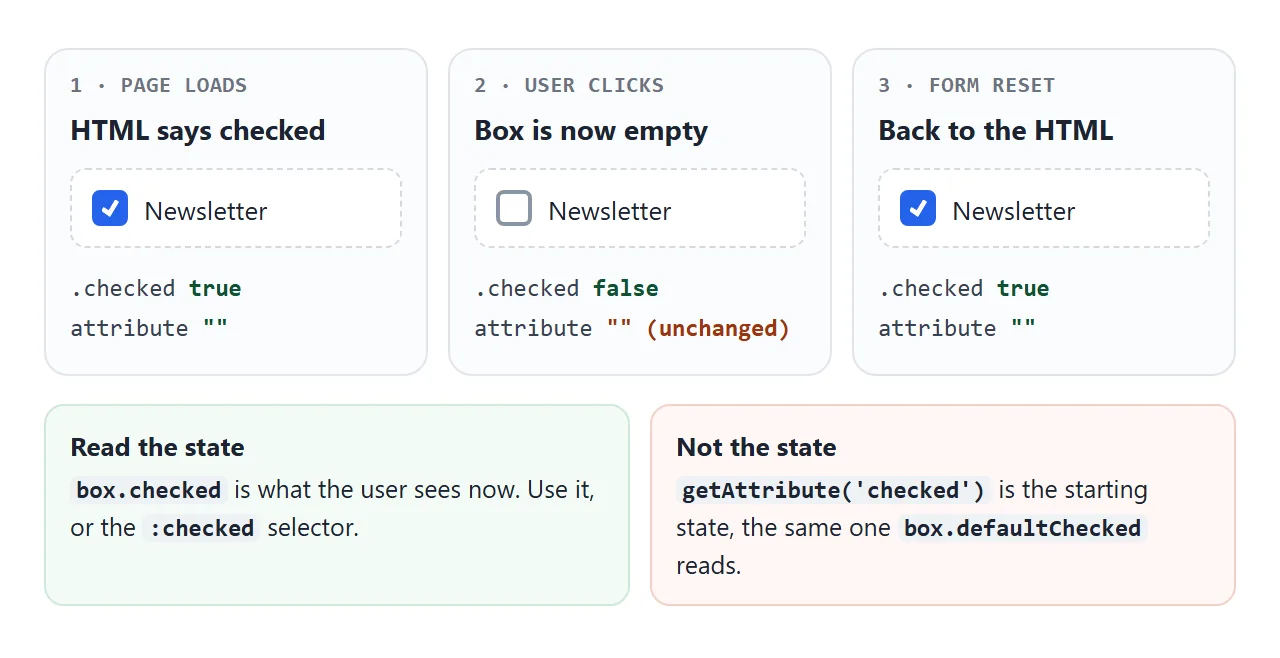
그렇기 때문에 getAttribute('checked')는 클릭 후 잘못된 답변을 제공합니다. defaultChecked 속성과 동일한 시작 상태를 읽습니다. 현재 상태를 다음과 같이 읽어보세요.
const box = document.querySelector('input[name="sms"]');
box.checked;            // true or false, right now
box.checked = true;     // tick it from code
box.defaultChecked;     // what the HTML attribute said
checked는 부울 속성입니다. 그 존재가 중요한 것이므로 checked="false"는 여전히 선택된 상자를 시작합니다.
사용자 또는 스크립트가 상자를 변경한 후에는 setAttribute를 사용하여 속성을 추가해도 더 이상 상자가 변경되지 않습니다. 양식을 재설정하면 해당 내용이 지워지고 모든 상자가 해당 속성으로 반환됩니다.
제출되는 항목: value 및 "on"
확인란을 선택하면 양식 데이터에 하나의 name=value 쌍이 추가되고, 그렇지 않으면 아무 것도 추가되지 않습니다. 입력에 value 속성이 없으면 브라우저는 on 문자열을 보냅니다.
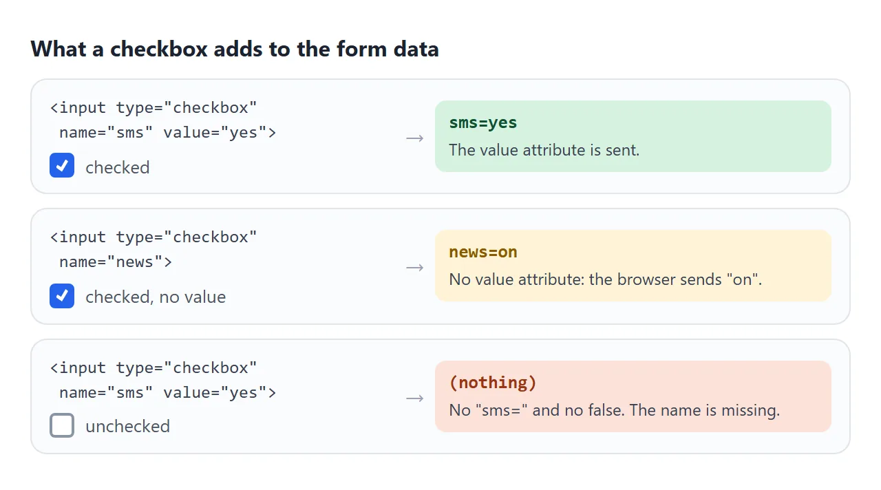
| 상자 | 양식과 함께 전송됨 |
|---|---|
확인됨, value="yes" |
sms=yes |
확인됨, value 없음 |
news=on |
| 선택 해제됨 | 아무것도. 이름이 없습니다 |
| 선택되어 있어도 비활성화됨 | 아무것도 |
확인했지만 name가 없습니다. |
아무것도 |
따라서 "누락"은 "선택 해제"를 의미합니다. 서버에서 false를 찾는 대신 이름이 존재하는지 확인하십시오. JavaScript에서 new FormData(form).has('sms')는 예 또는 아니요로 대답합니다. JavaScript의 FormData에서는 양식의 나머지 부분을 읽는 방법을 다룹니다.
서버에 명시적인 아니요가 필요한 경우 양식에서 확인란 앞에 <input type="hidden" name="sms" value="no">를 추가할 수 있습니다. 확인란을 선택하면 두 값이 모두 하나의 이름으로 도착하고 서버는 하나를 선택해야 합니다. 누락된 이름을 선택 취소된 것으로 처리하는 것이 더 간단합니다.
라벨 및 그룹: 라벨, 필드세트, 범례
기본 체크박스는 글자 한 개 정도의 크기입니다. 연결된 라벨을 사용하면 텍스트가 상자를 전환하게 되는데, 이는 휴대폰에서 가장 중요합니다. 래핑은 ID 없이 작동합니다.
<label><input type="checkbox" name="news"> Send me the newsletter</label>
다른 방법은 입력에 id="news"가 일치하는 <label for="news">입니다. 두 값은 대소문자를 포함하여 정확히 일치해야 합니다. 라벨 HTML은 양식과 화면 리더가 읽는 내용을 모두 다룹니다.
하나의 질문에 답하는 여러 상자는 <fieldset>에 속하며 질문은 <legend>에 있습니다. 범례는 전체 그룹의 이름을 지정하므로 화면 리더는 각 상자와 함께 "이 앱은 무엇을 할 수 있나요?" 그룹의 "파일을 읽으세요"라는 질문을 제공할 수 있습니다.
<fieldset>
  <legend>What can this app do?</legend>
  <label><input type="checkbox" name="perm" value="read"> Read your files</label>
  <label><input type="checkbox" name="perm" value="write"> Edit your files</label>
</fieldset>
그룹의 상자에 동일한 이름과 다른 값을 지정합니다. 그런 다음 양식은 perm=read&perm=write를 보내고 FormData.getAll('perm')는 ["read", "write"]를 반환합니다. Fieldset HTML의 그룹 요소에 대해 자세히 알아보세요.
:checked를 사용하여 확인된 값 읽기
:checked 선택기는 현재 선택되어 있는 확인란과 일치합니다. 그룹을 수집하려면 이름과 결합하세요.
const values = [...document.querySelectorAll('input[name="perm"]:checked')]
  .map((box) => box.value);   // ["read", "calendar"]
input[name=...] 부품을 유지합니다. 베어 :checked는 <select>에서 선택된 라디오 버튼 및 선택된 <option> 요소와도 일치합니다.
변경 사항에 반응하려면 이벤트 버블 이후 상자에서 change를 듣거나 양식에서 한 번 들어보세요. 코드에서 box.checked를 설정해도 change가 실행되지 않습니다. 스크립트가 상자를 선택하면 페이지 자체를 업데이트해야 합니다.
"모두 선택" 및 불확정 상태
"모두 선택" 상자에는 세 가지 모양이 있습니다. 아무 것도 선택하지 않은 경우 비어 있고, 모두 선택한 경우 선택되었으며, 일부가 선택된 경우 대시가 표시됩니다. 대시는 미정 상태입니다.
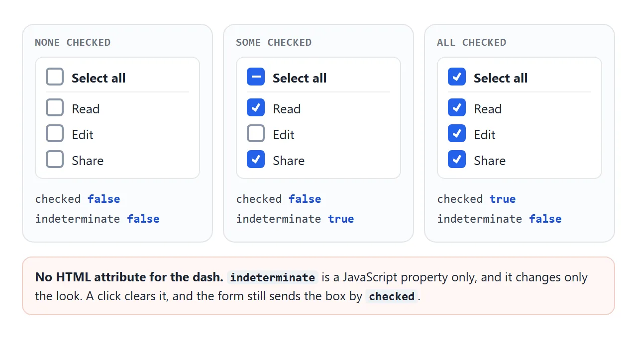
HTML 속성이 없습니다. JavaScript에서 설정하십시오.
function sync() {
  const on = form.querySelectorAll('input[name="perm"]:checked').length;
  all.checked = on === perms.length;
  all.indeterminate = on > 0 && on < perms.length;
}

all.addEventListener('change', () => {
  perms.forEach((box) => { box.checked = all.checked; });
  sync();   // setting .checked fired no change event
});
perms.forEach((box) => box.addEventListener('change', sync));
indeterminate는 외형만 변경합니다. 상자 아래에는 여전히 checked 값이 있으며 이것이 양식이 보내는 것입니다. 클릭하면 indeterminate가 지워지고 checked가 전환됩니다. CSS는 :indeterminate를 사용하여 상태를 타겟팅할 수 있습니다.
스타일링: 강조 색상 또는 맞춤 상자
색상 변경의 경우 하나의 속성으로 충분합니다. accent-color는 체크된 모양과 불확정한 모양을 포함하여 기본 확인란의 색상을 다시 지정하고 브라우저의 포커스 링과 키보드 처리를 유지합니다.
input[type="checkbox"] { accent-color: #16a34a; }
모양을 완전히 제어하기 위해 appearance: none는 기본 도면을 제거하지만 입력 자체는 유지합니다. 여전히 초점을 맞추고 Space로 전환하고 해당 레이블을 제출하고 작업합니다. CSS를 사용하여 상자와 체크 표시를 그립니다.
.custom input {
  appearance: none;
  width: 20px; height: 20px;
  border: 2px solid #8a94a6; border-radius: 6px;
  display: grid; place-content: center;
}
.custom input::before {
  content: ""; width: 10px; height: 10px; background: #fff;
  clip-path: polygon(14% 44%, 0 65%, 50% 100%, 100% 16%, 80% 0%, 43% 62%);
  transform: scale(0);
}
.custom input:checked { background: #7c3aed; border-color: #7c3aed; }
.custom input:checked::before { transform: scale(1); }
.custom input:focus-visible { outline: 3px solid #a78bfa; outline-offset: 2px; }
3개를 나란히 비교해 보세요. 상자 사이를 이동하려면 Tab 키를 누르고 상자를 전환하려면 Space 키를 누르세요.
<!doctype html>
<html lang="en">
<head>
<meta charset="utf-8">
<meta name="viewport" content="width=device-width, initial-scale=1">
<title>Checkbox styles</title>
<style>
  body { margin: 0; padding: 16px; font-family: system-ui, sans-serif; background: #f4f5f7; color: #1d2330; }
  .grid { display: grid; grid-template-columns: repeat(auto-fit, minmax(170px, 1fr)); gap: 12px; }
  fieldset { margin: 0; background: #fff; border: 1px solid #e1e4ea; border-radius: 12px; padding: 8px 14px 12px; }
  legend { font-weight: 700; font-size: 14px; padding: 0 4px; }
  legend code { font-weight: 400; font-size: 12px; color: #6b7280; }
  label { display: flex; align-items: center; gap: 10px; padding: 7px 0; cursor: pointer; }
  label:has(:disabled) { color: #9aa3b2; cursor: not-allowed; }

  /* 1. Simple: recolor the native box */
  .accent input { accent-color: #16a34a; }

  /* 2. Fully custom: remove the native look, draw our own box */
  .custom input {
    appearance: none;          /* the input stays in the page: focusable, clickable */
    width: 20px; height: 20px; margin: 0; flex: none;
    border: 2px solid #8a94a6; border-radius: 6px; background: #fff;
    display: grid; place-content: center; cursor: pointer;
  }
  .custom input::before {     /* the tick, hidden until checked */
    content: ""; width: 10px; height: 10px;
    clip-path: polygon(14% 44%, 0 65%, 50% 100%, 100% 16%, 80% 0%, 43% 62%);
    background: #fff; transform: scale(0); transition: transform .12s;
  }
  .custom input:checked { background: #7c3aed; border-color: #7c3aed; }
  .custom input:checked::before { transform: scale(1); }
  .custom input:indeterminate { background: #7c3aed; border-color: #7c3aed; }
  .custom input:indeterminate::before { clip-path: none; height: 2px; transform: scale(1); }
  .custom input:focus-visible { outline: 3px solid #a78bfa; outline-offset: 2px; } /* keyboard focus ring */
  .custom input:disabled { border-color: #d5d9e0; background: #f1f3f6; cursor: not-allowed; }
  .custom input:disabled:checked { background: #c4b5fd; border-color: #c4b5fd; }

  p { font-size: 13px; color: #4b5563; margin: 12px 0 0; }
  kbd { font: 12px ui-monospace, Consolas, monospace; border: 1px solid #c9ced6; border-radius: 4px; padding: 0 4px; background: #fff; }
</style>
</head>
<body>
<div class="grid">
  <fieldset class="default">
    <legend>Default</legend>
    <label><input type="checkbox"> Unchecked</label>
    <label><input type="checkbox" checked> Checked</label>
    <label><input type="checkbox" class="mixed"> Mixed</label>
    <label><input type="checkbox" checked disabled> Disabled</label>
  </fieldset>

  <fieldset class="accent">
    <legend>accent-color</legend>
    <label><input type="checkbox"> Unchecked</label>
    <label><input type="checkbox" checked> Checked</label>
    <label><input type="checkbox" class="mixed"> Mixed</label>
    <label><input type="checkbox" checked disabled> Disabled</label>
  </fieldset>

  <fieldset class="custom">
    <legend>appearance: none</legend>
    <label><input type="checkbox"> Unchecked</label>
    <label><input type="checkbox" checked> Checked</label>
    <label><input type="checkbox" class="mixed"> Mixed</label>
    <label><input type="checkbox" checked disabled> Disabled</label>
  </fieldset>
</div>
<p>Press <kbd>Tab</kbd> to move between boxes and <kbd>Space</kbd> to toggle. The custom column shows its own focus ring.</p>

<script>
  // "Mixed" has no HTML attribute; it can only be set from JavaScript
  document.querySelectorAll('.mixed').forEach((box) => { box.indeterminate = true; });
</script>
</body>
</html>
appearance가 사라지면 모든 상태를 그릴 수 있습니다. 스타일 :checked, :indeterminate, :disabled 및 :focus-visible 또는 키보드 사용자는 자신의 위치를 잊어버립니다.
display: none로 입력을 숨기지 말고 그 옆에 가짜 상자를 그리십시오. 그러면 탭 순서에서 입력이 제거됩니다. 스위치 모양의 컨트롤의 경우 토글 스위치 가이드는 대신 시각적으로 숨겨진 입력을 사용합니다.
완성된 예: 모두 선택 권한
이 양식은 권한 필드 집합, 실시간 개수와 불확정 대시가 포함된 "모두 선택" 상자, 필수 용어 상자 등 모든 것을 하나로 통합합니다. 제출이 차단되고 어두운 상자에 양식이 보내는 내용이 표시됩니다.
<!doctype html>
<html lang="en">
<head>
<meta charset="utf-8">
<meta name="viewport" content="width=device-width, initial-scale=1">
<title>Permissions with select all</title>
<style>
  body { margin: 0; padding: 16px; font-family: system-ui, sans-serif; background: #f4f5f7; color: #1d2330; }
  form { background: #fff; border-radius: 12px; padding: 14px 16px 16px; box-shadow: 0 2px 8px rgba(0, 0, 0, .08); }
  fieldset { border: 1px solid #e1e4ea; border-radius: 10px; margin: 0 0 12px; padding: 4px 12px 8px; }
  legend { font-weight: 700; padding: 0 4px; }
  label { display: flex; align-items: center; gap: 10px; padding: 7px 0; cursor: pointer; }
  input[type="checkbox"] { width: 18px; height: 18px; margin: 0; accent-color: #2563eb; flex: none; }
  .all { border-bottom: 1px solid #eceef1; font-weight: 600; }
  .count { font-weight: 400; color: #6b7280; margin-left: auto; font-size: 13px; }
  small { color: #6b7280; }
  button { font: inherit; font-weight: 600; margin-top: 4px; padding: 9px 16px; border: 0; border-radius: 8px; background: #2563eb; color: #fff; cursor: pointer; }
  pre { margin: 12px 0 0; padding: 10px 12px; background: #1e2330; color: #d6f2df; border-radius: 10px; font: 12.5px/1.5 ui-monospace, Consolas, monospace; white-space: pre-wrap; min-height: 3em; }
</style>
</head>
<body>
<form id="form">
  <fieldset>
    <legend>What can this app do?</legend>
    <label class="all">
      <input type="checkbox" id="all"> Select all <span class="count" id="count"></span>
    </label>
    <label><input type="checkbox" name="perm" value="read" checked> Read your files</label>
    <label><input type="checkbox" name="perm" value="write"> Edit your files</label>
    <label><input type="checkbox" name="perm" value="share"> Share with others</label>
    <label><input type="checkbox" name="perm" value="calendar" checked> See your calendar</label>
    <label><input type="checkbox" name="perm" value="email"> Send email for you</label>
  </fieldset>

  <label><input type="checkbox" name="terms" value="accepted" required> I agree to the terms <small>(required)</small></label>
  <button>Save</button>
</form>
<pre id="out">Submit to see what the form would send.</pre>

<script>
  const form = document.getElementById('form');
  const all = document.getElementById('all');
  const perms = form.querySelectorAll('input[name="perm"]');

  // Set "Select all" from the list: all, none, or some (indeterminate)
  function sync() {
    const on = form.querySelectorAll('input[name="perm"]:checked').length;
    all.checked = on === perms.length;
    all.indeterminate = on > 0 && on < perms.length;
    document.getElementById('count').textContent = `${on} of ${perms.length}`;
  }

  // Clicking "Select all" sets every box. Setting .checked fires no change event,
  // so call sync() ourselves.
  all.addEventListener('change', () => {
    perms.forEach((box) => { box.checked = all.checked; });
    sync();
  });
  perms.forEach((box) => box.addEventListener('change', sync));

  // Demo only: show the data instead of sending it
  form.addEventListener('submit', (e) => {
    e.preventDefault();
    const data = new FormData(form);
    document.getElementById('out').textContent =
      'perm: ' + JSON.stringify(data.getAll('perm')) + '\n' +
      'terms: ' + JSON.stringify(data.get('terms'));
  });

  sync();
</script>
</body>
</html>
- 모두 선택에는
name가 없으므로 전송되지 않습니다. 다른 상자만 구동합니다. - 개수와 대시는 변경될 때마다 호출되는 하나의
sync()함수에서 나옵니다. getAll('perm')는 확인된 값만 페이지 순서대로 반환합니다.
용어 필수 체크박스
단일 확인란의 required는 양식을 제출하기 전에 확인해야 함을 의미합니다. 이는 "약관에 동의합니다" 상자에 맞습니다. 브라우저는 제출을 중지하고 자체 메시지를 표시하며 상자는 선택될 때까지 :invalid와 일치합니다.
상자 그룹에서 required는 각 상자에 별도로 적용됩니다. HTML에는 체크박스에 대해 "최소 하나 이상 선택" 규칙이 내장되어 있지 않으므로 setCustomValidity()가 포함된 스크립트가 필요합니다. 양식 확인은 사용자 정의 메시지를 다룹니다.
실제 페이지에서는 양식을 인쇄하는 대신 서버로 보냅니다.
form.addEventListener('submit', async (e) => {
  e.preventDefault();
  await fetch('/api/permissions', { method: 'POST', body: new FormData(form) });
});
작동하지 않을 때
| 당신이 보는 것 | 원인 | 수정 |
|---|---|---|
| 선택 취소된 상자가 데이터에서 누락되었습니다. | 선택하지 않은 상자는 전송되지 않습니다. | 누락된 이름을 선택 취소한 것으로 처리하거나 has()를 사용하세요. |
| 값은 "on"으로 도착합니다. | 입력에 value 속성이 없습니다. |
value="yes" 또는 의미 있는 값을 추가하세요. |
getAttribute('checked')는 클릭 시 변경되지 않습니다. |
속성은 시작 상태입니다. | box.checked 읽기 |
HTML의 indeterminate는 아무 작업도 수행하지 않습니다. |
JavaScript 속성으로만 존재합니다. | 스크립트에서 box.indeterminate = true 설정 |
| "모두 선택" 후에 개수가 업데이트되지 않습니다. | .checked를 설정하면 change 이벤트가 발생하지 않습니다. |
루프 후에 업데이트 함수를 호출하세요. |
| Tab을 사용하여 사용자 정의 확인란에 접근할 수 없습니다. | 입력은 display: none입니다. |
입력 자체에 appearance: none를 사용하세요. |
| 라벨 텍스트를 클릭해도 아무 일도 일어나지 않습니다 | for와 id가 일치하지 않습니다. |
동일하게 만들거나 입력을 레이블로 묶습니다. |
checked="false"는 선택된 상자를 시작합니다. |
부울 속성은 존재 여부에 따라 계산됩니다. | 속성 제거 |
링크로 공유하세요
체크박스 양식은 대시가 표시되거나 숫자가 움직이는 것을 표시할 수 없는 스크린샷보다 클릭하여 판단하기가 더 쉽습니다. NOS에서는 브라우저가 선택되지 않은 용어 상자 자체를 차단하지 않으므로 HTML 파일 오프너에서 확인하세요.
작업 버전을 보내려면 페이지를 NOS 문서에 붙여넣고 공유 링크 만들기를 선택하세요. 링크할 HTML이 이를 안내합니다.
페이지는 작성된 대로 렌더링되고 해당 스크립트가 실행되므로 페이지를 받는 사람이 직접 상자를 선택할 수 있습니다. 나중에 코드를 변경하면 동일한 링크에 새 버전이 표시됩니다.