An analog clock needs a round face, three hands that turn around its center, and a few lines of JavaScript that read the time and set each hand's angle. CSS does the turning with transform: rotate(). JavaScript only works out the numbers.
Here is the smallest working version. It is one HTML file with no library and no image.
<!doctype html>
<html lang="en">
<head>
<meta charset="utf-8">
<meta name="viewport" content="width=device-width, initial-scale=1">
<title>Analog clock</title>
<style>
  body {
    margin: 0; min-height: 100vh; display: grid; place-content: center; justify-items: center; gap: 14px;
    font-family: system-ui, sans-serif; background: #f4f5f7; color: #1d2330;
  }
  .face {
    position: relative; box-sizing: border-box;
    width: min(70vw, 260px); aspect-ratio: 1;
    border: 6px solid #1d2330; border-radius: 50%; background: #fff;
  }
  .hand {
    position: absolute; left: 50%; bottom: 50%;   /* the hand's foot sits on the center */
    transform-origin: 50% 100%;                   /* ...and it turns around its foot */
    border-radius: 4px; background: #1d2330;
  }
  .hour   { width: 6px; height: 26%; margin-left: -3px; }
  .minute { width: 4px; height: 38%; margin-left: -2px; }
  .second { width: 2px; height: 42%; margin-left: -1px; background: #e0482b; }
  .pin { position: absolute; left: 50%; top: 50%; width: 12px; height: 12px; margin: -6px; border-radius: 50%; background: #e0482b; }
</style>
</head>
<body>
<div class="face" role="img" aria-label="Analog clock">
  <div class="hand hour" id="hour"></div>
  <div class="hand minute" id="minute"></div>
  <div class="hand second" id="second"></div>
  <div class="pin"></div>
</div>
<div id="readout">--:--:--</div>

<script>
  const hour = document.getElementById('hour');
  const minute = document.getElementById('minute');
  const second = document.getElementById('second');
  const readout = document.getElementById('readout');

  function tick() {
    const d = new Date();
    const s = d.getSeconds();                 // 0-59
    const m = d.getMinutes();                 // 0-59
    const h = d.getHours() % 12;              // 0-11, a 12-hour dial

    second.style.transform = 'rotate(' + (s * 6) + 'deg)';              // 360 / 60
    minute.style.transform = 'rotate(' + (m * 6 + s * 0.1) + 'deg)';    // creeps between minutes
    hour.style.transform   = 'rotate(' + (h * 30 + m * 0.5) + 'deg)';   // creeps between hours

    readout.textContent = d.toLocaleTimeString();
  }

  tick();                    // draw now, so the dial is not at 12:00:00 for a second
  setInterval(tick, 1000);
</script>
</body>
</html>
How it works, step by step
Every analog clock built this way follows the same five steps.
- Draw the face. A
divwithborder-radius: 50%andaspect-ratio: 1is a circle that stays round at any width. - Stand each hand on the center. Give the hand
position: absolute,left: 50%andbottom: 50%. Its foot now sits on the middle of the dial. - Move the pivot to the foot. Set
transform-origin: 50% 100%so the hand turns around its foot. - Turn the time into angles.
getSeconds(),getMinutes()andgetHours()return the numbers, and a short formula turns each one into degrees. - Write the angle, then repeat. Assign a string such as
rotate(90deg)tostyle.transform. Call the function once straight away, then again on an interval.
The hands are drawn pointing straight up, so an angle of 0deg reads 12 o'clock. In a left-to-right page a positive angle turns clockwise, which is the way a clock runs.
Step 3 is easy to skip. An element turns around its own center by default, because the initial value of transform-origin is 50% 50%.
For a hand that is the wrong point. The middle of the hand stays put, and its foot swings away from the dial's center.
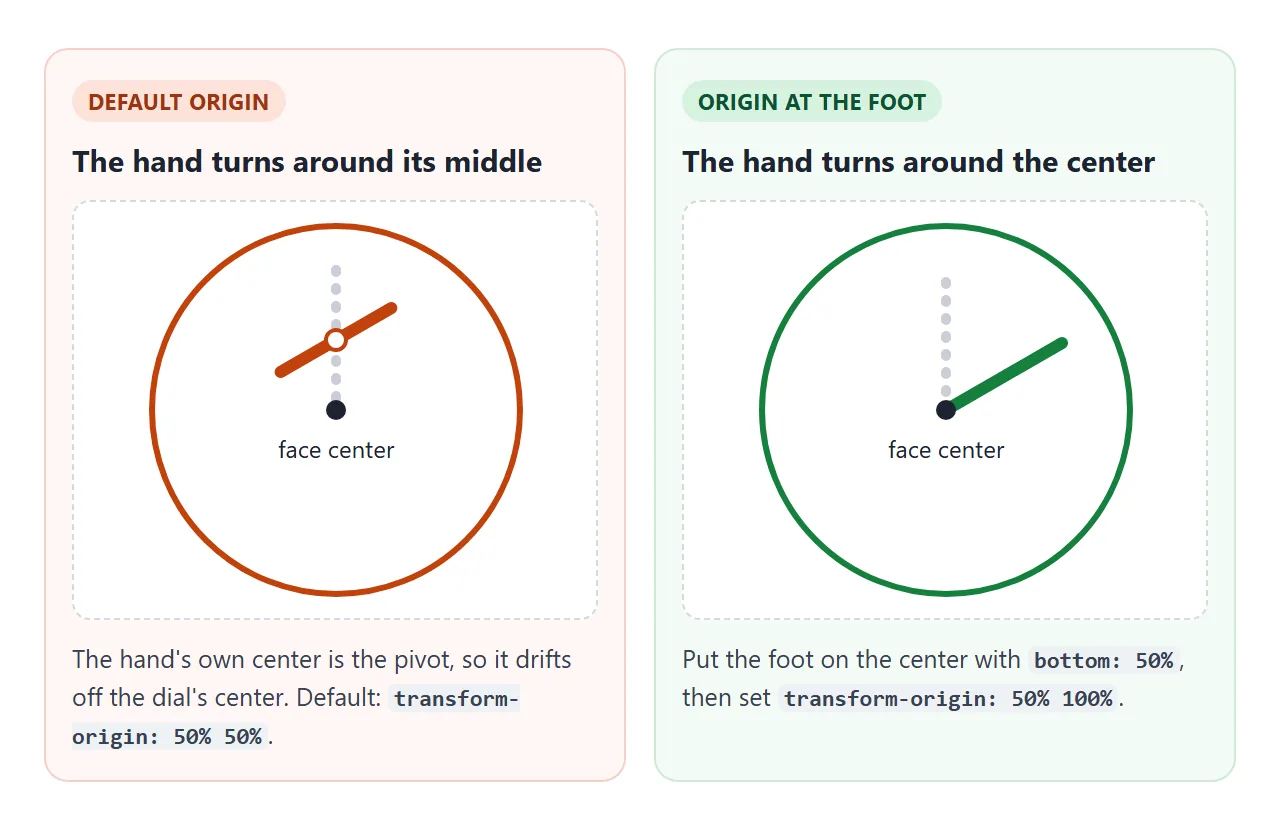
The transform-origin guide covers the keywords and percentages in more detail.
The angle formulas
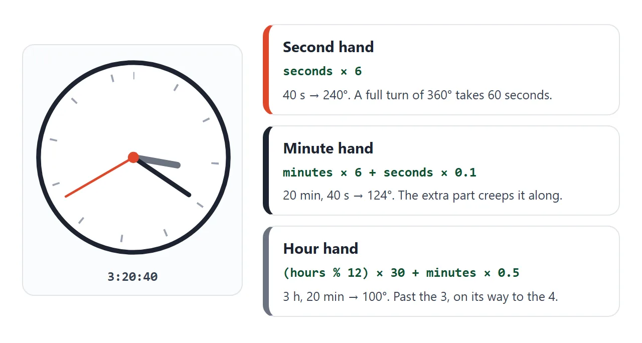
A full turn is 360 degrees. The second hand makes one turn in 60 seconds and the minute hand one turn in 60 minutes, so each step is 6 degrees. A 12-hour dial gives the hour hand 30 degrees per hour.
| Hand | Angle in degrees | Why |
|---|---|---|
| Second | seconds * 6 |
360 / 60 |
| Minute | minutes * 6 + seconds * 0.1 |
6 per minute, plus 0.1 per second |
| Hour | (hours % 12) * 30 + minutes * 0.5 |
30 per hour, plus 0.5 per minute |
The extra terms keep the minute and hour hands moving between marks. Without them, the hour hand at 3:30 would point straight at the 3 instead of midway to the 4.
getHours() returns a number from 0 to 23 in local time, so % 12 folds it onto a 12-hour dial. All three getters read the device's own clock.
Why the second hand spins backward at :00
Adding transition: transform .5s looks like an easy way to get a smooth hand. It works until the seconds wrap from 59 back to 0.
The angle then goes from 354deg to 0deg. The browser moves between those two values in a straight line, so the hand whips backward through the whole dial.
<!doctype html>
<html lang="en">
<head>
<meta charset="utf-8">
<meta name="viewport" content="width=device-width, initial-scale=1">
<title>Second hand wrap</title>
<style>
  body {
    margin: 0; padding: 14px 10px; box-sizing: border-box; min-height: 100vh;
    display: grid; justify-items: center; align-content: center; gap: 14px;
    font-family: system-ui, sans-serif; background: #f4f5f7; color: #1d2330;
  }
  .pair { display: flex; gap: 14px; justify-content: center; }
  .col { text-align: center; font-size: 13px; line-height: 1.35; }
  .col b { display: block; margin-bottom: 8px; }
  .bad b { color: #9a3412; } .good b { color: #0f5132; }
  .face {
    position: relative; box-sizing: border-box; margin: 0 auto 8px;
    width: min(38vw, 160px); aspect-ratio: 1;
    border: 4px solid #1d2330; border-radius: 50%; background: #fff;
  }
  .bad .face { border-color: #c2410c; } .good .face { border-color: #15803d; }
  .hand {
    position: absolute; left: 50%; bottom: 50%; width: 3px; height: 42%; margin-left: -1.5px;
    transform-origin: 50% 100%; background: #e0482b; border-radius: 3px;
    transition: transform .5s ease-out;         /* smooth movement between ticks */
  }
  .snap .hand { transition: none; }            /* used once, to jump without animating */
  .pin { position: absolute; left: 50%; top: 50%; width: 10px; height: 10px; margin: -5px; border-radius: 50%; background: #1d2330; }
  button { font: inherit; font-size: 15px; padding: 9px 16px; border-radius: 8px; border: 1px solid #1d2330; background: #1d2330; color: #fff; cursor: pointer; }
  p { margin: 0; font-size: 13px; color: #4b5563; text-align: center; max-width: 340px; }
  code { font: 12px ui-monospace, Consolas, monospace; }
</style>
</head>
<body>
<div class="pair" id="pair">
  <div class="col bad">
    <b>Angle resets</b>
    <div class="face"><div class="hand" id="a"></div><div class="pin"></div></div>
    <code id="angA">0deg</code>
  </div>
  <div class="col good">
    <b>Angle keeps counting</b>
    <div class="face"><div class="hand" id="b"></div><div class="pin"></div></div>
    <code id="angB">0deg</code>
  </div>
</div>
<button id="jump" type="button">Jump to :56</button>
<p>Press the button, then watch the left hand at :59 to :00. It whips back around. The right hand just carries on.</p>

<script>
  const pair = document.getElementById('pair');
  const a = document.getElementById('a');
  const b = document.getElementById('b');
  const angA = document.getElementById('angA');
  const angB = document.getElementById('angB');

  let offset = 0;                                   // lets the button move this clock forward
  const now = () => new Date(Date.now() + offset);

  let turns = 0, last = -1;                         // full laps the hand has made

  function draw(snap) {
    const s = now().getSeconds();
    if (s < last) turns++;                          // seconds went 59 -> 0: one more lap
    last = s;

    const wrapped = s * 6;                          // 0..354, jumps back to 0
    const counting = turns * 360 + s * 6;           // only ever grows

    if (snap) pair.classList.add('snap');
    a.style.transform = 'rotate(' + wrapped + 'deg)';
    b.style.transform = 'rotate(' + counting + 'deg)';
    if (snap) { void pair.offsetWidth; pair.classList.remove('snap'); }

    angA.textContent = wrapped + 'deg';
    angB.textContent = counting + 'deg';
  }

  document.getElementById('jump').addEventListener('click', () => {
    const d = now();
    const ahead = (56 - d.getSeconds() + 60) % 60;  // seconds to add so it reads :56
    offset += ahead * 1000 - d.getMilliseconds();
    turns = 0; last = -1;
    draw(true);
  });

  draw(true);
  setInterval(() => draw(false), 200);              // read the clock often; skipped ticks are harmless
</script>
</body>
</html>
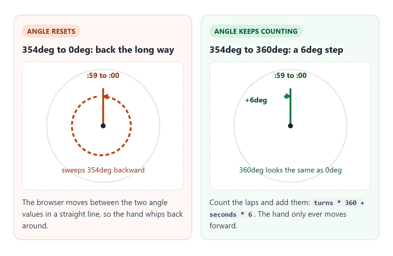
The fix is to never let the angle fall. Count the laps and add them:
if (s < last) turns++;            // seconds went 59 -> 0
last = s;
hand.style.transform = 'rotate(' + (turns * 360 + s * 6) + 'deg)';
A hand at 360deg looks the same as one at 0deg, so nothing visible changes except that the hand keeps moving forward. For a continuous sweep, redraw on every frame with requestAnimationFrame instead of once a second.
Let CSS do the turning
A clock hand is a turn that repeats, which is what a keyframe animation does. One rule is shared by all three hands, and only the duration changes.
@keyframes spin { from { transform: rotate(0deg); } to { transform: rotate(360deg); } }
.hand   { animation: spin linear infinite; }
.second { animation-duration: 60s; }
.minute { animation-duration: 3600s; }
.hour   { animation-duration: 43200s; }
infinite repeats the animation forever and linear keeps the speed constant. The CSS keyframes guide explains the rest of the syntax.
On its own the animation starts at its first keyframe, so every hand begins at 12. A negative animation-delay starts it part-way through instead. A delay of -15s puts the second hand 15 seconds into its lap.
JavaScript runs once, works out the seconds since midnight, and writes one negative delay per hand. After that the browser does the turning.
<!doctype html>
<html lang="en">
<head>
<meta charset="utf-8">
<meta name="viewport" content="width=device-width, initial-scale=1">
<title>CSS-driven analog clock</title>
<style>
  body {
    margin: 0; padding: 12px 10px; box-sizing: border-box; min-height: 100vh;
    display: grid; justify-items: center; align-content: center; gap: 12px;
    font-family: system-ui, sans-serif; background: #f4f5f7; color: #1d2330;
  }
  .face {
    position: relative; box-sizing: border-box;
    width: min(66vw, 250px); aspect-ratio: 1;
    border: 6px solid #1d2330; border-radius: 50%; background: #fff;
  }
  .mark { position: absolute; inset: 0; }                       /* full-size layer, turned around the center */
  .mark::before { content: ""; position: absolute; left: 50%; top: 2%; width: 1px; height: 3%; margin-left: -.5px; background: #9aa3b2; }
  .mark.five::before { width: 3px; height: 6%; margin-left: -1.5px; background: #1d2330; }
  .num { position: absolute; transform: translate(-50%, -50%); font-weight: 600; font-size: clamp(11px, 4.6vw, 17px); }

  .hand {
    position: absolute; left: 50%; bottom: 50%; transform-origin: 50% 100%;
    border-radius: 4px; background: #1d2330;
    animation: spin linear infinite;            /* the browser does the turning */
    animation-duration: var(--dur);
  }
  @keyframes spin { from { transform: rotate(0deg); } to { transform: rotate(360deg); } }
  .hour   { --dur: 43200s; width: 6px; height: 26%; margin-left: -3px; }   /* 12 hours */
  .minute { --dur: 3600s;  width: 4px; height: 38%; margin-left: -2px; }   /* 60 minutes */
  .second { --dur: 60s;    width: 2px; height: 42%; margin-left: -1px; background: #e0482b; }
  .ticking .second { animation-timing-function: steps(60); }               /* jump once a second */
  .pin { position: absolute; left: 50%; top: 50%; width: 12px; height: 12px; margin: -6px; border-radius: 50%; background: #e0482b; }

  .row { display: flex; flex-wrap: wrap; gap: 10px 16px; justify-content: center; align-items: center; font-size: 14px; }
  select { font: inherit; padding: 6px 8px; border-radius: 6px; border: 1px solid #c7ccd6; background: #fff; }
  #readout { font: 600 20px ui-monospace, Consolas, monospace; font-variant-numeric: tabular-nums; }
</style>
</head>
<body>
<div class="face" id="face" role="img" aria-label="Analog clock">
  <div class="hand hour" id="hour"></div>
  <div class="hand minute" id="minute"></div>
  <div class="hand second" id="second"></div>
  <div class="pin"></div>
</div>
<div id="readout">--:--:--</div>
<div class="row">
  <label>Time zone
    <select id="zone">
      <option value="">This device</option>
      <option value="Asia/Seoul">Seoul</option>
      <option value="Asia/Kolkata">India (IST)</option>
      <option value="Europe/London">London</option>
      <option value="America/New_York">New York</option>
      <option value="UTC">UTC</option>
    </select>
  </label>
  <label><input type="checkbox" id="ticking"> Ticking second hand</label>
</div>

<script>
  const face = document.getElementById('face');

  // Dial marks: 60 layers, each turned by 6 degrees; every fifth one is bold
  for (let i = 0; i < 60; i++) {
    const m = document.createElement('div');
    m.className = 'mark' + (i % 5 === 0 ? ' five' : '');
    m.style.transform = 'rotate(' + (i * 6) + 'deg)';
    face.prepend(m);
  }
  // Numbers 1-12 placed on a circle with sin and cos
  for (let n = 1; n <= 12; n++) {
    const a = n * 30 * Math.PI / 180;
    const el = document.createElement('div');
    el.className = 'num';
    el.textContent = n;
    el.style.left = (50 + 38 * Math.sin(a)) + '%';
    el.style.top = (50 - 38 * Math.cos(a)) + '%';
    face.append(el);
  }

  const hands = { hour: 43200, minute: 3600, second: 60 };   // seconds per full turn
  const readout = document.getElementById('readout');
  const zone = document.getElementById('zone');
  const ticking = document.getElementById('ticking');

  // Seconds since midnight in the chosen time zone
  function secondsOfDay(tz) {
    const parts = new Intl.DateTimeFormat('en-GB', {
      timeZone: tz || undefined, hourCycle: 'h23',
      hour: 'numeric', minute: 'numeric', second: 'numeric'
    }).formatToParts(new Date());
    const v = {};
    parts.forEach((p) => { v[p.type] = Number(p.value); });
    return v.hour * 3600 + v.minute * 60 + v.second + new Date().getMilliseconds() / 1000;
  }

  // A negative delay starts each hand part-way through its turn
  function setTime() {
    const t = secondsOfDay(zone.value);
    for (const id in hands) {
      const el = document.getElementById(id);
      el.style.animation = 'none';          // restart, so the delay counts from now
      void el.offsetWidth;                  // flush styles
      el.style.animation = '';
      el.style.animationDelay = -(t % hands[id]) + 's';
    }
  }

  function showText() {
    readout.textContent = new Intl.DateTimeFormat('en-GB', {
      timeZone: zone.value || undefined, hourCycle: 'h23',
      hour: '2-digit', minute: '2-digit', second: '2-digit'
    }).format(new Date());
  }

  zone.addEventListener('change', () => { setTime(); showText(); });
  ticking.addEventListener('change', () => face.classList.toggle('ticking', ticking.checked));

  // Respect a visitor who asked for less motion: start with the ticking hand
  if (matchMedia('(prefers-reduced-motion: reduce)').matches) {
    ticking.checked = true;
    face.classList.add('ticking');
  }

  setTime();
  showText();
  setInterval(showText, 250);
</script>
</body>
</html>
For a ticking hand, give the second hand steps(60) as its timing function. It divides each lap into 60 equal intervals and jumps from one to the next.
The example also checks the prefers-reduced-motion setting with matchMedia. It starts with the ticking hand when the visitor has asked for less motion.
Show the time in another time zone
Date reads the device's clock. To show another city, ask Intl.DateTimeFormat for the parts of the time in a named zone, then use those numbers for the angles.
function secondsOfDay(tz) {
  const parts = new Intl.DateTimeFormat('en-GB', {
    timeZone: tz, hourCycle: 'h23',
    hour: 'numeric', minute: 'numeric', second: 'numeric'
  }).formatToParts(new Date());
  const v = {};
  parts.forEach((p) => { v[p.type] = Number(p.value); });
  return v.hour * 3600 + v.minute * 60 + v.second;
}
The timeZone option takes IANA names such as America/New_York or Europe/London. When it is left out, the device's own zone is used.
For an IST analog clock, use Asia/Kolkata, which Intl prints as India Standard Time. Switch the list in the third example to see the hands and the digital readout move together.
The digital clock guide uses the same idea for a text timezone board, if you want the numbers without a dial.
When it does not work
| What you see | Cause | Fix |
|---|---|---|
| Hands never move, or all point to 12 | The angle has no unit, such as rotate(90) |
Write rotate(90deg) |
| The hand swings around its middle | The default origin is 50% 50% |
transform-origin: 50% 100% |
| The clock shows 12:00 for a second | The first draw waits for the interval | Call the function once before setInterval |
| The hour hand sits on the numbers | The minutes are left out of the formula | Add minutes * 0.5 |
| The second hand whips back at :00 | The angle resets and a transition animates it | Count turns, or remove the transition |
| The second hand skips a tick | setInterval can fire later than its delay |
Read the Date and run every 200 ms |
| The clock falls behind | It adds 6deg per tick instead of reading the time | Read the Date on every tick |
| Others see a different time | Date uses each device's own zone |
Pass a timeZone to Intl |
| The dial is cut off on a phone | The width is a fixed pixel value | Use min(70vw, 260px) and aspect-ratio |
The setInterval guide explains why timers run late. For sizing on a phone, the page also needs the viewport meta tag.
Share it as a link
A screenshot of a clock shows one moment, and it is wrong a second later. The useful thing to send is the clock itself.
To send the working version, paste the page into a NOS document and choose Create share link. HTML to link walks through it.
The page renders as written and its scripts run, so the people you send it to see hands that are moving. Each visitor sees their own device's time unless you set a time zone, as the third example does.
If you change the code later, the same link shows the new version.