Prototyping inside a design tool is excellent. Getting the result to somebody is where the useful part is lost.
What the viewer frame costs you
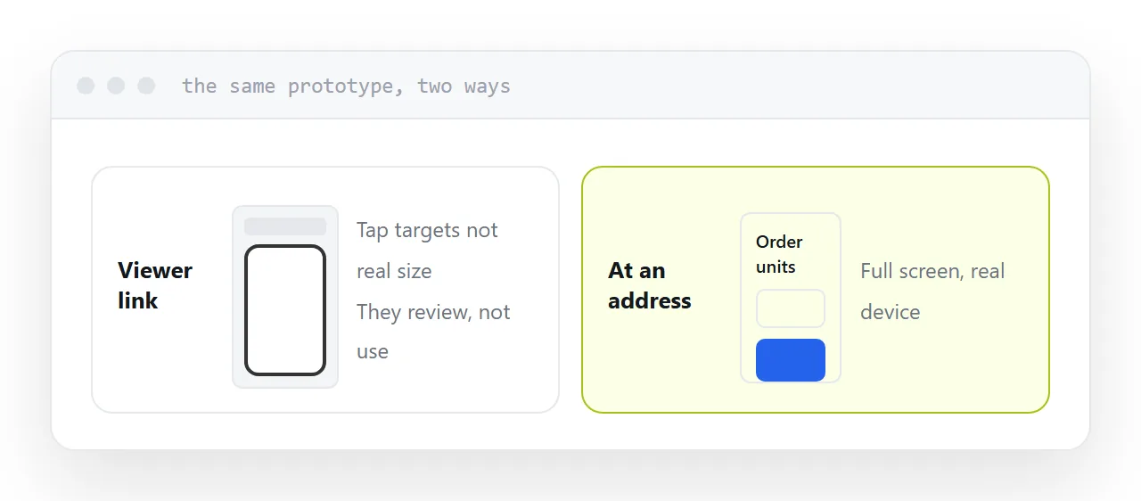
A prototype opened through a design tool's share link appears inside that tool's interface: a toolbar, a comment panel, and on a phone often a scaled-down rectangle with the device outline drawn around it.
Everything you wanted to learn is now unavailable.
Tap targets are not at their real size. Thumb reach is meaningless because the content is not where a thumb would find it. Text legibility is a guess. And the tester knows they are inside a prototype, so they behave like a reviewer rather than a user.
| Testing | Viewer link | Page at an address |
|---|---|---|
| Tap accuracy | No | Yes |
| Thumb reach | No | Yes |
| Real text size | No | Yes |
| Behaves like a user | No | Yes |
| Needs an account | Sometimes | No |
Publish it as a page
A prototype as a page at an address opens full screen on the device it is meant for, with nothing around it.
That is when people start using it rather than reviewing it, and when the hesitations become visible. Somebody who taps twice in the wrong place has told you more than an hour of discussion.
It also removes the account prompt, which alone loses you a share of testers.
Match fidelity to the question
Prototypes are frequently built to a higher finish than the question requires, which costs days.
Testing comprehension of a flow? Grey boxes and real words. The words matter; the visuals do not.
Testing whether people can complete a task? Real interactions, placeholder data.
Testing whether people want the thing? A single page describing it honestly, with one way to respond.
The last one is regularly the right test and almost never the one that gets built.
Send a task
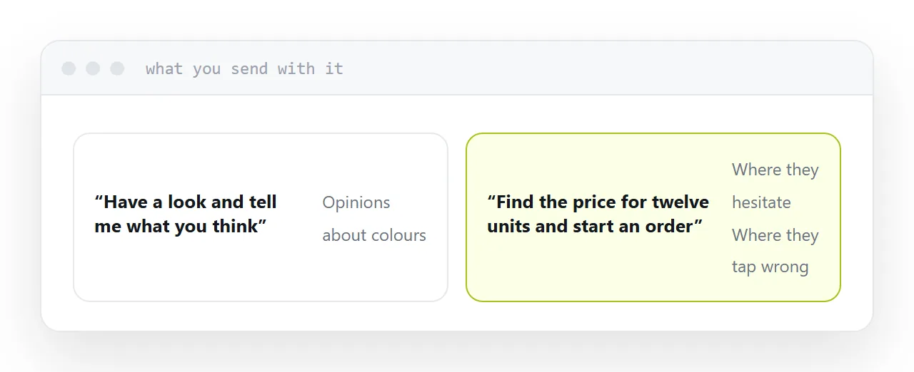
The worst instruction is "have a look and let me know what you think".
That asks for opinions, and you will get opinions about colours.
Send a task instead: find the price for twelve units and start an order. Then watch. Where somebody stops, re-reads or taps the wrong thing is the finding, and none of it is something they would have told you.
Describing the prototype beforehand is the other common error. It tells people what to see and removes the possibility of learning that it is not obvious.
For the surrounding ground, see How to send a prototype to a client and How to get feedback on a landing page.
Put it at an address
Publish the prototype as a page, open it on the device it is for, match the fidelity to the question, send a task rather than a description, and watch what happens instead of asking what they thought.