When an inline element such as a <span> or <mark> wraps onto a second line, the browser paints it as one long box cut at the line break. The cut ends get no padding, border or rounded corners.
box-decoration-break: clone tells the browser to draw a whole box around each line instead.
.highlight {
  -webkit-box-decoration-break: clone;
  box-decoration-break: clone;
}
Try it. The top box uses the default, the bottom box uses clone. Drag the slider to move the line breaks.
<!doctype html>
<html lang="en">
<head>
<meta charset="utf-8">
<meta name="viewport" content="width=device-width, initial-scale=1">
<title>box-decoration-break: slice vs clone</title>
<style>
  body { margin: 0; padding: 16px; font: 17px/1.9 system-ui, sans-serif; color: #1f2937; background: #fff; }
  .box { width: 300px; max-width: calc(100% - 26px); border: 1px dashed #cbd5e1; border-radius: 10px; padding: 8px 12px; margin-bottom: 14px; }
  .label { font: 700 13px/1.4 ui-monospace, Consolas, monospace; color: #6b7280; }
  p { margin: 0; }
  .hl {
    background: #fde68a;
    padding: 2px 8px;
    border-radius: 8px;
  }
  /* the one rule this page is about: every line gets its own padding and corners */
  .clone .hl {
    -webkit-box-decoration-break: clone; /* WebKit (Safari) reads only this name */
    box-decoration-break: clone;         /* Firefox reads only this name */
  }
  .controls { font-size: 14px; }
  input { vertical-align: middle; }
</style>
</head>
<body>
<div class="controls"><label>Width <input type="range" id="width" min="190" max="340" value="300"></label></div>

<div class="box" id="a">
  <div class="label">slice (default)</div>
  <p>Read this first: <span class="hl">this highlighted phrase is long enough to wrap onto another line</span> and the sentence goes on.</p>
</div>

<div class="box clone" id="b">
  <div class="label">clone</div>
  <p>Read this first: <span class="hl">this highlighted phrase is long enough to wrap onto another line</span> and the sentence goes on.</p>
</div>

<script>
  // narrow both boxes to move the line breaks around
  document.getElementById('width').addEventListener('input', (e) => {
    for (const id of ['a', 'b']) document.getElementById(id).style.width = e.target.value + 'px';
  });
</script>
</body>
</html>
What slice and clone change
The property has two values. slice is the default. It draws the box as if the line pieces were one unbroken strip, then slices it at each break. clone treats each piece as a box of its own.
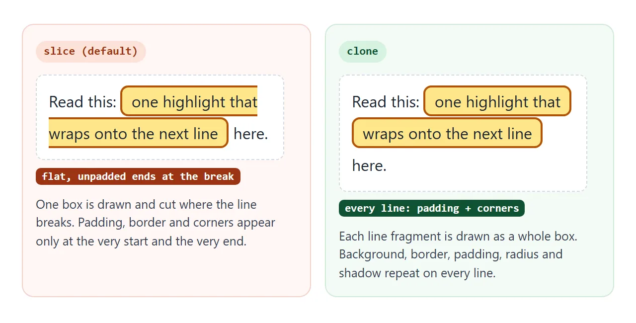
Only the decoration changes. The text wraps at the same words either way. Here is what each value does to the parts of the box:
| Part of the box | slice (default) | clone |
|---|---|---|
| Background colour | One strip, cut at the break | Filled on every line |
| Background image or gradient | Runs across all lines as one | Restarts on every line |
| Padding and border | Only at the first start and the last end | On both ends of every line |
border-radius |
Two outer corners, square at the cut | Four corners on every line |
box-shadow |
Open at the cut | Around every line |
| Left and right margin | Only at the first start and the last end | On both ends of every line |
We checked the margin row in Chromium, Firefox and WebKit: with clone, the second line started 20px in, matching a 20px side margin.
Padding and rounded corners on every line
A highlight usually has a little side padding and rounded corners. On one word that looks fine. On a phrase that wraps, only the first and last ends get them, which is why the default looks cut off.
With clone, each line gets the full padding, so each line is slightly wider. A word can move to the next line when you switch it on.
In the basic example the padding is 8px per side. With clone, the first and last lines each grew by 8px, and a middle line grew by 16px.
Vertical padding on an inline element does not push the lines apart. The boxes on two lines can touch or overlap. Raise line-height on the paragraph until there is a gap:
p { line-height: 1.9; }
.highlight { padding: 2px 8px; border-radius: 8px; }
For the HTML mark tag itself, when to use it and how to restyle it, see that guide. This page stays on the break behaviour. CSS border-radius covers the corner values.
The -webkit- prefix: write both lines
Browsers do not agree on the name. We tested an inline highlight in the Chromium, Firefox and WebKit engines that ship with Playwright, and read back which spelling each one applied.
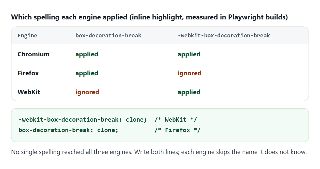
- Chromium applied both the standard and the
-webkit-name. - Firefox applied only
box-decoration-break. - WebKit applied only
-webkit-box-decoration-break.
So neither line alone works everywhere. Put the prefixed line first and the standard line second. An engine that does not know a property name skips that declaration, so the pair is safe. You can test support in a script with CSS.supports():
const ok = CSS.supports('box-decoration-break', 'clone')
  || CSS.supports('-webkit-box-decoration-break', 'clone');
Boxes split across columns and pages
Inline elements are not the only boxes that break. A block that is too tall for one column of a multi-column layout is split into pieces, one per column. box-decoration-break works on those pieces too.
<!doctype html>
<html lang="en">
<head>
<meta charset="utf-8">
<meta name="viewport" content="width=device-width, initial-scale=1">
<title>box-decoration-break in columns</title>
<style>
  body { margin: 0; padding: 16px; font: 15px/1.5 system-ui, sans-serif; color: #1f2937; background: #fff; }
  .cols {
    columns: 2;          /* the box below is taller than one column, so it breaks */
    column-gap: 16px;
    height: 230px;
    max-width: 420px;
    column-fill: auto;   /* fill the first column before the second */
  }
  .note {
    border: 3px solid #2563eb;
    border-radius: 10px;
    padding: 12px;
    background: #eff6ff;
  }
  .clone .note {
    -webkit-box-decoration-break: clone;
    box-decoration-break: clone;
  }
  label { display: inline-flex; gap: 6px; align-items: center; font-weight: 600; margin-bottom: 12px; cursor: pointer; }
</style>
</head>
<body>
<label><input type="checkbox" id="clone"> box-decoration-break: clone</label>
<div class="cols" id="cols">
  <div class="note">
    <b>Release notes</b><br>
    This card is too tall for one column, so the browser splits it into two pieces.
    With slice, the first piece has no bottom border and the second has no top border.
    With clone, each piece gets its own border, corners and padding.
  </div>
</div>

<script>
  const cols = document.getElementById('cols');
  document.getElementById('clone').addEventListener('change', (e) => {
    cols.classList.toggle('clone', e.target.checked);
  });
</script>
</body>
</html>
With slice, the first piece has no bottom border and the second has no top border. With clone, each piece is a complete card. The padding repeats too, so a cloned card takes more height. In a tight layout it can spill into another column.
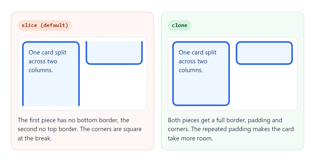
In our tests, Chromium and Firefox applied clone to the column pieces. WebKit did not: the card stayed sliced in columns, even with the prefixed name. The same WebKit build did clone inline highlights.
Treat column cloning as a nice extra, not something the layout depends on. CSS multi-column layout covers the column settings.
The CSS Fragmentation spec defines the same property for printed pages. A bordered box that breaks across a page can repeat its border on the next page. Check the result in print preview, since print styles are where page breaks show up.
A finished example: a highlighted headline
A common use is a bold headline with a colour band behind each line. Pick a style and narrow the box with the slider. Every new line gets the full shape.
<!doctype html>
<html lang="en">
<head>
<meta charset="utf-8">
<meta name="viewport" content="width=device-width, initial-scale=1">
<title>Highlighted headline</title>
<style>
  body { margin: 0; padding: 18px; font-family: system-ui, sans-serif; color: #111827; background: #f8fafc; }
  .controls { display: flex; flex-wrap: wrap; gap: 10px 16px; align-items: center; font-size: 14px; margin-bottom: 16px; }
  select, input { font: inherit; }
  .frame { background: #fff; border: 1px solid #e2e8f0; border-radius: 12px; padding: 18px; width: 100%; max-width: 100%; box-sizing: border-box; }
  h1 { margin: 0; font-size: 30px; line-height: 1.5; }

  /* shared by every style: each line is its own box */
  h1 span {
    -webkit-box-decoration-break: clone;
    box-decoration-break: clone;
    padding: 2px 10px;
  }
  .marker span { background: #fde68a; border-radius: 4px; }
  .pill span { background: #111827; color: #fff; border-radius: 999px; padding: 2px 14px; }
  .gradient span { background: linear-gradient(90deg, #f472b6, #818cf8); color: #fff; border-radius: 8px; }
  .shadow span { background: #fff; border-radius: 8px; box-shadow: 0 0 0 2px #111827, 4px 4px 0 2px #111827; }
</style>
</head>
<body>
<div class="controls">
  <label>Style
    <select id="style">
      <option value="marker">Marker</option>
      <option value="pill">Pill</option>
      <option value="gradient">Gradient</option>
      <option value="shadow">Outline + shadow</option>
    </select>
  </label>
  <label>Width <input type="range" id="width" min="55" max="100" value="100"></label>
</div>
<div class="frame" id="frame">
  <h1 class="marker" id="h"><span>Every line of this headline gets its own highlight</span></h1>
</div>

<script>
  const h = document.getElementById('h');
  const frame = document.getElementById('frame');
  document.getElementById('style').addEventListener('change', (e) => { h.className = e.target.value; });
  // narrow the box to see the lines rewrap; each new line gets the full style
  document.getElementById('width').addEventListener('input', (e) => { frame.style.width = e.target.value + '%'; });
</script>
</body>
</html>
- Marker: a flat colour with small corners.
- Pill: fully rounded ends on each line, which only works with
clone. - Gradient: with
clone, each line runs the full colour range. Removecloneand one gradient stretches across all lines instead. - Outline and shadow:
box-shadowdraws a frame and an offset shadow around every line.
The style classes change only colour and shape. The shared rule holds the two box-decoration-break lines and the side padding.
When it does not work
| What you see | Cause | Fix |
|---|---|---|
| Flat, unpadded ends where the line wraps | Default slice |
Add both clone lines |
| Works in Chromium, not in WebKit (Safari) | Only the standard name is written | Add the -webkit- line |
| Works in WebKit (Safari), not in Firefox | Only the -webkit- name is written |
Add the standard line |
| No change at all | The element is inline-block, or it never wraps |
Use a plain inline element that wraps |
| Highlights on two lines overlap | Vertical padding does not add line spacing | Raise line-height |
Adding a clone class later changes nothing in WebKit (Safari) |
In our WebKit test, the class change did not re-lay out the highlight | Put clone in the base rule from the start |
| A card in columns stays open in WebKit (Safari) | WebKit did not clone column pieces in our tests | Accept it, or avoid breaking the card with break-inside: avoid |
Share it as a link
Line breaks depend on the reader's screen width, so a screenshot shows only one case. Sent as a link, the page rewraps on each device and the people you send it to can see every line keep its shape.
To share the working version, paste the page into a NOS document and choose Create share link. HTML to link walks through it.
The page renders as written and its scripts run, so the buttons and sliders work for whoever opens it. If you change the code later, the same link shows the new version.