To change the bullets or numbers of an HTML list, set list-style-type in CSS on the <ul> or <ol>. ul { list-style-type: square; } gives square bullets, ol { list-style-type: upper-roman; } gives I, II, III, and list-style-type: "✅ " uses your own text.
Try the values on a real list. Each button changes one line of CSS.
<!doctype html>
<html lang="en">
<head>
<meta charset="utf-8">
<meta name="viewport" content="width=device-width, initial-scale=1">
<title>list-style-type values</title>
<style>
  body { margin: 0; padding: 16px; font-family: system-ui, sans-serif; background: #f4f5f7; color: #1d2330; }
  .picks { display: flex; flex-wrap: wrap; gap: 6px; margin-bottom: 14px; }
  .picks button {
    font: 13px ui-monospace, Consolas, monospace; padding: 6px 9px;
    border: 1px solid #cfd4dc; border-radius: 7px; background: #fff; cursor: pointer;
  }
  .picks button.on { background: #1d4ed8; border-color: #1d4ed8; color: #fff; }
  .card { background: #fff; border-radius: 12px; padding: 14px 18px; box-shadow: 0 2px 10px rgba(0, 0, 0, .06); }
  #list { margin: 0; padding-left: 3em; line-height: 1.8; }
  pre { margin: 12px 0 0; font: 13px ui-monospace, Consolas, monospace; color: #0f5132; white-space: pre-wrap; }
</style>
</head>
<body>
<div class="picks" id="picks"></div>

<div class="card">
  <ol id="list">
    <li>Pick a value above</li>
    <li>Watch the markers change</li>
    <li>Copy the line below</li>
    <li>Paste it into your own CSS</li>
  </ol>
  <pre id="code"></pre>
</div>

<script>
  // Each button sets list-style-type on the <ol>. Quoted values are custom strings.
  const values = ['disc', 'circle', 'square', 'decimal', 'decimal-leading-zero',
    'lower-roman', 'upper-roman', 'lower-alpha', 'upper-alpha', 'lower-greek',
    '"→ "', '"✅ "', '"⭐ "', 'none'];
  const list = document.getElementById('list');
  const code = document.getElementById('code');
  const picks = document.getElementById('picks');

  function pick(value, button) {
    list.style.listStyleType = value;
    code.textContent = 'ol { list-style-type: ' + value + '; }';
    picks.querySelectorAll('button').forEach((b) => b.classList.toggle('on', b === button));
  }

  values.forEach((value) => {
    const b = document.createElement('button');
    b.textContent = value;
    b.addEventListener('click', () => pick(value, b));
    picks.appendChild(b);
  });

  pick('decimal', picks.children[3]);
</script>
</body>
</html>
The property is inherited. Setting it once on the list reaches every item, and you only need a rule on a single li when that one item should look different.
Every list-style-type value, grouped
The values fall into three families: shapes that repeat, counters that go up, and strings you write yourself.
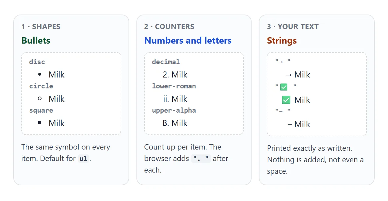
| Value | Marker for items 1, 2, 3 | Notes |
|---|---|---|
disc |
• • • | Default for ul |
circle |
◦ ◦ ◦ | Default for a ul inside a ul |
square |
▪ ▪ ▪ | Default for the third level |
decimal |
1. 2. 3. | Default for ol |
decimal-leading-zero |
01. 02. 03. | |
lower-roman / upper-roman |
i. ii. iii. / I. II. III. | Up to 3999, then decimal |
lower-alpha / upper-alpha |
a. b. c. / A. B. C. | After z comes aa, ab |
lower-greek |
α. β. γ. | |
"→ " |
→ → → | Any quoted text |
none |
nothing | The marker is gone, the indent stays |
lower-latin and upper-latin are the same as the alpha pair. CSS also defines styles for other writing systems, such as armenian, georgian, hebrew, hiragana and cjk-decimal.
Any counter value works on a <ul> too. If the order carries meaning, though, the list should be an <ol>.
The ol tag covers start, reversed and the type attribute. In short, <ol type="i"> matches lower-roman, and a list-style-type rule in your CSS wins over the attribute.
A name the browser does not know, such as a misspelt style, does not throw an error. The list quietly shows decimal numbers instead.
Custom strings and emoji as the marker
Any text in quotes becomes the marker. That covers dashes, arrows, check marks and emoji without images or extra markup.
ul.todo { list-style-type: "✅ "; }
ul.dash { list-style-type: "– "; }
ul.next { list-style-type: "👉 "; }
The one catch is the space. Counters get a ". " added after the number, but a string is printed exactly as typed.
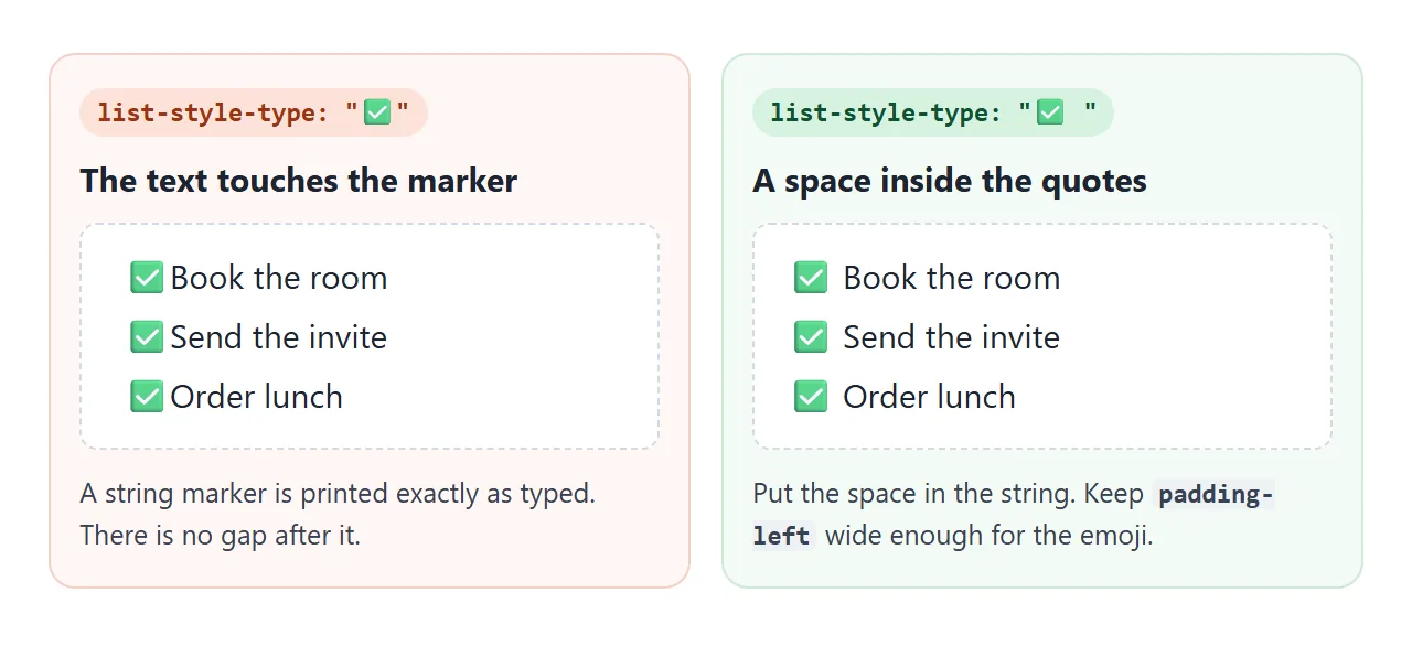
A wide emoji can also stick out to the left of the list. The marker hangs in the list's left padding, so give the list padding-left: 2em or more when the marker is wider than a dot.
A string is the same on every item. For markers that change from one item to the next, such as a different fruit each time, use @counter-style, further down.
list-style-image: a picture as the bullet
list-style-image replaces the marker with an image. An inline SVG in a data: URL keeps everything in one file:
ul.checks {
  list-style-image: url("data:image/svg+xml,%3Csvg xmlns='http://www.w3.org/2000/svg' width='12' height='12'%3E%3Cpath d='M1 6l3.5 3.5L11 2' stroke='%2316a34a' stroke-width='2.4' fill='none'/%3E%3C/svg%3E");
}
When an image is set, it takes the place of the list-style-type marker. Two limits decide whether it is the right tool:
- No sizing. The image is drawn at its own size, and no property scales it. A 40-pixel image gives a 40-pixel bullet. Set
widthandheightinside the SVG itself. - No reliable fallback. In our test with a missing image file, Chromium drew the
list-style-typesquare, while Firefox and WebKit drew no marker at all.
When the icon needs its own size or position, hide the marker and draw the icon with a ::before pseudo-element instead. CSS ::before and ::after shows how.
list-style-position: inside or outside
By default, markers sit outside the item box, in the padding to its left. Wrapped lines then line up with the first line of text, not with the marker.
With list-style-position: inside, the marker becomes the first thing on the first line, inside the box. Lines that wrap start under the marker.
<!doctype html>
<html lang="en">
<head>
<meta charset="utf-8">
<meta name="viewport" content="width=device-width, initial-scale=1">
<title>list-style-image and list-style-position</title>
<style>
  body { margin: 0; padding: 16px; font-family: system-ui, sans-serif; background: #f4f5f7; color: #1d2330; }
  .controls { display: grid; gap: 8px; margin-bottom: 14px; font-size: 14px; }
  .controls label { display: flex; align-items: center; gap: 8px; }
  select { font: inherit; padding: 4px 6px; }
  .card { background: #fff; border-radius: 12px; padding: 12px 14px; box-shadow: 0 2px 10px rgba(0, 0, 0, .06); }
  ul { margin: 0; padding-left: 2em; line-height: 1.5; }
  li { margin: 6px 0; outline: 1px dashed #b8c0cc; }  /* dashed line = the li box */

  /* marker sources */
  ul.square { list-style-type: square; }
  ul.image {
    /* a 12px green check, drawn by an inline SVG */
    list-style-image: url("data:image/svg+xml,%3Csvg xmlns='http://www.w3.org/2000/svg' width='12' height='12'%3E%3Cpath d='M1 6l3.5 3.5L11 2' stroke='%2316a34a' stroke-width='2.4' fill='none'/%3E%3C/svg%3E");
  }
  ul.emoji { list-style-type: "👉 "; }

  ul.inside { list-style-position: inside; }
  ul.tinted li::marker { color: #dc2626; }
  pre { margin: 12px 0 0; font: 12.5px ui-monospace, Consolas, monospace; color: #0f5132; white-space: pre-wrap; }
</style>
</head>
<body>
<div class="controls">
  <label>Marker
    <select id="source">
      <option value="square">list-style-type: square</option>
      <option value="image">list-style-image: url(check.svg)</option>
      <option value="emoji">list-style-type: "👉 "</option>
    </select>
  </label>
  <label><input type="checkbox" id="inside"> list-style-position: inside</label>
  <label><input type="checkbox" id="tint"> li::marker { color: red }</label>
</div>

<div class="card">
  <ul id="list" class="square">
    <li>A short item.</li>
    <li>A longer item that wraps onto a second line, so you can see where the second line starts.</li>
    <li>The dashed outline is the edge of each li.</li>
  </ul>
  <pre id="code"></pre>
</div>

<script>
  const list = document.getElementById('list');
  const source = document.getElementById('source');
  const inside = document.getElementById('inside');
  const tint = document.getElementById('tint');
  const code = document.getElementById('code');

  function update() {
    list.className = source.value;
    list.classList.toggle('inside', inside.checked);
    list.classList.toggle('tinted', tint.checked);
    code.textContent = 'ul {\n  ' + source.selectedOptions[0].text + ';\n  list-style-position: ' +
      (inside.checked ? 'inside' : 'outside') + ';\n}' +
      (tint.checked ? '\nli::marker { color: red; }' : '');
  }

  [source, inside, tint].forEach((el) => el.addEventListener('change', update));
  update();
</script>
</body>
</html>
Outside suits most lists, because the text forms a clean column. Inside is useful when the list sits in a tight box, such as a table cell or a narrow card, where there is no padding for the marker to hang in.
The three properties have a shorthand, and the values can go in any order:
ul { list-style: square inside; }
ul { list-style: url(check.svg) outside; }
Like any shorthand, list-style resets the parts you leave out. list-style: inside alone also sets the type back to its default, disc.
Styling the marker with ::marker
li::marker selects the marker itself: the bullet, the number, or the string. Colour and font changes apply only to the marker, while the item text keeps its own style.
li::marker {
  color: #1d4ed8;
  font-weight: 700;
}
::marker takes a short list of properties: color, the font properties, white-space, animation, transition and content. Box properties such as padding, margin and background are ignored without an error.
content on ::marker is the one to avoid for now. In our test WebKit, the engine behind Safari, ignored li::marker { content: "→ " } and kept the dot. list-style-type: "→ " gave the arrow in all three engines.
Your own marker set with @counter-style
@counter-style defines a new list style with a name. Once it exists, the name works as a list-style-type value like decimal does.
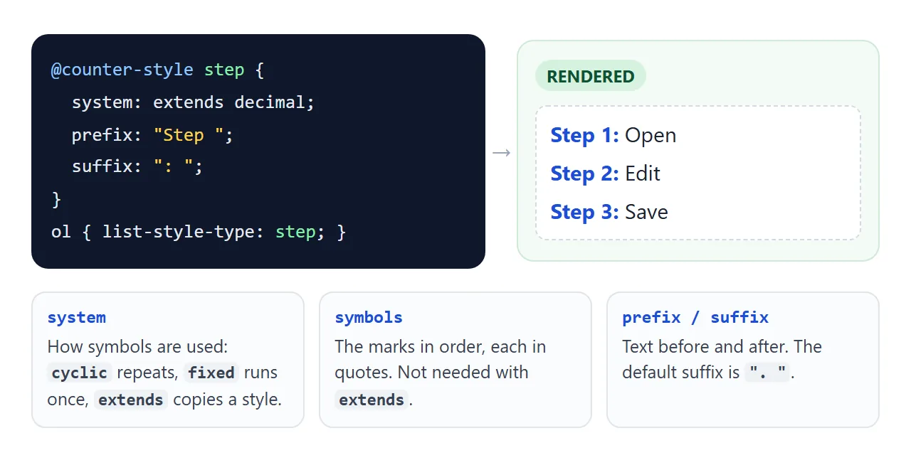
systemdecides how the symbols are used.cyclicrepeats them in turn.fixeduses each one once.extends decimalcopies an existing style so you can change only parts of it.symbolslists the marks, each in quotes.prefixandsuffixadd text before and after. The default suffix is". ", so setsuffix: " "for emoji.
<!doctype html>
<html lang="en">
<head>
<meta charset="utf-8">
<meta name="viewport" content="width=device-width, initial-scale=1">
<title>@counter-style lists</title>
<style>
  body { margin: 0; padding: 16px; font-family: system-ui, sans-serif; background: #eef1f5; color: #1d2330; }
  .grid { display: grid; grid-template-columns: repeat(auto-fit, minmax(190px, 1fr)); gap: 12px; }
  .card { background: #fff; border-radius: 12px; padding: 12px 14px; box-shadow: 0 2px 10px rgba(0, 0, 0, .06); }
  h3 { margin: 0 0 8px; font-size: 14px; }
  ol, ul { margin: 0; line-height: 1.7; font-size: 15px; }

  /* 1. "Step 1:" - copy decimal, change the text around the number */
  @counter-style step {
    system: extends decimal;
    prefix: "Step ";
    suffix: ": ";
  }
  .steps { list-style-type: step; padding-left: 4.6em; }
  .steps li::marker { color: #1d4ed8; font-weight: 700; }

  /* 2. Emoji bullets that repeat in turn */
  @counter-style fruit {
    system: cyclic;
    symbols: "🍎" "🍊" "🍋";
    suffix: " ";
  }
  .fruit { list-style-type: fruit; padding-left: 2em; }

  /* 3. Circled numbers; item 6 falls back to decimal */
  @counter-style circled {
    system: fixed;
    symbols: "①" "②" "③" "④" "⑤";
    suffix: " ";
  }
  .circled { list-style-type: circled; padding-left: 2em; }
  .circled li::marker { color: #16a34a; }
</style>
</head>
<body>
<div class="grid">
  <div class="card">
    <h3>Setup guide</h3>
    <ol class="steps">
      <li>Open the file</li>
      <li>Edit the text</li>
      <li>Save and reload</li>
    </ol>
  </div>
  <div class="card">
    <h3>Shopping list</h3>
    <ul class="fruit">
      <li>Apples</li>
      <li>Oranges</li>
      <li>Lemons</li>
      <li>Pears</li>
    </ul>
  </div>
  <div class="card">
    <h3>Top picks</h3>
    <ol class="circled">
      <li>Blue</li>
      <li>Green</li>
      <li>Orange</li>
      <li>Red</li>
      <li>Grey</li>
      <li>Sixth: no symbol left</li>
    </ol>
  </div>
</div>
</body>
</html>
A fixed style that runs out of symbols falls back to decimal, which is why the sixth item in the last list shows a plain 6.
For numbering headings, figures or anything that is not a list item, the same named styles plug into the counter() function. CSS counters covers that side. To remove the markers entirely, see HTML list without bullets.
When it does not work
| What you see | Cause | Fix |
|---|---|---|
| The value has no effect on one item | The li has display: flex or block, so it is no longer a list item |
Keep display: list-item, or wrap the content in a flex div inside the li |
| Plain numbers appear instead of your style | The style name is misspelt, or the @counter-style rule is missing |
Check the name matches exactly |
| Text touches a string or emoji marker | Strings get no space after them | Put a space inside the quotes |
| The marker is cut off on the left | The list's padding-left is too small for the marker |
Increase padding-left, or use inside |
| The bullet image is huge or tiny | list-style-image draws the image at its own size |
Resize the image or SVG, or use ::before |
padding or background on ::marker does nothing |
::marker ignores box properties |
Use color and font only, or draw with ::before |
The type attribute is ignored |
A CSS rule sets list-style-type on the same list |
Remove one of the two |
Share it as a link
A marker style is easier to judge on the real list than in a screenshot. Colours, emoji and the way long items wrap all depend on the fonts and screen width of whoever is looking.
To send the working version, paste the page into a NOS document and choose Create share link. HTML to link walks through it.
The page renders as written and its scripts run, so the people you send it to can click through the styles themselves. If you change the CSS later, the same link shows the new version.