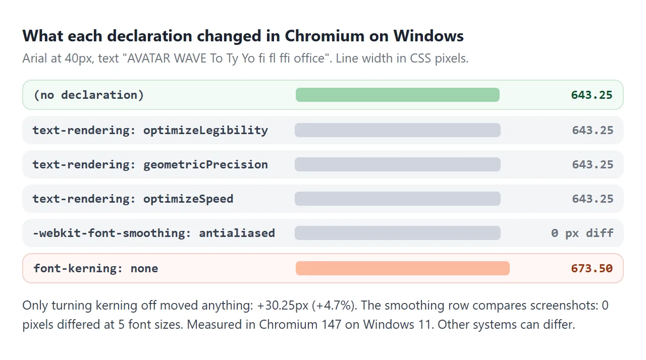
Four properties come up whenever CSS font rendering is tuned: text-rendering, font-kerning, -webkit-font-smoothing and font-size-adjust. We measured each one in Chromium on Windows. Only turning kerning off and setting font-size-adjust changed what was drawn. The others changed 0 pixels.
That does not make them useless everywhere. Font rendering depends on the operating system, so the honest test is the one on your own device. Start with kerning, the easiest one to see.
<!doctype html>
<html lang="en">
<head>
<meta charset="utf-8">
<meta name="viewport" content="width=device-width, initial-scale=1">
<title>font-kerning</title>
<style>
  body { margin: 0; padding: 14px; font-family: system-ui, sans-serif; background: #f4f5f7; color: #1d2330; }
  .bar { display: flex; flex-wrap: wrap; gap: 8px; align-items: center; font-size: 14px; margin-bottom: 10px; }
  select, input { font: inherit; padding: 4px 6px; }
  input { width: 150px; }
  .card { background: #fff; border-radius: 10px; padding: 10px 12px; margin-bottom: 8px; }
  .label { font: 600 12.5px ui-monospace, Consolas, monospace; color: #374151; }
  .sample { font-size: min(44px, 9.5vw); line-height: 1.2; white-space: nowrap; overflow: hidden; }
  .kern-on { font-kerning: normal; }
  .kern-off { font-kerning: none; }
  #result { font-size: 13.5px; color: #374151; margin: 6px 2px 0; }
</style>
</head>
<body>
<div class="bar">
  <label for="font">Font:</label>
  <select id="font">
    <option value="system-ui, sans-serif">system-ui</option>
    <option value="Arial, Helvetica, sans-serif">Arial / Helvetica</option>
    <option value="'Times New Roman', Times, serif">Times New Roman</option>
    <option value="Georgia, serif">Georgia</option>
    <option value="monospace">monospace</option>
  </select>
  <input id="text" value="AVATAR To WAVE" aria-label="Sample text">
</div>

<div class="card">
  <div class="label">font-kerning: normal</div>
  <div class="sample kern-on" id="on"></div>
</div>
<div class="card">
  <div class="label">font-kerning: none</div>
  <div class="sample kern-off" id="off"></div>
</div>
<p id="result"></p>

<script>
  const font = document.getElementById('font');
  const text = document.getElementById('text');
  const on = document.getElementById('on');
  const off = document.getElementById('off');
  const result = document.getElementById('result');

  // Width of the text with a given class, measured off screen
  function width(cls) {
    const s = document.createElement('span');
    s.className = 'sample ' + cls;
    s.style.cssText = 'position:absolute;visibility:hidden';
    s.style.fontFamily = font.value;
    s.textContent = text.value;
    document.body.append(s);
    const w = s.getBoundingClientRect().width;
    s.remove();
    return w;
  }

  function render() {
    on.textContent = off.textContent = text.value;
    on.style.fontFamily = off.style.fontFamily = font.value;
    const diff = width('kern-off') - width('kern-on');
    result.textContent = Math.abs(diff) < 0.1
      ? 'Same width. This font has no kerning for these letters, or it is monospaced.'
      : 'Kerning makes this line ' + diff.toFixed(1) + 'px narrower in this browser.';
  }

  font.addEventListener('change', render);
  text.addEventListener('input', render);
  render();
</script>
</body>
</html>
The lower line is wider because every letter keeps its full box. Kerning is the font's own list of pairs, such as AV and To, that should sit closer together.
font-kerning: the one that changes the text
font-kerning has three values. auto is the default and lets the browser decide. normal asks for the font's kerning, and none turns it off.
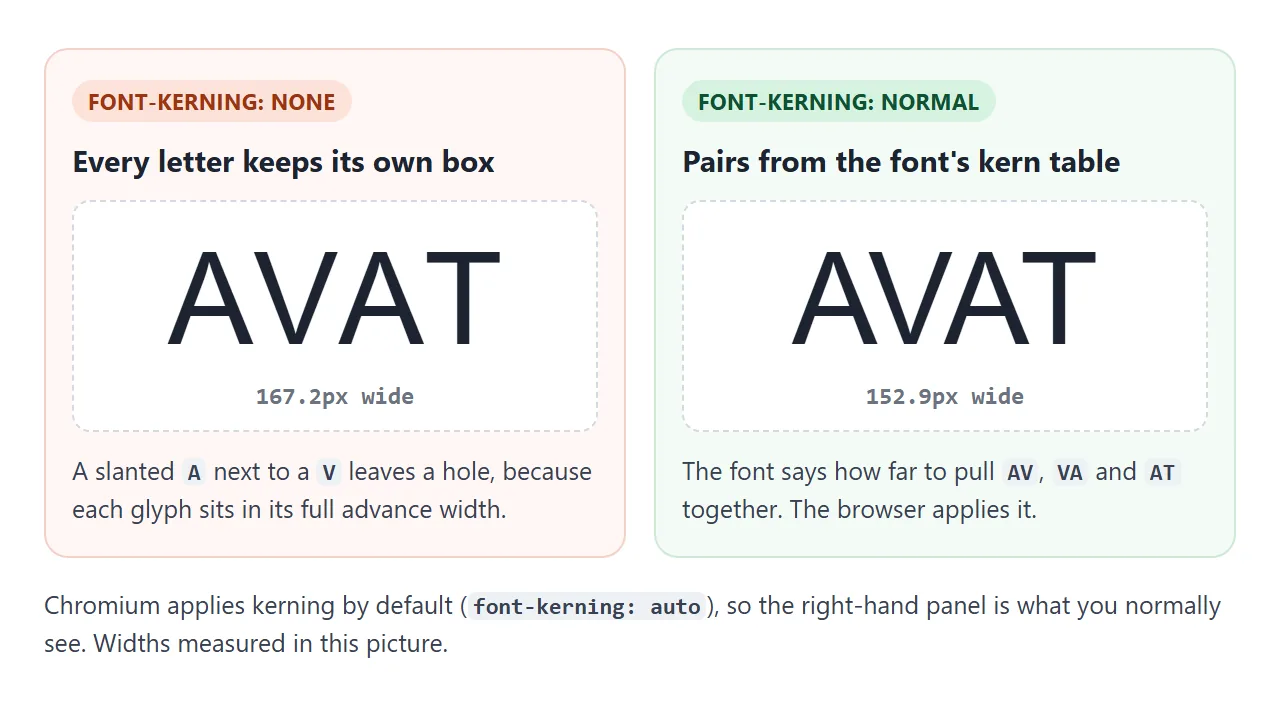
In Chromium, kerning was already on by default at every size we tried, from 11.3px to 40px. So font-kerning: normal usually changes nothing, and none makes text wider. With Arial at 40px, our test line grew from 643.25px to 673.50px.
Turn kerning off only where letters must keep fixed positions, such as text you animate letter by letter. Monospace fonts normally have no kerning, so the setting does nothing there.
text-rendering: optimizeLegibility and geometricPrecision
text-rendering is an SVG property that browsers also apply to HTML text. It is a hint, and the browser is free to ignore it. It takes four values:
| Value | What it asks for | What changed in Chromium on Windows |
|---|---|---|
auto |
Let the browser choose | This is the default |
optimizeLegibility |
Kerning and ligatures | Nothing: both are already on |
geometricPrecision |
Exact outlines over crisp pixels | 0 pixels at 5 sizes |
optimizeSpeed |
Speed over quality | Ligatures such as fi turned off in Calibri; kerning stayed |
Many style sheets put text-rendering: optimizeLegibility on body to switch kerning on. In current Chromium kerning is already on, so the line only adds noise.
Run the same test on your device. Each row shows how much one declaration changed the width of the sample line.
<!doctype html>
<html lang="en">
<head>
<meta charset="utf-8">
<meta name="viewport" content="width=device-width, initial-scale=1">
<title>What changes in this browser</title>
<style>
  body { margin: 0; padding: 14px; font-family: system-ui, sans-serif; background: #f4f5f7; color: #1d2330; }
  .bar { display: flex; flex-wrap: wrap; gap: 8px; align-items: center; font-size: 14px; margin-bottom: 10px; }
  select { font: inherit; padding: 4px 6px; }
  .sample { background: #fff; border-radius: 10px; padding: 8px 12px; font-size: 30px; white-space: nowrap; overflow: hidden; margin-bottom: 10px; }
  table { width: 100%; border-collapse: collapse; background: #fff; font-size: 13px; }
  td, th { padding: 7px 10px; border-bottom: 1px solid #eef0f3; text-align: left; }
  th { background: #eef1f5; font-weight: 600; }
  td:first-child { font-family: ui-monospace, Consolas, monospace; font-size: 12px; word-break: break-word; }
  td.num { text-align: right; white-space: nowrap; }
  .same { color: #6b7280; }
  .diff { color: #9a3412; font-weight: 600; }
  p { font-size: 12.5px; color: #6b7280; margin: 8px 2px 0; }
</style>
</head>
<body>
<div class="bar">
  <label for="font">Font:</label>
  <select id="font">
    <option value="system-ui, sans-serif">system-ui</option>
    <option value="Arial, Helvetica, sans-serif">Arial / Helvetica</option>
    <option value="Calibri, Carlito, sans-serif">Calibri</option>
    <option value="'Times New Roman', Times, serif">Times New Roman</option>
    <option value="Georgia, serif">Georgia</option>
  </select>
</div>
<div class="sample" id="sample">AVATAR To office affinity</div>

<table>
  <thead><tr><th>Declaration</th><th>Width change</th></tr></thead>
  <tbody id="rows"></tbody>
</table>
<p>Each line is measured at 40px against the same line with no declaration. 0 means this browser drew it at the same width.</p>

<script>
  // Each rendering setting to compare with the default
  const tests = [
    'text-rendering: optimizeLegibility',
    'text-rendering: geometricPrecision',
    'text-rendering: optimizeSpeed',
    'font-kerning: none',
    'font-variant-ligatures: none',
    '-webkit-font-smoothing: antialiased',
  ];
  const font = document.getElementById('font');
  const sample = document.getElementById('sample');
  const rows = document.getElementById('rows');

  function width(css) {
    const s = document.createElement('span');
    s.style.cssText = 'position:absolute;visibility:hidden;white-space:pre;font-size:40px;' + css;
    s.style.fontFamily = font.value;
    s.textContent = sample.textContent;
    document.body.append(s);
    const w = s.getBoundingClientRect().width;
    s.remove();
    return w;
  }

  function render() {
    sample.style.fontFamily = font.value;
    const base = width('');
    rows.innerHTML = '';
    tests.forEach((css) => {
      const d = width(css) - base;
      const same = Math.abs(d) < 0.05;
      const tr = document.createElement('tr');
      tr.innerHTML = '<td>' + css + '</td><td class="num ' + (same ? 'same' : 'diff') + '">' +
        (same ? '0' : (d > 0 ? '+' : '') + d.toFixed(2) + 'px') + '</td>';
      rows.append(tr);
    });
  }

  font.addEventListener('change', render);
  render();
</script>
</body>
</html>
On a Mac or a phone the numbers may differ, and that is the point of measuring. If a row reads 0, the declaration did nothing to the layout here.
-webkit-font-smoothing works on macOS only
-webkit-font-smoothing is not a standard property. MDN lists it as effective on macOS only. The values are auto, none, antialiased and subpixel-antialiased. Firefox on macOS uses a separate property:
.dark-panel {
  -webkit-font-smoothing: antialiased;  /* Chromium and Safari on macOS */
  -moz-osx-font-smoothing: grayscale;   /* Firefox on macOS */
}
On Windows, Chromium accepts the property and getComputedStyle even reports antialiased. But screenshots with and without it were identical: 0 pixels differed at five font sizes and two screen densities.
We could not measure macOS for this page. If you use the property there, check the result on a real Mac, and expect no change for readers on Windows, Linux or Android.
font-size-adjust: keep fallback fonts the same size
When a web font is slow or fails, the browser shows the next font in the list. Two fonts at the same font-size can have very different lowercase heights, called the x-height. The fallback then looks bigger or smaller, and lines wrap in new places.
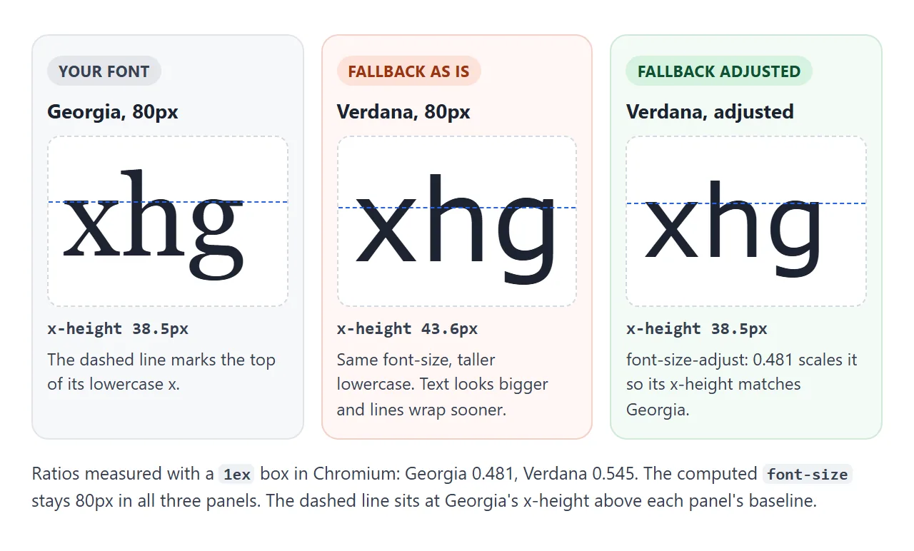
font-size-adjust takes one number: the x-height divided by the font size. Georgia measures 0.481 in Chromium and Verdana 0.545. With font-size-adjust: 0.481, Verdana's x-height at 200px came out within 0.1px of Georgia's.
body {
  font-family: Georgia, Verdana, sans-serif;
  font-size-adjust: 0.481;  /* Georgia's own ratio */
}
The main font is adjusted by the same rule, but because the number is its own ratio, it stays as it was. The computed font-size does not change either. Only the size the browser draws with does.
The finished demo measures your chosen font, applies its ratio to a fallback, and prints the CSS to copy.
<!doctype html>
<html lang="en">
<head>
<meta charset="utf-8">
<meta name="viewport" content="width=device-width, initial-scale=1">
<title>font-size-adjust for fallback fonts</title>
<style>
  body { margin: 0; padding: 14px; font-family: system-ui, sans-serif; background: #f4f5f7; color: #1d2330; }
  .bar { display: grid; grid-template-columns: auto 1fr; gap: 8px 10px; align-items: center; font-size: 14px; margin-bottom: 10px; }
  select { font: inherit; padding: 4px 6px; max-width: 100%; }
  .card { background: #fff; border-radius: 10px; padding: 10px 12px; margin-bottom: 8px; }
  .label { font: 600 12.5px ui-monospace, Consolas, monospace; color: #374151; }
  .sample { font-size: 22px; line-height: 1.35; margin-top: 4px; }
  .meta { font-size: 12.5px; color: #6b7280; margin-top: 4px; }
  label.tog { display: flex; gap: 8px; align-items: center; font-size: 14px; margin: 4px 0 10px; }
  pre { margin: 0; padding: 10px 12px; border-radius: 10px; background: #1d2330; color: #e5e7eb; font-size: 12.5px; white-space: pre-wrap; }
</style>
</head>
<body>
<div class="bar">
  <label for="primary">Your font:</label>
  <select id="primary">
    <option value="Georgia">Georgia</option>
    <option value="'Times New Roman'">Times New Roman</option>
    <option value="Arial">Arial</option>
  </select>
  <label for="fallback">Fallback:</label>
  <select id="fallback">
    <option value="Verdana, sans-serif">Verdana</option>
    <option value="sans-serif">sans-serif</option>
    <option value="serif">serif</option>
    <option value="monospace">monospace</option>
  </select>
</div>

<div class="card">
  <div class="label" id="pLabel"></div>
  <div class="sample" id="pSample">The quick brown fox jumps over the lazy dog.</div>
  <div class="meta" id="pMeta"></div>
</div>

<label class="tog"><input type="checkbox" id="adjust" checked> Apply font-size-adjust to the fallback</label>

<div class="card">
  <div class="label">The fallback, as it shows if your font fails</div>
  <div class="sample" id="fSample">The quick brown fox jumps over the lazy dog.</div>
  <div class="meta" id="fMeta"></div>
</div>
<pre id="css"></pre>

<script>
  const primary = document.getElementById('primary');
  const fallback = document.getElementById('fallback');
  const adjust = document.getElementById('adjust');

  // x-height divided by font size: the number font-size-adjust takes
  function ratio(family) {
    const s = document.createElement('span');
    s.style.cssText = 'position:absolute;visibility:hidden;display:inline-block;font-size:100px;height:1ex';
    s.style.fontFamily = family;
    document.body.append(s);
    const r = s.getBoundingClientRect().height / 100;
    s.remove();
    return r;
  }

  function render() {
    const value = ratio(primary.value).toFixed(3);
    document.getElementById('pLabel').textContent = 'Your font: ' + primary.value;
    document.getElementById('pSample').style.fontFamily = primary.value;
    document.getElementById('pMeta').textContent = 'x-height ratio ' + value;

    const f = document.getElementById('fSample');
    f.style.fontFamily = fallback.value;  // stands in for the page after your font fails to load
    f.style.fontSizeAdjust = adjust.checked ? value : 'none';
    document.getElementById('fMeta').textContent = 'x-height ratio ' + ratio(fallback.value).toFixed(3) +
      (adjust.checked ? ', scaled to ' + value : ', not adjusted');

    document.getElementById('css').textContent =
      'body {\n  font-family: ' + primary.value + ', ' + fallback.value + ';\n' +
      '  font-size-adjust: ' + value + ';\n}';
  }

  [primary, fallback, adjust].forEach((el) => el.addEventListener('change', render));
  render();
</script>
</body>
</html>
To find the ratio, measure it instead of guessing. A box that is 1ex tall at 100px gives the ratio directly. This is the same code the demo runs:
function ratio(family) {
  const s = document.createElement('span');
  s.style.cssText = 'position:absolute;visibility:hidden;' +
    'display:inline-block;font-size:100px;height:1ex';
  s.style.fontFamily = family;
  document.body.append(s);
  const r = s.getBoundingClientRect().height / 100;
  s.remove();
  return r;
}
Run it only when the font is loaded. Otherwise you measure the fallback. The keyword from-font looks like a shortcut, but it reads the first font that is available. When your main font fails, that is the fallback, and in our test nothing changed.
Newer browsers also accept a metric name, such as cap-height 0.7, to match capital letters instead.
For a web font you host yourself, the size-adjust descriptor in @font-face is another way to size a local fallback. Fonts not loading covers why the main font fails in the first place.
Where the other font settings live
Rendering properties decide how the chosen glyphs are placed and drawn. Choosing different glyphs, such as tabular numbers or small caps, is a separate job. Font feature settings in CSS covers those.
Spacing is separate too. letter-spacing adds the same gap after every letter, while kerning changes the gap per pair. Letter spacing in CSS has the details.
When it does not work
| What you see | Cause | Fix |
|---|---|---|
| optimizeLegibility changes nothing | Chromium already kerns and uses common ligatures | Remove it, or test with the demo above |
| Font smoothing does nothing | It only works on macOS | Test on a Mac, or drop it |
| font-kerning: normal changes nothing | Kerning is already on, or the font has no kerning | Compare with none to check |
| Monospace text ignores kerning | Monospace fonts have no kern pairs | Expected |
| The fallback font looks bigger | Its x-height is taller than your font's | Set font-size-adjust to your font's ratio |
| from-font does not help | It reads the fallback when the main font is missing | Write the ratio as a number |
| The ratio is wrong | Measured before the web font loaded | Measure after the font has loaded |
Share it as a link
Font rendering is the one topic where a screenshot proves nothing. The picture shows your screen, not the screen of the person you send it to.
To let someone run these tests on their own device, paste the page into a NOS document and choose Create share link. HTML to link walks through it.
The page renders as written and its scripts run, so the widths they see are measured in their browser. If you change the code later, the same link shows the new version.