An export turns an interactive report into a picture of one. That is sometimes what is needed and it changes the document's job entirely.
This guide covers what disappears, how to compensate, and when not to export at all.
What disappears
Filters. Frozen at whatever was selected when the export ran. The reader cannot change them and often cannot tell what they were.
Tooltips. Gone. Any value that only existed on hover is now unavailable, and dashboards frequently put important detail there.
Drill-through. Gone. The reader sees the summary with no route to the detail.
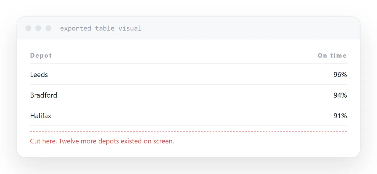
Scrolling visuals. Cut at the edge of the visual. A table showing twenty rows on screen exports the first eight, with nothing to indicate the rest exist.
That last one is the most dangerous, because it produces a document that looks complete and is not.
| On screen | Exported | |
|---|---|---|
| Change filters | Yes | No |
| Tooltips | Yes | No |
| Drill to detail | Yes | No |
| Long tables | Scroll | Cut off |
| Current figures | Yes | As at export time |
Write the filter state into the report
The reader needs to know what the numbers cover.
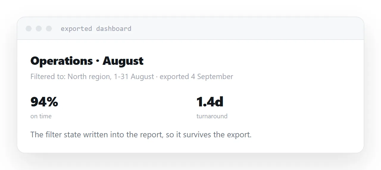
Add a text box to the report that states it: the date range, the region, the product line, whatever is filtered. It appears in the export because it is part of the report.
Without it, an exported dashboard is a set of figures with no stated scope, which is how the same number ends up meaning two different things in two meetings.
Add the commentary
On screen, the reader explores to understand. In an export they cannot, so the understanding has to be supplied.
A short paragraph saying what changed and why, placed in the report, does more for an external reader than any visual. It also survives the export intact.
This is work that a dashboard normally avoids by being interactive, and the export removes the avoidance.
Date it visibly
An exported dashboard circulates. It gets forwarded, saved, and opened in a meeting six weeks later.
Put the date in the report header so it appears in the export, prominently enough that someone reading it in a meeting sees it.
Undated exports are quoted as current figures long after they stopped being current, and the person who exported it is not in the room to say so.
Scheduled exports automate staleness
Scheduling a report to arrive weekly feels like a service and mostly is not.
What arrives is a snapshot that was accurate on Monday morning, read on Thursday, and quoted the following week. The recipient has no way to get a current figure without asking.
If someone needs the numbers regularly, give them an address they can open when they want. Then the figures are current whenever they look, and you stop producing a document that is out of date on arrival.
For the surrounding ground, see How to share a Power BI report outside your organisation and How to share an HTML dashboard as a link.
Put it at an address
Write the filter state into the report, check anything that scrolls, add the commentary, date it visibly, and publish a page for anyone who reads it regularly.
Then the exported document says what it covers and when.