Chrome DevTools is a set of panels built into Chrome that show what the browser actually did with your HTML. Open it with F12 (or Cmd+Option+I on a Mac), or right-click the part of the page that looks wrong and choose Inspect.
Try it on this page first. The button below has lost its label. Right-click it, choose Inspect, and find out why before you open the answer.
<!doctype html>
<html lang="en">
<head>
<meta charset="utf-8">
<meta name="viewport" content="width=device-width, initial-scale=1">
<title>Find the bug: the invisible button</title>
<style>
  body { margin: 0; padding: 16px; font-family: system-ui, sans-serif; background: #f4f5f7; color: #1d2330; }
  .card {
    max-width: 340px; padding: 18px 20px; border-radius: 12px;
    background: #fff; box-shadow: 0 6px 20px rgba(0, 0, 0, .1);
  }
  .card h2 { margin: 0 0 6px; font-size: 19px; }
  .card p { margin: 0 0 14px; color: #555; font-size: 14px; }
  .card button {
    padding: 10px 18px; border: 0; border-radius: 8px;
    background: #2563eb; color: #fff; font-size: 15px; cursor: pointer;
  }
  /* written later, for "primary" links elsewhere on the site */
  button.primary { color: #2563eb; }

  .task { margin: 16px 0 0; max-width: 340px; font-size: 14px; line-height: 1.5; }
  details { margin-top: 8px; max-width: 340px; font-size: 14px; line-height: 1.5; }
  summary { cursor: pointer; font-weight: 600; color: #2563eb; }
  code { background: #eef1f5; padding: 0 4px; border-radius: 4px; }
</style>
</head>
<body>
<div class="card">
  <h2>Weekly notes</h2>
  <p>One short email every Monday.</p>
  <button class="primary" id="join">Subscribe</button>
</div>

<p class="task"><b>Find the bug:</b> the button has lost its label. Right-click the blue button, choose <i>Inspect</i>, and look for a crossed-out line in the Styles pane.</p>
<details>
  <summary>Show the answer</summary>
  <p><code>.card button</code> sets <code>color: #fff</code>, but the later rule <code>button.primary</code> has the same specificity and wins, so the text is blue on blue. DevTools shows the white color crossed out.</p>
  <p>Fix: delete the <code>button.primary</code> rule, or scope it to links. Try it in the code.</p>
</details>
</body>
</html>
Nothing on your own page needs to change for this to work. DevTools reads any page Chrome has open, including a file opened from your disk.
Four panels, four questions
Four questions come up again and again on a hand-made page, and each has its own panel. You do not need the rest of DevTools to start.
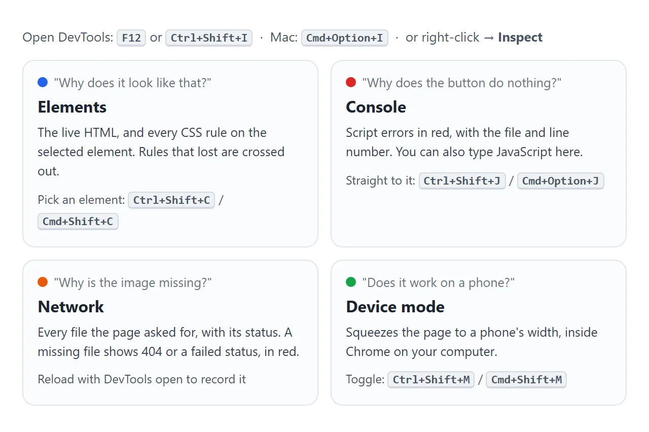
| Question | Panel | What to look at |
|---|---|---|
| Why does it look like that? | Elements | The Styles pane for the selected element |
| Why does the button do nothing? | Console | Red error lines |
| Why is the image or stylesheet missing? | Network | Rows with 404 or a failed status |
| Why does it break on a phone? | Device mode | The page at a phone's width |
If this is a page that looked fine and suddenly does not, start with HTML page not displaying properly in Chrome instead. It covers the cache, extensions and profile problems that sit outside your code.
Inspect an element and read the Styles pane
Right-click an element and choose Inspect, or press Ctrl+Shift+C (Cmd+Shift+C on a Mac) and click it. The Elements panel highlights its HTML, and the Styles pane lists every CSS rule that matches it.
Rules are listed with the one that takes precedence at the top. A declaration that lost to another rule is crossed out. That is the whole trick behind the demo above.
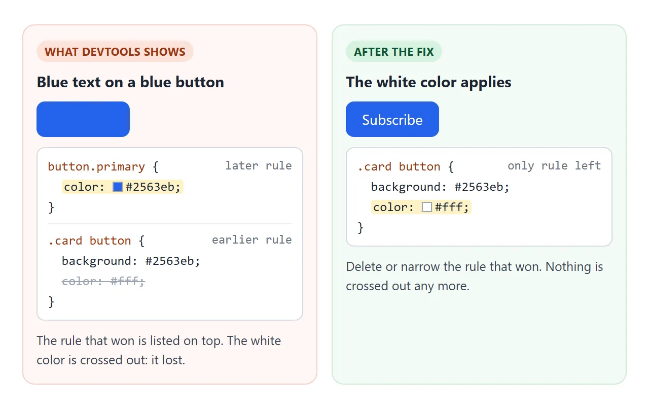
When two selectors have the same specificity, the one later in the file wins. Here both rules are one class plus one element, so the later one sets the text to the same blue as the background.
Edit CSS live, then copy it back
Every value in the Styles pane is editable. Click a value and type, or use the arrow keys on a number. Untick the checkbox next to a line to switch it off. The page updates as you type.
These edits live only in that tab. Reload and they are gone, so once something works, copy it into your file. Three more controls in the Elements panel help:
- Computed tab: the final value of each property, after every rule is applied.
- Box model diagram: the element's content size, padding, border and margin, with numbers.
- :hov button: forces states such as :hover and :focus, so you can style them without holding the mouse still.
Read the Console when a script fails
When a script throws an error, the rest of that function stops running. The page gives no sign of it. The Console does: it prints the error in red, with a link to the file and line.
<!doctype html>
<html lang="en">
<head>
<meta charset="utf-8">
<meta name="viewport" content="width=device-width, initial-scale=1">
<title>Find the bug: the button that does nothing</title>
<style>
  body { margin: 0; padding: 16px; font-family: system-ui, sans-serif; background: #f4f5f7; color: #1d2330; }
  .shop {
    display: flex; align-items: center; gap: 14px; flex-wrap: wrap;
    max-width: 360px; padding: 16px 18px; border-radius: 12px;
    background: #fff; box-shadow: 0 6px 20px rgba(0, 0, 0, .1);
  }
  .shop button {
    padding: 10px 16px; border: 0; border-radius: 8px;
    background: #16a34a; color: #fff; font-size: 15px; cursor: pointer;
  }
  .count { font-size: 15px; }
  .task { margin: 16px 0 0; max-width: 360px; font-size: 14px; line-height: 1.5; }
  details { margin-top: 8px; max-width: 360px; font-size: 14px; line-height: 1.5; }
  summary { cursor: pointer; font-weight: 600; color: #2563eb; }
  code { background: #eef1f5; padding: 0 4px; border-radius: 4px; }
  #said { font-family: ui-monospace, Consolas, monospace; font-size: 13px; color: #b91c1c; }
</style>
</head>
<body>
<div class="shop">
  <button id="add">Add to cart</button>
  <span class="count">In cart: <b id="count">0</b></span>
</div>

<p class="task"><b>Find the bug:</b> click <i>Add to cart</i>. Nothing happens. Open DevTools (F12), go to the Console tab, click again, and read the red line.</p>
<details>
  <summary>Show the answer</summary>
  <p>The console says: <span id="said">(click the button first)</span></p>
  <p><code>total</code> is used but never declared. Add <code>let total = 0;</code> above the listener in the code and the counter works.</p>
</details>

<script>
  const add = document.getElementById('add');
  const count = document.getElementById('count');

  add.addEventListener('click', () => {
    total = total + 1;          // the bug: total was never declared
    count.textContent = total;
  });

  // Copies uncaught errors onto the page, for readers on a phone with no DevTools
  window.addEventListener('error', (e) => {
    document.getElementById('said').textContent = 'Uncaught ' + e.message.replace(/^Uncaught /, '');
  });
</script>
</body>
</html>
In Chrome the red line reads like this:
Uncaught ReferenceError: total is not defined
Click the file name on the right of the error to jump to the line.
An error that happens on a click only appears after the click, so keep the Console open while you reproduce the problem. For other reasons scripts do nothing, see HTML JavaScript not working.
The Console also runs JavaScript you type. After selecting an element in the Elements panel, type $0 in the Console to get that element.
Find 404s in the Network panel
A missing image, stylesheet or script usually leaves no error on the page. The Network panel lists every file the page requested, with a status code. It records only while DevTools is open, so open it and then reload.
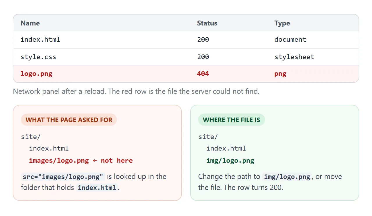
A 404 means the server was asked for a file at that address and did not have it. On a page opened from disk there is no server, so the row fails instead.
In the Console, Chrome reports the same miss in one of two forms:
Failed to load resource: the server responded with a status of 404
Failed to load resource: net::ERR_FILE_NOT_FOUND
Click the red row and look at the full address Chrome asked for. Compare it with where the file really is: a wrong folder, a typo, or Logo.png against logo.png.
Relative vs absolute paths explains how the address is built. The Disable cache box at the top of the panel makes sure you see fresh files while DevTools is open.
Test a phone width with device mode
Press Ctrl+Shift+M (Cmd+Shift+M on a Mac) with DevTools open, or click the phone-and-tablet icon at its top left. The page shrinks to a phone-sized viewport. Pick a phone from the list, or type a width such as 390.
<!doctype html>
<html lang="en">
<head>
<meta charset="utf-8">
<meta name="viewport" content="width=device-width, initial-scale=1">
<title>Find the bug: sideways scroll on a phone</title>
<style>
  body { margin: 0; padding: 16px; font-family: system-ui, sans-serif; background: #f4f5f7; color: #1d2330; }
  .page { max-width: 560px; }
  h2 { margin: 0 0 6px; font-size: 20px; }
  p { margin: 0 0 12px; font-size: 14px; line-height: 1.5; }
  .promo {
    width: 480px;               /* fine on a laptop, too wide for a phone */
    padding: 14px 16px; border-radius: 10px; box-sizing: border-box;
    background: linear-gradient(90deg, #fde68a, #fca5a5); font-weight: 600;
  }
  .tools { display: flex; gap: 8px; flex-wrap: wrap; margin: 14px 0 8px; }
  .tools button { padding: 8px 12px; border: 1px solid #cbd2dc; border-radius: 8px; background: #fff; font-size: 14px; cursor: pointer; }
  .outline * { outline: 1px solid #ef4444; }   /* shows every box's edge */
  #out { font-family: ui-monospace, Consolas, monospace; font-size: 13px; white-space: pre-wrap; margin: 0; }
  details { margin-top: 8px; font-size: 14px; line-height: 1.5; }
  summary { cursor: pointer; font-weight: 600; color: #2563eb; }
  code { background: #eef1f5; padding: 0 4px; border-radius: 4px; }
</style>
</head>
<body>
<div class="page" id="page">
  <h2>Spring menu</h2>
  <p>Fresh pasta, seasonal greens, and a short list of natural wines.</p>
  <div class="promo">Book before Friday for a free dessert</div>
  <p><b>Find the bug:</b> on a laptop this looks fine. Turn on device mode (Ctrl+Shift+M, or Cmd+Shift+M on a Mac) at 390 wide, or open it on a phone. The page scrolls sideways. Which element is too wide?</p>
</div>

<div class="tools">
  <button id="outline">Outline every box</button>
  <button id="check">List elements wider than the screen</button>
</div>
<pre id="out"></pre>

<details>
  <summary>Show the answer</summary>
  <p><code>.promo</code> has a fixed <code>width: 480px</code>. Change it to <code>max-width: 480px</code> and it shrinks to fit a narrow screen.</p>
</details>

<script>
  document.getElementById('outline').addEventListener('click', () => {
    document.body.classList.toggle('outline');
  });

  // Same check you can paste into the Console on any page
  document.getElementById('check').addEventListener('click', () => {
    const screenW = document.documentElement.clientWidth;
    const right = (el) => el.getBoundingClientRect().right + scrollX;  // right edge on the page
    const wide = [...document.querySelectorAll('body *')].filter((el) => right(el) > screenW);
    document.getElementById('out').textContent = wide.length
      ? 'Screen is ' + screenW + 'px. Too wide:\n' + wide.map((el) =>
          el.tagName.toLowerCase() + (el.className ? '.' + el.className : '') +
          ' ends at ' + Math.round(right(el)) + 'px').join('\n')
      : 'Screen is ' + screenW + 'px. Nothing sticks out.';
  });
</script>
</body>
</html>
The usual cause of sideways scrolling is one element with a fixed width wider than the screen. To find it on any page, paste this into the Console:
const w = document.documentElement.clientWidth;
[...document.querySelectorAll('body *')]
  .filter(el => el.getBoundingClientRect().right > w);
The result lists every element whose right edge is past the screen. Replace a fixed width with max-width and it shrinks to fit.
If the whole page looks tiny in device mode, the <head> is missing the viewport meta tag.
In our test with Chromium's phone emulation, a page without it was laid out 980 pixels wide and scaled down, while the same page with it was laid out at 390.
Device mode is still Chrome on your computer. It will not show problems specific to Safari or another phone browser, so check a finished page on a real phone too.
When it does not work
| What you see | Cause | Fix |
|---|---|---|
| Your CSS change has no effect | Another rule wins | Find it above the crossed-out line in Styles |
| The rule is not listed at all | The selector does not match, or the file did not load | Check the class name, then the Network panel |
| A value is crossed out with a warning icon | The value is invalid, such as a typo in a unit | Correct the value |
| Edits vanish on reload | DevTools changes are not saved to your file | Copy the change into your file |
| Network panel is empty | DevTools opened after the page loaded | Reload with DevTools open |
| Console shows nothing but the button still fails | The code never ran, or no listener is attached | Check the script tag and the element id |
| Page is tiny in device mode | No viewport meta tag | Add it to the head |
Share it as a link
Once the page works, the people you built it for still need to see it. A screenshot shows the layout but none of the behaviour, and an .html attachment may open as plain text on a phone.
To send the working version, paste the page into a NOS document and choose Create share link. HTML to link walks through it.
The page renders as written and its scripts run, so the people you send it to can click and scroll it themselves, and open DevTools on it too. If you fix something later, the same link shows the new version.