An HTML page not displaying properly in Chrome splits into two cases, and a guest window separates them in seconds. Open the page in a guest window: correct there means your profile is at fault, wrong there means the file is.
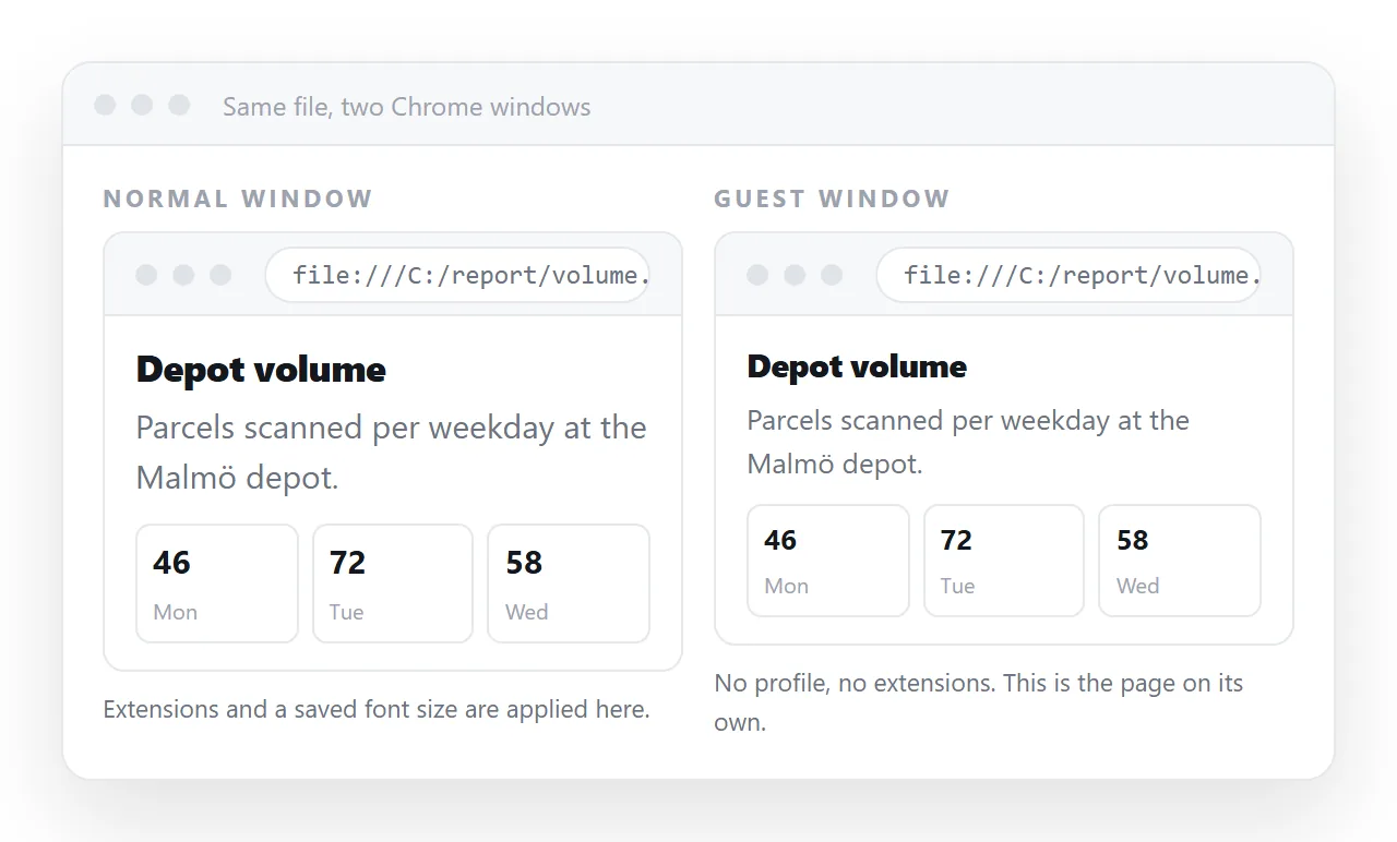
Do that first. Everything below is ordered by how often it turns out to be the answer.
HTML page not displaying properly in Chrome: diagnosis order
| Symptom | Likely cause | Where to look |
|---|---|---|
| Correct in guest, wrong in your profile | Extension or cached copy | Disable extensions, hard reload |
| Spacing and widths differ from other browsers | Quirks mode | Missing doctype |
| Styles or images absent only when opened from disk | Local file restrictions | File protocol |
| Text overflows, layout cut off on small screens | Missing viewport line | Viewport meta tag |
| Blank page, nothing renders | Script error or a policy block | Console |
| Odd characters instead of letters | Charset not declared | <meta charset="utf-8"> |
Cache, first because it is most common
Chrome will hold a stylesheet or a script long after you changed it, and the page you are staring at is a mixture of old and new.
Open developer tools, right click the reload button, and choose Empty cache and hard reload. That clears the question for this one page.
If the page is served with long cache headers, editing the file is not enough for your readers either. Change the asset address itself, which is what cache busting does with a version query.
Quirks mode
A page without a doctype on the first line is rendered in a legacy compatibility mode, where the box model and some inherited properties behave differently.
<!doctype html>
<html lang="en">
The effect is subtle: widths that include padding in one mode and not the other, tables spacing differently, line heights shifting. It shows up as "close, but wrong".
Add the doctype as the very first line, before any comment or blank line. Then check box sizing, which is the property most often blamed for what quirks mode caused.
Local file restrictions
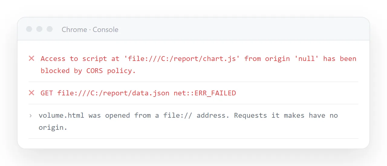
Chrome restricts pages opened by double clicking more tightly than some other browsers. A script trying to read a neighbouring file, load a module, or fetch JSON is blocked.
The console names each block. If your page builds its content from fetched data, this is why it is empty.
Two ways out. Inline the data and the assets so nothing is fetched, or open the page from an address rather than from disk. Self-contained HTML covers the first.
Extensions
Ad blockers, dark mode extensions, privacy tools and translation tools all alter pages. Several of them hide elements whose class names look like advertising.
The guest window test above identifies this. If the page is right in guest and wrong in your profile, disable extensions one at a time.
This matters for a second reason: you may be debugging a fault that no reader ever sees, or shipping a page that only looks right because of something installed on your machine.
Small screens
Chrome on a phone lays a page out at desktop width and scales it down when the viewport line is missing, which reads as tiny text rather than as a bug.
<meta name="viewport" content="width=device-width,initial-scale=1">
Use Chrome's device toolbar to check at phone width before shipping. Fixed pixel widths and wide tables are the usual casualties, and a media query handles both.
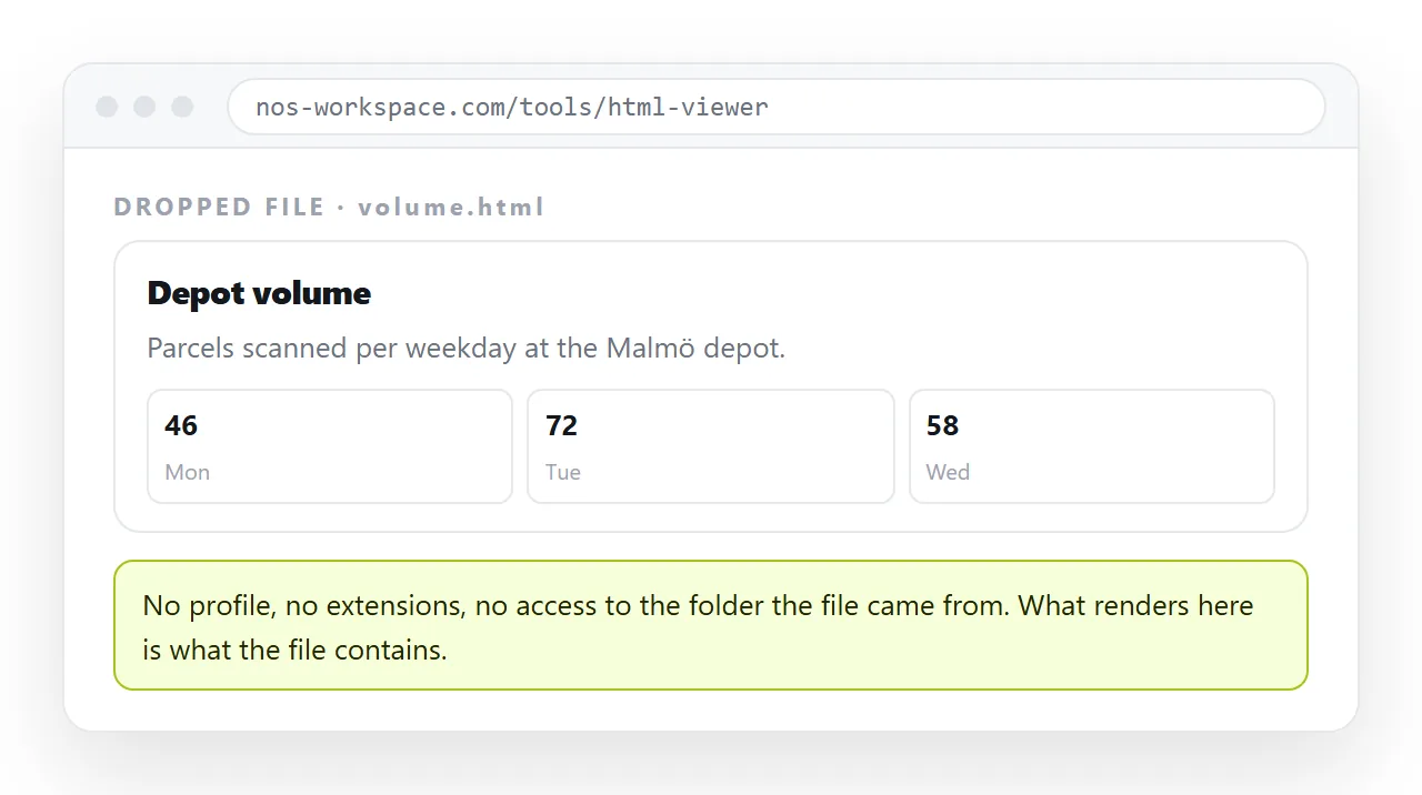
Your Chrome has your cache, your extensions and your folder. It is the least representative environment available.
Drop the file into the HTML file opener, which has never seen your project. Then paste the HTML into a document, create a share link, and open that in a private window.
If both of those look right, the page is fine and the difference was local to your machine.
Narrow it down before rewriting anything. Missing styling points at CSS not loading. Broken picture icons point at images not loading. Wrong typeface points at a web font that failed and fell back.
Each of those has its own short chain of causes, and the console usually names the one you have.
Chrome on a phone is a different check
The device toolbar simulates width, not the mobile engine, so it misses a few real differences.
Viewport height units behave differently where the address bar collapses on scroll. Hover styles have no equivalent, so anything only reachable on hover is unreachable. And a wide table produces horizontal scrolling that is far more disruptive on a small screen.
Open the actual page on an actual phone before you decide it is finished.
Chrome, and several extensions, can recolour a page the author did not design for.
If your page sets a light background but not a text colour, a dark preference can produce dark text on a dark background. Set both, together, on every element that sets either. Dark mode CSS covers the pattern.
Work from the outside in. Confirm the page is correct in a guest window, then in a private window, then in your own profile. The first step that fails names the layer responsible.
If it is wrong in all three, the file is wrong, and the console will usually say why before you have read a line of CSS.