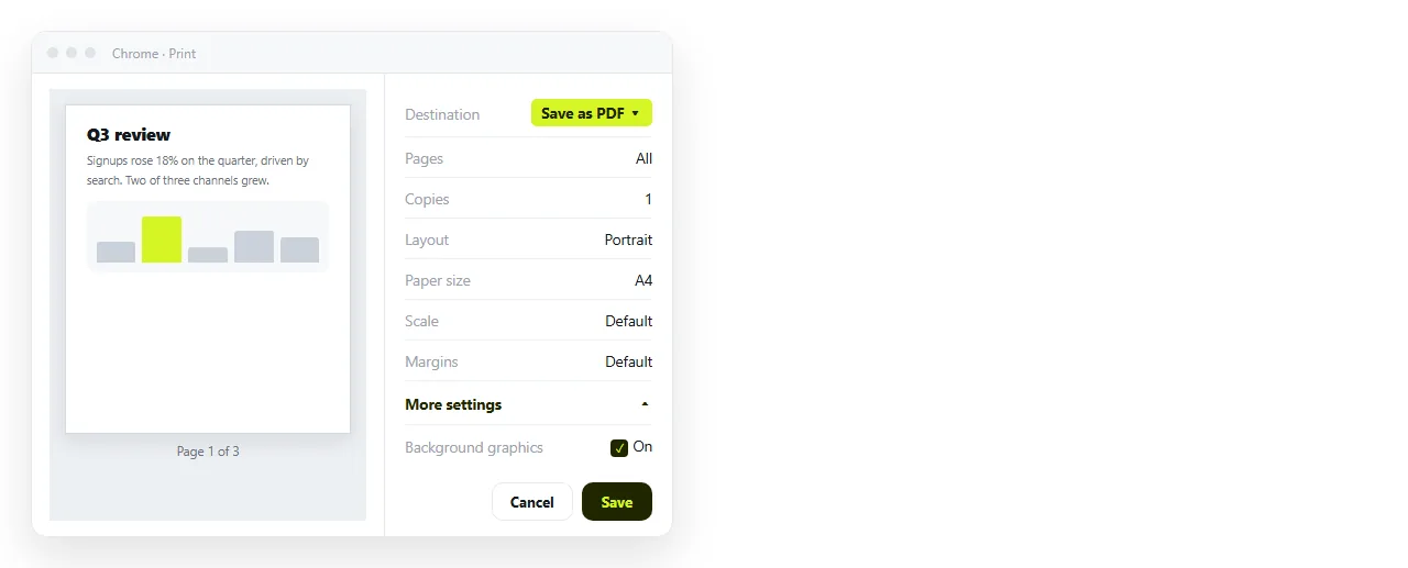
To convert HTML to PDF without losing formatting, print from a browser with Background graphics ticked, and add a small print stylesheet that fixes the page width and the page breaks.
Those two moves account for nearly every complaint about broken exports. The rest of this page is the detail behind them.
HTML to PDF without losing formatting: what goes wrong
| Symptom | Cause | Fix |
|---|---|---|
| Colours and shading gone | Background graphics off | Tick it in More settings |
| Layout collapsed to one column | Mobile media query fired at paper width | Print media query, or landscape |
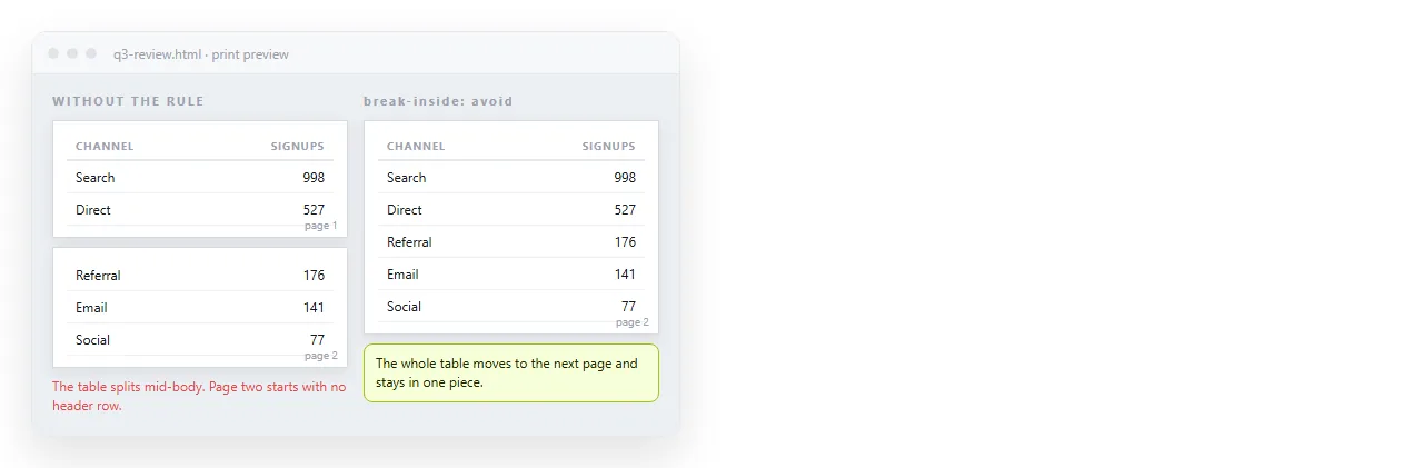
| Table cut in half | No break rules | break-inside: avoid |
| Text tiny or huge | Scale set wrong | Set scale to 100, then adjust |
| Blank sections | Content that animates in on scroll | Disable the animation for print |
| Missing fonts | Web font had not loaded | Wait for the page, then print |
Notice that none of these are the converter's fault. They are the page telling the printer something the printer then honours.
The six settings, in order
1. Background graphics on. It sits under More settings in the Chrome print dialog and is off by default. This is the single biggest cause of a report that looks grey and empty in PDF.
2. Margins. Default leaves a wide border and reflows tight layouts. None gives you edge to edge, which suits dashboards and looks wrong for prose. Pick deliberately.
3. Scale. Leave it at 100 first and see what happens. Fit to page width rescues a table that overflows, at the cost of making everything smaller.
4. Paper size and orientation. A wide dashboard belongs in landscape. A memo belongs in portrait. Changing this is faster than rewriting the CSS.
5. Headers and footers. The browser adds the page title, the address and a date unless you untick it. For an internal draft it is useful. For something client facing it looks unfinished.
6. Print the page, not the screenshot. Real printing gives you selectable text and working links. Keeping links clickable covers why that matters more than people expect.
The print stylesheet that fixes most of it
Add this inside the page before exporting. It is short and it survives being pasted anywhere.
@media print {
  body { background: #fff; color: #111; }
  .sidebar, .nav, .no-print { display: none; }
  table, figure, .card { break-inside: avoid; }
  h2, h3 { break-after: avoid; }
  a[href^="http"]::after { content: " (" attr(href) ")"; }
}
Four rules, four different problems.
- The first forces readable contrast on paper, since a dark theme prints as a sheet of ink.
- The second removes navigation and controls that mean nothing on paper.
- The third and fourth stop tables, cards and headings being cut at a page boundary.
- The last one writes link addresses out in brackets, so a printed copy is still usable.
Print stylesheets goes further into the rules and when each one is worth adding.
The width problem, specifically
This is the one people misdiagnose. A page that looks correct on a wide monitor exports as a narrow single column, and it seems like the export broke.
It did not. A sheet of A4 at typical print scale is narrower than your browser window, so a @media (max-width: 900px) rule fires and the page shows its phone layout.
Two ways out. Switch to landscape, which widens the effective page. Or restate the wide layout inside @media print so the mobile rules lose.
Media queries explains the mechanism if the behaviour is unfamiliar.
What cannot survive, no matter the settings
Some things are not formatting loss. They are the difference between a page and a sheet of paper.
- Tabs, accordions and anything collapsed. Only the open panel prints. Expand everything first.
- Sorting and filtering. The PDF freezes whatever state the page was in.
- Hover states and tooltips. There is no pointer on paper.
- Scrolling regions. Only the visible slice of an inner scroll area prints.
- Video and audio. A poster frame at best.
If those parts are the document, a PDF is the wrong deliverable. PDF versus a live page sets out where the line falls.
Checking the result honestly
Open the PDF and the page side by side. Three specific checks catch most remaining problems.

- Page one, top to bottom. Colour, spacing, font. If page one is right the stylesheet is working.
- Every page boundary. Look at what got cut. That is where break rules earn their place.
- The last page. A stray blank page or a single orphaned line usually means a fixed height or a margin on the final element.
When the page came out of an AI chat
Generated pages tend to carry heavy dark theming and animated sections, both of which print badly. AI HTML to PDF covers the specific fixes for that source, and the general advice above still applies.
If the page needs to keep working as a page as well, give it an address before you export. Paste the HTML into a NOS document, then Share, Share link, Create link.
You send the link to people who want the working version, and attach the PDF for whoever needs a file in a folder. Neither copy has to pretend to be the other.