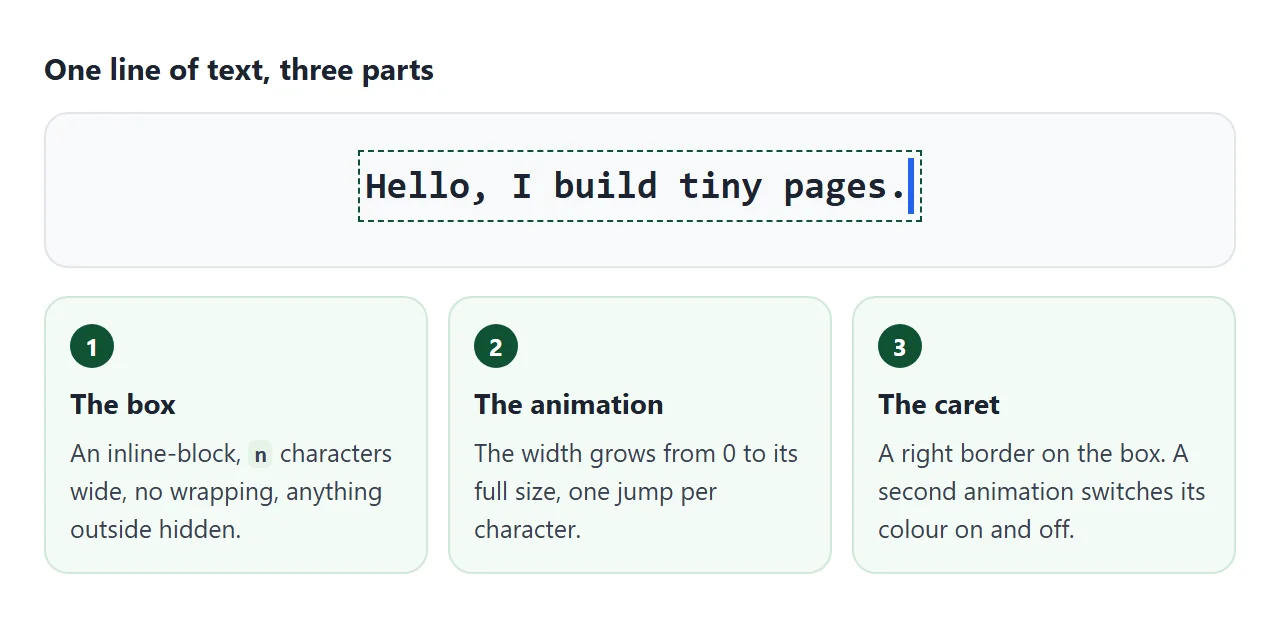
A typing effect in CSS is one line of monospace text in a box whose width grows from 0, one jump per character. steps() makes the jumps, overflow: hidden hides the untyped part, and a right border plays the caret. It fits in one file.
Try it. Change the text and press Replay. The effect itself is the CSS in the style block. The short script only puts your text in the box, counts it and replays the animation.
<!doctype html>
<html lang="en">
<head>
<meta charset="utf-8">
<meta name="viewport" content="width=device-width, initial-scale=1">
<title>Typing effect, smallest version</title>
<style>
  body { margin: 0; padding: 22px 16px; font-family: system-ui, sans-serif; background: #f4f5f7; }

  .typing {
    --n: 26;                                  /* number of characters in the text */
    display: inline-block;
    width: calc(var(--n) * 1ch);              /* exactly n characters wide */
    white-space: nowrap;                      /* never wrap to a second line */
    overflow: hidden;                         /* hide what is not typed yet */
    font: clamp(14px, 5vw, 20px) ui-monospace, Consolas, "Courier New", monospace;
    border-right: .12em solid #2563eb;        /* the caret */
    animation: typing 2.4s steps(var(--n)), caret .75s step-end infinite;
  }
  @keyframes typing { from { width: 0; } }
  @keyframes caret { 50% { border-color: transparent; } }

  /* controls for this page only */
  .tools { margin-top: 26px; display: flex; gap: 8px; flex-wrap: wrap; align-items: center; }
  input { flex: 1; min-width: 140px; padding: 8px 10px; font: 14px system-ui, sans-serif; border: 1px solid #c9cdd4; border-radius: 8px; }
  button { padding: 8px 14px; font: 600 14px system-ui, sans-serif; border: 0; border-radius: 8px; background: #2563eb; color: #fff; cursor: pointer; }
  #count { margin: 10px 0 0; font-size: 13px; color: #5b6270; }
</style>
</head>
<body>
<div><span class="typing" id="t">Hello, I build tiny pages.</span></div>

<div class="tools">
  <input id="text" value="Hello, I build tiny pages." maxlength="28" aria-label="Your text">
  <button id="go" type="button">Replay</button>
</div>
<p id="count"></p>

<script>
  const t = document.getElementById('t');
  const box = document.getElementById('text');
  const count = document.getElementById('count');

  function play() {
    const n = Math.max(1, box.value.length);
    t.textContent = box.value || ' ';
    t.style.setProperty('--n', n);                 // width and steps() both read --n
    count.textContent = n + ' characters, so steps(' + n + ') and width ' + n + 'ch';
    // remove the animation, force a layout, put it back: it starts again from zero
    t.style.animation = 'none';
    void t.offsetWidth;
    t.style.animation = '';
  }

  document.getElementById('go').addEventListener('click', play);
  box.addEventListener('input', play);
  play();
</script>
</body>
</html>
For looping phrases, deleting letters and emoji, see typewriter effect in CSS and JavaScript. This guide stays with the smallest single-file version: how to build it, change it and fix it.
The smallest typing effect file
Five steps build it:
- Put the text in an element, such as a
<span>, and give it a class. - Make that element a clipping box:
inline-block, no wrapping, overflow hidden, monospace font. - Set its width to the number of characters times
1ch, from a custom property named--n. - Add a keyframe that starts at width 0, and run it with
steps(var(--n)). - Add a
border-rightas the caret, and a second animation that blinks its colour.
This is the CSS the demo uses:
.typing {
  --n: 26;                           /* characters in the text */
  display: inline-block;
  width: calc(var(--n) * 1ch);
  white-space: nowrap;
  overflow: hidden;
  font: 20px ui-monospace, Consolas, "Courier New", monospace;
  border-right: .12em solid #2563eb; /* the caret */
  animation: typing 2.4s steps(var(--n)), caret .75s step-end infinite;
}
@keyframes typing { from { width: 0; } }
@keyframes caret { 50% { border-color: transparent; } }
The HTML is one element:
<span class="typing">Hello, I build tiny pages.</span>
Count the characters, spaces included, and write that number in --n.
How each line works
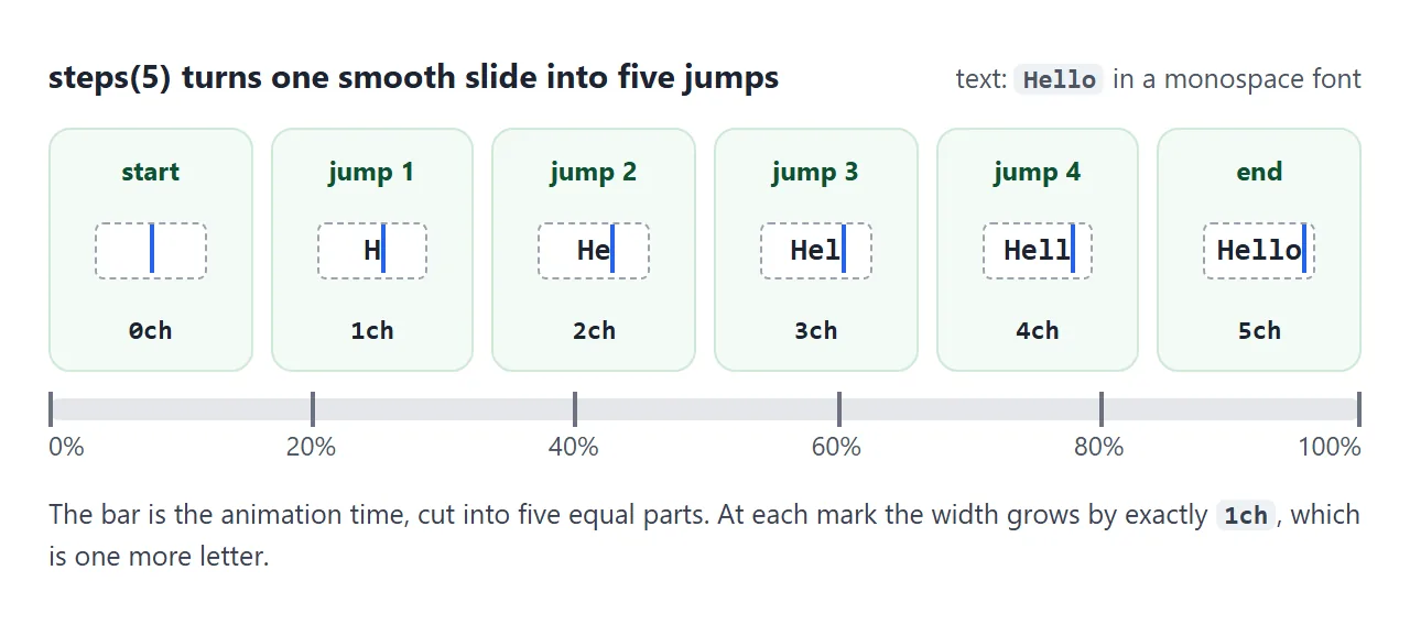
chis the width of the glyph "0" in the element's font. In a monospace font every glyph has the same width, so26chholds exactly 26 characters.--nandvar(). A custom property starts with two dashes, andvar()inserts its value into another property. One number now sets both the width and the number of steps.from { width: 0; }has notokeyframe. When one is missing, the browser finishes the animation with the element's own computed values, so it ends at the width you set.steps(26)divides the time into 26 equal intervals. The default jump isjump-end, so the last jump happens when the animation ends.overflow: hiddenclips content at the element's padding box.white-space: nowrapstops the text from breaking onto a second line.step-endis the same assteps(1, jump-end). The caret switches on and off. The default timing function,ease, would fade it instead.
Use your own text, speed and colour
Replace the text, then set --n to its length. In the demo the script does that with box.value.length. JavaScript counts a string in UTF-16 code units, so emoji and some other characters count as two. For those, see the typewriter guide.
Speed. The animation duration is how long one pass takes. Divide it by --n to get the time per letter. In the demo, 2.4s over 26 characters is about 0.09 seconds each.
Delay. animation-delay is the wait between applying the animation to the element and its start. The multi-line example below uses it.
Colour. The caret is a border, so change border-right and the blink colour. The caret-color property is a different thing: it colours the text cursor in inputs, textareas and contenteditable elements. See CSS caret-color.
Replay. A finished animation does not run again by itself. An animation continues until it ends or its name is removed, so the script removes it, reads offsetWidth so the browser lays the page out, then puts it back:
t.style.animation = 'none';  // remove the animation
void t.offsetWidth;          // force a layout
t.style.animation = '';      // put it back: it starts from zero
The mistakes that break it
Each piece of the build list does a job. Take one away and the effect fails in a recognisable way. Pick a mistake in the demo and press Replay to see it happen.
<!doctype html>
<html lang="en">
<head>
<meta charset="utf-8">
<meta name="viewport" content="width=device-width, initial-scale=1">
<title>Typing effect: break it on purpose</title>
<style>
  body { margin: 0; padding: 16px; font-family: system-ui, sans-serif; background: #f4f5f7; color: #1d2330; }
  .stage { height: 118px; padding: 12px 14px; background: #fff; border: 1px dashed #c9cdd4; border-radius: 10px; overflow: hidden; }

  .typing {
    --n: 26;
    display: inline-block;
    width: calc(var(--n) * 1ch);
    white-space: nowrap;
    overflow: hidden;
    font: clamp(13px, 4.6vw, 19px) ui-monospace, Consolas, "Courier New", monospace;
    border-right: .12em solid #2563eb;
    animation: typing 2.4s steps(var(--n)), caret .75s step-end infinite;
  }
  @keyframes typing { from { width: 0; } }
  @keyframes caret { 50% { border-color: transparent; } }

  /* one broken rule per mistake */
  .typing[data-bug="smooth"]  { animation: typing 2.4s, caret .75s step-end infinite; }
  .typing[data-bug="wrap"]    { white-space: normal; }
  .typing[data-bug="short"]   { --n: 20; }                 /* width and steps() say 20, text has 26 */
  .typing[data-bug="long"]    { --n: 34; }                 /* says 34, text has 26 */
  .typing[data-bug="visible"] { overflow: visible; }

  fieldset { margin: 14px 0 0; padding: 0; border: 0; display: grid; grid-template-columns: 1fr 1fr; gap: 6px 14px; }
  label { font-size: 13.5px; cursor: pointer; }
  button { margin-top: 12px; padding: 7px 14px; font: 600 14px system-ui, sans-serif; border: 0; border-radius: 8px; background: #2563eb; color: #fff; cursor: pointer; }
  #why { margin: 10px 0 0; font-size: 13.5px; line-height: 1.45; color: #374151; min-height: 40px; }
</style>
</head>
<body>
<div class="stage"><span class="typing" id="t" data-bug="ok">Hello, I build tiny pages.</span></div>

<fieldset>
  <label><input type="radio" name="bug" value="ok" checked> Correct</label>
  <label><input type="radio" name="bug" value="smooth"> No steps()</label>
  <label><input type="radio" name="bug" value="wrap"> No nowrap</label>
  <label><input type="radio" name="bug" value="short"> Count too small</label>
  <label><input type="radio" name="bug" value="long"> Count too big</label>
  <label><input type="radio" name="bug" value="visible"> No overflow: hidden</label>
</fieldset>
<button id="go" type="button">Replay</button>
<p id="why"></p>

<script>
  const t = document.getElementById('t');
  const why = document.getElementById('why');
  const notes = {
    ok: 'All five pieces in place: one letter per jump, one line, caret at the end.',
    smooth: 'Without steps() the width grows smoothly, so the box often ends in the middle of a letter.',
    wrap: 'Without nowrap the narrow box wraps the words onto new lines while it grows.',
    short: 'The count is smaller than the text, so the last letters never appear.',
    long: 'The count is bigger than the text, so the caret drifts past the end of the words.',
    visible: 'Without overflow: hidden the whole text is there from the start. Only the caret moves.'
  };

  function show() {
    const bug = document.querySelector('input[name="bug"]:checked').value;
    t.dataset.bug = bug;
    why.textContent = notes[bug];
    t.style.animation = 'none';   // restart: remove, force a layout, put back
    void t.offsetWidth;
    t.style.animation = '';
  }

  document.querySelectorAll('input[name="bug"]').forEach((r) => r.addEventListener('change', show));
  document.getElementById('go').addEventListener('click', show);
  show();
</script>
</body>
</html>
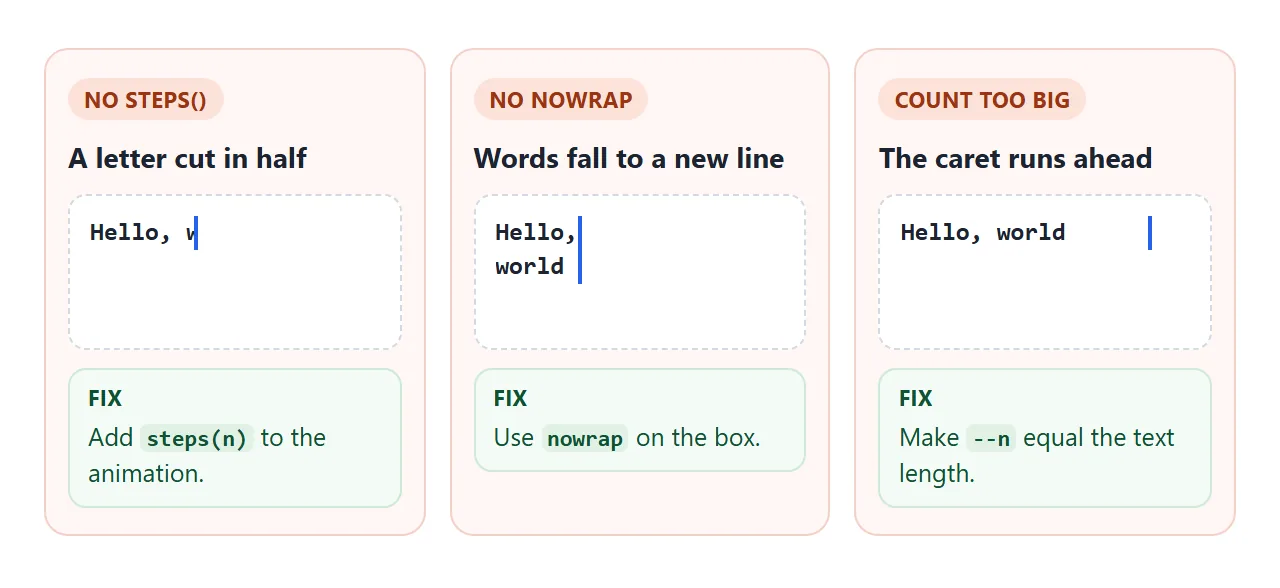
The same mistakes are listed with their fixes in the table further down. The one the demo cannot show is the font: in a font whose glyphs have different widths, the jumps are still 1ch each and stop between letters.
Several lines, one after another
Pure CSS has no "next phrase", but it can type several lines in order. Give each line its own element with its own --n and a start time --d, and delay each animation until the line before it has finished.
<!doctype html>
<html lang="en">
<head>
<meta charset="utf-8">
<meta name="viewport" content="width=device-width, initial-scale=1">
<title>Typing effect, several lines</title>
<style>
  body { margin: 0; padding: 16px; font-family: system-ui, sans-serif; background: #f4f5f7; }
  .card { padding: 22px 20px; border-radius: 14px; background: #0f172a; color: #e2e8f0; min-height: 120px; }
  .card p { margin: 0 0 10px; }

  .t {
    --c: #38bdf8;                       /* caret colour */
    --t: calc(var(--n) * .08s);         /* 0.08 s per character */
    display: inline-block;
    width: calc(var(--n) * 1ch);
    white-space: nowrap;
    overflow: hidden;
    font: clamp(14px, 4.8vw, 19px) ui-monospace, Consolas, "Courier New", monospace;
    border-right: .12em solid transparent;   /* caret is invisible until its line starts */
    animation:
      typing var(--t) steps(var(--n)) var(--d) backwards,   /* backwards: stay empty during the delay */
      caret .75s step-end var(--d) infinite,
      done 0s calc(var(--d) + var(--t)) forwards;           /* hide this caret when the line is finished */
  }
  .t.last { animation-name: typing, caret; }                /* the last line keeps its caret */

  @keyframes typing { from { width: 0; } }
  @keyframes caret { 0% { border-color: var(--c); } 50% { border-color: transparent; } }
  @keyframes done { to { border-color: transparent; } }

  @media (prefers-reduced-motion: reduce) {
    .t { animation: none; }               /* show the full text at once */
  }

  button { margin-top: 14px; padding: 8px 14px; font: 600 14px system-ui, sans-serif; border: 0; border-radius: 8px; background: #2563eb; color: #fff; cursor: pointer; }
</style>
</head>
<body>
<div class="card">
  <p><span class="t" style="--n:13; --d:.3s">Hi, I'm Mina.</span></p>
  <p><span class="t" style="--n:23; --d:1.7s">I make small web pages.</span></p>
  <p><span class="t last" style="--n:26; --d:3.9s">This one is a single file.</span></p>
</div>
<button id="go" type="button">Replay</button>

<script>
  document.getElementById('go').addEventListener('click', () => {
    const lines = document.querySelectorAll('.t');
    lines.forEach((el) => { el.style.animation = 'none'; });   // remove the animations
    void document.body.offsetWidth;                            // force a layout
    lines.forEach((el) => { el.style.animation = ''; });       // put them back: they start again
  });
</script>
</body>
</html>
Three details make it work:
backwardsfill.animation-fill-mode: backwardsapplies the first keyframe during the delay, so a waiting line stays at width 0 instead of showing its full text.- Speed per character.
--tiscalc(var(--n) * .08s), so every line types at the same speed whatever its length. - Caret hand-over. A third animation,
done, runs for 0 seconds when its line finishes and keeps the caret transparent. The last line leavesdoneout and keeps blinking.
The page also respects people who ask for less motion. prefers-reduced-motion: reduce matches when the user has turned that setting on in their device. The demo then sets animation: none, so all three lines appear at once with no caret.
When it does not work
| What you see | Cause | Fix |
|---|---|---|
| The whole text shows at once, only the caret moves | Nothing hides the untyped part | overflow: hidden |
| The text slides in smoothly, or a letter is cut in half | No steps(), so the default ease applies |
Add steps(n) to the animation |
| Words drop to a second line while typing | Wrapping is allowed | white-space: nowrap |
| The last letters never appear | --n is smaller than the text |
Count again, spaces included |
| The caret runs past the end of the text | --n is bigger than the text |
Make --n equal the length |
| Jumps stop between letters | The font is not monospace | Use a monospace font |
| The caret fades instead of blinking | The blink uses the default ease |
step-end on the blink |
| Typing is over before anyone scrolls to it | The animation begins when it is applied | Start it when the element is on screen, see IntersectionObserver |
| Replay does nothing | The animation already ended | Remove it, force a layout, put it back |
| Nothing animates, the text is just there | Reduced motion is on, or a name is misspelled | See CSS animation not working |
For the animation properties used here, CSS keyframes goes deeper, and CSS variables covers --n.
Share it as a link
A typing effect is a motion, and a screenshot freezes one frame of it. To send the working version, paste the page into a NOS document and choose Create share link. HTML to link walks through it.
The page renders as written and its scripts run, so anyone with the link can open it without an account, watch the text type and press Replay. If you change the text or the speed later, the same link shows the new version.