<img> 태그는 페이지에 그림을 넣습니다. 닫는 태그가 없으며 표시할 파일인 src와 그림을 나타내는 텍스트인 alt의 두 가지 속성이 필요합니다.
width 및 height도 추가하면 파일이 로드되는 동안 페이지가 점프하지 않습니다.
<img src="photos/shoe.jpg" alt="Red running shoe, side view" width="800" height="600">
한 번에 하나씩 속성을 사용해 보세요. 파란색 상자는 사진보다 좁은 용기입니다.
<!doctype html>
<html lang="en">
<head>
<meta charset="utf-8">
<meta name="viewport" content="width=device-width, initial-scale=1">
<title>img attribute playground</title>
<style>
  body { margin: 0; padding: 16px; font-family: system-ui, sans-serif; background: #f4f5f7; color: #1d2330; }
  .toggles { display: flex; flex-wrap: wrap; gap: 6px 14px; margin-bottom: 10px; font-size: 14px; }
  .toggles label { display: flex; align-items: center; gap: 6px; cursor: pointer; }
  code { font: 600 13px ui-monospace, Consolas, monospace; }
  button {
    font: 600 14px system-ui, sans-serif; padding: 7px 12px; border-radius: 8px;
    border: 1px solid #1d2330; background: #1d2330; color: #fff; cursor: pointer;
  }
  pre {
    margin: 10px 0; padding: 8px 10px; border-radius: 8px; background: #fff; border: 1px solid #e1e4ea;
    font: 12.5px/1.5 ui-monospace, Consolas, monospace; white-space: pre-wrap; word-break: break-all;
  }

  /* The container is narrower than the 600px picture. Blue shows its edges. */
  .stage { max-width: 320px; background: #cfe3ff; overflow: auto; }
  .after { max-width: 320px; margin: 0; padding: 8px 10px; background: #fff; font-size: 14px; border: 1px solid #e1e4ea; }

  /* These classes are switched on and off by the checkboxes */
  .fit  { max-width: 100%; }
  .auto { height: auto; }
  .block { display: block; }

  #readout { margin: 10px 0 0; font-size: 14px; line-height: 1.6; }
  .bad { color: #b42318; font-weight: 600; }
  .good { color: #0f7a3d; font-weight: 600; }
</style>
</head>
<body>
<div class="toggles">
  <label><input type="checkbox" id="dims"> <code>width="600" height="300"</code></label>
  <label><input type="checkbox" id="fit"> <code>max-width: 100%</code></label>
  <label><input type="checkbox" id="auto"> <code>height: auto</code></label>
  <label><input type="checkbox" id="block"> <code>display: block</code></label>
</div>
<button id="replay">Replay loading (1.5 s)</button>

<pre id="code"></pre>

<div class="stage" id="stage"><img id="pic" alt="Blue mountains under a yellow sun" src="data:image/svg+xml,%3Csvg xmlns='http://www.w3.org/2000/svg' width='600' height='300' viewBox='0 0 600 300'%3E%3Crect width='600' height='300' fill='%238ecae6'/%3E%3Ccircle cx='470' cy='80' r='36' fill='%23ffb703'/%3E%3Cpath d='M0 300 L150 130 L260 240 L360 110 L520 280 L600 200 V300Z' fill='%233b6e8f'/%3E%3Cpath d='M0 300 L120 225 L240 290 L380 205 L600 300Z' fill='%232a9d8f'/%3E%3C/svg%3E"></div>
<p class="after" id="after">This paragraph sits under the image.</p>

<p id="readout"></p>

<script>
  const img = document.getElementById('pic');
  const stage = document.getElementById('stage');
  const after = document.getElementById('after');
  const box = (id) => document.getElementById(id);
  let moved = null;  // how far the paragraph jumped on the last replay

  function apply() {
    if (box('dims').checked) { img.setAttribute('width', 600); img.setAttribute('height', 300); }
    else { img.removeAttribute('width'); img.removeAttribute('height'); }
    img.classList.toggle('fit', box('fit').checked);
    img.classList.toggle('auto', box('auto').checked);
    img.classList.toggle('block', box('block').checked);
    show();
  }

  function show() {
    const css = ['fit', 'auto', 'block'].filter((k) => box(k).checked)
      .map((k) => ({ fit: 'max-width: 100%;', auto: 'height: auto;', block: 'display: block;' })[k]);
    box('code').textContent =
      '<img src="mountains.svg" alt="Blue mountains"' +
      (box('dims').checked ? ' width="600" height="300"' : '') + '>\n' +
      'img { ' + (css.join(' ') || '/* no CSS */') + ' }';

    const r = img.getBoundingClientRect();
    const gap = Math.round(stage.getBoundingClientRect().top + stage.clientHeight - r.bottom);  // clientHeight skips the scrollbar
    const ratio = r.height ? (r.width / r.height).toFixed(2) : '-';
    const lines = [];
    lines.push('Image box: ' + Math.round(r.width) + ' x ' + Math.round(r.height) + ' px, ratio ' + ratio + ' (the file is 2.00)' +
      (ratio !== '2.00' && r.height ? ' <span class="bad">stretched</span>' : ''));
    lines.push('Wider than the container: ' + (r.width > stage.clientWidth + 1
      ? '<span class="bad">yes, it overflows</span>' : '<span class="good">no</span>'));
    lines.push('Blue gap under the image: ' + (gap > 0
      ? '<span class="bad">' + gap + ' px</span>' : '<span class="good">0 px</span>'));
    if (moved !== null) lines.push('Paragraph moved while loading: ' + (moved > 0
      ? '<span class="bad">' + moved + ' px</span>' : '<span class="good">0 px</span>'));
    box('readout').innerHTML = lines.join('<br>');
  }

  // Demo only: this picture lives inside the page, so it would appear at once.
  // Replay holds src back for 1.5 s to imitate a slow network. The img is hidden
  // meanwhile, and alt is held back too: an img with no src is drawn as a broken
  // image or as its alt text, which a loading image is not.
  box('replay').addEventListener('click', () => {
    const src = img.src, alt = img.alt;
    img.removeAttribute('src'); img.removeAttribute('alt');
    img.style.visibility = 'hidden';
    const before = after.getBoundingClientRect().top;
    moved = null; show();
    setTimeout(() => {
      img.addEventListener('load', () => {
        img.style.visibility = '';
        moved = Math.round(after.getBoundingClientRect().top - before);
        show();
      }, { once: true });
      img.alt = alt; img.src = src;
    }, 1500);
  });

  document.querySelectorAll('.toggles input').forEach((c) => c.addEventListener('change', () => { moved = null; apply(); }));
  img.addEventListener('load', show);
  apply();
</script>
</body>
</html>
모든 것을 끄고 시작하세요. 그림이 상자 밖으로 쏟아져 나오고 그 아래에 얇은 파란색 줄이 표시됩니다. 4개를 모두 선택하고 로딩을 다시 재생합니다. 단락이 그대로 유지됩니다.
속성은 하나씩
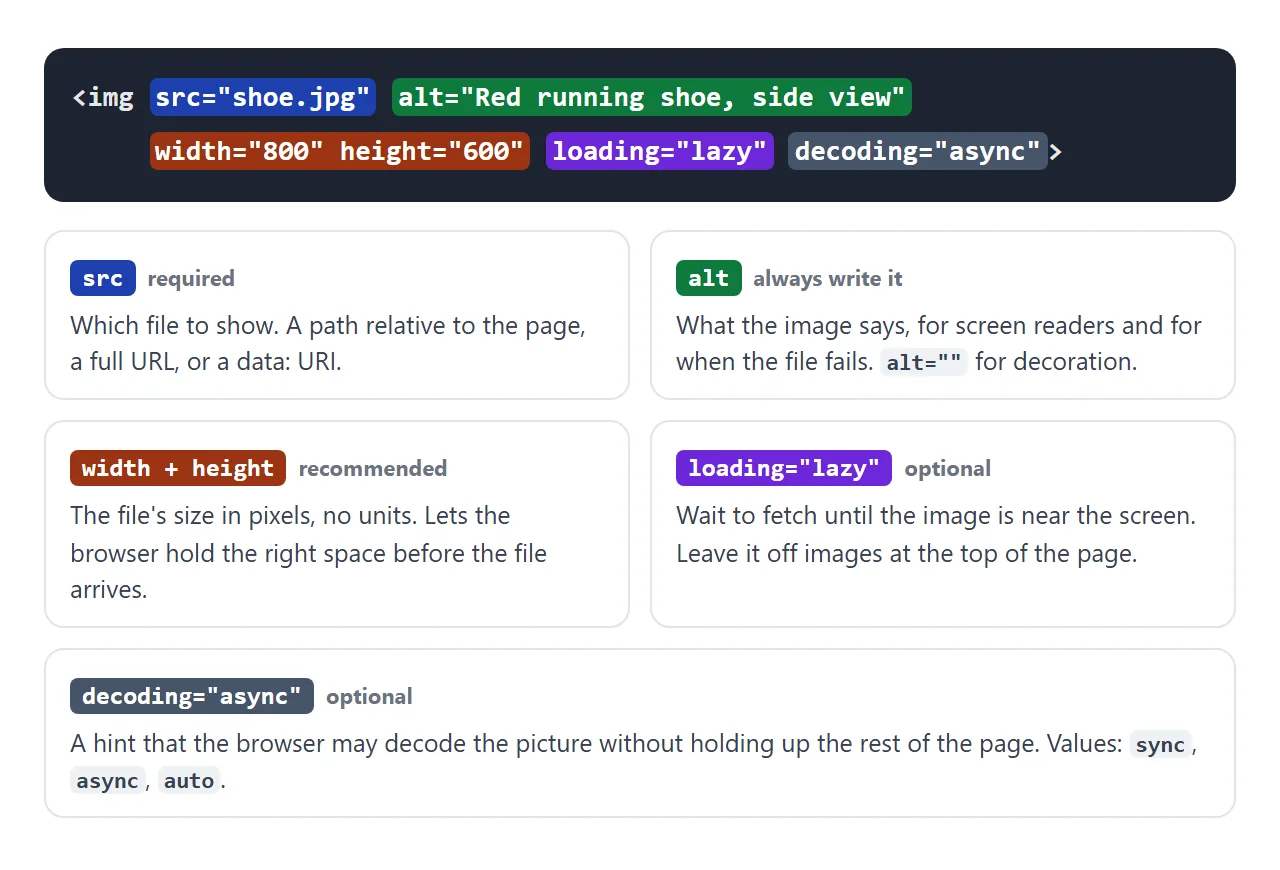
| 속성 | 기능 | 건너뛰고 |
|---|---|---|
src |
보여줄 파일 | 로드된 항목이 없습니다. |
alt |
이미지를 대체하는 텍스트 | 화면 판독기가 파일 이름을 읽을 수 있습니다. |
width, height |
적절한 비율로 공간을 확보하세요 | 이미지가 도착하면 페이지가 이동합니다. |
loading="lazy" |
이미지가 화면 근처에 올 때까지 기다리세요 | 모든 이미지가 한 번에 다운로드됩니다. |
decoding="async" |
페이지를 잡지 않고 디코딩 | 일반적으로 눈에 보이는 변화는 없습니다. |
srcset, sizes |
다양한 파일 크기 제공 | 휴대폰에서 대용량 파일을 다운로드합니다. |
src는 photos/shoe.jpg, 전체 URL 또는 페이지 내부에 그림을 보유하는 데이터 URI와 같은 페이지에 상대적인 경로를 사용합니다.
여기의 데모에서는 옆에 파일이 없어도 작동해야 하기 때문에 데이터 URI를 사용합니다. HTML에 이미지 삽입에서는 만드는 방법을 보여줍니다.
alt: 그림에 나오는 내용, 아니면 아무것도 아님
alt는 화면 판독기로 소리내어 읽혀지고 파일을 로드할 수 없을 때 브라우저에 표시됩니다. 이미지가 독자에게 보여 주는 내용이 아닌, "차트: 3월 매출이 두 배로 늘었습니다"가 "막대형 차트"를 능가하는 내용을 작성하십시오.
구분선이나 배경 장식과 같은 순수한 장식인 그림은 alt=""라는 빈 값을 갖습니다. 이는 스크린 리더에게 건너뛰도록 지시합니다.
alt를 완전히 제외하는 것은 다르며 일부 화면 판독기는 대신 파일 이름을 읽습니다. 대체 텍스트 작성이 더 깊어집니다.
title는 대체품이 아닙니다. 마우스를 가리키면 툴팁이 표시되고 터치 스크린에는 아무것도 표시되지 않습니다.
alt |
title |
|
|---|---|---|
| 스크린 리더로 읽기 | 응, 이미지 자체로는 | 안정적이지 않음 |
| 파일이 실패할 때 표시됨 | 예 | 아니요 |
| 마우스를 올리면 표시됨 | 아니요 | 예, 툴팁으로 |
| 필요 | 모든 이미지에 | 드물게 |
너비와 높이가 페이지 점프를 중지합니다.
width 및 height가 없으면 브라우저는 파일이 도착할 때만 사진 크기를 인식합니다. 그때까지는 공간이 없으며 이미지 아래의 모든 항목이 나타날 때 아래로 이동합니다.
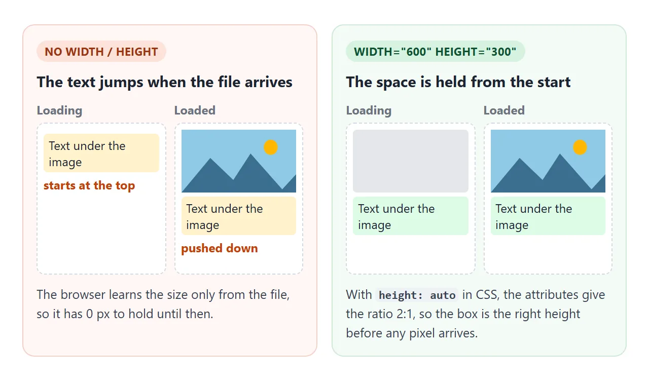
숫자는 px를 제외한 파일 크기(픽셀)입니다. 브라우저는 이를 종횡비로 변환합니다. 다음 CSS와 페어링하세요.
img {
  max-width: 100%;  /* never wider than the container */
  height: auto;     /* height follows the width at the file's ratio */
  display: block;   /* no gap under the image */
}
height: auto 라인이 중요합니다. max-width는 있지만 height: auto는 없으면 너비가 줄어들고 height 속성이 유지되므로 그림이 찌그러집니다. 플레이그라운드에서 너비, 높이 및 최대 너비 상자를 선택하고 높이 자동을 끄면 판독값에 "늘어남"이라고 표시됩니다.
이미지의 가로 세로 비율 유지는 알 수 없는 크기의 이미지를 다룹니다.
이미지 아래의 간격
<img>는 기본적으로 인라인입니다. 이는 큰 글자처럼 텍스트 기준선에 위치하며, g 및 p와 같은 문자의 기준선 아래에 몇 픽셀을 유지합니다. 해당 스트립은 이미지 아래에 간격으로 나타납니다.
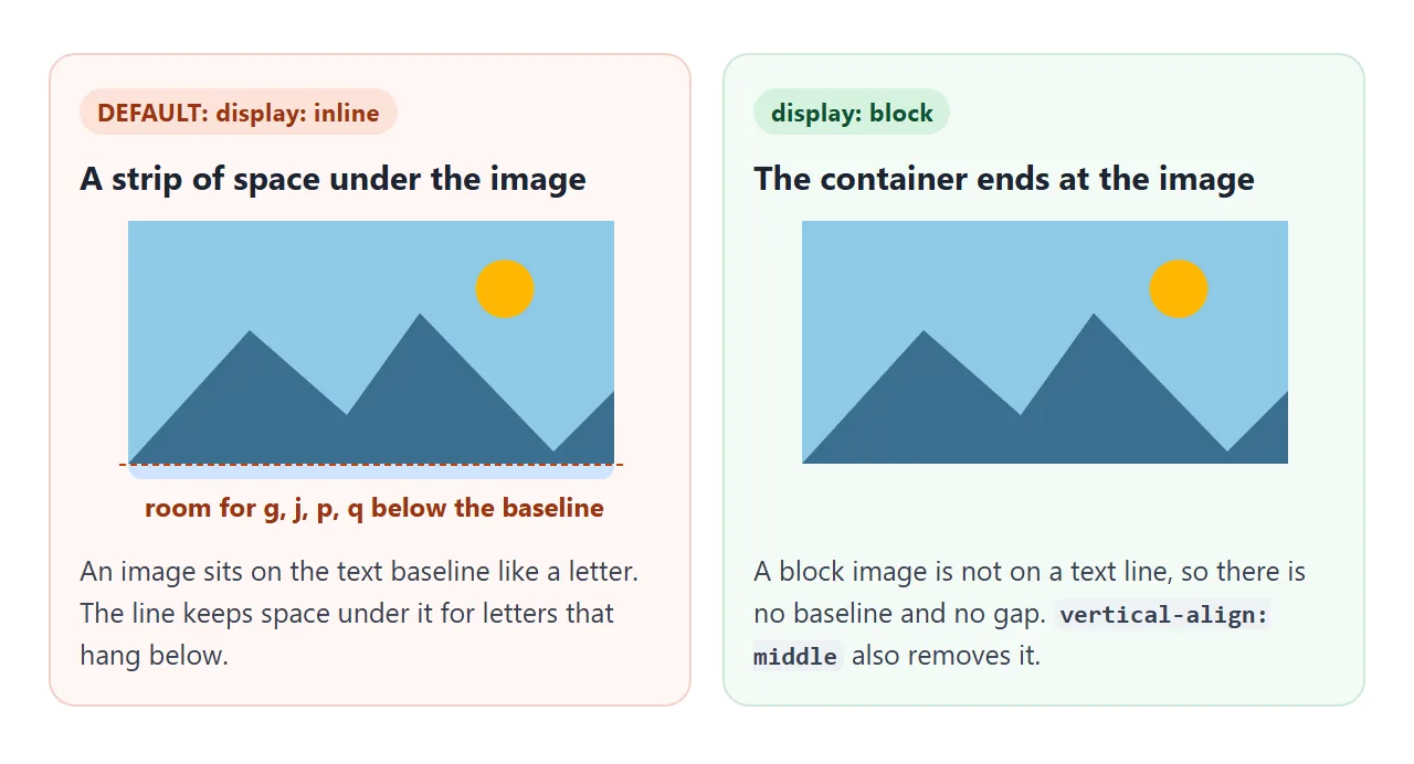
display: block는 텍스트 줄에서 이미지를 빼내므로 간격이 사라집니다. vertical-align: middle 또는 bottom는 이미지가 인라인으로 유지되어야 하는 경우에도 작동합니다(예: 문장 내부의 아이콘). CSS 표시에서 차이점을 설명합니다.
파일이 로드되지 않는 경우
잘못된 경로, 파일 이름의 오타 또는 요청을 거부하는 서버는 모두 같은 방식으로 종료됩니다. error 이벤트가 발생하고 브라우저는 이미지 위치에 alt 텍스트를 표시합니다.
<!doctype html>
<html lang="en">
<head>
<meta charset="utf-8">
<meta name="viewport" content="width=device-width, initial-scale=1">
<title>Broken image and fallback</title>
<style>
  body { margin: 0; padding: 16px; font-family: system-ui, sans-serif; background: #f4f5f7; color: #1d2330; }
  .row { display: grid; grid-template-columns: repeat(auto-fit, minmax(160px, 1fr)); gap: 12px; }
  figure { margin: 0; padding: 10px; background: #fff; border: 1px solid #e1e4ea; border-radius: 10px; }
  figcaption { font-size: 13px; line-height: 1.45; color: #4b5563; margin-top: 8px; }
  code { font: 600 12.5px ui-monospace, Consolas, monospace; color: #1d2330; }

  img {
    display: block; max-width: 100%; height: auto;
    background: #eef1f5;   /* shows the space the img takes */
    outline: 1px dashed #9aa3b2;
  }
  #log { margin: 12px 0 0; font-size: 13px; color: #4b5563; }
</style>
</head>
<body>
<div class="row">
  <figure>
    <!-- Wrong path: the file does not exist -->
    <img src="photos/Team.JPG" alt="Five people at a table, laughing" width="300" height="200">
    <figcaption><b>With alt.</b> The file fails, and the browser shows the alt text in its place.</figcaption>
  </figure>
  <figure>
    <img src="photos/Team.JPG" alt="" width="300" height="200">
    <figcaption><b>With <code>alt=""</code>.</b> No words to fall back on, only an empty box. Right for decoration, wrong for content.</figcaption>
  </figure>
  <figure>
    <img src="photos/Team.JPG" alt="Five people at a table, laughing" width="300" height="200" class="has-fallback">
    <figcaption><b>With a fallback.</b> The <code>error</code> event swaps in a placeholder picture.</figcaption>
  </figure>
</div>
<p id="log">Waiting for the images to fail...</p>

<script>
  // A small grey "no image" picture, stored inside the page
  const FALLBACK = 'data:image/svg+xml,' + encodeURIComponent(
    '<svg xmlns="http://www.w3.org/2000/svg" width="300" height="200">' +
    '<rect width="300" height="200" fill="#e5e7eb"/>' +
    '<path d="M110 130 L140 95 L160 115 L175 100 L200 130Z" fill="#9ca3af"/>' +
    '<circle cx="182" cy="80" r="9" fill="#9ca3af"/>' +
    '<text x="150" y="160" font-family="sans-serif" font-size="16" fill="#4b5563" text-anchor="middle">Image unavailable</text></svg>');

  const log = document.getElementById('log');
  let failed = 0;

  document.querySelectorAll('img').forEach((img) => {
    const onFail = () => {
      failed++;
      log.textContent = 'error event fired on ' + failed + ' of 3 images.';
      if (img.classList.contains('has-fallback')) img.src = FALLBACK;  // once: the fallback cannot fail again
    };
    img.addEventListener('error', onFail, { once: true });
    // The image may have failed before this script ran
    if (img.complete && img.naturalWidth === 0) img.dispatchEvent(new Event('error'));
  });
</script>
</body>
</html>
대신 자리 표시자를 표시하려면 error 이벤트가 발생할 때 src를 교체하세요. 짧은 버전은 태그에 있습니다.
<img src="photos/team.jpg" alt="Five people at a table"
     onerror="this.onerror = null; this.src = 'images/placeholder.svg'">
this.onerror = null가 중요합니다. 자리 표시자도 누락된 경우 핸들러는 계속해서 실행됩니다.
데모에서는 같은 이유로 addEventListener와 { once: true }를 사용합니다. 또한 스크립트가 실행되기 전에 이미지가 실패할 수 있으므로 img.complete && img.naturalWidth === 0도 확인합니다.
대체는 증상을 숨깁니다. 원인을 찾으려면 HTML에 이미지가 표시되지 않음을 참조하세요.
로딩, 디코딩, srcset
loading="lazy"를 사용하면 브라우저가 이미지가 화면에 가까워질 때까지 이미지를 가져올 때까지 기다릴 수 있습니다. 긴 제품 사진 페이지에는 독자가 도달한 행만 로드됩니다.
페이지가 열릴 때 표시되는 이미지는 제외하세요. 그렇지 않으면 예상보다 늦게 도착할 수 있습니다.
decoding="async"는 브라우저가 페이지의 나머지 부분을 유지하지 않고도 사진을 디코딩할 수 있다는 힌트입니다. 추가해도 안전하며 눈에 띄는 차이가 없는 경우가 많습니다.
srcset는 동일한 그림을 여러 크기로 제공하며, sizes는 이미지가 얼마나 넓게 그려질지 브라우저에 알려줍니다.
<img src="shoe-800.jpg" alt="Red running shoe, side view" width="800" height="600"
     srcset="shoe-400.jpg 400w, shoe-800.jpg 800w, shoe-1600.jpg 1600w"
     sizes="(max-width: 600px) 100vw, 50vw">
브라우저는 화면에서 선명하게 보이는 가장 작은 파일을 선택합니다. 반응형 이미지 만들기는 srcset, sizes 및 picture 요소를 다룹니다.
완성된 예: 제품 그리드
위의 모든 것이 한곳에 있습니다. 각 카드의 이미지에는 alt, width 및 height, loading="lazy" 및 decoding="async"와 세 개의 CSS 라인이 있습니다. 데모에서는 느린 네트워크를 모방하기 위해 각 파일을 잠시 보류합니다.
<!doctype html>
<html lang="en">
<head>
<meta charset="utf-8">
<meta name="viewport" content="width=device-width, initial-scale=1">
<title>Product cards with img</title>
<style>
  body { margin: 0; padding: 16px; font-family: system-ui, sans-serif; background: #f4f5f7; color: #1d2330; }
  .bar { margin-bottom: 12px; font-size: 14px; }
  #status { display: block; margin-top: 8px; min-height: 2.9em; line-height: 1.45; }  /* fixed room, so the text itself moves nothing */
  button {
    font: 600 14px system-ui, sans-serif; padding: 7px 12px; border-radius: 8px;
    border: 1px solid #1d2330; background: #1d2330; color: #fff; cursor: pointer;
  }
  .grid { display: grid; grid-template-columns: repeat(auto-fill, minmax(150px, 1fr)); gap: 12px; }
  .card { background: #e9edf2; border: 1px solid #e1e4ea; border-radius: 12px; overflow: hidden; }  /* grey shows until the picture arrives */
  .info { background: #fff; padding: 10px 12px 12px; }

  /* The four lines every content image wants */
  .card img {
    display: block;       /* no gap under the image */
    width: 100%;          /* fill the card */
    height: auto;         /* keep the ratio from width/height */
  }
  .card h3 { font-size: 15px; margin: 0 0 2px; }
  .card p { font-size: 14px; margin: 0; color: #4b5563; }
  .foot { margin-top: 12px; padding: 10px 12px; background: #fff; border: 1px dashed #9aa3b2; border-radius: 10px; font-size: 14px; }
</style>
</head>
<body>
<div class="bar">
  <button id="replay">Replay slow loading</button>
  <span id="status"></span>
</div>

<div class="grid">
  <!-- In your page: src="mug.jpg" instead of data-pic="mug" -->
  <div class="card">
    <img data-pic="mug" alt="White mug with a blue stripe" width="400" height="300" loading="lazy" decoding="async">
    <div class="info"><h3>Stripe mug</h3><p>$14</p></div>
  </div>
  <div class="card">
    <img data-pic="plant" alt="Small green plant in a terracotta pot" width="400" height="300" loading="lazy" decoding="async">
    <div class="info"><h3>Desk plant</h3><p>$22</p></div>
  </div>
  <div class="card">
    <img data-pic="lamp" alt="Yellow desk lamp with a round shade" width="400" height="300" loading="lazy" decoding="async">
    <div class="info"><h3>Reading lamp</h3><p>$39</p></div>
  </div>
  <div class="card">
    <img data-pic="book" alt="Stack of three notebooks in red, teal and navy" width="400" height="300" loading="lazy" decoding="async">
    <div class="info"><h3>Notebook set</h3><p>$12</p></div>
  </div>
</div>
<div class="foot" id="foot">This box sits under the grid. Watch whether it moves while the pictures load.</div>

<script>
  // Stand-in product photos drawn in SVG (400 x 300, the same ratio as the attributes)
  const svg = (inner) => 'data:image/svg+xml,' + encodeURIComponent(
    '<svg xmlns="http://www.w3.org/2000/svg" width="400" height="300"><rect width="400" height="300" fill="#f3efe7"/>' + inner + '</svg>');
  const pics = {
    mug: svg('<rect x="140" y="90" width="110" height="130" rx="12" fill="#fff" stroke="#cbd5e1" stroke-width="3"/>' +
      '<rect x="140" y="140" width="110" height="22" fill="#2563eb"/><path d="M250 120 h24 a26 26 0 0 1 0 52 h-24" fill="none" stroke="#cbd5e1" stroke-width="10"/>'),
    plant: svg('<path d="M150 170 h100 l-14 80 h-72Z" fill="#c2410c"/><path d="M200 170 C170 120 150 110 130 100 C165 100 190 130 200 170 C205 110 230 85 265 80 C240 110 215 135 200 170Z" fill="#2a9d8f"/>'),
    lamp: svg('<ellipse cx="200" cy="245" rx="60" ry="10" fill="#374151"/><rect x="195" y="140" width="10" height="105" fill="#374151"/>' +
      '<path d="M140 145 L170 75 h60 l30 70Z" fill="#fbbf24"/>'),
    book: svg('<rect x="120" y="190" width="160" height="30" rx="4" fill="#1e3a8a"/><rect x="130" y="158" width="150" height="30" rx="4" fill="#0f766e"/>' +
      '<rect x="115" y="126" width="165" height="30" rx="4" fill="#b91c1c"/>'),
  };

  const imgs = document.querySelectorAll('.card img');
  const foot = document.getElementById('foot');
  const status = document.getElementById('status');

  // Demo only: these pictures live inside the page, so they would appear at once.
  // Each one is held back for a moment to imitate a slow network. The img is hidden
  // meanwhile, and alt is held back too: an img with no src is drawn as a broken
  // image or as its alt text, which a loading image is not.
  function load(delay) {
    const top = foot.getBoundingClientRect().top;
    let done = 0;
    imgs.forEach((img, i) => {
      const alt = img.dataset.alt || (img.dataset.alt = img.alt);
      img.removeAttribute('src'); img.removeAttribute('alt');
      img.style.visibility = 'hidden';
      setTimeout(() => {
        img.addEventListener('load', () => {
          img.style.visibility = '';
          done++;
          const moved = Math.round(foot.getBoundingClientRect().top - top);
          status.textContent = done + ' of ' + imgs.length + ' loaded. The box below moved ' + moved + ' px.';
        }, { once: true });
        img.alt = alt;
        img.src = pics[img.dataset.pic];
      }, delay * (i + 1));
    });
    status.textContent = '0 of ' + imgs.length + ' loaded. The space is already reserved.';
  }

  document.getElementById('replay').addEventListener('click', () => load(500));
  load(400);
</script>
</body>
</html>
- src 및 alt를 작성하세요. 이미지의 내용을 설명하거나 장식용으로
alt=""를 사용하세요. - 너비와 높이를 추가합니다. 파일의 픽셀 크기(단위 없음)입니다.
- 세 개의 CSS 줄을 추가합니다.
max-width: 100%,height: auto,display: block. - 이미지를 더 자세히 로드하세요. 페이지가 열릴 때 표시되지 않는 이미지에
loading="lazy"를 추가하세요.
회색은 이미지가 아직 비어 있는 동안 카드 배경이 비쳐 보이기 때문에 나타납니다. 다양한 모양의 그림을 동일한 상자로 자르려면 object-fit을 사용하세요.
작동하지 않을 때
| 당신이 보는 것 | 원인 | 수정 |
|---|---|---|
| 대체 텍스트 또는 깨진 아이콘이 표시됩니다. | 파일이 로드되지 않았습니다. 경로가 잘못되었거나 서버가 파일을 거부했습니다. | 페이지 폴더의 경로를 확인하세요. |
| 컴퓨터에서 작동하지만 온라인에서는 작동하지 않습니다. | 파일 이름 대소문자: 많은 서버에서 Photo.JPG가 photo.jpg가 아닙니다. |
사례를 정확히 일치시키세요. |
| 이미지 아래의 얇은 간격 | 이미지는 인라인이며 기준선에 위치합니다. | display: block |
| 이미지가 찌그러지거나 늘어납니다. | width 및 height가 다른 비율로 고정됨 |
CSS의 height: auto |
| 이미지가 나타나면 페이지가 이동합니다. | width 및 height 없음 |
파일의 픽셀 크기 추가 |
| 이미지가 상자 밖으로 쏟아져 나옵니다. | 컨테이너보다 넓네요 | max-width: 100% |
| 상단 이미지가 늦게 나타납니다 | 한 번에 볼 수 있는 이미지의 loading="lazy" |
거기서 loading="lazy"를 제거하세요. |
링크로 공유하세요
페이지를 이동할 때 이미지가 손실되기 쉽습니다. 자체적으로 전송된 .html 파일은 이미지 파일이 컴퓨터에 남아 있기 때문에 상대 경로로 가리키는 모든 사진을 잃게 됩니다.
데이터 URI 또는 인라인 SVG로 삽입된 그림은 페이지 내에서 이동합니다.
작업 버전을 보내려면 페이지를 NOS 문서에 붙여넣고 공유 링크 만들기를 선택하세요. 링크할 HTML이 이를 안내합니다.
페이지는 작성된 대로 렌더링되고 해당 스크립트가 실행되므로 대체 및 게으른 그리드는 페이지를 보내는 사람들에 대해 동일하게 작동합니다. 나중에 코드를 변경하면 동일한 링크에 새 버전이 표시됩니다.