Chakra UI is a component library for React: buttons, inputs, cards, dialogs and a styling system you set through props such as p={6} or colorPalette="teal".
Its project page describes it as "accessible React components for building high-quality web apps and design systems", and it is MIT licensed.
The official setup uses npm and a project. If what you want is one working HTML file, the example below is the whole page. Click the button.
<!doctype html>
<html lang="en">
<head>
<meta charset="utf-8">
<meta name="viewport" content="width=device-width, initial-scale=1">
<title>Chakra UI in one HTML file</title>
<!-- Map package names to pinned jsDelivr ESM bundles -->
<script type="importmap">
{
  "imports": {
    "react": "https://cdn.jsdelivr.net/npm/react@19.2.8/+esm",
    "react-dom/client": "https://cdn.jsdelivr.net/npm/react-dom@19.2.8/client/+esm",
    "@chakra-ui/react": "https://cdn.jsdelivr.net/npm/@chakra-ui/react@3.37.0/+esm",
    "https://cdn.jsdelivr.net/npm/react@19.0.0/+esm": "https://cdn.jsdelivr.net/npm/react@19.2.8/+esm"
  }
}
</script>
</head>
<body>
<div id="root"><p style="font-family: system-ui, sans-serif; padding: 24px; margin: 0;">Loading Chakra UI...</p></div>

<script type="module">
  import { createElement as h, useState } from 'react';
  import { createRoot } from 'react-dom/client';
  import { ChakraProvider, defaultSystem, Box, Heading, Text, Button } from '@chakra-ui/react';

  function App() {
    const [count, setCount] = useState(0);
    // h(Component, props, ...children) is what JSX compiles to
    return h(Box, { p: 6, maxW: 'sm' },
      h(Heading, { size: 'xl', mb: 2 }, 'Hello from Chakra UI'),
      h(Text, { color: 'fg.muted', mb: 4 }, 'One HTML file, no build step.'),
      h(Button, { colorPalette: 'teal', onClick: () => setCount(count + 1) }, 'Clicked ' + count + ' times')
    );
  }

  // Every Chakra component must sit inside ChakraProvider
  createRoot(document.getElementById('root')).render(
    h(ChakraProvider, { value: defaultSystem }, h(App))
  );
</script>
</body>
</html>
The first load fetches the library as many small module files from cdn.jsdelivr.net, so it shows "Loading Chakra UI..." for a moment. Later loads come from the browser cache.
How the one-file page is built
There is no build step, so the page does four jobs a bundler would normally do for you.
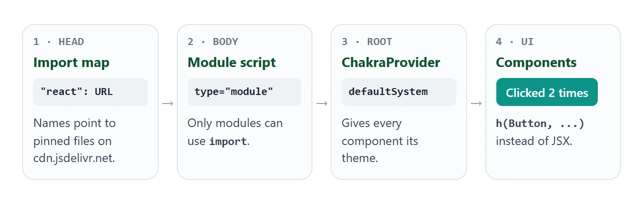
- Import map. A
<script type="importmap">block maps the namesreact,react-dom/clientand@chakra-ui/reactto pinned files on cdn.jsdelivr.net. It must come before the module script. - Module script. The code goes in
<script type="module">. A plain<script>stops with "Cannot use import statement outside a module". - ChakraProvider. Every Chakra component reads its theme from
ChakraProvider. With no custom theme, passvalue: defaultSystem. - Components. Each JSX tag becomes a
createElementcall, imported ashto keep it short.
The import map, line by line
These are the four entries the examples use:
<script type="importmap">
{
  "imports": {
    "react": "https://cdn.jsdelivr.net/npm/react@19.2.8/+esm",
    "react-dom/client": "https://cdn.jsdelivr.net/npm/react-dom@19.2.8/client/+esm",
    "@chakra-ui/react": "https://cdn.jsdelivr.net/npm/@chakra-ui/react@3.37.0/+esm",
    "https://cdn.jsdelivr.net/npm/react@19.0.0/+esm": "https://cdn.jsdelivr.net/npm/react@19.2.8/+esm"
  }
}
</script>
The /+esm ending asks jsDelivr for a browser-ready module. Inside that file, the dependencies are already written as full jsDelivr addresses with exact versions, such as react@19.2.8.
The last line looks odd, and it matters most. The Emotion bundle that Chakra styles through imports react@19.0.0, while Chakra and React DOM import react@19.2.8. Import map keys can be full URLs, so this line sends the stray version to the same file.
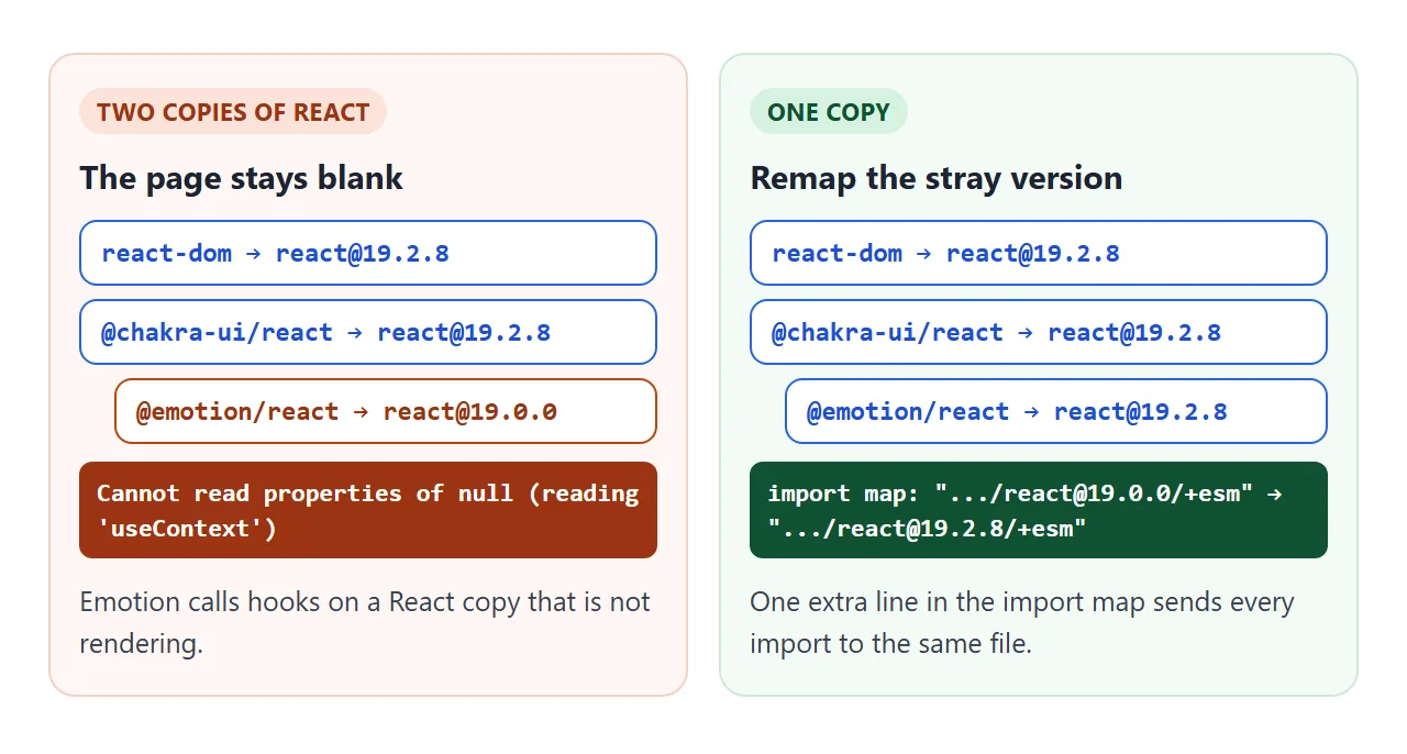
Without that line, the page stays blank and the console shows "Cannot read properties of null (reading 'useContext')". If you change any version number, open the bundle URLs and check their import lines again.
JSX without a compiler
Chakra's docs show JSX, such as <Button colorPalette="teal">. Browsers cannot read JSX, and React documents createElement as the alternative. The translation is mechanical:
// JSX:  <Button colorPalette="teal" onClick={add}>Add</Button>
h(Button, { colorPalette: 'teal', onClick: add }, 'Add')

// JSX:  <Card.Root><Card.Body>Hi</Card.Body></Card.Root>
h(Card.Root, null, h(Card.Body, null, 'Hi'))
Props stay the same, including Chakra's style props such as p, mb, maxW and bg. Components with parts, like Card.Root and Field.Label, are passed the same way.
Variants, colour palettes and dark mode
Buttons take a variant prop for the style and a colorPalette prop for the colour. Setting colorPalette on a parent such as HStack passes it to the buttons inside. Pick a palette, then switch to dark mode:
<!doctype html>
<html lang="en">
<head>
<meta charset="utf-8">
<meta name="viewport" content="width=device-width, initial-scale=1">
<title>Chakra UI variants, palettes and dark mode</title>
<script type="importmap">
{
  "imports": {
    "react": "https://cdn.jsdelivr.net/npm/react@19.2.8/+esm",
    "react-dom/client": "https://cdn.jsdelivr.net/npm/react-dom@19.2.8/client/+esm",
    "@chakra-ui/react": "https://cdn.jsdelivr.net/npm/@chakra-ui/react@3.37.0/+esm",
    "https://cdn.jsdelivr.net/npm/react@19.0.0/+esm": "https://cdn.jsdelivr.net/npm/react@19.2.8/+esm"
  }
}
</script>
</head>
<body>
<div id="root"><p style="font-family: system-ui, sans-serif; padding: 24px; margin: 0;">Loading Chakra UI...</p></div>

<script type="module">
  import { createElement as h, useState } from 'react';
  import { createRoot } from 'react-dom/client';
  import { ChakraProvider, defaultSystem, Box, Stack, HStack, Button, Text } from '@chakra-ui/react';

  const palettes = ['teal', 'blue', 'purple', 'red'];
  const variants = ['solid', 'subtle', 'outline', 'ghost'];

  function App() {
    const [palette, setPalette] = useState('teal');
    const [dark, setDark] = useState(false);

    function toggleDark() {
      // Chakra's dark styles apply under a .dark class on a parent
      document.documentElement.classList.toggle('dark', !dark);
      setDark(!dark);
    }

    return h(Box, { p: 5, bg: 'bg', color: 'fg', minH: '100vh' },
      h(Stack, { gap: 4 },
        h(Text, { fontWeight: 'semibold' }, 'colorPalette'),
        h(HStack, { wrap: 'wrap' }, palettes.map((p) =>
          h(Button, { key: p, size: 'sm', variant: p === palette ? 'solid' : 'outline',
            onClick: () => setPalette(p) }, p))),
        h(Text, { fontWeight: 'semibold' }, 'variant'),
        // colorPalette on a parent is inherited by the buttons inside
        h(HStack, { wrap: 'wrap', colorPalette: palette }, variants.map((v) =>
          h(Button, { key: v, variant: v }, v))),
        h(Button, { alignSelf: 'start', variant: 'surface', onClick: toggleDark },
          dark ? 'Light mode' : 'Dark mode')
      )
    );
  }

  createRoot(document.getElementById('root')).render(
    h(ChakraProvider, { value: defaultSystem }, h(App))
  );
</script>
</body>
</html>
In a project, the Chakra docs add dark mode through a Provider snippet built on the next-themes package. Chakra's dark styles apply under a .dark class on a parent element, so a single file can toggle that class on <html> itself:
document.documentElement.classList.toggle('dark');
The colour tokens in the example, such as bg, fg and fg.muted, switch with it. Fixed colours like white do not. For dark mode without a library, see dark mode in CSS.
A finished example: a sign-up card
A form uses Card, Field and Input. Press Sign up with the fields empty, then fill them in.
<!doctype html>
<html lang="en">
<head>
<meta charset="utf-8">
<meta name="viewport" content="width=device-width, initial-scale=1">
<title>Chakra UI sign-up card</title>
<script type="importmap">
{
  "imports": {
    "react": "https://cdn.jsdelivr.net/npm/react@19.2.8/+esm",
    "react-dom/client": "https://cdn.jsdelivr.net/npm/react-dom@19.2.8/client/+esm",
    "@chakra-ui/react": "https://cdn.jsdelivr.net/npm/@chakra-ui/react@3.37.0/+esm",
    "https://cdn.jsdelivr.net/npm/react@19.0.0/+esm": "https://cdn.jsdelivr.net/npm/react@19.2.8/+esm"
  }
}
</script>
</head>
<body>
<div id="root"><p style="font-family: system-ui, sans-serif; padding: 24px; margin: 0;">Loading Chakra UI...</p></div>

<script type="module">
  import { createElement as h, useState } from 'react';
  import { createRoot } from 'react-dom/client';
  import { ChakraProvider, defaultSystem, Box, Card, Field, Input, Button, Stack, Text } from '@chakra-ui/react';

  function App() {
    const [errors, setErrors] = useState({});
    const [sent, setSent] = useState(null);

    function onSubmit(e) {
      e.preventDefault();  // handle it in the page, send nothing
      const data = Object.fromEntries(new FormData(e.target));
      const next = {};
      if (!data.name.trim()) next.name = 'Enter your name.';
      if (!/^\S+@\S+\.\S+$/.test(data.email)) next.email = 'Enter a valid email.';
      setErrors(next);
      setSent(Object.keys(next).length ? null : data);
    }

    // Field.Root gets invalid; Field.ErrorText only shows when it is set
    const field = (name, label, type) =>
      h(Field.Root, { invalid: !!errors[name] },
        h(Field.Label, null, label),
        h(Input, { name, type, placeholder: label }),
        h(Field.ErrorText, null, errors[name]));

    return h(Box, { p: 4, bg: 'bg.muted', minH: '100vh' },
      h(Card.Root, { maxW: 'sm', mx: 'auto' },
        h(Card.Header, null,
          h(Card.Title, null, 'Join the beta'),
          h(Card.Description, null, 'Two fields, checked in the page.')),
        h(Card.Body, null,
          h('form', { id: 'signup', onSubmit, noValidate: true },
            h(Stack, { gap: 4 }, field('name', 'Name', 'text'), field('email', 'Email', 'email')))),
        h(Card.Footer, { flexDirection: 'column', alignItems: 'stretch', gap: 3 },
          h(Button, { type: 'submit', form: 'signup', colorPalette: 'teal' }, 'Sign up'),
          sent && h(Text, { id: 'result', color: 'green.fg', fontSize: 'sm' },
            'Thanks, ' + sent.name + '. We would write to ' + sent.email + '.'))
      )
    );
  }

  createRoot(document.getElementById('root')).render(
    h(ChakraProvider, { value: defaultSystem }, h(App))
  );
</script>
</body>
</html>
- Errors: pass
invalidtoField.Root.Field.ErrorTextonly appears while it is set. - Reading values: the submit handler calls
preventDefault()and reads the inputs withFormData, covered in FormData in JavaScript. - Sending: nothing leaves the page. A real sign-up would post to your server, shown below but not run here.
await fetch('https://api.example.com/signup', {
  method: 'POST',
  body: new FormData(form),
});
When you need the npm project instead
The single file is for a page, a prototype or a demo you want to send. For a full app, the Chakra docs set up a project with a bundler.
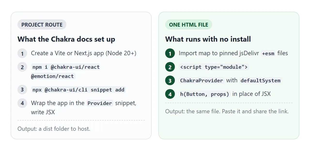
npm i @chakra-ui/react @emotion/react
npx @chakra-ui/cli snippet add
The docs list Node.js 20 as the minimum, with guides for Vite, Next.js and other frameworks.
The build produces static files, and hosting a built front end covers where they can go. If you only want ready-made styling without React, a Tailwind HTML template needs one script tag.
| One HTML file | npm project | |
|---|---|---|
| Install | Nothing | Node.js and npm |
| Writing components | h(Button, props) |
JSX |
| Provider | ChakraProvider + defaultSystem |
The Provider snippet |
| Dark mode | Toggle the dark class |
Snippet using next-themes |
| Result | The file itself | A built folder to host |
When it does not work
| What you see | Cause | Fix |
|---|---|---|
| "Cannot use import statement outside a module" | Plain <script> tag |
Use type="module" |
| "Failed to resolve module specifier" | Import map missing, after the module script, or not valid JSON | Put it first and check commas |
| Blank page, "reading 'useContext'" | Two React versions loaded | Remap react@19.0.0 in the import map |
| "forgot to wrap component within ChakraProvider" | No provider | Render inside ChakraProvider |
| "Unexpected token '<'" | JSX in the browser | Use h(...) |
| Dark mode leaves some parts light | Fixed colours instead of tokens | Use bg and fg tokens |
A trailing comma after the last import map entry is enough to make it invalid JSON. For other blank-page causes, see HTML JavaScript not working.
Share it as a link
A Chakra page is easier to show than to describe. A screenshot cannot be clicked, and an .html attachment may open as plain code on a phone.
To send the working version, paste the page into a NOS document and choose Create share link. HTML to link walks through it.
The page renders as written, its scripts run and the library loads from cdn.jsdelivr.net, so anyone with the link can press the buttons and fill in the form without an account.
If you change the code later, the same link shows the new version.