A Tailwind HTML template that works with no build step is one file: the browser build in a script tag, then markup carrying utility classes.
Here is a starter you can paste and edit. It has a header, a card grid, a table and dark mode.
<!doctype html>
<html lang="en" class="h-full">
<head>
  <meta charset="utf-8">
  <meta name="viewport" content="width=device-width,initial-scale=1">
  <title>Weekly report</title>
  <script src="https://cdn.tailwindcss.com"></script>
</head>
<body class="h-full bg-slate-50 text-slate-900 dark:bg-slate-900 dark:text-slate-100">

  <header class="border-b border-slate-200 dark:border-slate-700">
    <div class="mx-auto max-w-5xl px-6 py-5 flex items-baseline justify-between">
      <h1 class="text-xl font-semibold">Weekly report</h1>
      <p class="text-sm text-slate-500">Week 38</p>
    </div>
  </header>

  <main class="mx-auto max-w-5xl px-6 py-8 space-y-8">

    <section class="grid gap-4 sm:grid-cols-2 lg:grid-cols-3">
      <div class="rounded-lg border border-slate-200 dark:border-slate-700 p-5">
        <p class="text-sm text-slate-500">Active accounts</p>
        <p class="mt-1 text-3xl font-semibold tabular-nums">1,284</p>
      </div>
      <div class="rounded-lg border border-slate-200 dark:border-slate-700 p-5">
        <p class="text-sm text-slate-500">Open tickets</p>
        <p class="mt-1 text-3xl font-semibold tabular-nums">37</p>
      </div>
      <div class="rounded-lg border border-slate-200 dark:border-slate-700 p-5">
        <p class="text-sm text-slate-500">Median first reply</p>
        <p class="mt-1 text-3xl font-semibold tabular-nums">42m</p>
      </div>
    </section>

    <section>
      <h2 class="text-base font-semibold mb-3">By team</h2>
      <div class="overflow-x-auto rounded-lg border border-slate-200 dark:border-slate-700">
        <table class="w-full text-sm">
          <thead class="bg-slate-100 dark:bg-slate-800 text-left">
            <tr>
              <th scope="col" class="px-4 py-2 font-medium">Team</th>
              <th scope="col" class="px-4 py-2 font-medium">Tickets</th>
              <th scope="col" class="px-4 py-2 font-medium">Trend</th>
            </tr>
          </thead>
          <tbody class="divide-y divide-slate-200 dark:divide-slate-700">
            <tr><td class="px-4 py-2">Billing</td><td class="px-4 py-2 tabular-nums">14</td><td class="px-4 py-2 text-emerald-600">down</td></tr>
            <tr><td class="px-4 py-2">Onboarding</td><td class="px-4 py-2 tabular-nums">12</td><td class="px-4 py-2 text-rose-600">up</td></tr>
          </tbody>
        </table>
      </div>
    </section>

  </main>
</body>
</html>
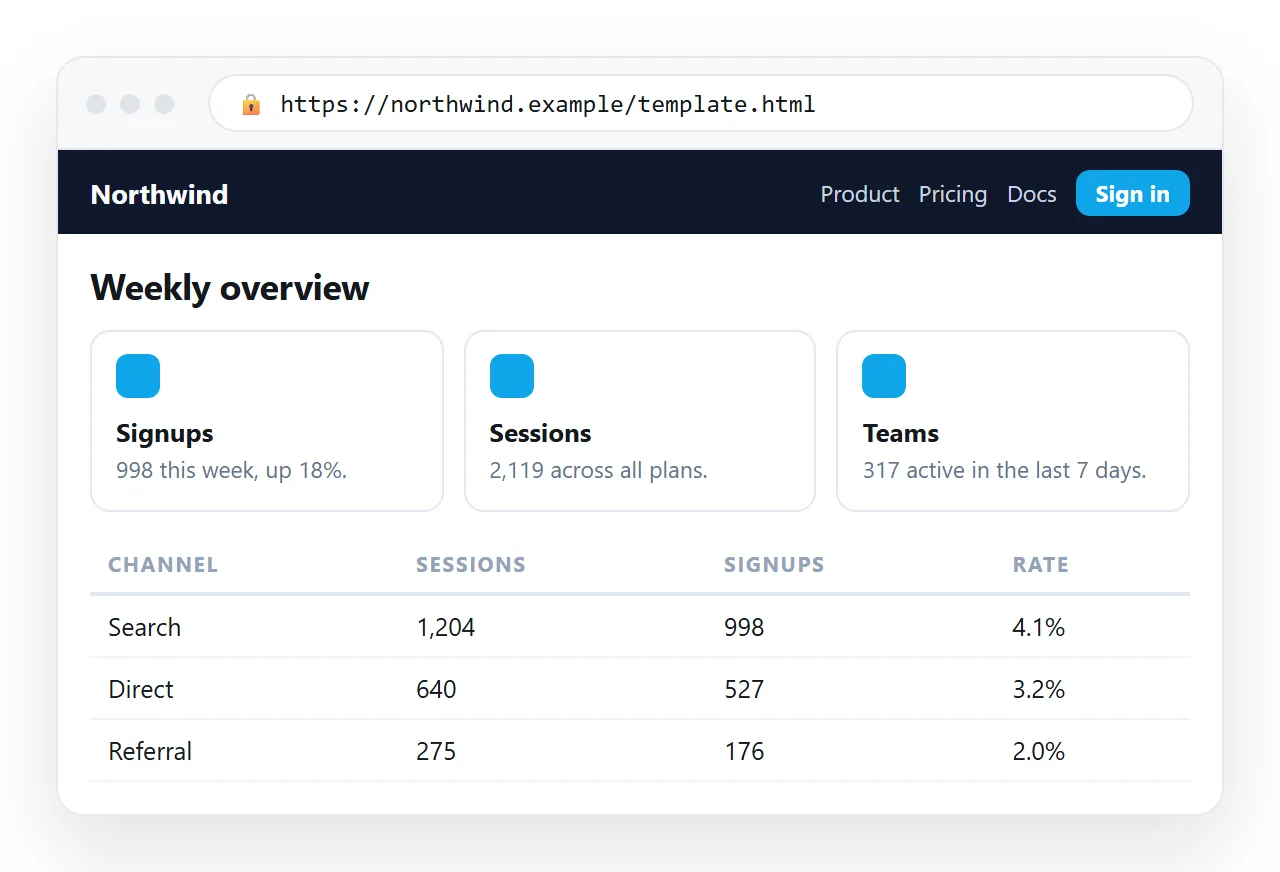
What the classes in that file are doing
| Class group | Job | Change it to |
|---|---|---|
mx-auto max-w-5xl px-6 |
Centred column with side padding | max-w-3xl for reading, max-w-7xl for dashboards |
grid gap-4 sm:grid-cols-2 lg:grid-cols-3 |
Cards reflow by width | Any column count per breakpoint |
rounded-lg border p-5 |
The card itself | shadow-sm instead of border |
dark:bg-slate-900 |
Dark variant of a rule | Any class can take dark: |
tabular-nums |
Digits of equal width | Keep it anywhere numbers stack |
divide-y |
Lines between children | divide-x for columns |
tabular-nums is the one worth remembering. Without it, a column of figures wobbles because the digits have different widths.
How the responsive part works
The template has no media queries in it, and it still reflows correctly. That is what the breakpoint prefixes are doing.
A class with no prefix applies at every width. A class with sm:, md: or lg: applies from that width upward and stays applied above it.
<div class="grid gap-4 sm:grid-cols-2 lg:grid-cols-3">
Read that as one column by default, two from the small breakpoint, three from large. The default case is the phone, which is the right way round for most internal pages.
The same prefixes work on anything, not only layout. text-sm md:text-base, hidden lg:block and px-4 md:px-8 are all valid, and they cover most of what a media query would have done.
One caution. Do not give every element its own set of breakpoints. Let the container reflow and the contents follow, or the page becomes impossible to reason about.
Where the table earns its keep
Dashboards paste badly into narrow screens, and the wrapper above is why this one does not.
overflow-x-auto on a div around the table lets it scroll sideways rather than squashing the columns into unreadable widths. It costs one class and removes the most common mobile complaint.
For tables people scan rather than read, add whitespace-nowrap on the cells that must not wrap, usually dates and figures. Leave the description column free to wrap.
Adding your own colours
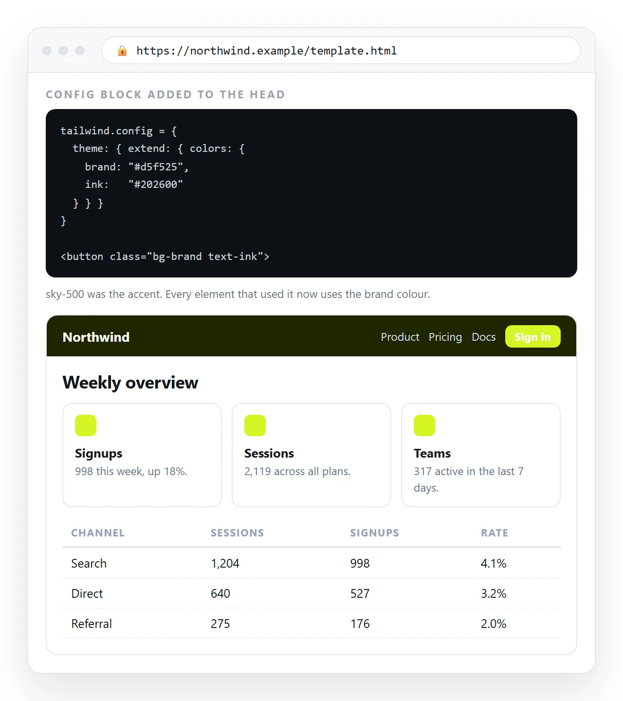
The browser build takes a configuration block in the page, placed after the script tag:
<script>
  tailwind.config = {
    theme: {
      extend: {
        colors: { brand: { 500: '#3b6cf0', 600: '#2f57c9' } },
        fontFamily: { sans: ['Inter', 'system-ui', 'sans-serif'] }
      }
    }
  };
</script>
After that, bg-brand-500 and text-brand-600 work like any built-in colour. Define brand values once here rather than writing arbitrary hex values through the markup, which nothing keeps consistent.
The browser build against a compiled stylesheet
| Browser build | Compiled | |
|---|---|---|
| Setup | One script tag | Node, a config, a build command |
| Stylesheet size | Generated at load | Only the classes you used |
| First paint | Short unstyled flash | No flash |
| Works offline | No | Yes |
| Suits | Prototypes, internal pages, demos | Public production sites |
The browser build is documented as a development and prototyping convenience, so use it accordingly. For an internal weekly report that five people open, it is the right tool. For a marketing site, compile.
Keeping the markup readable
Long class strings are the standard complaint about Tailwind, and most of it is avoidable.
- Order classes consistently, for example layout, then spacing, then colour, then type.
- Repeat a card by copying the block, not by inventing a new variant each time.
- Pull genuinely repeated patterns into a class with
@applyonce you are compiling. - Do not mix in a second stylesheet that fights the utilities. Pick one system per page.
- Keep arbitrary values rare.
w-[327px]is a sign the layout wants a different approach.
The first point matters more than it looks. Consistent order makes a long class string scannable, because your eye learns where to find the colour without reading the whole line.
Editors can enforce it. A class sorting plugin applied on save removes the decision entirely, and it also makes differences between two similar blocks visible in a diff rather than buried in reordered text.
Sharing the finished page
The page depends on that script tag. Copy the file in full, including the <head>, or the classes stop resolving and you get unstyled text.
Paste the complete HTML into a NOS document. It renders as written, dark theme and all, at an address of its own. Then Share, Share link, Create link.
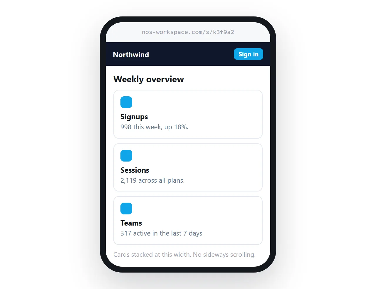
Because the text stays clickable in the document, next week's figures replace this week's at the same link. Turning HTML into a link is that step by itself.
If the page renders plain when you test it, open the file in the HTML file opener. Unstyled output there means the Tailwind script is not travelling with the file, which is the same class of problem as a missing external stylesheet.
Adding Tailwind to an existing HTML file covers retrofitting rather than starting fresh, and a Bootstrap template is the component-based alternative.