A Bootstrap HTML template is one file with two external references: the stylesheet in the head, and the JavaScript bundle before the closing body tag.
Here is a complete starter with a navbar, a card grid and a table.
<!doctype html>
<html lang="en">
<head>
  <meta charset="utf-8">
  <meta name="viewport" content="width=device-width,initial-scale=1">
  <title>Weekly report</title>
  <link href="https://cdn.jsdelivr.net/npm/bootstrap@5/dist/css/bootstrap.min.css" rel="stylesheet">
</head>
<body class="bg-body-tertiary">

  <nav class="navbar navbar-expand-lg bg-white border-bottom">
    <div class="container">
      <span class="navbar-brand mb-0 h1">Weekly report</span>
      <span class="text-secondary small">Week 38</span>
    </div>
  </nav>

  <main class="container py-4">

    <div class="row g-3 mb-4">
      <div class="col-12 col-md-4">
        <div class="card h-100">
          <div class="card-body">
            <p class="text-secondary small mb-1">Active accounts</p>
            <p class="fs-3 fw-semibold mb-0">1,284</p>
          </div>
        </div>
      </div>
      <div class="col-12 col-md-4">
        <div class="card h-100">
          <div class="card-body">
            <p class="text-secondary small mb-1">Open tickets</p>
            <p class="fs-3 fw-semibold mb-0">37</p>
          </div>
        </div>
      </div>
      <div class="col-12 col-md-4">
        <div class="card h-100">
          <div class="card-body">
            <p class="text-secondary small mb-1">Median first reply</p>
            <p class="fs-3 fw-semibold mb-0">42m</p>
          </div>
        </div>
      </div>
    </div>

    <h2 class="h6 mb-2">By team</h2>
    <div class="table-responsive">
      <table class="table table-sm table-striped align-middle bg-white">
        <thead>
          <tr><th scope="col">Team</th><th scope="col">Tickets</th><th scope="col">Trend</th></tr>
        </thead>
        <tbody>
          <tr><td>Billing</td><td>14</td><td><span class="badge text-bg-success">down</span></td></tr>
          <tr><td>Onboarding</td><td>12</td><td><span class="badge text-bg-danger">up</span></td></tr>
        </tbody>
      </table>
    </div>

  </main>

  <script src="https://cdn.jsdelivr.net/npm/bootstrap@5/dist/js/bootstrap.bundle.min.js"></script>
</body>
</html>
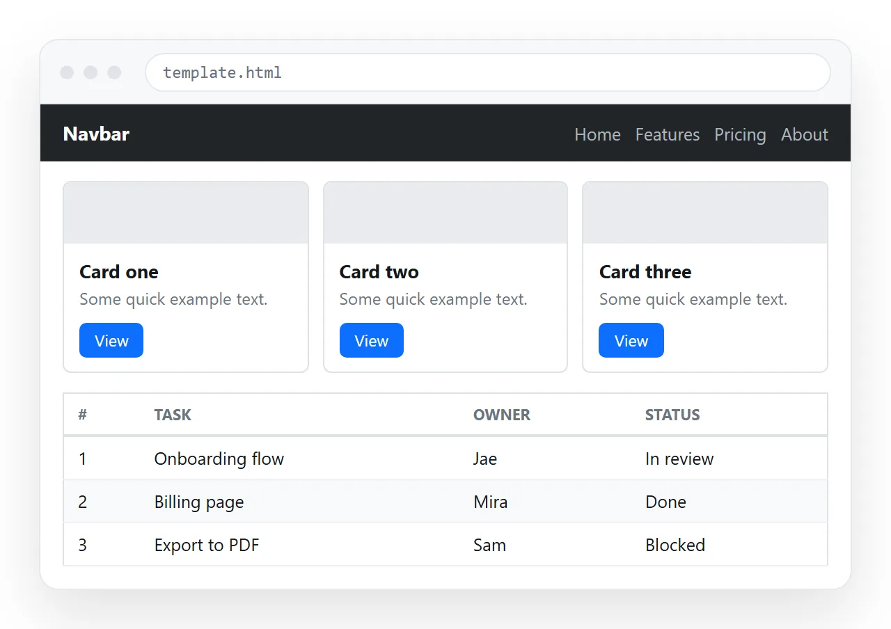
The classes that are doing the work
| Class | Job | Note |
|---|---|---|
container |
Centres content, sets gutters | container-fluid for full width |
row and col-* |
The twelve column grid | Columns must sit inside a row |
col-md-4 |
Three across from medium width up | Full width below that breakpoint |
g-3 |
Gap between grid items | Goes on the row, not the column |
card and card-body |
The card shell and its padding | h-100 makes a row of cards equal height |
table-responsive |
Horizontal scroll on narrow screens | Wrap the table, do not style it |
badge text-bg-success |
Small status label | Pairs colour and contrast correctly |
The row wrapper is the one to remember. Columns without a row lose their gutters and widths, which reads as a broken grid when it is only a missing div.
Do you need the JavaScript bundle
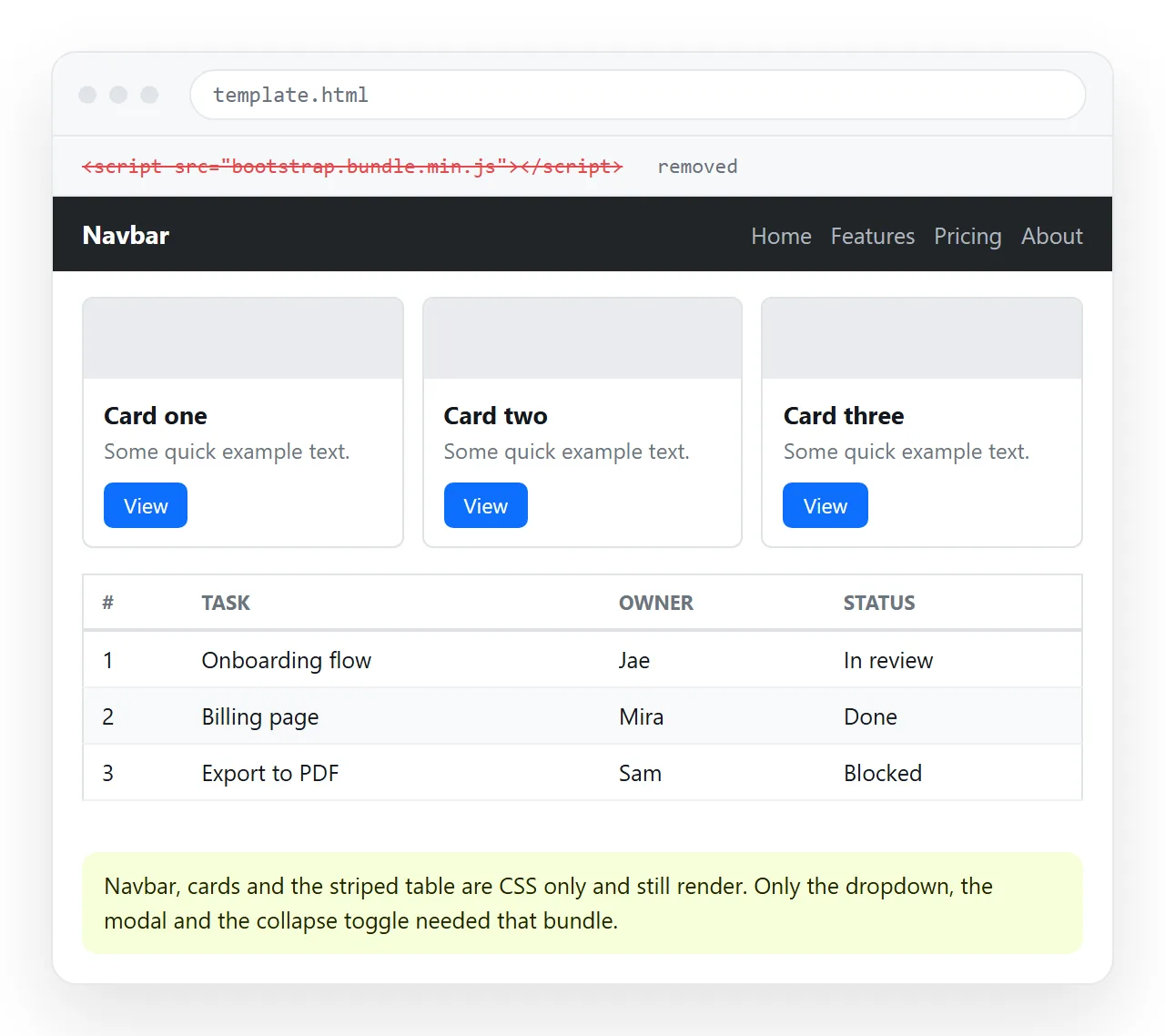
Only for components that move. The stylesheet alone covers a large amount of what people build.
Needs the bundle: modal, dropdown, tabs, collapse, accordion, tooltip, popover, toast, offcanvas, carousel.
Does not need it: grid, cards, tables, buttons, badges, forms, alerts without dismiss, list groups, pagination, typography.
If your page is a report, leave the script out. That removes a request and an external dependency for something you never call.
Changing how it looks
Bootstrap pages look like Bootstrap pages, which is the point and also the complaint. Three levels of escape, in increasing effort:
- Utility classes and CSS variables. Override
--bs-primaryand the spacing utilities without touching the build. - Your own stylesheet after the Bootstrap link. Later rules of equal specificity win, so a small override file goes a long way.
- A Sass build with customised variables. This is where the smaller, properly branded output comes from, and it needs a toolchain.
Level two covers most internal work. Load order matters: your file after theirs, or nothing you write will apply.
The cheapest single change is the accent colour. Overriding --bs-primary moves buttons, links and active states together, so the page stops looking like the default in one line.
After that, spacing. Bootstrap defaults are generous, and tightening the container padding and card spacing does more for a dense report than any colour change.
The grid, in one paragraph each
The grid is twelve columns wide at every breakpoint, and the column classes say how many of those twelve to take.
col-md-4 means four of twelve, so three across, from the medium breakpoint upward. Below that breakpoint the col-12 beside it applies and each card takes the full width.
Plain col with no number splits the row evenly between however many columns are present. That is the fastest way to lay out two or three equal blocks without counting.
Gutters live on the row. g-3 sets both horizontal and vertical spacing, gx-3 and gy-3 set them separately. Putting margins on the columns instead is the usual cause of a row that overflows its container.
One rule prevents most grid bugs: container, then row, then columns, then your content inside the column. Skipping a level is what produces the misalignment people assume is a framework problem.
Making the table useful
Report tables get three classes worth knowing, and they compose.
table-smtightens the row height, which matters once there are more than about fifteen rows.table-stripedalternates row backgrounds, so the eye tracks across wide rows.align-middlecentres cell content vertically, which stops badges sitting on the baseline.
Wrap the whole table in table-responsive rather than trying to shrink the columns. Sideways scrolling is a better outcome on a phone than four squashed columns nobody can read.
Bootstrap against a utility framework
| Bootstrap | Tailwind | |
|---|---|---|
| What you get | Finished components | Utility classes to build them |
| Time to a working page | Minutes | Minutes, more markup |
| Default appearance | Recognisably Bootstrap | Unstyled until you decide |
| Markup length | Short class names | Long class strings |
| Customising deeply | Sass variables | Config file and plugins |
Neither is wrong. Pick the first column when the page needs to exist today and nobody will judge it on originality. The Tailwind HTML template is the other starter if you want the second column.
Sharing the finished page
The page depends on those two CDN references, so copy the file whole, head included. Strip the head and every class stops meaning anything.
Paste the complete HTML into a NOS document. It renders as written, at an address of its own. Then Share, Share link, Create link.
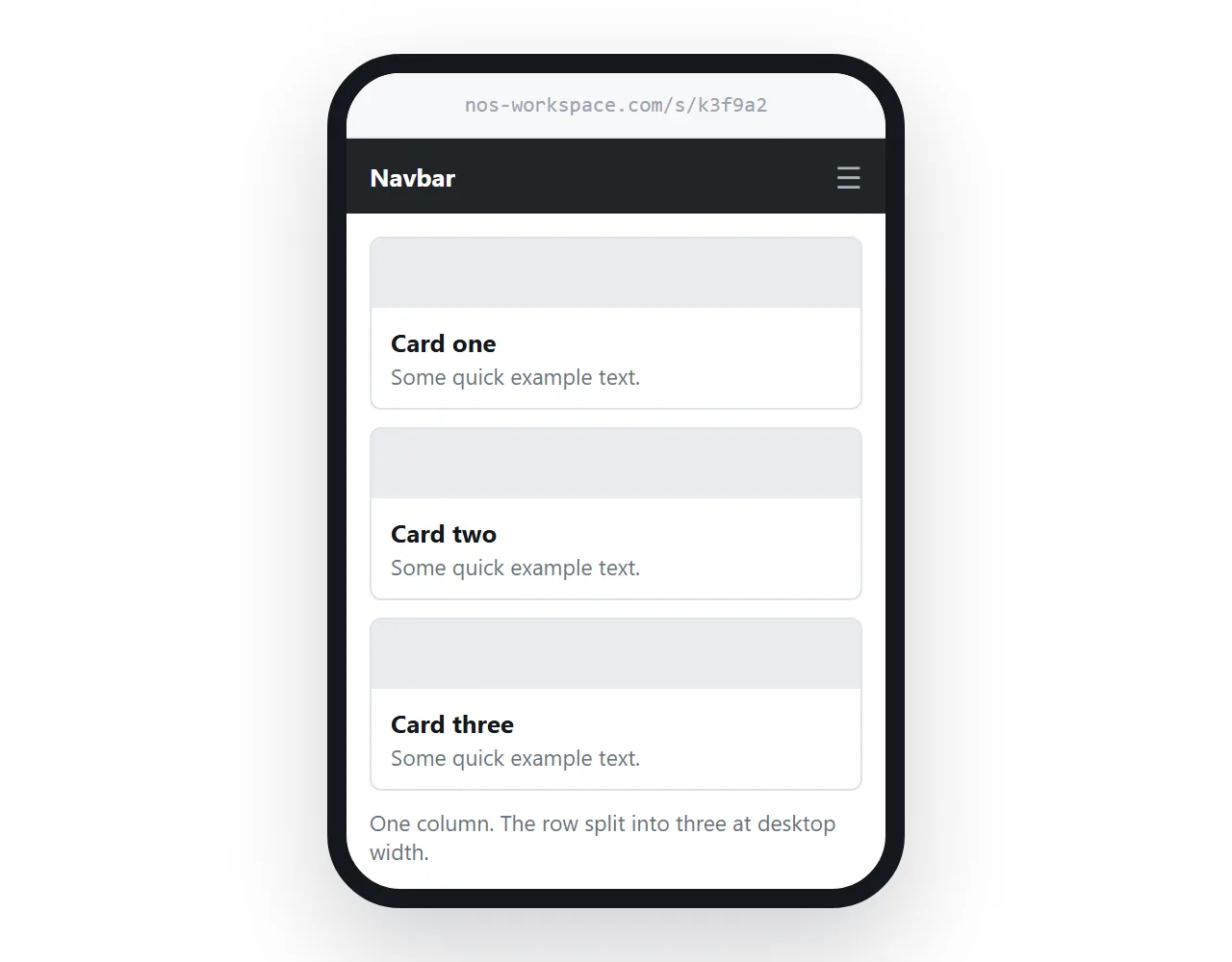
The address does not change when the numbers do, so next week's report replaces this week's at the same link. Turning HTML into a link is that step alone.
Before sending, open the file in the HTML file opener. A page that looks unstyled there is not loading its external stylesheet, which is exactly what the reader would have seen.
For pages that must work with no network at all, self-contained HTML explains how to fold the CSS inside instead.