Pico CSS is a CSS framework from picocss.com, and this guide is about that stylesheet. You link one file and write ordinary tags such as <h1>, <form> and <button>. They come out styled. Pico's site calls it a minimal CSS framework for semantic HTML.
Here is the smallest useful page. The only class on it is container.
<!doctype html>
<html lang="en">
<head>
<meta charset="utf-8">
<meta name="viewport" content="width=device-width, initial-scale=1">
<meta name="color-scheme" content="light dark">
<title>Pico CSS starter</title>
<!-- one stylesheet, pinned to an exact version -->
<link rel="stylesheet" href="https://cdn.jsdelivr.net/npm/@picocss/pico@2.1.1/css/pico.min.css">
</head>
<body>
<main class="container">
  <h1>Hello, Pico</h1>
  <p>Plain HTML tags, styled. The only class on this page is <code>container</code>.</p>

  <article>
    <header>A card is an article</header>
    Press the button to prove scripts run.
    <footer><button id="btn">Clicked 0 times</button></footer>
  </article>

  <form id="f">
    <label>Your name
      <input name="name" placeholder="Ada" required>
    </label>
    <button type="submit">Say hello</button>
  </form>
  <p id="out"></p>
</main>

<script>
  let n = 0;
  const btn = document.getElementById('btn');
  btn.addEventListener('click', () => {
    n++;
    btn.textContent = 'Clicked ' + n + (n === 1 ? ' time' : ' times');
  });

  // handle the form inside the page; nothing is sent anywhere
  document.getElementById('f').addEventListener('submit', (e) => {
    e.preventDefault();
    const name = new FormData(e.target).get('name');
    document.getElementById('out').textContent = 'Hello, ' + name + '!';
  });
</script>
</body>
</html>
Pico's own site says it works without dependencies, package managers, external files or JavaScript. For a single HTML file, that means there is nothing to install.
The smallest working page
This is the template from the Pico docs, with the stylesheet pinned to the version used in this guide:
<!doctype html>
<html lang="en">
  <head>
    <meta charset="utf-8">
    <meta name="viewport" content="width=device-width, initial-scale=1">
    <meta name="color-scheme" content="light dark">
    <link rel="stylesheet"
      href="https://cdn.jsdelivr.net/npm/@picocss/pico@2.1.1/css/pico.min.css">
    <title>Hello world!</title>
  </head>
  <body>
    <main class="container">
      <h1>Hello world!</h1>
    </main>
  </body>
</html>
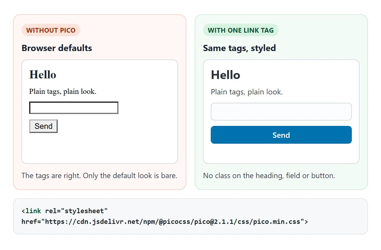
- Add the viewport and color-scheme meta tags. The viewport meta tag is what makes the page scale on a phone.
- Add the link tag. The Pico docs show
@2in the address. The version here is the exact number printed in the stylesheet's own header comment, so the file never changes under you. - Wrap the content in
<main class="container">. - Write plain HTML, and add a class only when you need a variant.
The styles come from the CDN, so the page looks styled only while that address can be loaded.
Standard or classless?
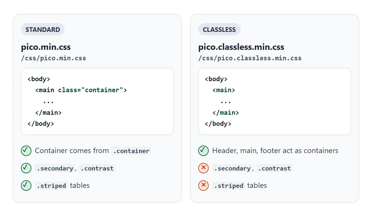
Pico ships two stylesheets. The standard file gives the page a width through the container class. The classless file needs no class at all: the docs say <header>, <main> and <footer> directly inside <body> act as containers.
Try the switch. The demo reloads the same markup with each stylesheet. Watch the two buttons and the striped table change.
<!doctype html>
<html lang="en">
<head>
<meta charset="utf-8">
<meta name="viewport" content="width=device-width, initial-scale=1">
<meta name="color-scheme" content="light dark">
<title>Pico: standard vs classless, light vs dark</title>
<link id="pico" rel="stylesheet" href="https://cdn.jsdelivr.net/npm/@picocss/pico@2.1.1/css/pico.min.css">
</head>
<body>
<main class="container">
  <h2>Switch the stylesheet</h2>

  <small>Stylesheet</small>
  <div role="group">
    <button id="std" type="button">pico.min.css</button>
    <button id="cls" type="button" class="outline">pico.classless.min.css</button>
  </div>

  <small>Color scheme</small>
  <div role="group">
    <button type="button" data-theme-pick="auto">Auto</button>
    <button type="button" data-theme-pick="light" class="outline">Light</button>
    <button type="button" data-theme-pick="dark" class="outline">Dark</button>
  </div>
  <p><small id="state">pico.min.css, data-theme not set (follows the system)</small></p>

  <button class="secondary">class="secondary"</button>
  <button class="contrast">class="contrast"</button>
  <table class="striped">
    <thead><tr><th>Class</th><th>Needs the standard file</th></tr></thead>
    <tbody>
      <tr><td>.secondary</td><td>yes</td></tr>
      <tr><td>.contrast</td><td>yes</td></tr>
      <tr><td>.striped</td><td>yes</td></tr>
    </tbody>
  </table>
</main>

<script>
  const BASE = 'https://cdn.jsdelivr.net/npm/@picocss/pico@2.1.1/css/';
  const link = document.getElementById('pico');
  const state = document.getElementById('state');
  let file = 'pico.min.css', theme = 'auto';

  function show() {
    state.textContent = file + ', ' +
      (theme === 'auto' ? 'data-theme not set (follows the system)' : 'data-theme="' + theme + '"');
  }

  // swap the stylesheet: same page, same tags
  function pickFile(name) {
    file = name;
    link.href = BASE + name;
    document.getElementById('std').className = name === 'pico.min.css' ? '' : 'outline';
    document.getElementById('cls').className = name === 'pico.min.css' ? 'outline' : '';
    show();
  }
  document.getElementById('std').addEventListener('click', () => pickFile('pico.min.css'));
  document.getElementById('cls').addEventListener('click', () => pickFile('pico.classless.min.css'));

  // data-theme on <html> forces a scheme; removing it hands control back to the system
  document.querySelectorAll('[data-theme-pick]').forEach((b) => {
    b.addEventListener('click', () => {
      theme = b.dataset.themePick;
      if (theme === 'auto') document.documentElement.removeAttribute('data-theme');
      else document.documentElement.setAttribute('data-theme', theme);
      document.querySelectorAll('[data-theme-pick]').forEach((x) => {
        x.className = x === b ? '' : 'outline';
      });
      show();
    });
  });
</script>
</body>
</html>
The docs say the secondary and contrast button styles and the striped table class are not available in the classless version.
Pick the classless file for a quick page of headings and paragraphs. Pick the standard one when you want those variants or a container-fluid layout.
Page width: the container class
In the standard file, .container gives a centered, fixed-width column and .container-fluid gives a full-width one. The width steps up with the viewport:
| Viewport | Breakpoint | Container width |
|---|---|---|
| Extra small | under 576px | 100% |
| Small | 576px and up | 510px |
| Medium | 768px and up | 700px |
| Large | 1024px and up | 950px |
| Extra large | 1280px and up | 1200px |
| Extra extra large | 1536px and up | 1450px |
If you leave the class off the standard file, <main> fills the whole window. In a test at a 900px viewport it measured 900px wide, and 700px with the class. On a 390px phone the two look the same.
Light and dark mode
Pico has light and dark schemes built in. The default is light, and the dark scheme turns on by itself when the visitor's system asks for prefers-color-scheme: dark. No JavaScript is involved.
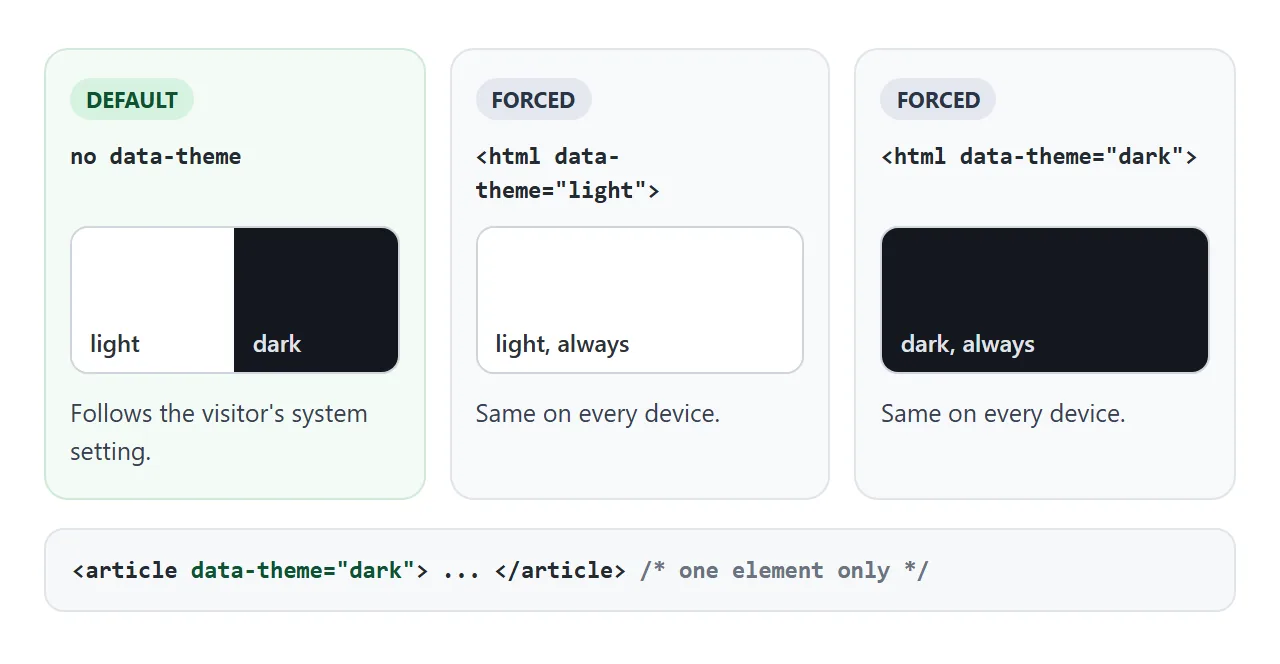
To fix the scheme, set data-theme on the <html> element. To style one block differently, put it on that element. Dark mode in CSS and color-scheme explain the browser side.
Make it yours with CSS variables
Every Pico variable starts with --pico-, so it cannot collide with yours. Style variables, such as the corner radius, go on :root.
Color variables depend on the scheme. The docs set them for light with :root:not([data-theme="dark"]) and for dark under the media query. CSS variables covers the basics.
A finished page: a feedback form
The last example uses a navigation bar, a three-card grid, a form with validation, a modal and an accordion. It also turns the accent green with two variables.
<!doctype html>
<html lang="en">
<head>
<meta charset="utf-8">
<meta name="viewport" content="width=device-width, initial-scale=1">
<meta name="color-scheme" content="light dark">
<title>Trail Club feedback</title>
<link rel="stylesheet" href="https://cdn.jsdelivr.net/npm/@picocss/pico@2.1.1/css/pico.min.css">
<style>
  /* style variables do not depend on the color scheme */
  :root { --pico-border-radius: 1rem; }
  /* color variables are set per scheme, as the Pico docs describe */
  :root:not([data-theme="dark"]) {
    --pico-primary-background: #0f766e;
    --pico-primary-hover-background: #115e59;
  }
  @media (prefers-color-scheme: dark) {
    :root:not([data-theme="light"]) {
      --pico-primary-background: #0d9488;
      --pico-primary-hover-background: #0f766e;
    }
  }
</style>
</head>
<body>
<main class="container">
  <nav>
    <ul><li><strong>Trail Club</strong></li></ul>
    <ul><li><a href="#form">Feedback</a></li><li><a href="#faq">FAQ</a></li></ul>
  </nav>

  <h1>Tell us about Saturday's hike</h1>

  <div class="grid">
    <article><header>Distance</header>12 km</article>
    <article><header>Climb</header>480 m</article>
    <article><header>Walkers</header>23</article>
  </div>

  <form id="form" novalidate>
    <label>Email
      <input type="email" name="email" placeholder="you@example.com" aria-describedby="email-help">
      <small id="email-help">We only use it to reply.</small>
    </label>
    <label>How was the route?
      <select name="rating">
        <option>Great</option><option>Fine</option><option>Too steep</option>
      </select>
    </label>
    <button type="submit">Preview</button>
  </form>

  <section id="faq">
    <details name="faq" open>
      <summary>Is anything sent to a server?</summary>
      <p>No. The form is handled by JavaScript inside this page.</p>
    </details>
    <details name="faq">
      <summary>Why one open at a time?</summary>
      <p>Both items share the same <code>name</code> attribute.</p>
    </details>
  </section>
</main>

<dialog id="dlg">
  <article>
    <header><strong>What would be sent</strong></header>
    <pre id="data"></pre>
    <footer><button id="close" class="secondary">Close</button></footer>
  </article>
</dialog>

<script>
  const form = document.getElementById('form');
  const email = form.elements.email;
  const help = document.getElementById('email-help');
  const dlg = document.getElementById('dlg');

  form.addEventListener('submit', (e) => {
    e.preventDefault();                      // no request leaves the page
    const ok = email.checkValidity() && email.value !== '';
    email.setAttribute('aria-invalid', ok ? 'false' : 'true');   // Pico colours the field and its <small>
    help.textContent = ok ? 'Looks good.' : 'Enter an email like you@example.com';
    if (!ok) return;
    document.getElementById('data').textContent =
      JSON.stringify(Object.fromEntries(new FormData(form)), null, 2);
    dlg.showModal();                         // Pico has no JS: opening the dialog is up to you
  });
  document.getElementById('close').addEventListener('click', () => dlg.close());
</script>
</body>
</html>
- Navigation: a
<nav>with two<ul>lists puts the brand on the left and links on the right. - Cards: an
<article>with<header>and<footer>is a card. Thegridclass puts cards side by side, and the docs say columns collapse below 768px. - Validation:
aria-invalid="true"or"false"colors the field, and the<small>under it follows. - Modal: a
<dialog>holding an<article>. Pico has no JavaScript, so the page callsshowModal()itself. - Accordion:
<details>and<summary>need no script, and a sharednamekeeps one open at a time.
For another form pattern, see HTML form submit.
When it does not work
| What you see | Cause | Fix |
|---|---|---|
| Plain unstyled page | The link address is wrong or cannot load | Check the href and that the page is online |
| Text runs edge to edge on a wide screen | Standard file, but no container class |
Add class="container" to <main> |
.secondary or .striped does nothing |
You linked the classless file | Link pico.min.css instead |
| A link does not look like a button | It is a plain <a> |
Add role="button" |
| The modal never opens | Pico ships no JavaScript | Call showModal() yourself |
| The page turns dark on some phones | Auto scheme follows the system | Set data-theme="light" on <html> |
| Custom color has no effect | Set on the wrong selector | Use the per-scheme selectors from the docs |
| Page reloads on submit | The form still submits | Call preventDefault() in the submit listener |
If the stylesheet itself will not load, CSS not loading in HTML lists the usual causes.
Share it as a link
A Pico page is a single .html file, so it is easy to send and easy to get wrong. An attachment may open as plain code on a phone, and a screenshot cannot be clicked.
Paste the page into a NOS document and choose Create share link. HTML to link walks through it.
The stylesheet loads from the CDN and the scripts run, so the people you send it to can submit the form and flip the theme themselves. If you change the code later, the same link shows the new version.