Here, "Bulma" means the CSS framework (bulma.io), not a person or a place. It styles plain HTML through class names, so a Bulma page is an ordinary HTML file with one extra <link> tag in the head.
Try the smallest working page. Click Save.
<!doctype html>
<html lang="en">
<head>
<meta charset="utf-8">
<meta name="viewport" content="width=device-width, initial-scale=1">
<title>Hello Bulma</title>
<!-- The only Bulma line: one stylesheet, pinned to a version -->
<link rel="stylesheet" href="https://cdn.jsdelivr.net/npm/bulma@1.0.4/css/bulma.min.css">
</head>
<body>
<section class="section">
  <div class="container">
    <h1 class="title">Hello Bulma</h1>
    <p class="subtitle">One stylesheet link. No build step, no install.</p>

    <div class="box">
      <p id="msg">Nothing saved yet.</p>
      <br>
      <div class="buttons">
        <button class="button is-primary" id="save">Save</button>
        <button class="button is-link is-light">Cancel</button>
        <button class="button is-danger is-outlined">Delete</button>
      </div>
    </div>
  </div>
</section>

<script>
  // Bulma only styles. Your own script decides what a click does.
  const save = document.getElementById('save');
  const msg = document.getElementById('msg');
  save.addEventListener('click', () => {
    save.classList.add('is-loading');
    msg.textContent = 'Saving...';
    setTimeout(() => {
      save.classList.remove('is-loading');
      msg.textContent = 'Saved.';
    }, 800);
  });
</script>
</body>
</html>
The framework describes itself as a CSS library that provides classes to style your HTML. There is nothing to build and nothing to install. If the page looks plain, the link tag did not load.
The one line that loads Bulma
Bulma's installation page shows a pre-built stylesheet on a CDN. The starter page needs that line plus the responsive viewport tag, both in the head.
<meta name="viewport" content="width=device-width, initial-scale=1">
<link rel="stylesheet"
      href="https://cdn.jsdelivr.net/npm/bulma@1.0.4/css/bulma.min.css">
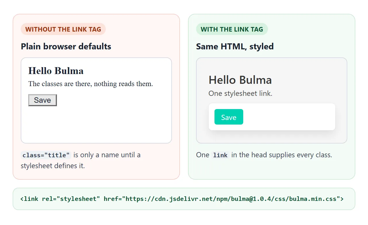
Keep the version number in the address, as the installation page does. Without the viewport meta tag, many phones render the page in a wider virtual window and shrink it to fit the screen.
The classes to learn first
A page needs only a handful of classes to look finished.
| Class | What it does |
|---|---|
section |
Pads a block of the page |
container |
Centres content on larger screens |
title and subtitle |
Headings, sized with is-1 to is-6 |
box |
White container with padding and a shadow |
button |
Buttons, coloured with is-primary, is-link, is-danger |
columns and column |
The grid |
Modifiers start with is- and are added next to the base class. button is-primary is-light is a primary button in its light variant.
Columns: side by side, then stacked
Add a columns container and put column elements inside it. Each column gets an equal width. Size one with a class such as is-half or is-one-third, and the others share the space left over. The grid divides into 12, so is-1 to is-12 also work.
<!doctype html>
<html lang="en">
<head>
<meta charset="utf-8">
<meta name="viewport" content="width=device-width, initial-scale=1">
<title>Bulma columns</title>
<link rel="stylesheet" href="https://cdn.jsdelivr.net/npm/bulma@1.0.4/css/bulma.min.css">
<style>
  body { padding: 16px; }
  h2 { font-size: 14px; font-weight: 700; margin: 0 0 4px; }
  p.note { font-size: 12px; margin: 0 0 8px; opacity: .75; }
  .box { padding: 12px; margin: 0; text-align: center; font-size: 13px; }
</style>
</head>
<body>
<h2>columns (default)</h2>
<p class="note">Side by side on a wide screen, stacked on a phone.</p>
<div class="columns">
  <div class="column is-half"><div class="box">is-half</div></div>
  <div class="column"><div class="box">auto</div></div>
  <div class="column"><div class="box">auto</div></div>
</div>

<h2>columns is-mobile</h2>
<p class="note">Stays in a row on a phone too.</p>
<div class="columns is-mobile">
  <div class="column is-half"><div class="box">is-half</div></div>
  <div class="column"><div class="box">auto</div></div>
  <div class="column"><div class="box">auto</div></div>
</div>

<p class="note" id="width"></p>
<script>
  // Show the width this page is rendered at, so the stacking is easy to explain
  const out = document.getElementById('width');
  function show() { out.textContent = 'Page width now: ' + window.innerWidth + 'px. Narrow the window or open this on a phone to see the first row stack.'; }
  show();
  window.addEventListener('resize', show);
</script>
</body>
</html>
This is where most first pages go wrong. By default, columns are only activated from tablet width up, so on a phone they pile on top of each other. That is intended: a phone is a narrow place.
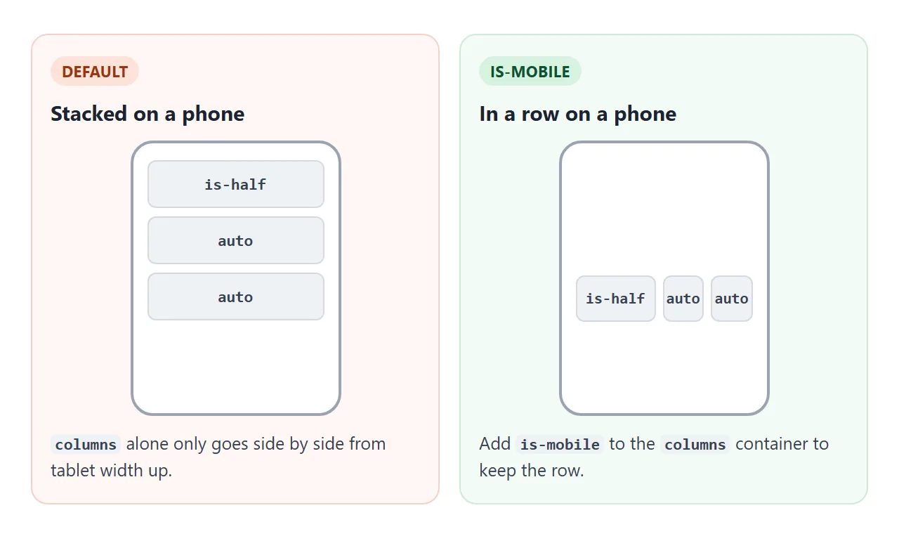
When a row of small items should stay a row on a phone, such as three numbers, add is-mobile to the columns container.
What Bulma leaves to your JavaScript
Bulma's own documentation says the package does not come with any JavaScript. Three parts you will want are only styled, never wired up.
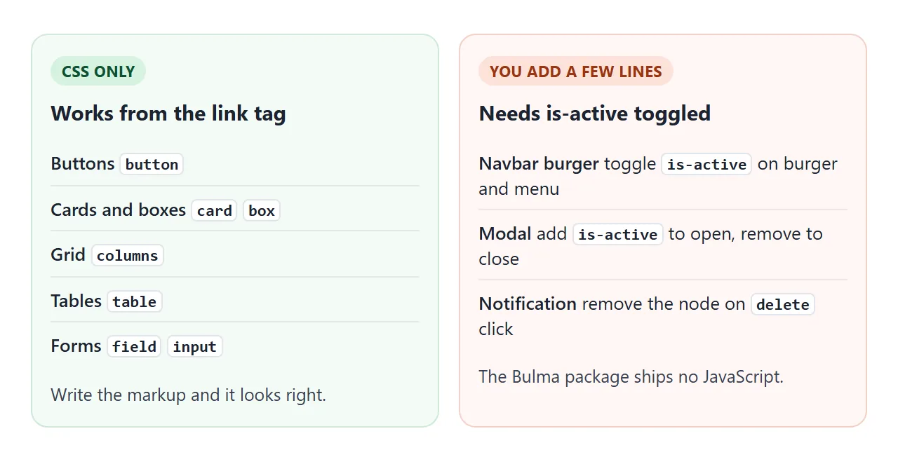
- Navbar burger: on a touch screen the menu stays hidden until you add
is-activeto both the burger and the menu. The burger needs four emptyspantags and adata-targetpointing at the menu. - Modal: adding
is-activeto themodalelement shows it. Removing the class hides it. - Notification: the
deletebutton is only a cross. Your script removes the notification.
Each is a few lines of classList.toggle. The next example has all three, plus a form and a theme switch.
A finished example: a small team board
<!doctype html>
<html lang="en">
<head>
<meta charset="utf-8">
<meta name="viewport" content="width=device-width, initial-scale=1">
<title>Team board</title>
<link rel="stylesheet" href="https://cdn.jsdelivr.net/npm/bulma@1.0.4/css/bulma.min.css">
<style>
  main { padding: 16px; }
  .stat { padding: 10px; margin: 0; text-align: center; }
  .stat b { display: block; font-size: 22px; }
  .stat span { font-size: 12px; }
  #out { font-size: 12px; margin-top: 8px; white-space: pre-wrap; }
</style>
</head>
<body>

<nav class="navbar" role="navigation" aria-label="main navigation">
  <div class="navbar-brand">
    <a class="navbar-item"><strong>Team board</strong></a>
    <a role="button" class="navbar-burger" aria-label="menu" aria-expanded="false" data-target="menu">
      <span aria-hidden="true"></span>
      <span aria-hidden="true"></span>
      <span aria-hidden="true"></span>
      <span aria-hidden="true"></span>
    </a>
  </div>
  <div id="menu" class="navbar-menu">
    <div class="navbar-start">
      <a class="navbar-item">Overview</a>
      <a class="navbar-item">Tasks</a>
    </div>
    <div class="navbar-end">
      <div class="navbar-item">
        <button class="button is-light" id="theme">Dark theme</button>
      </div>
    </div>
  </div>
</nav>

<main class="container">
  <div class="notification is-info is-light">
    <button class="delete" aria-label="dismiss"></button>
    Sprint ends Friday.
  </div>

  <div class="columns is-mobile">
    <div class="column"><div class="box stat"><b>12</b><span>Open</span></div></div>
    <div class="column"><div class="box stat"><b>5</b><span>Doing</span></div></div>
    <div class="column"><div class="box stat"><b>31</b><span>Done</span></div></div>
  </div>

  <div class="table-container">
    <table class="table is-striped is-fullwidth">
      <thead><tr><th>Task</th><th>Owner</th><th>Status</th></tr></thead>
      <tbody>
        <tr><td>Fix login</td><td>Mina</td><td>Doing</td></tr>
        <tr><td>Write docs</td><td>Jun</td><td>Open</td></tr>
        <tr><td>Ship v2</td><td>Sara</td><td>Done</td></tr>
      </tbody>
    </table>
  </div>

  <button class="button is-primary" id="open">Add task</button>
</main>

<div class="modal" id="modal">
  <div class="modal-background"></div>
  <div class="modal-content">
    <div class="box">
      <form id="form">
        <div class="field">
          <label class="label" for="task">Task</label>
          <div class="control"><input class="input" id="task" name="task" required placeholder="What needs doing?"></div>
        </div>
        <div class="field">
          <label class="label" for="owner">Owner</label>
          <div class="control"><input class="input" id="owner" name="owner" placeholder="Name"></div>
        </div>
        <button class="button is-link" type="submit">Add</button>
        <pre id="out"></pre>
      </form>
    </div>
  </div>
  <button class="modal-close is-large" aria-label="close"></button>
</div>

<script>
  // Bulma ships no JavaScript, so each toggle below is ours.
  const $ = (s) => document.querySelector(s);

  // Navbar burger: toggle is-active on the burger and on its menu
  const burger = $('.navbar-burger');
  burger.addEventListener('click', () => {
    burger.classList.toggle('is-active');
    document.getElementById(burger.dataset.target).classList.toggle('is-active');
  });

  // Notification: remove it when the delete button is clicked
  $('.notification .delete').addEventListener('click', (e) => e.target.parentNode.remove());

  // Modal: is-active shows it
  const modal = $('#modal');
  $('#open').addEventListener('click', () => modal.classList.add('is-active'));
  modal.querySelector('.modal-background').addEventListener('click', () => modal.classList.remove('is-active'));
  modal.querySelector('.modal-close').addEventListener('click', () => modal.classList.remove('is-active'));

  // Form handled inside the page: show what would be sent
  $('#form').addEventListener('submit', (e) => {
    e.preventDefault();
    const data = Object.fromEntries(new FormData(e.target));
    $('#out').textContent = JSON.stringify(data);
    const row = document.createElement('tr');
    row.innerHTML = '<td></td><td></td><td>Open</td>';
    row.children[0].textContent = data.task;
    row.children[1].textContent = data.owner || '-';
    $('tbody').appendChild(row);
  });

  // Dark theme: Bulma v1 reads data-theme on the html element
  const root = document.documentElement;
  const theme = $('#theme');
  theme.addEventListener('click', () => {
    const dark = root.getAttribute('data-theme') === 'dark';
    if (dark) root.removeAttribute('data-theme'); else root.setAttribute('data-theme', 'dark');
    theme.textContent = dark ? 'Dark theme' : 'Light theme';
  });
</script>
</body>
</html>
- Layout: the three stat boxes sit in a
columns is-mobilerow so they stay a row on a phone. - Table: a
table is-striped is-fullwidthinside atable-container, which scrolls sideways if the table is wider than the screen. - Form: the
field,label,controlandinputclasses style it. The page handles the submit itself and does not send it anywhere. - Theme: Bulma 1 reads
data-theme="dark"on thehtmlelement. The button sets and removes it.
Bulma 1 also follows the visitor's light or dark system setting on its own, using prefers-color-scheme. Setting color-scheme explains the browser side of that.
When it does not work
| What you see | Cause | Fix |
|---|---|---|
| The page looks like plain HTML | The stylesheet did not load | Check the link address and the version in it |
| It works on my disk, not for others | The link points to a file on your computer | Use the CDN address |
| Columns stack on a phone | That is the default | Add is-mobile to columns |
| Columns ignore each other | column is not inside columns |
Wrap them in a columns container |
| The burger does nothing | Bulma ships no script | Toggle is-active on burger and menu |
| The modal never appears | Nothing adds is-active |
Add it in a click handler |
| The page is tiny on a phone | No viewport meta tag | Add the tag from the starter |
| A fixed white area on a dark screen | Hard-coded colours against Bulma's dark theme | Colour with Bulma classes |
A stylesheet that fails to load is a general problem with its own guide: CSS not loading.
Share it as a link
A Bulma page is easier to judge on a real screen. A screenshot cannot show the burger opening or the columns stacking on a phone, and an attached .html file may open as plain code on a phone, or not open at all.
Paste the page into a NOS document and choose Create share link. HTML to link walks through it.
The stylesheet loads from its CDN and your scripts run, so the people you send it to can open the burger and the modal themselves. If you change the code later, the same link shows the new version.