shadcn/ui is a library for React projects, not a file you can link. The search "shadcn ui" points at its ready-made components: buttons, cards, inputs, tabs.
A command-line tool copies them into your code, and a plain HTML file cannot run that. It can borrow the styling.
Here is a card in the shadcn style, built in one HTML file with Tailwind from a CDN. Type a name and press Create.
<!doctype html>
<html lang="en">
<head>
<meta charset="utf-8">
<meta name="viewport" content="width=device-width, initial-scale=1">
<title>shadcn-style card in plain HTML</title>
<script src="https://cdn.jsdelivr.net/npm/@tailwindcss/browser@4.3.3"></script>
<style type="text/tailwindcss">
  /* theme tokens: the same names shadcn/ui uses */
  :root {
    --radius: 0.625rem;
    --background: oklch(1 0 0);
    --foreground: oklch(0.145 0 0);
    --card: oklch(1 0 0);
    --card-foreground: oklch(0.145 0 0);
    --primary: oklch(0.205 0 0);
    --primary-foreground: oklch(0.985 0 0);
    --muted-foreground: oklch(0.556 0 0);
    --border: oklch(0.922 0 0);
    --input: oklch(0.922 0 0);
    --ring: oklch(0.708 0 0);
  }
  /* map tokens to Tailwind utilities: bg-card, text-primary, ... */
  @theme inline {
    --color-background: var(--background);
    --color-foreground: var(--foreground);
    --color-card: var(--card);
    --color-card-foreground: var(--card-foreground);
    --color-primary: var(--primary);
    --color-primary-foreground: var(--primary-foreground);
    --color-muted-foreground: var(--muted-foreground);
    --color-border: var(--border);
    --color-input: var(--input);
    --color-ring: var(--ring);
    --radius-md: calc(var(--radius) * 0.8);
    --radius-xl: calc(var(--radius) * 1.4);
  }
  @layer base { * { border-color: var(--border); } }
</style>
</head>
<body class="bg-background text-foreground font-sans p-4">

<!-- Card: the class string below is the one in shadcn/ui's card.tsx -->
<div class="flex flex-col gap-6 rounded-xl border bg-card py-6 text-card-foreground shadow-sm max-w-sm mx-auto">
  <div class="grid gap-2 px-6">
    <div class="leading-none font-semibold">Create project</div>
    <div class="text-sm text-muted-foreground">Name it, then press Create.</div>
  </div>
  <form id="f" class="grid gap-3 px-6">
    <label for="name" class="flex items-center gap-2 text-sm leading-none font-medium">Name</label>
    <input id="name" name="name" value="my-first-page" required
      class="h-9 w-full min-w-0 rounded-md border border-input bg-transparent px-3 py-1 text-base shadow-xs outline-none placeholder:text-muted-foreground md:text-sm focus-visible:border-ring focus-visible:ring-[3px] focus-visible:ring-ring/50">
    <div class="flex items-center gap-2 pt-1">
      <button type="submit"
        class="inline-flex h-9 items-center justify-center rounded-md bg-primary px-4 py-2 text-sm font-medium whitespace-nowrap text-primary-foreground hover:bg-primary/90 focus-visible:ring-[3px] focus-visible:ring-ring/50 outline-none">Create</button>
      <span id="out" class="text-sm text-muted-foreground"></span>
    </div>
  </form>
</div>

<script>
  // Plain JS: shadcn/ui's React code is not needed for a static card
  document.getElementById('f').addEventListener('submit', (e) => {
    e.preventDefault();  // stay on the page, no server here
    const name = new FormData(e.target).get('name');
    document.getElementById('out').textContent = 'Created "' + name + '"';
  });
</script>
</body>
</html>
Everything on screen is HTML, Tailwind classes and CSS variables. No React, no build step.
What shadcn/ui is, and why there is no script tag
The shadcn/ui documentation describes it as "a set of beautifully-designed, accessible components and a code distribution platform" that is open source and open code. Its introduction also says: "This is not a component library. It is how you build your component library."
That sentence explains the missing script tag. You do not load shadcn/ui from a server. A command such as the one below copies a component's source file into your own project, where you can edit it.
pnpm dlx shadcn@latest add button
The Button page shows the result being used with a React import, @/components/ui/button. The components.json file in a project sets up that kind of alias, so a browser opening an HTML file cannot resolve it.
The project is licensed under the MIT license, according to its GitHub README.
Copy the look: tokens and class strings
Two things make a shadcn component look the way it does. The first is a set of theme tokens: CSS variables such as --background, --primary and --radius. The second is the class string on each element.
The docs say each token pairs with a -foreground token that colours the text on top of it.
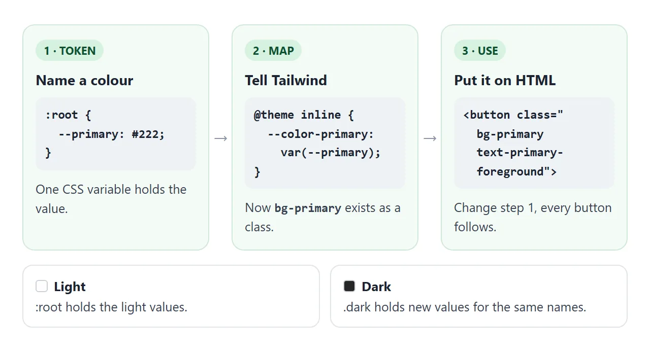
To use them in one HTML file:
- Add the Tailwind browser script from
cdn.jsdelivr.net, with a pinned version. - Put your tokens in a style block marked
type="text/tailwindcss". - Add an
@theme inlineblock that maps each token to a Tailwind colour. - Copy the class strings from a component onto plain elements.
- Write any behaviour in a
<script>.
The card above is steps 1 to 4. In the shadcn/ui source, the card is a div with a class string, and the HTML version uses those same classes:
<div class="flex flex-col gap-6 rounded-xl border bg-card py-6
  text-card-foreground shadow-sm">
Tailwind's documentation gives the script tag for its Play CDN and says custom CSS that needs Tailwind features goes in a style tag with type="text/tailwindcss". Pin the version, as the demos here do, so a new release cannot change your page.
Light and dark with one class
Because every colour is a variable, dark mode is a second set of values for the same names. The shadcn/ui docs show a .dark block next to :root, and an @theme inline block that points each Tailwind colour at a variable.
<!doctype html>
<html lang="en">
<head>
<meta charset="utf-8">
<meta name="viewport" content="width=device-width, initial-scale=1">
<title>Button variants and a theme switch</title>
<script src="https://cdn.jsdelivr.net/npm/@tailwindcss/browser@4.3.3"></script>
<style type="text/tailwindcss">
  :root {
    --radius: 0.625rem;
    --background: oklch(1 0 0);
    --foreground: oklch(0.145 0 0);
    --primary: oklch(0.205 0 0);
    --primary-foreground: oklch(0.985 0 0);
    --secondary: oklch(0.97 0 0);
    --secondary-foreground: oklch(0.205 0 0);
    --accent: oklch(0.97 0 0);
    --accent-foreground: oklch(0.205 0 0);
    --destructive: oklch(0.577 0.245 27.325);
    --muted-foreground: oklch(0.556 0 0);
    --border: oklch(0.922 0 0);
    --ring: oklch(0.708 0 0);
  }
  /* dark mode = the same names with new values, no dark: classes needed */
  .dark {
    --background: oklch(0.145 0 0);
    --foreground: oklch(0.985 0 0);
    --primary: oklch(0.922 0 0);
    --primary-foreground: oklch(0.205 0 0);
    --secondary: oklch(0.269 0 0);
    --secondary-foreground: oklch(0.985 0 0);
    --accent: oklch(0.269 0 0);
    --accent-foreground: oklch(0.985 0 0);
    --destructive: oklch(0.704 0.191 22.216);
    --muted-foreground: oklch(0.708 0 0);
    --border: oklch(1 0 0 / 15%);
    --ring: oklch(0.556 0 0);
  }
  @theme inline {
    --color-background: var(--background);
    --color-foreground: var(--foreground);
    --color-primary: var(--primary);
    --color-primary-foreground: var(--primary-foreground);
    --color-secondary: var(--secondary);
    --color-secondary-foreground: var(--secondary-foreground);
    --color-accent: var(--accent);
    --color-accent-foreground: var(--accent-foreground);
    --color-destructive: var(--destructive);
    --color-muted-foreground: var(--muted-foreground);
    --color-border: var(--border);
    --color-ring: var(--ring);
    --radius-md: calc(var(--radius) * 0.8);
  }
  @layer base { * { border-color: var(--border); } }
  /* shared part of every button, simplified from shadcn/ui's button.tsx */
  @utility btn {
    display: inline-flex; align-items: center; justify-content: center;
    height: 2.25rem; padding: 0 1rem; border-radius: var(--radius-md);
    font-size: 0.875rem; font-weight: 500; white-space: nowrap; outline: none;
    transition: all .15s;
  }
</style>
</head>
<body class="bg-background text-foreground font-sans p-4 min-h-screen">

<div class="flex items-center justify-between gap-3 mb-5">
  <h1 class="text-base font-semibold">Variants</h1>
  <button id="theme" type="button" aria-pressed="false" class="btn border bg-background hover:bg-accent hover:text-accent-foreground">Dark</button>
</div>

<div class="flex flex-wrap gap-3">
  <button class="btn bg-primary text-primary-foreground hover:bg-primary/90">Default</button>
  <button class="btn bg-secondary text-secondary-foreground hover:bg-secondary/80">Secondary</button>
  <button class="btn bg-destructive text-white hover:bg-destructive/90">Destructive</button>
  <button class="btn border bg-background hover:bg-accent hover:text-accent-foreground">Outline</button>
  <button class="btn hover:bg-accent hover:text-accent-foreground">Ghost</button>
  <button class="btn text-primary underline-offset-4 hover:underline">Link</button>
</div>

<p class="mt-6 mb-2 text-sm text-muted-foreground">Badges use the same tokens.</p>
<div class="flex flex-wrap gap-2">
  <span class="inline-flex items-center rounded-full border border-transparent bg-primary px-2 py-0.5 text-xs font-medium text-primary-foreground">Default</span>
  <span class="inline-flex items-center rounded-full border border-transparent bg-secondary px-2 py-0.5 text-xs font-medium text-secondary-foreground">Secondary</span>
  <span class="inline-flex items-center rounded-full border border-transparent bg-destructive px-2 py-0.5 text-xs font-medium text-white">Destructive</span>
  <span class="inline-flex items-center rounded-full border px-2 py-0.5 text-xs font-medium text-foreground">Outline</span>
</div>

<script>
  const btn = document.getElementById('theme');
  btn.addEventListener('click', () => {
    // flipping one class swaps every token value at once
    const dark = document.documentElement.classList.toggle('dark');
    btn.textContent = dark ? 'Light' : 'Dark';
    btn.setAttribute('aria-pressed', dark);
  });
</script>
</body>
</html>
No dark: class is needed on the buttons. The button classes say bg-primary, and bg-primary reads --primary. Flip the class on the page root and the variable changes under every element.
The demos reuse the default-theme values the docs list for --radius, --background, --foreground and --primary. The other values are my own greys, a starting point rather than the project's exact palette.
For more on the pattern, see CSS variables and Tailwind dark mode in HTML.
What does not come over to plain HTML
Some parts of shadcn/ui belong to a project, not to a page.
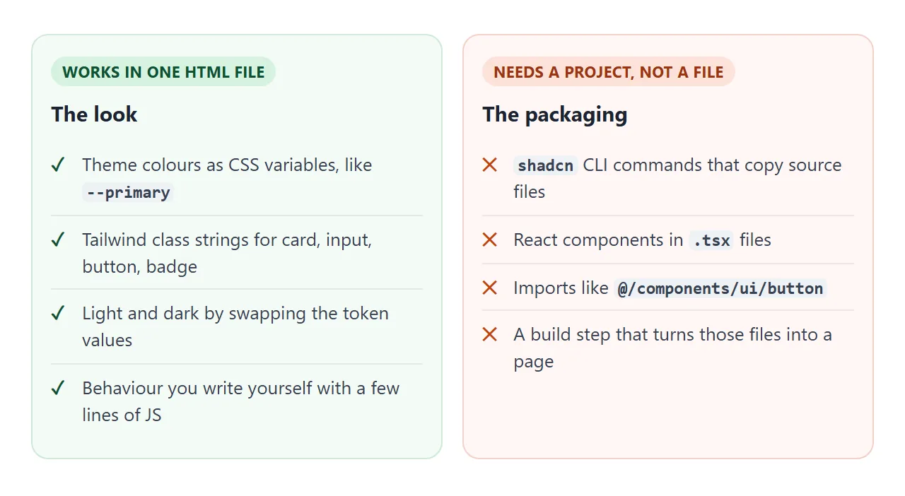
| Part | In a shadcn project | In one HTML file |
|---|---|---|
| Look of a button or card | A .tsx component |
The same classes on a div or button |
| Colours | Variables in the site's CSS file | Variables in a style block |
| Adding a component | A CLI command | Paste the markup |
| Tabs, switch | A component that tracks state | Markup plus your own JavaScript |
| Imports | @/components/... paths |
Not available |
The Button source also shows what the component does besides styling. It is a React function that picks a class set for each variant: default, secondary, destructive, outline, ghost and link. In HTML you choose the class set yourself, as the variants demo does.
If you want the real components, the docs list framework guides for Next.js, Vite, TanStack Start, Laravel, React Router and Astro. A React app needs a build before it can be a page. Host a React app as a page covers that route.
Add the behaviour yourself
The shadcn/ui tabs and switch are built on the radix-ui package, and their classes style the page by reading attributes. The tab classes look for data-[state=active], and the switch classes look for data-[state=checked].
Tailwind's documentation describes the data-* and aria-* variants that make this possible. So in HTML you set the attribute and the same style rule applies.
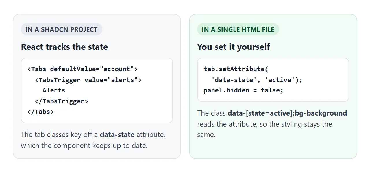
A switch also needs the right semantics. MDN describes the switch role as an on/off control that must carry aria-checked, where true means on.
<!doctype html>
<html lang="en">
<head>
<meta charset="utf-8">
<meta name="viewport" content="width=device-width, initial-scale=1">
<title>Settings card: tabs, switch and form</title>
<script src="https://cdn.jsdelivr.net/npm/@tailwindcss/browser@4.3.3"></script>
<style type="text/tailwindcss">
  :root {
    --radius: 0.625rem;
    --background: oklch(1 0 0);
    --foreground: oklch(0.145 0 0);
    --card: oklch(1 0 0);
    --card-foreground: oklch(0.145 0 0);
    --primary: oklch(0.205 0 0);
    --primary-foreground: oklch(0.985 0 0);
    --muted: oklch(0.97 0 0);
    --muted-foreground: oklch(0.556 0 0);
    --border: oklch(0.922 0 0);
    --input: oklch(0.922 0 0);
    --ring: oklch(0.708 0 0);
  }
  @theme inline {
    --color-background: var(--background);
    --color-foreground: var(--foreground);
    --color-card: var(--card);
    --color-card-foreground: var(--card-foreground);
    --color-primary: var(--primary);
    --color-primary-foreground: var(--primary-foreground);
    --color-muted: var(--muted);
    --color-muted-foreground: var(--muted-foreground);
    --color-border: var(--border);
    --color-input: var(--input);
    --color-ring: var(--ring);
    --radius-md: calc(var(--radius) * 0.8);
    --radius-xl: calc(var(--radius) * 1.4);
  }
  @layer base { * { border-color: var(--border); } }
</style>
</head>
<body class="bg-background text-foreground font-sans p-4">

<div class="flex flex-col gap-5 rounded-xl border bg-card py-6 text-card-foreground shadow-sm max-w-md mx-auto">
  <div class="px-6">
    <div class="leading-none font-semibold">Settings</div>
    <div class="mt-2 text-sm text-muted-foreground">Tabs and a switch, written without React.</div>
  </div>

  <!-- Tabs: data-state is the hook, the same idea Radix uses -->
  <div class="px-6">
    <div role="tablist" class="inline-flex h-9 w-full items-center rounded-lg bg-muted p-[3px]">
      <button role="tab" id="t-account" aria-controls="account" data-state="active"
        class="tab h-[calc(100%-1px)] flex-1 rounded-md px-2 text-sm font-medium text-muted-foreground data-[state=active]:bg-background data-[state=active]:text-foreground data-[state=active]:shadow-sm">Account</button>
      <button role="tab" id="t-notify" aria-controls="notify" data-state="inactive"
        class="tab h-[calc(100%-1px)] flex-1 rounded-md px-2 text-sm font-medium text-muted-foreground data-[state=active]:bg-background data-[state=active]:text-foreground data-[state=active]:shadow-sm">Alerts</button>
    </div>
  </div>

  <form id="account" role="tabpanel" class="grid gap-3 px-6">
    <label for="email" class="text-sm leading-none font-medium">Email</label>
    <input id="email" name="email" type="email" required placeholder="you@example.com"
      class="h-9 w-full min-w-0 rounded-md border border-input bg-transparent px-3 py-1 text-base shadow-xs outline-none placeholder:text-muted-foreground md:text-sm focus-visible:border-ring focus-visible:ring-[3px] focus-visible:ring-ring/50">
    <div class="flex items-center gap-3">
      <button type="submit" class="inline-flex h-9 items-center rounded-md bg-primary px-4 text-sm font-medium text-primary-foreground hover:bg-primary/90">Save</button>
      <span id="saved" class="text-sm text-muted-foreground" role="status"></span>
    </div>
  </form>

  <div id="notify" hidden class="grid gap-3 px-6">
    <div class="flex items-center justify-between gap-3">
      <span id="sw-label" class="text-sm font-medium">Email me about changes</span>
      <!-- Switch: a button with role="switch" -->
      <button id="sw" type="button" role="switch" aria-checked="false" aria-labelledby="sw-label"
        class="inline-flex h-[1.15rem] w-8 shrink-0 items-center rounded-full border border-transparent bg-input p-0 transition-colors aria-checked:bg-primary focus-visible:ring-[3px] focus-visible:ring-ring/50 outline-none">
        <span class="pointer-events-none block size-4 rounded-full bg-background shadow transition-transform translate-x-0 in-aria-checked:translate-x-[calc(100%-2px)]"></span>
      </button>
    </div>
    <p id="state" class="text-sm text-muted-foreground">Alerts are off.</p>
  </div>
</div>

<script>
  const tabs = document.querySelectorAll('.tab');
  const account = document.getElementById('account');
  const notify = document.getElementById('notify');

  tabs.forEach((tab) => tab.addEventListener('click', () => {
    tabs.forEach((t) => t.setAttribute('data-state', t === tab ? 'active' : 'inactive'));
    const showAccount = tab.id === 't-account';
    account.hidden = !showAccount;
    notify.hidden = showAccount;
  }));

  const sw = document.getElementById('sw');
  sw.addEventListener('click', () => {
    const on = sw.getAttribute('aria-checked') !== 'true';
    sw.setAttribute('aria-checked', on);
    document.getElementById('state').textContent = 'Alerts are ' + (on ? 'on.' : 'off.');
  });

  account.addEventListener('submit', (e) => {
    e.preventDefault();  // handled inside the page, nothing is sent
    document.getElementById('saved').textContent = 'Saved ' + new FormData(account).get('email');
  });
</script>
</body>
</html>
The form is handled inside the page. The submit listener calls preventDefault() and reads the fields with FormData, which MDN defines as key and value pairs for form fields. Nothing is sent anywhere. See form without an action for the pattern.
When it does not work
| What you see | Cause | Fix |
|---|---|---|
| The page has no styling at all | The Tailwind script did not load | Check the script tag and that the CDN address is spelled right |
bg-primary shows no colour |
The token is not mapped to Tailwind | Add --color-primary in an @theme inline block |
Your @theme block is ignored |
It sits in a normal style tag | Use type="text/tailwindcss" on that style tag |
| The Dark button changes nothing | The .dark block misses some tokens |
Redefine every token, and put the class on the html element |
| The console says it cannot resolve an import | A project import path is in the page | Replace the component with plain markup and classes |
| Tabs or switch look stuck | Nothing updates the state attribute | Set data-state or aria-checked in a click listener |
Share it as a link
A shadcn-style page is easier to show than to describe, because the tabs, the switch and the dark button only make sense when you press them. A screenshot cannot do that, and an .html attachment may open as plain code on a phone.
To send the working version, paste the page into a NOS document and choose Create share link. HTML to link walks through it.
Scripts run and the Tailwind script from the CDN loads, so the people you send it to can press the buttons themselves, with no account. If you change the code later, the same link shows the new version.
For a starter file with the Tailwind script already in place, see Tailwind HTML template.