Forced colors is a mode where the browser swaps every colour on your page for a small palette the user chose, and drops shadows and gradients. Windows contrast themes turn it on.
You detect it with @media (forced-colors: active). You fix what breaks with borders, system colour keywords such as Canvas and Highlight, and, in a few places, forced-color-adjust: none.
Try the switch below. Tick Preview forced colours, then untick Use the forced-colors rules and watch the switches disappear.
<!doctype html>
<html lang="en">
<head>
<meta charset="utf-8">
<meta name="viewport" content="width=device-width, initial-scale=1">
<title>Forced colours: a switch that survives</title>
<style>
  body { margin: 0; padding: 14px; font-family: system-ui, sans-serif; background: #eef1f5; color: #1d2330; }
  #stage { background: #eef1f5; padding: 4px; }
  .panel { max-width: 420px; background: #fff; border-radius: 12px; padding: 6px 16px;
           box-shadow: 0 4px 14px rgba(0, 0, 0, .1); }
  .row { display: flex; align-items: center; justify-content: space-between; gap: 12px;
         padding: 12px 0; border-bottom: 1px solid #eef1f5; font-size: 15px; }
  .row:last-child { border-bottom: 0; }

  /* A switch drawn only with background colours */
  .switch { position: relative; flex: none; width: 46px; height: 26px; padding: 0;
            border: 0; border-radius: 13px; background: #cbd5e1; cursor: pointer; }
  .switch[aria-checked="true"] { background: #16a34a; }
  .knob { position: absolute; top: 3px; left: 3px; width: 20px; height: 20px;
          border-radius: 50%; background: #fff; box-shadow: 0 1px 3px rgba(0, 0, 0, .3);
          transition: left .15s; }
  .switch[aria-checked="true"] .knob { left: 23px; }

  .bar { margin-top: 12px; font-size: 13px; line-height: 1.8; }
  .bar label { display: block; }
  .note { margin: 4px 0 0; font-size: 12px; color: #5b6270; }
</style>
<!-- These rules apply only in forced colours mode.
     Same as writing them inside @media (forced-colors: active) { } -->
<style id="forced" media="(forced-colors: active)">
  .switch { border: 2px solid ButtonText; }             /* draw the track edge */
  .knob { top: 1px; left: 1px; background: ButtonText; } /* knob in the text colour */
  .switch[aria-checked="true"] { background: Highlight; }
  .switch[aria-checked="true"] .knob { left: 21px; background: HighlightText; }
</style>
</head>
<body>
<div id="stage">
  <div class="panel">
    <div class="row">Email alerts <button class="switch" role="switch" aria-checked="true" aria-label="Email alerts"><span class="knob"></span></button></div>
    <div class="row">Weekly summary <button class="switch" role="switch" aria-checked="false" aria-label="Weekly summary"><span class="knob"></span></button></div>
  </div>
</div>

<div class="bar">
  <label><input type="checkbox" id="preview"> Preview forced colours (rough copy)</label>
  <label><input type="checkbox" id="fix" checked> Use the forced-colors rules</label>
  <p class="note" id="real">Forced colours on this device: no.</p>
</div>

<script>
  // flip a switch on click
  document.querySelectorAll('.switch').forEach((sw) => {
    sw.addEventListener('click', () => {
      sw.setAttribute('aria-checked', sw.getAttribute('aria-checked') === 'true' ? 'false' : 'true');
    });
  });

  // report the real media query, and follow it if the setting changes
  const mq = matchMedia('(forced-colors: active)');
  const real = document.getElementById('real');
  const report = () => { real.textContent = 'Forced colours on this device: ' + (mq.matches ? 'yes' : 'no') + '.'; };
  mq.addEventListener('change', report); report();

  // ---- Preview only: a rough copy of forced colours. Your page does not need this. ----
  const stage = document.getElementById('stage'), forced = document.getElementById('forced');
  const touched = new Map();  // element -> properties the preview set
  // colours you chose with system keywords are kept, as in the real mode
  const SYS = /^(Canvas|CanvasText|ButtonFace|ButtonText|Highlight|HighlightText|LinkText|GrayText)$/i;
  const own = (el, p) => SYS.test(el.style.getPropertyValue(p)) || (!forced.disabled &&
    [...forced.sheet.cssRules].some((r) => el.matches(r.selectorText) && r.style.getPropertyValue(p)));
  function paint() {
    const sim = document.getElementById('preview').checked;
    touched.forEach((props, el) => props.forEach((p) => el.style.removeProperty(p))); touched.clear();
    forced.disabled = !document.getElementById('fix').checked;
    forced.media = sim ? 'all' : '(forced-colors: active)';
    if (!sim) return;
    for (const el of [stage, ...stage.querySelectorAll('*')]) {
      const cs = getComputedStyle(el);
      if (cs.forcedColorAdjust === 'none' || el instanceof SVGElement) continue;
      const btn = el.matches('button');
      const set = (p, v) => {
        if (own(el, p)) return;
        el.style.setProperty(p, v, 'important');
        touched.set(el, [...(touched.get(el) || []), p]);
      };
      if (cs.backgroundColor !== 'rgba(0, 0, 0, 0)') set('background-color', btn ? 'ButtonFace' : 'Canvas');
      set('color', btn ? 'ButtonText' : 'CanvasText');
      set('border-color', btn ? 'ButtonText' : 'CanvasText');
      set('outline-color', 'CanvasText');
      set('box-shadow', 'none'); set('text-shadow', 'none');
      if (!cs.backgroundImage.includes('url(')) set('background-image', 'none');
    }
  }
  document.getElementById('preview').addEventListener('change', paint);
  document.getElementById('fix').addEventListener('change', paint);
  stage.addEventListener('click', paint);
</script>
</body>
</html>
The preview in these examples is a rough copy of the real mode, written in JavaScript. We compared it element by element with Chromium's forced colors emulation, and the colours matched. Testing the real mode is covered below.
What forced colors mode does to your CSS
The browser does not hide your page or switch to a different stylesheet. It keeps your layout, fonts and sizes, and overrides a fixed set of colour properties.
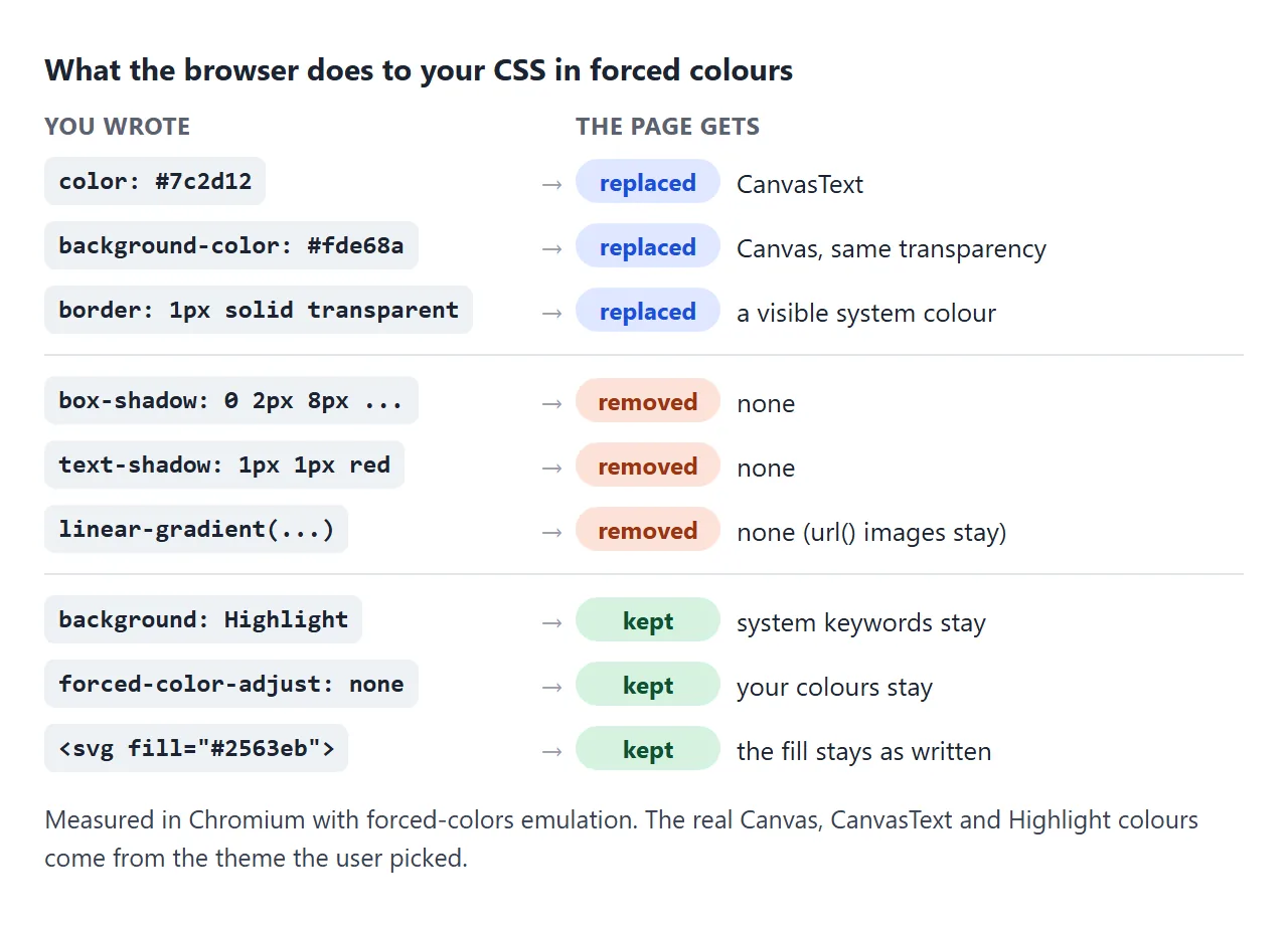
- Replaced:
color,background-color, border colours and outline colours get system colours. A background keeps its transparency, so a see-through background stays see-through. - Removed:
box-shadowandtext-shadowbecomenone. Gradient backgrounds becomenone. Background images loaded withurl()stay. - Kept: values you wrote with system colour keywords, and anything under
forced-color-adjust: none.
Two results surprise people. A transparent border or outline turns into a visible line, because its colour is replaced too.
And gradient text, made with background-clip: text and a transparent text colour, comes back as plain readable text. The background-clip guide covers that effect.
What disappears: shapes made of colour alone
The rule of thumb: if a part is only visible because two colours differ, it will vanish. Forced colours make both colours the same.
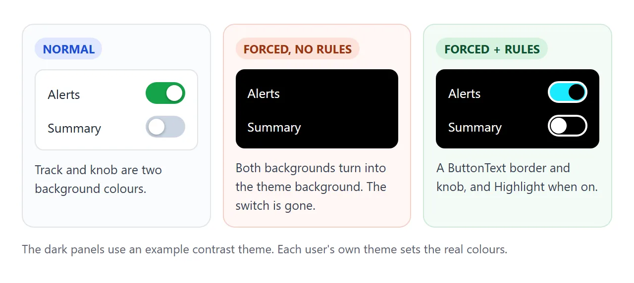
Common casualties:
- Switches and sliders drawn with a coloured track and a white knob.
- Selected tabs that differ from the others only by a lighter background.
- Cards whose only edge is a shadow on a grey page.
- Focus rings drawn with
box-shadow. - Icons with a hard-coded white fill on a coloured button.
- Errors shown only by turning a border red. The border stays, but it is no longer red.
Compare the broken and fixed version of each one:
<!doctype html>
<html lang="en">
<head>
<meta charset="utf-8">
<meta name="viewport" content="width=device-width, initial-scale=1">
<title>Forced colours: before and after</title>
<style>
  body { margin: 0; padding: 12px; font-family: system-ui, sans-serif; background: #eef1f5; color: #1d2330; }
  #stage { background: #eef1f5; }
  .grid { display: grid; grid-template-columns: 1fr 1fr; gap: 6px 12px; align-items: center; }
  .head { font-size: 13px; font-weight: 700; padding: 4px 0; }
  .lbl { grid-column: 1 / -1; margin: 10px 0 0; font-size: 12px; color: #5b6270; }
  .cell { min-width: 0; }

  /* 1. A card whose edge is only a shadow */
  .card { background: #fff; border-radius: 10px; padding: 10px 12px; font-size: 14px;
          box-shadow: 0 2px 8px rgba(0, 0, 0, .15); }
  .after .card { border: 1px solid transparent; }  /* invisible now, a real edge in forced colours */

  /* 2. Tabs where the selected one is only a lighter background */
  .tabs { display: flex; background: #e2e8f0; border-radius: 8px; padding: 3px; }
  .tab { flex: 1; min-width: 0; padding: 6px 0; border: 0; border-radius: 6px; background: transparent;
         color: #475569; font: 13px system-ui, sans-serif; cursor: pointer; }
  .tab[aria-selected="true"] { background: #fff; color: #1d2330; box-shadow: 0 1px 3px rgba(0, 0, 0, .2); }

  /* 3. An error shown only by a red border */
  input { box-sizing: border-box; width: 100%; padding: 7px 9px; border: 2px solid #dc2626;
          border-radius: 7px; font: 14px system-ui, sans-serif; }
  .err { display: block; margin-top: 4px; font-size: 12px; color: #b91c1c; }

  /* 4. A white icon on a blue button */
  .icon-btn { width: 40px; height: 40px; border: 0; border-radius: 10px; background: #2563eb;
              color: #fff; cursor: pointer; }
  .icon-btn svg { width: 20px; height: 20px; display: block; margin: auto; }

  /* 5. A focus ring drawn with box-shadow */
  .save { padding: 8px 14px; border: 0; border-radius: 8px; background: #1d2330; color: #fff;
          font: 14px system-ui, sans-serif; cursor: pointer; }
  .save:focus-visible { outline: none; box-shadow: 0 0 0 3px #7c3aed; }
  .after .save:focus-visible { outline: 3px solid transparent; outline-offset: 2px; }

  .bar { margin-top: 14px; font-size: 13px; }
  .note { margin: 4px 0 0; font-size: 12px; color: #5b6270; }
</style>
<!-- Same as @media (forced-colors: active) { ... } -->
<style id="forced" media="(forced-colors: active)">
  .after .tab[aria-selected="true"] {
    forced-color-adjust: none;  /* else Chromium draws a Canvas backplate behind the text */
    background: Highlight; color: HighlightText;
  }
</style>
</head>
<body>
<div id="stage">
  <div class="grid">
    <div class="head">Before</div><div class="head">After</div>

    <p class="lbl">1. Card edge</p>
    <div class="cell before"><div class="card">Invoice 204, paid</div></div>
    <div class="cell after"><div class="card">Invoice 204, paid</div></div>

    <p class="lbl">2. Selected tab (click one)</p>
    <div class="cell before"><div class="tabs" role="tablist"><button class="tab" role="tab" aria-selected="false">Day</button><button class="tab" role="tab" aria-selected="true">Week</button><button class="tab" role="tab" aria-selected="false">Month</button></div></div>
    <div class="cell after"><div class="tabs" role="tablist"><button class="tab" role="tab" aria-selected="false">Day</button><button class="tab" role="tab" aria-selected="true">Week</button><button class="tab" role="tab" aria-selected="false">Month</button></div></div>

    <p class="lbl">3. Error on a field</p>
    <div class="cell before"><input value="sam@" aria-label="Email"></div>
    <div class="cell after"><input value="sam@" aria-label="Email" aria-describedby="e1"><small class="err" id="e1">Enter a full email address.</small></div>

    <p class="lbl">4. Icon button</p>
    <div class="cell before"><button class="icon-btn" aria-label="Add"><svg viewBox="0 0 20 20" fill="#fff"><path d="M9 3h2v6h6v2h-6v6H9v-6H3V9h6z"/></svg></button></div>
    <div class="cell after"><button class="icon-btn" aria-label="Add"><svg viewBox="0 0 20 20" fill="currentColor"><path d="M9 3h2v6h6v2h-6v6H9v-6H3V9h6z"/></svg></button></div>

    <p class="lbl">5. Focus ring (click the page, then press Tab)</p>
    <div class="cell before"><button class="save">Save</button></div>
    <div class="cell after"><button class="save">Save</button></div>
  </div>
</div>

<div class="bar">
  <label><input type="checkbox" id="preview" style="width:auto;border:0"> Preview forced colours (rough copy)</label>
  <p class="note" id="real">Forced colours on this device: no.</p>
</div>

<script>
  // select a tab inside its own group
  document.querySelectorAll('.tab').forEach((tab) => {
    tab.addEventListener('click', () => {
      tab.parentElement.querySelectorAll('.tab').forEach((t) => t.setAttribute('aria-selected', t === tab));
    });
  });

  const mq = matchMedia('(forced-colors: active)');
  const real = document.getElementById('real');
  const report = () => { real.textContent = 'Forced colours on this device: ' + (mq.matches ? 'yes' : 'no') + '.'; };
  mq.addEventListener('change', report); report();

  // ---- Preview only: a rough copy of forced colours. Your page does not need this. ----
  const stage = document.getElementById('stage'), forced = document.getElementById('forced');
  const touched = new Map();  // element -> properties the preview set
  // colours you chose with system keywords are kept, as in the real mode
  const SYS = /^(Canvas|CanvasText|ButtonFace|ButtonText|Highlight|HighlightText|LinkText|GrayText)$/i;
  const own = (el, p) => SYS.test(el.style.getPropertyValue(p)) || (!forced.disabled &&
    [...forced.sheet.cssRules].some((r) => el.matches(r.selectorText) && r.style.getPropertyValue(p)));
  function paint() {
    const sim = document.getElementById('preview').checked;
    touched.forEach((props, el) => props.forEach((p) => el.style.removeProperty(p))); touched.clear();
    forced.media = sim ? 'all' : '(forced-colors: active)';
    if (!sim) return;
    for (const el of [stage, ...stage.querySelectorAll('*')]) {
      const cs = getComputedStyle(el);
      if (cs.forcedColorAdjust === 'none' || el instanceof SVGElement) continue;
      const btn = el.matches('button');
      const set = (p, v) => {
        if (own(el, p)) return;
        el.style.setProperty(p, v, 'important');
        touched.set(el, [...(touched.get(el) || []), p]);
      };
      if (cs.backgroundColor !== 'rgba(0, 0, 0, 0)') set('background-color', btn ? 'ButtonFace' : 'Canvas');
      set('color', btn ? 'ButtonText' : 'CanvasText');
      set('border-color', btn ? 'ButtonText' : 'CanvasText');
      set('outline-color', 'CanvasText');
      set('box-shadow', 'none'); set('text-shadow', 'none');
      if (!cs.backgroundImage.includes('url(')) set('background-image', 'none');
    }
  }
  document.getElementById('preview').addEventListener('change', paint);
  stage.addEventListener('click', paint);
</script>
</body>
</html>
Fix 1: transparent borders and outlines
The cheapest fix needs no media query. Give the element a border or outline in transparent. You cannot see it in normal colours. In forced colours, the browser replaces the colour and the line appears.
.card {
  box-shadow: 0 2px 8px rgba(0, 0, 0, .15);
  border: 1px solid transparent; /* shows up only in forced colours */
}

.button:focus-visible {
  box-shadow: 0 0 0 3px #7c3aed;
  outline: 3px solid transparent; /* the ring that survives */
}
The same trick keeps focus rings visible, since a box-shadow ring is removed. The CSS outline guide goes deeper on focus rings, :focus-visible and outline offsets. For shadows in general, see the box-shadow guide.
Fix 2: @media (forced-colors: active) with system colours
When a state needs its own colour, such as "on" or "selected", write rules that only apply in forced colours. Inside them, use system colour keywords. The browser keeps these, and they always match the user's theme.
@media (forced-colors: active) {
  .switch { border: 2px solid ButtonText; }
  .knob { background: ButtonText; }
  .switch[aria-checked="true"] { background: Highlight; }
  .switch[aria-checked="true"] .knob { background: HighlightText; }
}
Use them in the pairs they were made for, so text always contrasts with its background:
| Keyword | Meant for |
|---|---|
Canvas / CanvasText |
Page background / normal text |
ButtonFace / ButtonText |
Button background / button text and borders |
Highlight / HighlightText |
Selected item background / its text |
LinkText |
Links |
GrayText |
Disabled text |
Do not rely on the exact colour a keyword gives you. One user's Highlight might be a dark purple and another's bright cyan. The last example on this page lists what each keyword resolves to on your device right now.
Text on Highlight needs one more line
In our tests, Chromium drew a block in the Canvas colour behind text in forced colours. On a selected tab with a Highlight background, that block covered the tab and hid its HighlightText label. Adding forced-color-adjust: none to that one element removed the block:
@media (forced-colors: active) {
  .tab[aria-selected="true"] {
    forced-color-adjust: none;
    background: Highlight;
    color: HighlightText;
  }
}
This is safe because every colour on the element is now a system colour the user chose.
Fix 3: SVG icons with currentColor
Chromium kept an inline SVG fill exactly as written in forced colours. With a light theme, a blue button turns white and its white icon disappears. Set the fill to currentColor instead. The icon then follows the text colour, and the browser replaces that one.
<button class="icon-btn" aria-label="Add">
  <svg viewBox="0 0 20 20" fill="currentColor">...</svg>
</button>
The SVG fill guide explains currentColor in more detail.
forced-color-adjust: none, and when to use it
forced-color-adjust decides whether the browser may change an element's colours. auto is the default. none keeps your colours as written. It is inherited, so it also covers every child element.
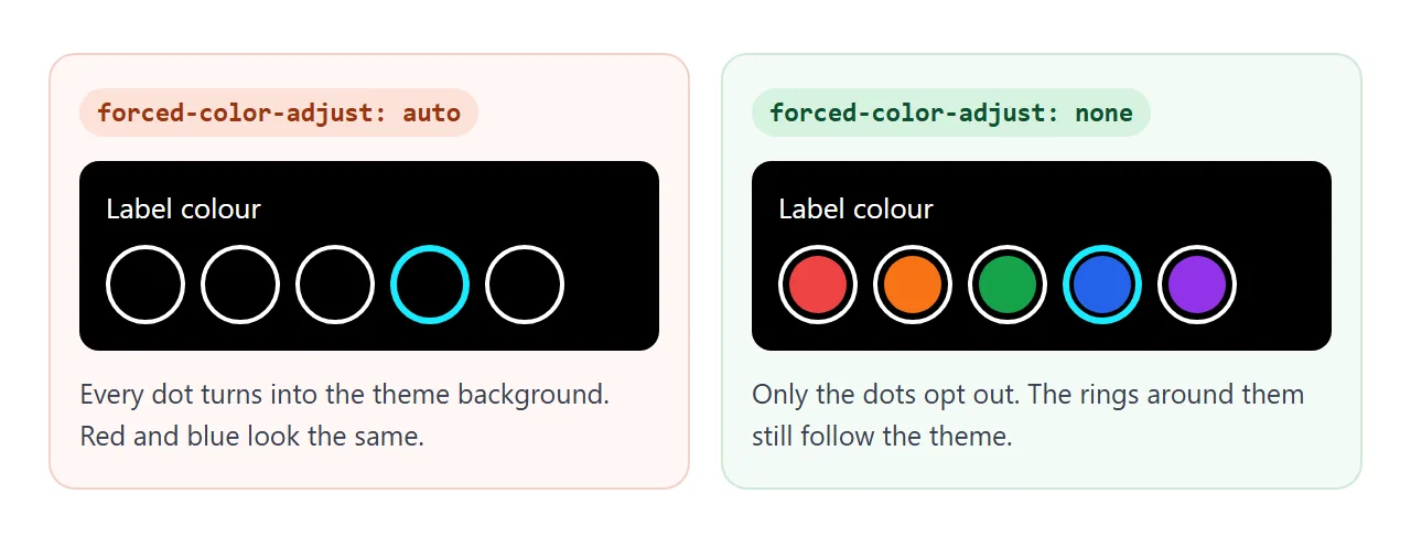
Use none where the colour is the information: swatches in a colour picker, a chart legend, a preview of a brand colour.
Keep it small. Put it on the swatch, not the panel, so the rings, labels and focus outline around the swatch still follow the user's theme.
The example below is a label colour picker built this way, with a live list of the system colours on your device.
<!doctype html>
<html lang="en">
<head>
<meta charset="utf-8">
<meta name="viewport" content="width=device-width, initial-scale=1">
<title>Forced colours: label picker and system colours</title>
<style>
  body { margin: 0; padding: 12px; font-family: system-ui, sans-serif; background: #eef1f5; color: #1d2330; }
  #stage { background: #eef1f5; }
  .panel { background: #fff; border: 1px solid transparent; border-radius: 12px; padding: 12px 14px;
           box-shadow: 0 4px 14px rgba(0, 0, 0, .1); margin-bottom: 12px; }
  h3 { margin: 0 0 10px; font-size: 15px; }

  /* Label colour picker: here the colour IS the content */
  .swatches { display: flex; flex-wrap: wrap; gap: 8px; }
  .sw { width: 40px; height: 40px; padding: 4px; border: 2px solid transparent; border-radius: 50%;
        background: transparent; cursor: pointer; }
  .sw[aria-pressed="true"] { border-color: #1d2330; }
  .dot { display: block; width: 100%; height: 100%; border-radius: 50%; }
  .keep .dot { forced-color-adjust: none; }  /* keep the real colours in forced colours mode */
  .picked { margin: 10px 0 0; font-size: 14px; }

  /* System colour keywords, read live */
  table { width: 100%; border-collapse: collapse; font-size: 13px; }
  td { padding: 4px 4px; border-bottom: 1px solid #eef1f5; }
  td:first-child { width: 36px; }
  .chip { display: block; width: 28px; height: 18px; border: 1px solid CanvasText; border-radius: 4px; }
  code { font: 12px ui-monospace, Consolas, monospace; }
  .rgb { color: #5b6270; }

  .bar { font-size: 13px; line-height: 1.8; }
  .bar label { display: block; }
  .note { margin: 2px 0 0; font-size: 12px; color: #5b6270; }
</style>
<!-- Same as @media (forced-colors: active) { ... } -->
<style id="forced" media="(forced-colors: active)">
  .sw[aria-pressed="true"] { border-color: Highlight; }
</style>
</head>
<body>
<div id="stage">
  <div class="panel keep" id="picker">
    <h3>Label colour</h3>
    <div class="swatches" id="swatches"></div>
    <p class="picked" id="picked"></p>
  </div>
  <div class="panel">
    <h3>System colours right now</h3>
    <table><tbody id="sys"></tbody></table>
    <p class="note">These values change only when forced colours are really on, not in the preview.</p>
  </div>
</div>

<div class="bar">
  <label><input type="checkbox" id="preview"> Preview forced colours (rough copy)</label>
  <label><input type="checkbox" id="keep" checked> forced-color-adjust: none on the dots</label>
  <p class="note" id="real">Forced colours on this device: no.</p>
</div>

<script>
  // build the picker
  const colours = { Red: '#ef4444', Orange: '#f97316', Green: '#16a34a', Teal: '#0d9488', Blue: '#2563eb', Purple: '#9333ea' };
  const box = document.getElementById('swatches'), picked = document.getElementById('picked');
  for (const [name, hex] of Object.entries(colours)) {
    const b = document.createElement('button');
    b.className = 'sw'; b.setAttribute('aria-label', name); b.setAttribute('aria-pressed', name === 'Blue');
    b.innerHTML = '<span class="dot" style="background:' + hex + '"></span>';
    b.addEventListener('click', () => {
      box.querySelectorAll('.sw').forEach((s) => s.setAttribute('aria-pressed', s === b));
      picked.textContent = 'Selected: ' + name;
    });
    box.append(b);
  }
  picked.textContent = 'Selected: Blue';

  // show each system colour keyword and the colour it resolves to
  const sys = document.getElementById('sys');
  const keywords = ['Canvas', 'CanvasText', 'ButtonFace', 'ButtonText', 'Highlight', 'HighlightText', 'LinkText', 'GrayText'];
  function listColours() {
    sys.innerHTML = '';
    for (const k of keywords) {
      const tr = document.createElement('tr');
      tr.innerHTML = '<td><span class="chip" style="background:' + k + '"></span></td><td><code>' + k + '</code></td><td class="rgb"></td>';
      sys.append(tr);
      tr.querySelector('.rgb').textContent = getComputedStyle(tr.querySelector('.chip')).backgroundColor;
    }
  }
  listColours();

  const mq = matchMedia('(forced-colors: active)');
  const real = document.getElementById('real');
  const report = () => { real.textContent = 'Forced colours on this device: ' + (mq.matches ? 'yes' : 'no') + '.'; listColours(); };
  mq.addEventListener('change', report); report();

  document.getElementById('keep').addEventListener('change', (e) => {
    document.getElementById('picker').classList.toggle('keep', e.target.checked); paint();
  });

  // ---- Preview only: a rough copy of forced colours. Your page does not need this. ----
  const stage = document.getElementById('stage'), forced = document.getElementById('forced');
  const touched = new Map();  // element -> properties the preview set
  // colours you chose with system keywords are kept, as in the real mode
  const SYS = /^(Canvas|CanvasText|ButtonFace|ButtonText|Highlight|HighlightText|LinkText|GrayText)$/i;
  const own = (el, p) => SYS.test(el.style.getPropertyValue(p)) || (!forced.disabled &&
    [...forced.sheet.cssRules].some((r) => el.matches(r.selectorText) && r.style.getPropertyValue(p)));
  function paint() {
    const sim = document.getElementById('preview').checked;
    touched.forEach((props, el) => props.forEach((p) => el.style.removeProperty(p))); touched.clear();
    forced.media = sim ? 'all' : '(forced-colors: active)';
    if (!sim) return;
    for (const el of [stage, ...stage.querySelectorAll('*')]) {
      const cs = getComputedStyle(el);
      if (cs.forcedColorAdjust === 'none' || el instanceof SVGElement) continue;
      const btn = el.matches('button');
      const set = (p, v) => {
        if (own(el, p)) return;
        el.style.setProperty(p, v, 'important');
        touched.set(el, [...(touched.get(el) || []), p]);
      };
      if (cs.backgroundColor !== 'rgba(0, 0, 0, 0)') set('background-color', btn ? 'ButtonFace' : 'Canvas');
      set('color', btn ? 'ButtonText' : 'CanvasText');
      set('border-color', btn ? 'ButtonText' : 'CanvasText');
      set('outline-color', 'CanvasText');
      set('box-shadow', 'none'); set('text-shadow', 'none');
      if (!cs.backgroundImage.includes('url(')) set('background-image', 'none');
    }
  }
  document.getElementById('preview').addEventListener('change', paint);
  document.getElementById('stage').addEventListener('click', paint);
</script>
</body>
</html>
Testing forced colours: DevTools and Playwright
You do not need to change your Windows theme to test.
- Windows: Settings, Accessibility, Contrast themes. This is the real mode, with a real palette.
- Chrome or Edge DevTools: open the Rendering panel and set "Emulate CSS media feature forced-colors" to active.
- Playwright: emulate it per page or per context, then take screenshots or read computed styles.
# Python
page = browser.new_page(forced_colors="active")
# or, on a page that is already open
page.emulate_media(forced_colors="active")
// JavaScript
await page.emulateMedia({ forcedColors: 'active' });
We ran the examples on this page through the Python version at 640px and 390px width, and checked that the fixes show and the broken versions disappear.
Emulation shows one palette. Your users may pick a darker or lighter one, so check more than one theme when you can.
When it does not work
| What you see | Cause | Fix |
|---|---|---|
| A switch or toggle vanishes | Track and knob are only background colours | Border plus system colours in a forced-colors rule |
| The selected tab looks like the others | Selection shown only by background | Highlight background in a forced-colors rule |
| The selected tab shows an empty box | A Canvas block is drawn behind the text |
forced-color-adjust: none on that element |
| No focus ring | The ring was a box-shadow |
Add outline: 3px solid transparent |
| An icon is invisible | SVG fill is a fixed colour | fill="currentColor" |
| Colour swatches all look the same | Their backgrounds were replaced | forced-color-adjust: none on the swatch only |
| The forced-colors rules never apply | Written for -ms-high-contrast |
Use @media (forced-colors: active) |
Share it as a link
Forced colours are easier to show than to describe. A screenshot shows one theme. A shared page lets someone turn on their own contrast theme, or the DevTools emulation, and check the real thing.
To send the working version, paste the page into a NOS document and choose Create share link. HTML to link walks through it.
The page renders as written and its scripts run, so the people you send it to can flip the switches themselves. If you fix a colour later, the same link shows the new version.