"Glitch" in a search for glitch html usually means Glitch.com, where the starter project held an index.html, a style.css and a script.js. Its project hosting ended on July 8, 2025. If you meant the visual glitch effect, jump to the last two examples.
For a page you want to keep, the useful move is to fold those three files into one HTML file. Here is a Glitch-style page after that move. The comments mark where each file's contents went.
<!doctype html>
<html lang="en">
<head>
<meta charset="utf-8">
<meta name="viewport" content="width=device-width, initial-scale=1">
<title>Three files, one file</title>
<style>
  /* was style.css */
  body { margin: 0; padding: 24px; font-family: system-ui, sans-serif; background: #f4f5f7; color: #1d2330; }
  h1 { margin: 0 0 6px; font-size: 22px; }
  p { margin: 0 0 16px; color: #4b5563; }
  .dot { width: 64px; height: 64px; border-radius: 50%; background: #2563eb; margin-bottom: 16px; }
  .wiggle { animation: wiggle .4s ease-in-out; }
  @keyframes wiggle { 25% { transform: translateX(-14px); } 75% { transform: translateX(14px); } }
  button { font: inherit; padding: 10px 16px; border: 0; border-radius: 8px; background: #1d2330; color: #fff; cursor: pointer; }
</style>
</head>
<body>
  <!-- was index.html -->
  <h1>Hello from one file</h1>
  <p>Clicks: <b id="count">0</b></p>
  <div class="dot" id="dot"></div>
  <button id="btn">Wiggle</button>

  <script>
    // was script.js
    const dot = document.getElementById('dot');
    const count = document.getElementById('count');
    let n = 0;

    document.getElementById('btn').addEventListener('click', () => {
      n += 1;
      count.textContent = n;
      dot.classList.remove('wiggle');
      void dot.offsetWidth;          // restart the animation
      dot.classList.add('wiggle');
    });
  </script>
</body>
</html>
Click the button. The counter and the wiggle come from the inline script, and the look comes from the inline style. Nothing else is loaded, so the file works when you double-click it and when you share it.
What Glitch was, and what changed
Glitch was a place to build a small web project and run it at a live address. The dates below come from the company's own announcement.
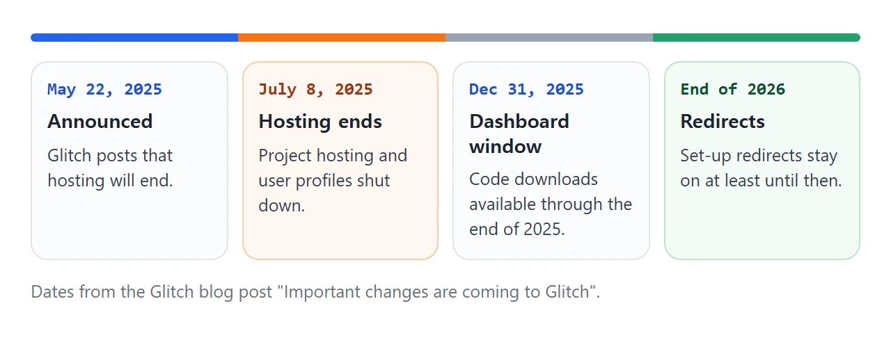
The post said project hosting and user profiles would shut down on July 8, 2025. It said the dashboard would stay available through the end of 2025, with code downloads for all projects.
It also described a redirects feature for project subdomains, to be set up before December 31, 2025 and kept at least through the end of 2026.
Whether a particular old link still redirects is not something this page can promise. A file you hold does not depend on any of that.
Fold three files into one file
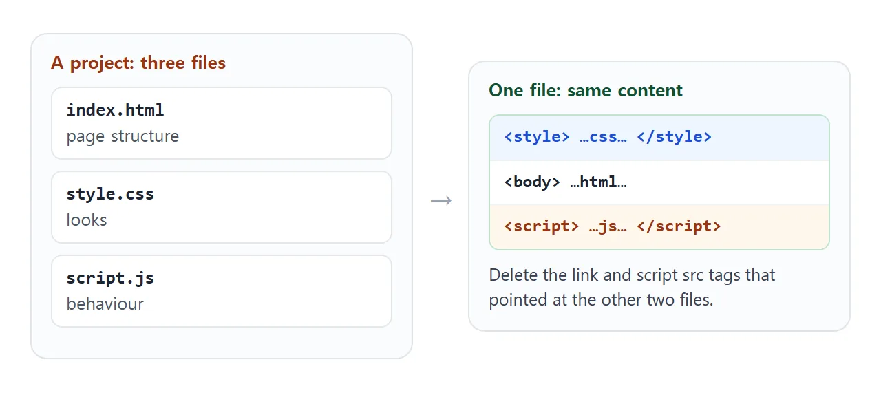
A multi-file page loads its CSS and JavaScript through tags that point at other files. A single file carries them inside.
- Open
index.html,style.cssandscript.jsin a text editor. - Paste the CSS inside a
<style>element in the<head>. Delete the<link rel="stylesheet">tag that loaded it. - Paste the JavaScript inside a
<script>element just before</body>. Delete the<script src="...">tag. - Save as one
.htmlfile and open it in a browser.
The result looks like this:
<head>
  <meta charset="utf-8">
  <meta name="viewport" content="width=device-width, initial-scale=1">
  <style>
    /* contents of style.css */
  </style>
</head>
<body>
  <!-- contents of index.html body -->
  <script>
    // contents of script.js
  </script>
</body>
Keep the script at the end of the body. Code that looks up elements by id runs before they exist if it sits in the head. The viewport meta tag line keeps the page readable on a phone.
What does not come along
Some parts of a project are not text that you can paste.
- Images and fonts that were project files. A path such as
images/cat.pngpoints at a file that is no longer beside the page. Replace it with inline SVG, adata:URI, or a CSS gradient. - Libraries. If the project loaded a library from a CDN with a script tag, the tag still works as written, provided the address is reachable from where the file is opened.
- Server code. A script that ran on Glitch's side, not in the browser, has no place in a plain HTML file.
A stylesheet that is still separate and fails to load is a different problem, covered in HTML not loading CSS. For hosting a folder of files instead of one file, see deploy an HTML, CSS and JS website for free.
The other meaning: a glitch text effect
Some searches for glitch html are about the flickering, colour-split heading. It needs no library. The text is drawn three times: the real text, plus a ::before and a ::after copy.
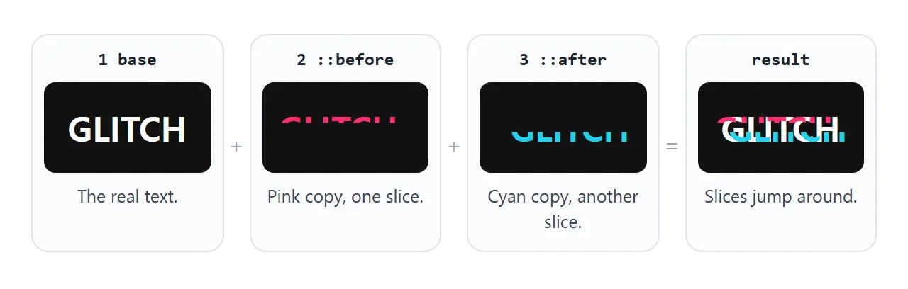
Each copy gets its text from a data-text attribute through content: attr(data-text), is cut to a horizontal band with clip-path: inset(), and is nudged sideways by a keyframe animation. Using steps(1) makes the jumps abrupt instead of smooth.
<!doctype html>
<html lang="en">
<head>
<meta charset="utf-8">
<meta name="viewport" content="width=device-width, initial-scale=1">
<title>CSS glitch text</title>
<style>
  body { margin: 0; min-height: 100vh; display: grid; place-items: center; background: #111; }
  .glitch {
    position: relative; margin: 0;
    font: 800 clamp(34px, 12vw, 72px)/1 system-ui, sans-serif; color: #fff; letter-spacing: 2px;
  }
  /* two copies of the text, read from the data-text attribute */
  .glitch::before, .glitch::after {
    content: attr(data-text);
    position: absolute; left: 0; top: 0; width: 100%;
  }
  .glitch::before { color: #ff2d6f; animation: slice-a 2.2s steps(1) infinite; }
  .glitch::after  { color: #22d3ee; animation: slice-b 2.2s steps(1) infinite; }

  @keyframes slice-a {
    0%   { clip-path: inset(0 0 100% 0); transform: translate(0); }
    10%  { clip-path: inset(10% 0 60% 0); transform: translate(-6px, 0); }
    20%  { clip-path: inset(70% 0 5% 0);  transform: translate(5px, 0); }
    30%  { clip-path: inset(0 0 100% 0);  transform: translate(0); }
  }
  @keyframes slice-b {
    0%   { clip-path: inset(0 0 100% 0); transform: translate(0); }
    15%  { clip-path: inset(55% 0 20% 0); transform: translate(6px, 0); }
    25%  { clip-path: inset(15% 0 70% 0); transform: translate(-5px, 0); }
    35%  { clip-path: inset(0 0 100% 0);  transform: translate(0); }
  }
  /* respect the "reduce motion" setting */
  @media (prefers-reduced-motion: reduce) {
    .glitch::before, .glitch::after { animation: none; display: none; }
  }
</style>
</head>
<body>
  <h1 class="glitch" data-text="GLITCH">GLITCH</h1>
</body>
</html>
The prefers-reduced-motion block at the end hides the copies for visitors who have set their device to reduce motion. Keep it in any animated page.
Tune it: a finished example
The same effect, with controls. Change the text, the sideways shift and the cycle length, or pause it.
<!doctype html>
<html lang="en">
<head>
<meta charset="utf-8">
<meta name="viewport" content="width=device-width, initial-scale=1">
<title>Glitch tuner</title>
<style>
  :root { --shift: 6px; --speed: 2.2s; }
  body { margin: 0; font-family: system-ui, sans-serif; background: #111; color: #e5e7eb; }
  .stage { height: 170px; display: grid; place-items: center; }
  .glitch { position: relative; margin: 0; font: 800 clamp(30px, 11vw, 60px)/1 system-ui, sans-serif; color: #fff; }
  .glitch::before, .glitch::after { content: attr(data-text); position: absolute; left: 0; top: 0; width: 100%; }
  .glitch::before { color: #ff2d6f; animation: a var(--speed) steps(1) infinite; }
  .glitch::after  { color: #22d3ee; animation: b var(--speed) steps(1) infinite; }
  .paused::before, .paused::after { animation-play-state: paused; }
  @keyframes a {
    0%  { clip-path: inset(0 0 100% 0); transform: none; }
    10% { clip-path: inset(10% 0 60% 0); transform: translateX(calc(var(--shift) * -1)); }
    20% { clip-path: inset(70% 0 5% 0);  transform: translateX(var(--shift)); }
    30% { clip-path: inset(0 0 100% 0);  transform: none; }
  }
  @keyframes b {
    0%  { clip-path: inset(0 0 100% 0); transform: none; }
    15% { clip-path: inset(55% 0 20% 0); transform: translateX(var(--shift)); }
    25% { clip-path: inset(15% 0 70% 0); transform: translateX(calc(var(--shift) * -1)); }
    35% { clip-path: inset(0 0 100% 0);  transform: none; }
  }
  @media (prefers-reduced-motion: reduce) { .glitch::before, .glitch::after { display: none; } }

  .panel { padding: 12px 16px 16px; background: #1b1b1f; display: grid; gap: 10px; }
  label { display: grid; grid-template-columns: 90px 1fr 54px; align-items: center; gap: 10px; font-size: 14px; }
  output { font-variant-numeric: tabular-nums; color: #9ca3af; }
  input[type=text] { font: inherit; padding: 6px 8px; border-radius: 6px; border: 1px solid #374151; background: #111; color: #fff; width: 100%; box-sizing: border-box; }
  button { font: inherit; padding: 8px 14px; border: 0; border-radius: 8px; background: #22d3ee; color: #062a30; font-weight: 600; cursor: pointer; justify-self: start; }
</style>
</head>
<body>
  <div class="stage"><h1 class="glitch" id="g" data-text="GLITCH">GLITCH</h1></div>
  <div class="panel">
    <label>Text <input type="text" id="txt" value="GLITCH" maxlength="12"><span></span></label>
    <label>Shift <input type="range" id="shift" min="0" max="20" value="6"><output id="shiftOut">6px</output></label>
    <label>Cycle <input type="range" id="speed" min="0.6" max="4" step="0.1" value="2.2"><output id="speedOut">2.2s</output></label>
    <button id="pause" aria-pressed="false">Pause</button>
  </div>

  <script>
    const g = document.getElementById('g');
    const root = document.documentElement;

    // the text lives in two places: the element and data-text
    document.getElementById('txt').addEventListener('input', (e) => {
      const t = e.target.value || ' ';
      g.textContent = t;
      g.setAttribute('data-text', t);
    });
    document.getElementById('shift').addEventListener('input', (e) => {
      root.style.setProperty('--shift', e.target.value + 'px');
      document.getElementById('shiftOut').textContent = e.target.value + 'px';
    });
    document.getElementById('speed').addEventListener('input', (e) => {
      root.style.setProperty('--speed', e.target.value + 's');
      document.getElementById('speedOut').textContent = e.target.value + 's';
    });
    document.getElementById('pause').addEventListener('click', (e) => {
      const on = g.classList.toggle('paused');
      e.target.textContent = on ? 'Play' : 'Pause';
      e.target.setAttribute('aria-pressed', on);
    });
  </script>
</body>
</html>
- Text: the script sets the heading's text and its
data-texttogether. They must match, or the copies show different words. - Shift and cycle: the sliders set the custom properties
--shiftand--speedon the root element, and the keyframes read them withvar(). - Pause: a class sets
animation-play-state: paused. The animation continues from where it stopped.
When it does not work
| Symptom | Cause | Fix |
|---|---|---|
| Page is unstyled | The link tag still points at style.css |
Paste the CSS into a style element |
| Buttons do nothing | The script tag still has a src |
Paste the code inside the script tag |
| Script says an element is null | The script runs in the head | Move it just before the closing body tag |
| Image is a broken icon | The path pointed at a project file | Use inline SVG or a data URI |
| Glitch text has no coloured copies | data-text is missing or empty |
Set it to the same words as the heading |
| Copies never show | The reduce-motion setting is on | Turn it off to test, and keep the block |
Share it as a link
A single file is easy to keep, but a screenshot cannot be clicked and an attached .html may open as plain code on a phone. Opening an HTML file on a phone explains why.
To send the working version, paste the page into a NOS document and choose Create share link. HTML to link walks through it.
The page renders as written and its scripts run, so people with the link can press the button and watch the glitch without an account. If you change the code later, the same link shows the new version.