CSS 전환은 해당 값이 변경될 때마다 이전 값에서 새 값으로 속성에 애니메이션을 적용합니다. 예를 들어 transition: opacity 300ms ease와 같이 요소에 한 번 쓰고 나중에 opacity를 변경할 때마다 스냅 대신 300밀리초 이상 슬라이드됩니다.
시도해 보세요. 지속 시간, 지연 및 타이밍 기능을 변경한 다음 이동을 누르세요. 버튼 아래 줄은 실행 중인 CSS입니다.
<!doctype html>
<html lang="en">
<head>
<meta charset="utf-8">
<meta name="viewport" content="width=device-width, initial-scale=1">
<title>CSS transition playground</title>
<style>
  body { margin: 0; padding: 14px; font-family: system-ui, sans-serif; background: #f4f5f7; color: #1d2330; }
  .track { position: relative; height: 56px; border-radius: 12px; background: #fff; box-shadow: inset 0 0 0 1px #dde1e7; }
  .ball {
    position: absolute; top: 8px; left: 8px;
    width: 40px; height: 40px; border-radius: 50%; background: #2563eb;
    /* the whole lesson in one line: property, duration, timing function, delay */
    transition: left 600ms ease 0ms;
  }
  .ball.on { left: calc(100% - 48px); }
  .controls { display: grid; grid-template-columns: repeat(auto-fit, minmax(160px, 1fr)); gap: 10px 14px; margin: 14px 0 12px; font-size: 13px; }
  label { display: grid; gap: 4px; }
  select, input { font: inherit; }
  button { font: inherit; font-weight: 600; padding: 8px 16px; border: 0; border-radius: 8px; background: #1d2330; color: #fff; cursor: pointer; }
  code { display: block; margin-top: 10px; padding: 8px 10px; border-radius: 8px; background: #fff; font: 13px ui-monospace, Consolas, monospace; overflow-wrap: anywhere; }
  #log { margin: 8px 0 0; font-size: 13px; color: #0f5132; min-height: 1.4em; }
</style>
</head>
<body>
<div class="track"><div class="ball" id="ball"></div></div>

<div class="controls">
  <label>Duration: <span id="durOut">600ms</span>
    <input id="dur" type="range" min="100" max="2000" step="100" value="600"></label>
  <label>Delay: <span id="delOut">0ms</span>
    <input id="del" type="range" min="0" max="1000" step="100" value="0"></label>
  <label>Timing function
    <select id="ease">
      <option>ease</option><option>linear</option><option>ease-in</option>
      <option>ease-out</option><option>ease-in-out</option>
      <option>cubic-bezier(.34, 1.56, .64, 1)</option>
      <option>steps(5)</option>
    </select></label>
</div>

<button id="go">Move</button>
<code id="css"></code>
<p id="log"></p>

<script>
  const ball = document.getElementById('ball');
  const dur = document.getElementById('dur'), del = document.getElementById('del'), ease = document.getElementById('ease');
  const log = document.getElementById('log');

  function update() {
    const t = `left ${dur.value}ms ${ease.value} ${del.value}ms`;
    ball.style.transition = t;  // same as writing it in the stylesheet
    document.getElementById('css').textContent = `transition: ${t};`;
    document.getElementById('durOut').textContent = dur.value + 'ms';
    document.getElementById('delOut').textContent = del.value + 'ms';
  }
  [dur, del, ease].forEach((el) => el.addEventListener('input', update));
  update();

  let started = 0;
  document.getElementById('go').addEventListener('click', () => {
    started = performance.now();
    log.textContent = 'Moving...';
    ball.classList.toggle('on');  // change the value; the transition animates it
  });

  // fires once per property when the transition finishes
  ball.addEventListener('transitionend', (e) => {
    const ms = Math.round(performance.now() - started);
    log.textContent = `transitionend: ${e.propertyName}, ${e.elapsedTime}s of motion, ${ms}ms after the click`;
  });
</script>
</body>
</html>
전환 자체는 아무것도 시작하지 않습니다. 다른 것, 즉 클릭으로 전환되는 클래스, :hover 규칙 또는 JavaScript에서 설정된 스타일 등 값이 변경됩니다. 전환은 변경 사항의 모양만 결정합니다.
속기 뒤에 숨은 다섯 가지 속성
transition는 약어입니다. 각 부분에는 고유한 속성이 있으며 각 부분에는 기본값이 있습니다.
| 재산 | 기본값 | 제어 대상 |
|---|---|---|
transition-property |
all |
애니메이션을 적용하는 속성 |
transition-duration |
0s |
변경에 소요되는 시간 |
transition-timing-function |
ease |
이동 중에 속도가 어떻게 달라지나요? |
transition-delay |
0s |
시작하기까지 얼마나 기다려야 하는지 |
transition-behavior |
normal |
display와 같은 속성이 참여하는지 여부 |
기간 기본값은 일반적인 놀라움을 설명합니다. 0s를 사용하면 모든 자산이 이미 즉시 "전환"됩니다. 기간을 지정하기 전까지는 아무것도 움직이지 않습니다.
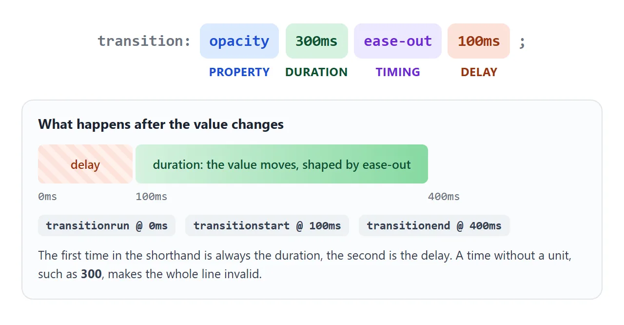
속기 내부의 순서는 시간에만 중요합니다. 첫 번째는 지속 시간이고 두 번째는 지연입니다. 속성 이름과 타이밍 기능은 어디에나 있을 수 있습니다.
매번 ms 또는 s 장치가 필요할 때마다. transition: opacity 300가 유효하지 않으며 브라우저가 전체 선언을 삭제합니다.
여러 속성 및 시차적 지연
전환을 쉼표로 구분하세요. 각각은 고유한 기간, 타이밍 및 지연을 갖습니다.
.card {
  transition:
    transform 200ms ease-out,
    box-shadow 300ms ease-out,
    background-color 150ms linear;
}
목록을 사용하여 긴 형식을 작성할 수도 있습니다. 값은 위치에 따라 정렬됩니다. 첫 번째 기간은 첫 번째 속성과 함께 적용됩니다.
.card {
  transition-property: opacity, transform;
  transition-duration: 200ms, 400ms;
}
transition: all 300ms는 더 짧지만 계획하지 않은 속성을 포함하여 변경되는 모든 속성에 애니메이션을 적용합니다. 속성의 이름을 지정하면 의도한 모션만 유지되며 다른 것은 없습니다.
transition-delay는 값이 이동하기 시작하기 전에 기다립니다. 이는 각 항목이 이전 항목보다 약간 더 긴 지연을 가져오는 시차를 두는 목록에 유용합니다.
음수 지연은 전환을 도중에 시작합니다. transition: opacity 1s -0.5s를 사용하면 마치 0.5초가 이미 지나간 것처럼 페이드가 시작됩니다.
시스템에 더 적은 양의 동작을 요청한 사람들을 위해 동작을 짧게 유지하세요. prefers-reduced-motion 미디어 쿼리를 사용하면 전환을 단축하거나 제거할 수 있습니다.
호버 효과에 규칙을 적용하는 위치와 들어오고 나갈 때 서로 다른 속도를 사용하는 방법은 CSS 호버 전환을 참조하세요.
타이밍 기능: 용이함, 큐빅 베지어 및 단계
타이밍 기능은 시간이 어떻게 소비되는지를 결정합니다. 아래의 모든 점에는 동일한 1.6초가 걸립니다. 타이밍 기능만 다릅니다.
<!doctype html>
<html lang="en">
<head>
<meta charset="utf-8">
<meta name="viewport" content="width=device-width, initial-scale=1">
<title>Timing functions side by side</title>
<style>
  body { margin: 0; padding: 14px; font-family: system-ui, sans-serif; background: #f4f5f7; color: #1d2330; }
  .lane { display: grid; grid-template-columns: 118px 1fr; align-items: center; gap: 8px; margin-bottom: 6px; }
  .lane span { font: 12px ui-monospace, Consolas, monospace; overflow-wrap: anywhere; }
  .track { position: relative; height: 34px; border-radius: 8px; background: #fff; box-shadow: inset 0 0 0 1px #dde1e7; }
  .dot {
    position: absolute; top: 5px; left: 5px; width: 24px; height: 24px; border-radius: 50%; background: #2563eb;
    transition: left 1.6s;  /* same duration for all; only the timing function differs */
  }
  .run .dot { left: calc(100% - 29px); }
  button { font: inherit; font-weight: 600; padding: 8px 16px; border: 0; border-radius: 8px; background: #1d2330; color: #fff; cursor: pointer; margin-top: 6px; }
</style>
</head>
<body>
<div id="race">
  <div class="lane"><span>linear</span><div class="track"><i class="dot" style="transition-timing-function: linear"></i></div></div>
  <div class="lane"><span>ease</span><div class="track"><i class="dot" style="transition-timing-function: ease"></i></div></div>
  <div class="lane"><span>ease-in</span><div class="track"><i class="dot" style="transition-timing-function: ease-in"></i></div></div>
  <div class="lane"><span>ease-out</span><div class="track"><i class="dot" style="transition-timing-function: ease-out"></i></div></div>
  <div class="lane"><span>ease-in-out</span><div class="track"><i class="dot" style="transition-timing-function: ease-in-out"></i></div></div>
  <div class="lane"><span>cubic-bezier(.34, 1.56, .64, 1)</span><div class="track"><i class="dot" style="transition-timing-function: cubic-bezier(.34, 1.56, .64, 1)"></i></div></div>
  <div class="lane"><span>steps(5)</span><div class="track"><i class="dot" style="transition-timing-function: steps(5)"></i></div></div>
</div>
<button id="go">Run</button>

<script>
  // every dot starts and ends together; watch how each one spends the 1.6 seconds
  document.getElementById('go').addEventListener('click', () => {
    document.getElementById('race').classList.toggle('run');
  });
</script>
</body>
</html>
5개의 키워드는 고정 곡선입니다. 그 중 4개는 숫자가 설정된 큐빅-베지어 곡선입니다.
| 키워드 | 와 동일 | 같은 느낌 |
|---|---|---|
linear |
cubic-bezier(0, 0, 1, 1) |
기계 안정성 |
ease |
cubic-bezier(0.25, 0.1, 0.25, 1) |
빠른 시작, 연착륙 |
ease-in |
cubic-bezier(0.42, 0, 1, 1) |
느린 시작, 갑작스러운 정지 |
ease-out |
cubic-bezier(0, 0, 0.58, 1) |
빠른 시작, 부드러운 중지 |
ease-in-out |
cubic-bezier(0.42, 0, 0.58, 1) |
양쪽 끝에서 천천히 |
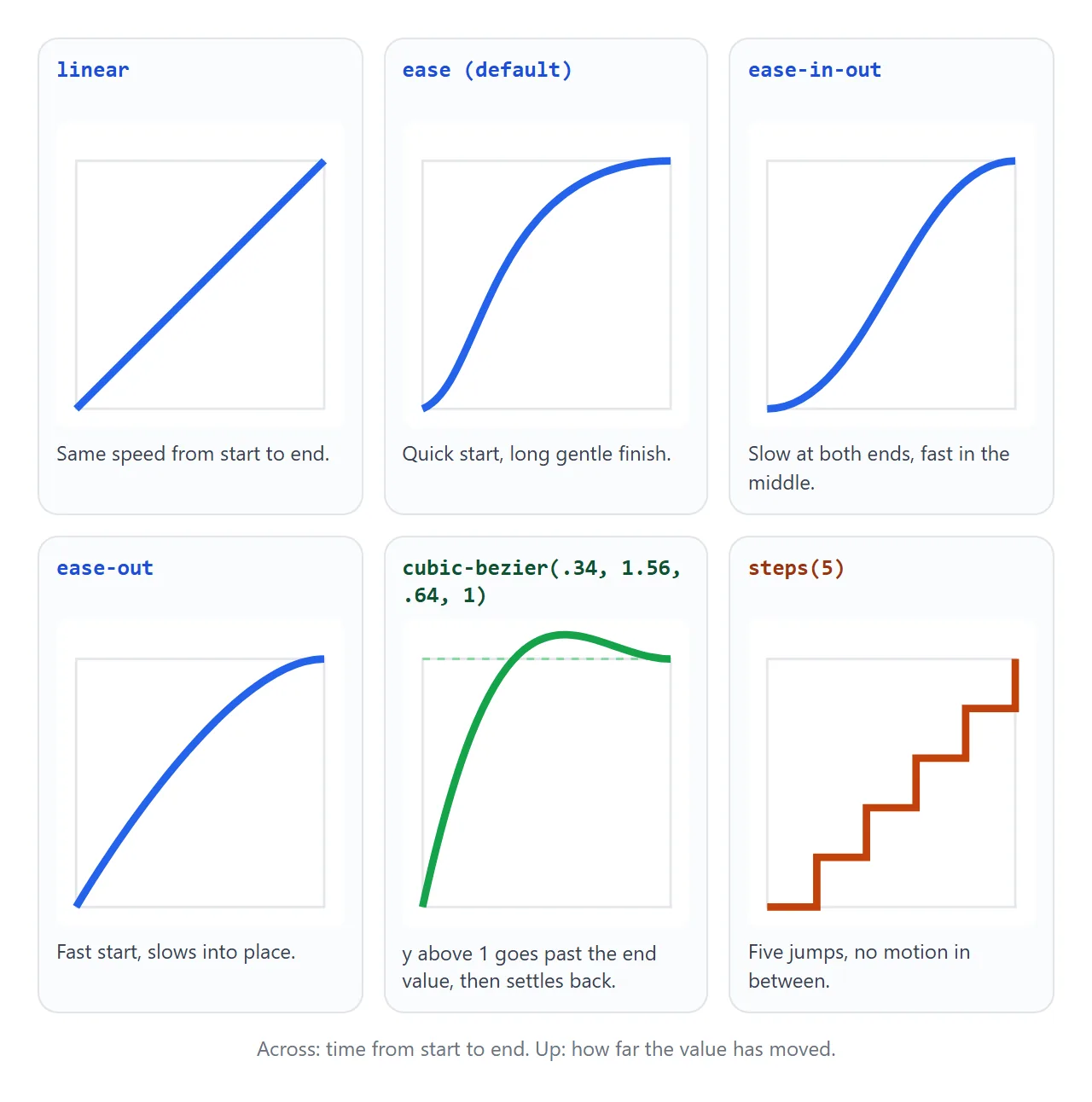
**cubic-bezier(x1, y1, x2, y2)**는 두 개의 제어점을 사용합니다. x 값은 시간이며 0과 1 사이에 있어야 합니다. 그렇지 않으면 선언이 유효하지 않습니다. y 값은 해당 범위를 벗어날 수 있습니다.
1보다 큰 y는 안정되기 전에 목표를 지나는 값을 전달하며, 이는 작은 바운스로 읽혀집니다.
**steps(n)**는 변경 사항을 중간에 움직임 없이 n 점프로 분할합니다. 카운터, 스프라이트 시트 또는 타이핑 효과에 적합합니다.
두 번째 인수는 점프 위치를 선택합니다.
jump-end(기본값 또는end): 시작 값을 먼저 유지합니다.jump-start(또는start): 한 번에 점프하므로 시작 값이 표시되지 않습니다.jump-none: 시작 및 종료 값을 모두 단계로 표시합니다.jump-both: 시작과 끝에서 점프합니다.
step-start 및 step-end는 steps(1, jump-start) 및 steps(1, jump-end)에 대한 바로가기입니다.
디스플레이 페이드 인 및 아웃: 없음
display는 개별 속성입니다. none와 block 사이에는 중간 지점이 없으므로 기본적으로 즉시 뒤집힙니다. 나가는 도중에 요소가 즉시 사라지고 opacity의 페이드가 전혀 표시되지 않습니다.
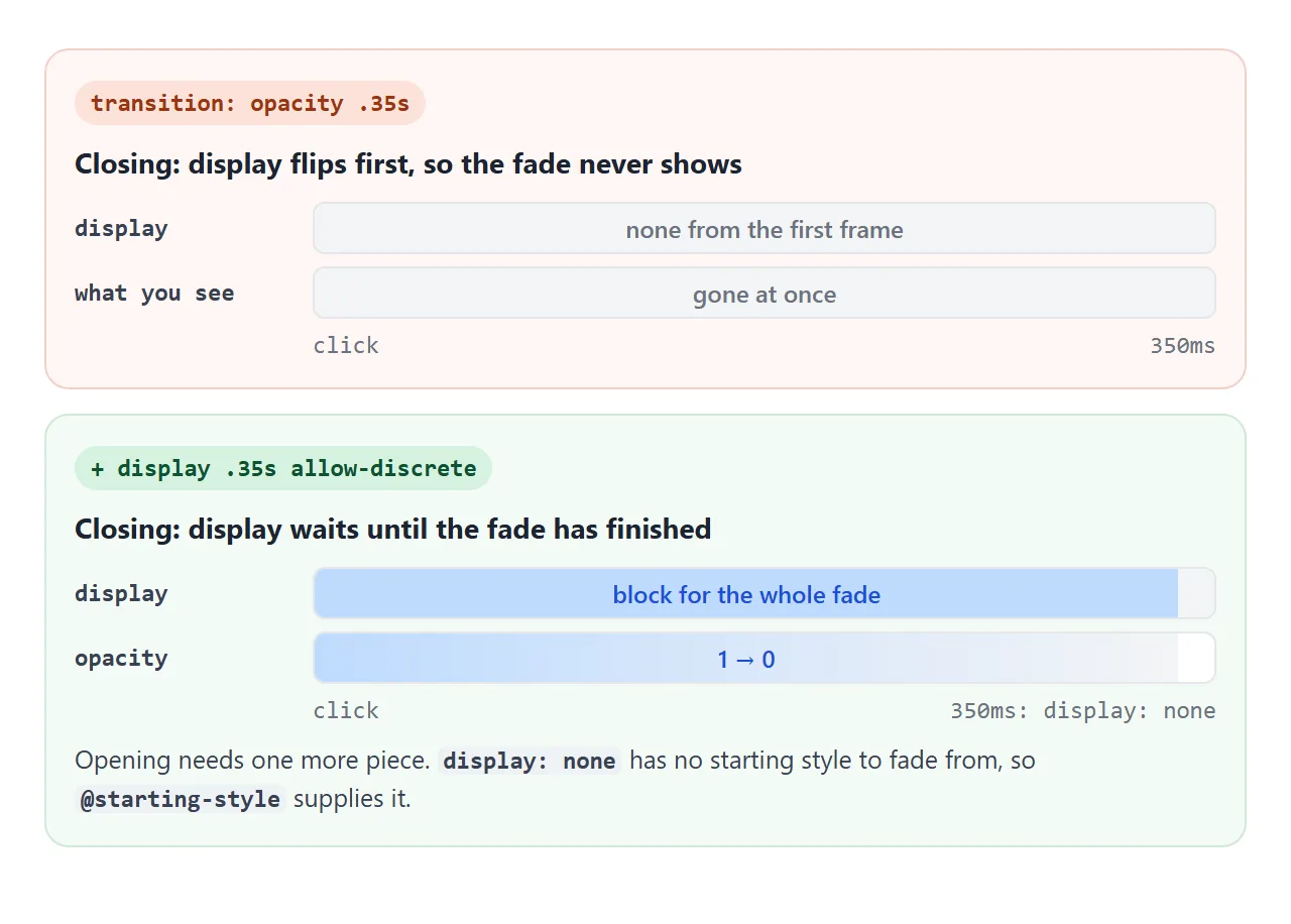
두 가지 추가 사항으로 문제가 해결되었습니다.
transition-behavior: allow-discrete또는 줄여서allow-discrete를 사용하면display가 합류할 수 있습니다.none로 가는 도중에 페이드를 기다립니다.**
@starting-style**는 브라우저에 진입에 대한 시작 값을 제공합니다.display: none에서 나오는 요소에는 이전 스타일이 없으므로 이 규칙이 없으면 완전 불투명하게 나타납니다.
.panel {
  display: none;
  opacity: 0;
  transition: opacity .35s, display .35s allow-discrete;
}
.panel.open { display: block; opacity: 1; }

@starting-style {
  .panel.open { opacity: 0; }
}
패널을 열고 닫은 다음 상자를 선택하면 두 가지 추가 사항 없이 동일한 패널을 볼 수 있습니다.
<!doctype html>
<html lang="en">
<head>
<meta charset="utf-8">
<meta name="viewport" content="width=device-width, initial-scale=1">
<title>Fade in and out from display: none</title>
<style>
  body { margin: 0; padding: 14px; font-family: system-ui, sans-serif; background: #f4f5f7; color: #1d2330; }
  .bar { display: flex; flex-wrap: wrap; gap: 10px 16px; align-items: center; font-size: 13px; }
  button { font: inherit; font-weight: 600; padding: 8px 16px; border: 0; border-radius: 8px; background: #1d2330; color: #fff; cursor: pointer; }

  .panel {
    display: none; opacity: 0; transform: translateY(-10px);
    margin-top: 12px; padding: 14px 16px; border-radius: 12px; background: #fff;
    box-shadow: 0 8px 24px rgba(0, 0, 0, .12); font-size: 14px; line-height: 1.5;
    /* display joins the list with allow-discrete, so it waits for the fade */
    transition: opacity .35s, transform .35s, display .35s allow-discrete;
  }
  .panel.open { display: block; opacity: 1; transform: none; }
  /* where the fade-in starts, since display: none had no style to start from */
  @starting-style {
    body:not(.plain) .panel.open { opacity: 0; transform: translateY(-10px); }
  }

  /* the "without" version: same panel, no allow-discrete, no @starting-style */
  .plain .panel { transition: opacity .35s, transform .35s; }

  #log { margin: 12px 0 0; padding: 8px 10px; border-radius: 8px; background: #1d2330; color: #d1fae5;
         font: 12px/1.5 ui-monospace, Consolas, monospace; height: 96px; overflow: auto; }
</style>
</head>
<body>
<div class="bar">
  <button id="toggle" aria-expanded="false" aria-controls="panel">Show details</button>
  <label><input type="checkbox" id="plain"> Turn off allow-discrete and @starting-style</label>
</div>

<div class="panel" id="panel">
  <b>Order #1042</b><br>
  Two items, shipped Tuesday. While closed, this panel is display: none, so it takes no space and cannot be tabbed into.
</div>

<pre id="log"></pre>

<script>
  const panel = document.getElementById('panel');
  const btn = document.getElementById('toggle');
  const log = document.getElementById('log');
  const say = (s) => { log.textContent += s + '\n'; log.scrollTop = log.scrollHeight; };

  btn.addEventListener('click', () => {
    const open = panel.classList.toggle('open');
    btn.textContent = open ? 'Hide details' : 'Show details';
    btn.setAttribute('aria-expanded', open);
  });

  document.getElementById('plain').addEventListener('change', (e) => {
    document.body.classList.toggle('plain', e.target.checked);
    log.textContent = '';
  });

  // one event per property that transitioned
  panel.addEventListener('transitionrun', (e) => say(`run  ${e.propertyName}`));
  panel.addEventListener('transitionend', (e) => {
    say(`end  ${e.propertyName} (${e.elapsedTime}s)`);
    if (e.propertyName === 'opacity' && !panel.classList.contains('open')) say('-> fully closed');
  });
</script>
</body>
</html>
justify-content와 같은 다른 개별 속성도 allow-discrete를 허용합니다. 지속 시간 중간에 전환됩니다. display는 전체 페이드 아웃 동안 계속 표시되고 페이드 인 시작 시 나타나는 예외입니다.
팝오버 또는 대화상자도 display: none로 숨겨지므로 동일한 패턴을 사용합니다.
overlay와 allow-discrete도 목록에 추가하면 페이드 아웃되는 동안 맨 위에 유지됩니다. 값 자체에 대한 자세한 내용은 CSS 표시에 있습니다.
전환 종료 이벤트
전환이 완료되면 요소는 transitionend 이벤트를 수신합니다. 모션 후 정리에 사용하세요. 요소를 제거하거나, 초점을 이동하거나, 다음 단계를 시작하세요.
panel.addEventListener('transitionend', (e) => {
  if (e.propertyName !== 'opacity') return;  // one of several events
  // the fade has finished
});
그것에 대해 알아야 할 네 가지 사항:
속성당 한 번 실행됩니다.
opacity및transform의 전환은 두 개의 이벤트를 보냅니다.padding와 같은 약어는 각 측면에 하나씩 4개를 보냅니다.e.propertyName를 확인하세요.e.elapsedTime는 지연을 계산하지 않습니다. 200ms 지연의 300ms 전환은0.3를 보고합니다.버블링됩니다. 부모의 청취자는 자녀의 전환도 듣습니다. 중요한 경우
e.target를 확인하세요.전환이 중단되면 실행되지 않습니다. 전환을 제거하거나 중간에 값을 반전하면
transitioncancel가 대신 전송됩니다.
transitionrun는 전환이 생성될 때 지연되기 전에 실행됩니다. transitionstart는 지연이 끝나고 값이 이동하기 시작하면 실행됩니다.
작동하지 않을 때
| 당신이 보는 것 | 원인 | 수정 |
|---|---|---|
| 값이 움직임 없이 스냅됩니다. | 지속 시간이 없거나 300와 같은 단위가 없는 시간입니다. |
300ms 또는 0.3s 쓰기 |
transition 라인 전체가 무시됩니다. |
A cubic-bezier x 0 이외의 값 ~ 1 |
x1과 x2를 0과 1 사이로 유지하세요. |
| 방금 추가한 요소가 끝 상태에 나타납니다. | 이전 스타일이 없었기 때문에 애니메이션을 적용할 것이 없었습니다. | @starting-style 사용 |
display: none에서 표시되는 것이 페이드 인되지 않습니다. |
같은 원인: display: none는 시작 스타일을 남기지 않습니다. |
@starting-style + allow-discrete |
display: none로 숨기는 것이 페이드 아웃되지 않습니다. |
display는 첫 번째 프레임에서 뒤집힙니다. |
목록에 display .35s allow-discrete 추가 |
0에서 auto까지 높이 점프 |
auto는 애니메이션으로 표시할 숫자가 아닙니다. |
전환 높이 자동을 참조하세요. |
| 마우스를 올리면 애니메이션이 작동하지만 다시 돌아옵니다. | 전환은 :hover 규칙에만 있습니다. |
요소의 기본 규칙에 넣습니다. |
transitionend가 실행되지 않음 |
전환이 취소되었거나 값이 변경되지 않았습니다. | transitioncancel도 들어보세요 |
transitionend가 여러 번 발생함 |
속성당 하나의 이벤트, 속기의 경우 측면당 하나의 이벤트 | e.propertyName에서 필터링 |
반복되어야 하는 모션의 경우, 페이지 로드 시 실행되거나 여러 정지를 통과해야 하는 경우 전환은 잘못된 도구입니다. 대신 CSS 키프레임을 사용하세요.
링크로 공유하세요
모션은 스크린샷이나 서면 설명으로 판단하기 어렵습니다. 이징, 지연 및 페이드 아웃은 누군가가 클릭할 때만 표시됩니다.
작업 버전을 보내려면 페이지를 NOS 문서에 붙여넣고 공유 링크 만들기를 선택하세요. 링크할 HTML이 이를 안내합니다.
페이지는 작성된 대로 렌더링되고 해당 스크립트가 실행되므로 페이지를 보내는 사람이 버튼을 누르고 타이밍을 직접 확인할 수 있습니다. 나중에 기간을 조정하면 동일한 링크에 새 버전이 표시됩니다.