An AI html email generator writes a web page, and inboxes are not browsers. The gap between those two facts causes almost every problem people report with generated email.
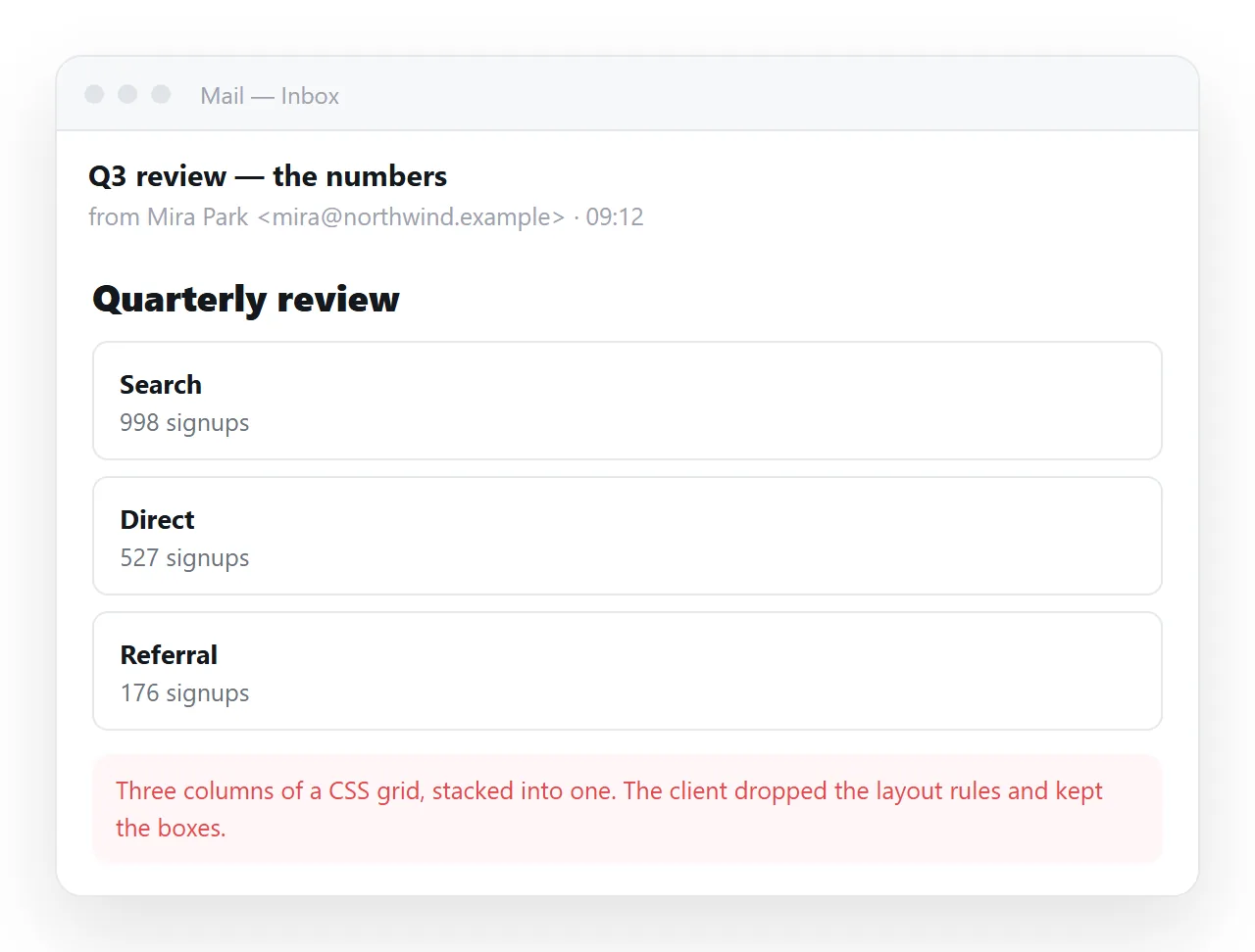
Email clients render an older and much narrower subset of HTML and CSS. The parts that make a generated page look current, flexbox, grid, custom properties, are often the first to go.
What an AI HTML email generator gives you
Ask for an email and you will usually receive a modern page: a style block in the head, flex containers, custom properties for colour, and a media query for small screens.
That file is correct HTML. It is also the wrong dialect for the destination, in the same way that a document written for print is not wrong, only aimed elsewhere.
Email HTML is closer to markup from twenty years ago. Tables for layout, attributes for alignment, styles written onto each element.
What survives and what does not
| Feature | In a browser | In mail clients |
|---|---|---|
| Table based layout | Works | Works everywhere |
| Inline styles | Works | Works everywhere |
| Style block in the head | Works | Sometimes removed |
| Flexbox and grid | Works | Unreliable, Outlook especially |
| Custom properties for colour | Works | Unreliable |
| Web fonts | Works | Often ignored, falls back |
| Remote images | Works | Blocked until the reader allows them |
| Scripts | Works | Removed |
| Forms | Works | Removed or neutralised |
The last two rows are worth naming clearly. Anything interactive in a generated email will not be interactive when it arrives, so a signup form in the message body is not a form, it is a picture of one.
Dark mode adds a further variation. Some clients invert colours on their own, so a message built on a white card can arrive with grey text on a dark background. Fixed colours on both text and background reduce the surprise.
A prompt that gets closer on the first pass
The generator follows the request, so the request has to include the constraints it will not assume:
- Table based layout, not flexbox or grid.
- All CSS inline on the elements, not in a style block.
- A fixed content width of around 600 pixels, centred.
- No web fonts. Use a system font stack.
- No scripts and no form fields.
- Alt text on every image.
Point six does more than accessibility work here. With remote images blocked, alt text is what the reader sees in the space.
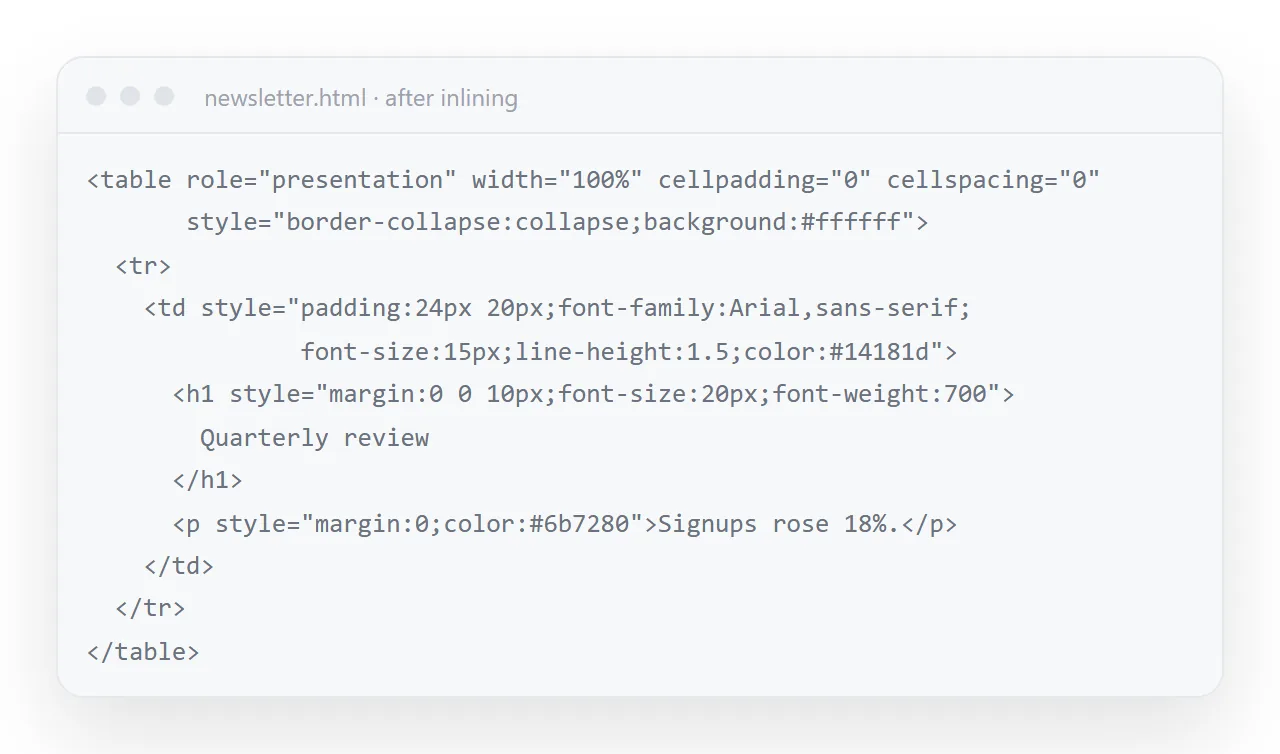
Inline CSS explains the tradeoff in general terms. For email it is not a tradeoff, it is the only form that arrives intact.
Check it before it goes out
Two tests, in this order.
First, render the markup on its own in the HTML file opener. This confirms the structure holds and nothing is missing, before any mail client is involved.
Second, send it to yourself and read it in the clients your audience actually uses. Look at it once with images loaded and once with them blocked.
A message that stops making sense with images off is a message built around pictures of text, which is also the shape spam filters are most suspicious of.
While testing, read the message at phone width as well. Most mail is opened on a phone, and a fixed width wider than the screen forces horizontal scrolling for every recipient.
When to send a link instead
Heavy layout in the message body buys you very little and costs a lot. There are three cases where a link is the better shape.
The content will change. Every sent copy is frozen. A corrected figure means a second email and two versions in circulation.
The content is long. Reports, dashboards and briefings are pages. Clipping in some clients truncates long messages, which puts your conclusion below a fold you cannot see.
The content is interactive. Charts, sorting, tabs and calculators are removed on the way in. They work at an address.
The route is short. Paste the page into a NOS document, create a share link with Share, then Share link, then Create link, and send a plain email with one line and that link.
Turning HTML into a link is that step alone, and email versus a link for documents compares the two by what the reader ends up seeing.
The attachment route, and why it fails
The remaining option is attaching the .html file. It is the one to avoid.
Company mail gateways often strip HTML attachments, because a page carrying a form and a script is the standard construction for a fake sign-in page. Yours looks the same to a filter.
Even when it arrives, a desktop opens it in whatever owns the extension and a phone drops it into file storage. Sharing an HTML file by email covers what happens to it in transit.
Signatures are a separate problem
A signature is email HTML with tighter limits again, because it is pasted into a settings field rather than sent as a message body.
The rules overlap, but the size, the image handling and the editor involved are different enough that AI HTML email signature generators treats them on their own.