A how-to guide template has five parts: a title that starts with "how to", a line with the step count and the time, what the reader needs first, numbered steps with one action each, and a short list of fixes.
Add a line under each step saying what the screen shows.
Built as a web page and sent as a link, the guide opens on a phone next to the real tool. When a menu changes, you edit one step and the link you already sent stays the same.
Here is a finished example you can copy. The office and the app are made up. Press Mark as done under a step to see the progress bar move.
<!doctype html>
<html lang="en">
<head>
<meta charset="utf-8">
<meta name="viewport" content="width=device-width, initial-scale=1">
<title>How to book a meeting room</title>
<style>
  * { box-sizing: border-box; }
  body {
    margin: 0; background: #f3f4f6; color: #1f2937;
    font-family: system-ui, -apple-system, "Segoe UI", sans-serif; line-height: 1.5;
  }
  .page { max-width: 640px; margin: 0 auto; padding: 22px 18px 30px; }
  .meta { font-size: 13px; color: #6b7280; margin: 0 0 6px; }
  h1 { font-size: 23px; line-height: 1.25; margin: 0 0 10px; }
  .facts { display: flex; flex-wrap: wrap; gap: 8px; margin: 0 0 14px; padding: 0; list-style: none; }
  .facts li { background: #e0e7ff; color: #1e3a8a; font-size: 13px; font-weight: 600; border-radius: 99px; padding: 3px 11px; }
  .before { background: #fff; border: 1px solid #e5e7eb; border-radius: 12px; padding: 12px 16px; font-size: 15px; }
  .before b { display: block; margin-bottom: 2px; }
  .before ul { margin: 4px 0 0; padding-left: 20px; }
  .progress { position: sticky; top: 0; z-index: 2; background: #f3f4f6; padding: 12px 0 8px; font-size: 14px; color: #4b5563; }
  .bar { height: 8px; background: #e5e7eb; border-radius: 99px; margin-top: 6px; overflow: hidden; }
  .bar i { display: block; height: 100%; width: 0; background: #1e3a8a; border-radius: 99px; transition: width .2s; }
  .step { background: #fff; border: 1px solid #e5e7eb; border-radius: 12px; padding: 14px 16px; margin: 0 0 12px; }
  .step h2 { font-size: 17px; margin: 0 0 4px; display: flex; gap: 10px; align-items: baseline; }
  .num { flex: none; display: inline-grid; place-items: center; width: 26px; height: 26px; border-radius: 50%; background: #1e3a8a; color: #fff; font-size: 14px; }
  .step p { margin: 0 0 8px; font-size: 15px; }
  .step { display: grid; grid-template-columns: 1fr 250px; column-gap: 16px; }
  .step h2 { grid-column: 1 / -1; }
  .step .txt { grid-column: 1; }
  .step .vis { grid-column: 2; grid-row: 2; }
  @media (max-width: 560px) { .step { display: block; } }
  .scr { border: 1px solid #cbd2dc; border-radius: 8px; overflow: hidden; background: #fff; max-width: 330px; margin-bottom: 8px; }
  .scr-bar { background: #e5e7eb; font-size: 12px; font-weight: 600; padding: 5px 10px; color: #374151; }
  .row { display: flex; justify-content: space-between; align-items: center; padding: 6px 10px; font-size: 13px; border-top: 1px solid #f0f1f3; }
  .row.hl { background: #fff7ed; outline: 2px solid #ea580c; outline-offset: -2px; font-weight: 600; }
  .row .tag { background: #ea580c; color: #fff; border-radius: 99px; font-size: 11px; padding: 1px 8px; }
  .cap { font-size: 13px; color: #4b5563; margin: 6px 0 10px; }
  .cap b { color: #9a3412; }
  .done-btn { font: inherit; font-size: 14px; font-weight: 600; border: 1px solid #1e3a8a; background: #fff; color: #1e3a8a; border-radius: 8px; padding: 7px 14px; cursor: pointer; }
  .step.done { background: #f4fbf6; border-color: #cfe9d7; }
  .step.done .num { background: #0f5132; }
  .step.done .done-btn { background: #0f5132; border-color: #0f5132; color: #fff; }
  .stuck { background: #fffbeb; border: 1px solid #fde68a; border-radius: 12px; padding: 12px 16px; font-size: 14px; }
  .stuck b { display: block; margin-bottom: 2px; }
  .foot { margin-top: 18px; font-size: 12px; color: #6b7280; }
  @media (max-width: 420px) { h1 { font-size: 20px; } }
</style>
</head>
<body>
<div class="page">
  <p class="meta">Office guide (fictional) · updated 1 Oct 2026</p>
  <h1>How to book a meeting room</h1>
  <ul class="facts"><li>4 steps</li><li>About 2 minutes</li><li>Works on a phone</li></ul>

  <div class="before">
    <b>Before you start</b>
    You need the RoomBook app or its web page, and your office login.
  </div>

  <div class="progress"><span id="count"></span><div class="bar"><i id="fill"></i></div></div>
  <div id="steps"></div>

  <div class="stuck">
    <b>If something goes wrong</b>
    No free slot in the list? Try the next day, or ask Facilities. Booked the wrong room? Open the booking and choose Cancel, then book again.
  </div>

  <p class="foot">Sample guide for illustration. Edit the STEPS list in the code to write your own.</p>
</div>

<script>
  // One list drives the whole page: change a step here and the page updates.
  const STEPS = [
    { title: 'Open the Rooms page',
      text: 'In RoomBook, tap Rooms, then choose the day you need.',
      screen: { bar: 'RoomBook · Rooms', rows: ['Mon 5 Oct', 'Tue 6 Oct', 'Wed 7 Oct'], hl: 1 },
      caption: 'A list of days. The row Tue 6 Oct is circled.' },
    { title: 'Pick a free room',
      text: 'Rooms with a free slot show the time. Choose the one that fits your group.',
      screen: { bar: 'Tue 6 Oct · Rooms', rows: ['Room 1A · full', 'Room 2B · free 10:00', 'Room 3C · full'], hl: 1 },
      caption: 'Three rooms. Only Room 2B shows a free time, and it is circled.' },
    { title: 'Add a title and the guests',
      text: 'Type a short title. Add guests by name; they get an invite.',
      screen: { bar: 'New booking · Room 2B', rows: ['Title: Budget review', 'Guests: Ana, Ben, Chloe', 'Time: 10:00-11:00'], hl: 0 },
      caption: 'A form with three lines. The Title line is circled.' },
    { title: 'Press Book',
      text: 'Check the time, then press Book. A confirmation appears and guests get the invite.',
      screen: { bar: 'New booking · Room 2B', rows: ['Time: 10:00-11:00', 'Room: 2B, 6 seats', 'Book'], hl: 2 },
      caption: 'The last line is a button labelled Book, and it is circled.' }
  ];

  const root = document.getElementById('steps');
  STEPS.forEach((s, i) => {
    const rows = s.screen.rows.map((r, j) =>
      '<div class="row' + (j === s.screen.hl ? ' hl' : '') + '"><span>' + r + '</span>' +
      (j === s.screen.hl ? '<span class="tag">' + (i + 1) + '</span>' : '') + '</div>').join('');
    root.insertAdjacentHTML('beforeend',
      '<section class="step"><h2><span class="num">' + (i + 1) + '</span>' + s.title + '</h2>' +
      '<div class="txt"><p>' + s.text + '</p>' +
      '<p class="cap"><b>What you see:</b> ' + s.caption + '</p>' +
      '<button class="done-btn" type="button">Mark as done</button></div>' +
      '<div class="vis"><div class="scr"><div class="scr-bar">' + s.screen.bar + '</div>' + rows + '</div></div></section>');
  });

  const count = document.getElementById('count');
  const fill = document.getElementById('fill');
  function update() {
    const n = document.querySelectorAll('.step.done').length;
    count.textContent = n + ' of ' + STEPS.length + ' steps done';
    fill.style.width = (n / STEPS.length * 100) + '%';
  }
  root.addEventListener('click', (e) => {
    const btn = e.target.closest('.done-btn');
    if (!btn) return;
    const step = btn.closest('.step');
    step.classList.toggle('done');
    btn.textContent = step.classList.contains('done') ? 'Done' : 'Mark as done';
    update();
  });
  update();
</script>
</body>
</html>
If you would rather start from plain text, this is the skeleton:
How to [do the task]
[number] steps, about [number] minutes.
Before you start: [what you need].

Step 1: [one action].
You will see: [what is on the screen].
Step 2: [one action].
You will see: [what is on the screen].

If something goes wrong: [problem] - [fix].
Last updated: [date]
Why each part is there
The count and the time tell a colleague what they are starting, so they do not give up halfway. "Before you start" stops the step 3 surprise: a login or a file they do not have.
The "you will see" line does the work of a screenshot. It lets the reader confirm they are on the right screen before they press anything. For longer manuals, see writing a user manual.
Make it with AI
Paste this into ChatGPT, Claude or Gemini, then add your steps under it.
Make one self-contained HTML file: a how-to guide that reads
well on a phone.

Top: the title, then small labels for the number of steps and
the time. Then a "Before you start" box. Then my steps as
numbered cards. Under each step, add a line starting
"What you see:" using my description. Then a box called
"If something goes wrong". Add a "Mark as done" button on each
step and a progress bar.

Rules: no external images, fonts or scripts. Keep the steps in
one JavaScript list at the top, so I can edit one step in one
place. Include the viewport meta tag. Use only my wording for
what happens on screen. If a step has no description, write
TBC instead of inventing one.

My steps:
[paste here]
The chat has never seen your tool, so it can only guess at what is on the screen. That is why the prompt tells it to use your wording.
Before you send the guide, check four things:
- Follow it yourself, in the real tool. Do every step with the page open. If a step does not match the screen, fix the step.
- Each step is one action. If the chat merged two, split them.
- The "what you see" lines are yours. Delete anything the chat added that you did not say.
- It fits a narrow screen. Resize the preview window to phone width and read it.
Send it as a link
Paste the HTML into NOS and the page appears as written, scripts included. Choose Create share link and copy the link. HTML to link walks through it.
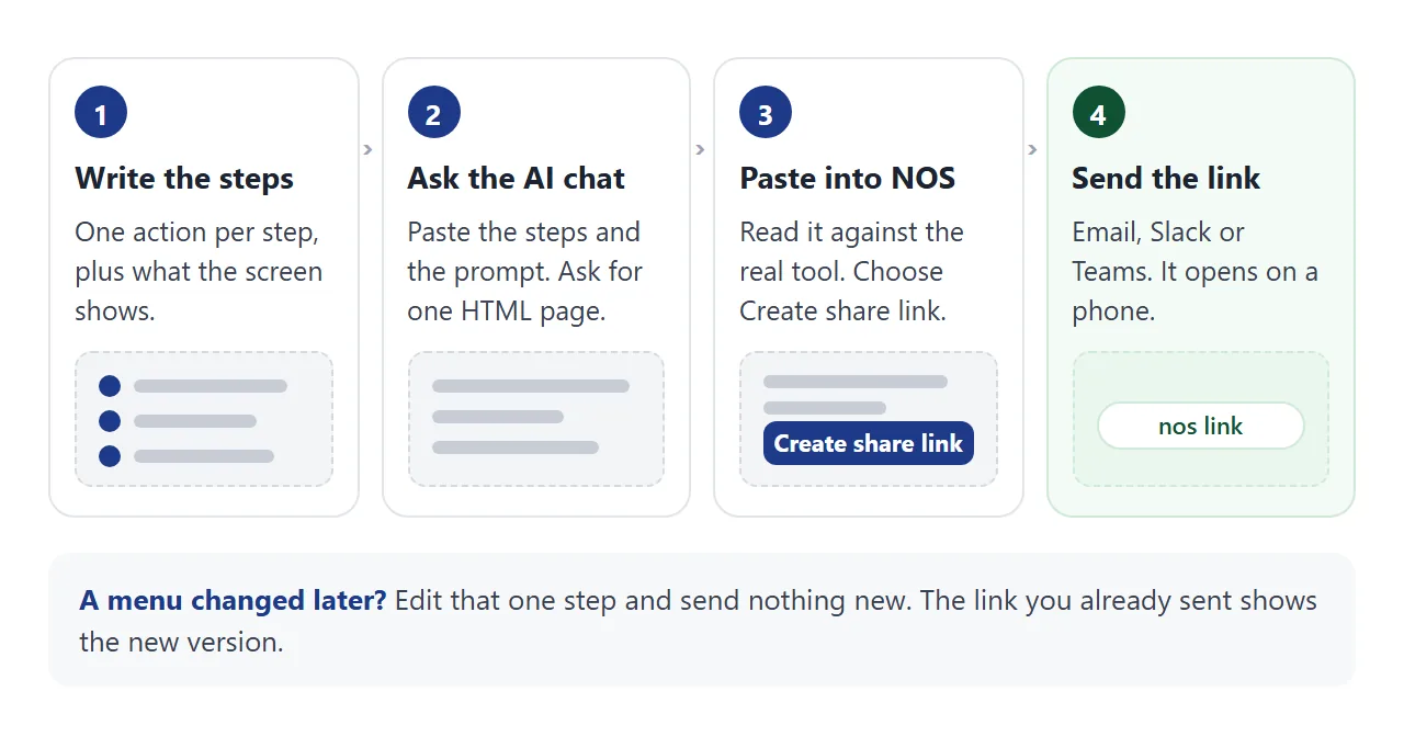
The colleague taps the link and the guide opens in their browser, phone included. They do not need an account, and they cannot edit your page.
When a step changes, edit the code in NOS. The same link shows the new version. Pictures from other websites do not load in NOS and sending a form to a server is blocked, so keep the guide as steps and text.
Where you paste the link changes what the reader sees first. As of October 2026:
- Email. Put the link in the message body. On personal Gmail the attachment limit is 25 MB, and on work or school accounts the administrator sets it.
- Slack. Slack shows a preview under a pasted link, and you can remove it. Slack lists "no preview data" among the reasons a preview may not show. See sending HTML in Slack.
- Teams. Whether Teams previews a pasted link depends on the URL previews setting, which an administrator controls. See sharing in Teams.
- Paper. Turn the link into a QR code and stick it by the printer or the door. See the QR code link guide.
Describe the screen, not just the click
"Click Settings" fails when the reader cannot find Settings. "Click Settings, the gear at the top right" works, and a "what you see" line makes it easier still.
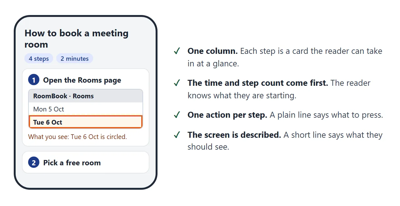
Name things the way the screen does. If the button says Book, write Book, not "confirm". Say where it is, and what colour or shape it has if that helps.
The page needs the viewport meta tag. Without it, MDN explains, some mobile devices lay the page out in a wider virtual window and shrink it, so text turns small. The example has it. For more, see fixing AI pages on mobile.
Ways to share a guide compared
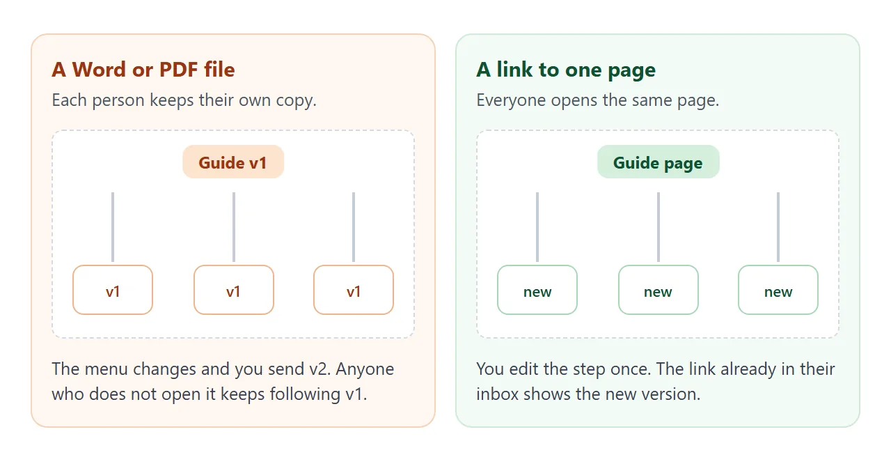
The guide is the same. What differs is how many copies exist, and what happens when a step changes.
| Way to share | What the reader does | When a step changes |
|---|---|---|
| Word file attached | Downloads and opens it | Every copy stays as sent |
| PDF attached | Downloads and opens it | Every copy stays as sent |
| Link in the email body | Taps the link | Same link shows the new page |
| Link in Slack | Taps the link or its preview | Same link shows the new page |
| Link in Teams | Taps the link | Same link shows the new page |
| QR code on paper | Scans with a phone camera | Same link shows the new page |
A file is the right choice when the reader needs to keep or print it. For a guide people follow while working, a link means the version they open is the current one. See why links beat attachments.
A second guide: one task, two versions
Some tasks differ by device. This guide has a switch at the top. The reader picks a computer or a phone, and the steps change.
<!doctype html>
<html lang="en">
<head>
<meta charset="utf-8">
<meta name="viewport" content="width=device-width, initial-scale=1">
<title>How to submit an expense claim</title>
<style>
  * { box-sizing: border-box; }
  body {
    margin: 0; background: #f3f4f6; color: #1f2937;
    font-family: system-ui, -apple-system, "Segoe UI", sans-serif; line-height: 1.5;
  }
  .page { max-width: 640px; margin: 0 auto; padding: 22px 18px 30px; }
  .meta { font-size: 13px; color: #6b7280; margin: 0 0 6px; }
  h1 { font-size: 23px; line-height: 1.25; margin: 0 0 12px; }
  .switch { display: flex; gap: 0; margin: 0 0 14px; border: 1px solid #1e3a8a; border-radius: 10px; overflow: hidden; }
  .switch button { flex: 1; font: inherit; font-size: 15px; font-weight: 600; padding: 10px 8px; border: 0; background: #fff; color: #1e3a8a; cursor: pointer; }
  .switch button[aria-pressed="true"] { background: #1e3a8a; color: #fff; }
  ol { list-style: none; margin: 0; padding: 0; counter-reset: s; }
  li { counter-increment: s; background: #fff; border: 1px solid #e5e7eb; border-radius: 12px; padding: 12px 16px 12px 52px; margin: 0 0 10px; position: relative; }
  li::before { content: counter(s); position: absolute; left: 14px; top: 12px; width: 26px; height: 26px; border-radius: 50%; background: #1e3a8a; color: #fff; display: grid; place-items: center; font-size: 14px; font-weight: 700; }
  li b { display: block; font-size: 16px; }
  li span { font-size: 15px; }
  .see { display: block; margin-top: 6px; padding: 6px 10px; background: #fff7ed; border-left: 3px solid #ea580c; border-radius: 0 6px 6px 0; font-size: 13px; color: #7c2d12; }
  .tip { background: #ecfdf5; border: 1px solid #a7f3d0; border-radius: 12px; padding: 12px 16px; font-size: 14px; }
  .foot { margin-top: 18px; font-size: 12px; color: #6b7280; }
  @media (max-width: 420px) { h1 { font-size: 20px; } }
</style>
</head>
<body>
<div class="page">
  <p class="meta">Finance guide (fictional) · updated 1 Oct 2026</p>
  <h1>How to submit an expense claim</h1>

  <div class="switch" role="group" aria-label="Choose your device">
    <button type="button" data-v="computer" aria-pressed="true">On a computer</button>
    <button type="button" data-v="phone" aria-pressed="false">On a phone</button>
  </div>

  <ol id="steps"></ol>
  <div class="tip" id="tip"></div>

  <p class="foot">Sample guide for illustration. Edit the GUIDE object in the code to write your own.</p>
</div>

<script>
  // Two versions of the same guide. The reader picks one; the steps swap.
  const GUIDE = {
    computer: {
      steps: [
        { t: 'Open ExpensePal in your browser', d: 'Sign in with your office login.', see: 'A blue page with a New claim button at top right.' },
        { t: 'Choose New claim', d: 'Give the claim a name, such as Client visit, October.', see: 'A form with a Name box and a Date range.' },
        { t: 'Drag in your receipts', d: 'Drop each receipt photo or PDF onto the grey box.', see: 'Each receipt appears as a small card with an amount to check.' },
        { t: 'Press Submit', d: 'Your manager is notified.', see: 'A green bar saying Claim sent.' }
      ],
      tip: 'Tip: scan paper receipts first, so you have one file per receipt.'
    },
    phone: {
      steps: [
        { t: 'Open the ExpensePal app', d: 'Sign in once; it remembers you.', see: 'A home screen with a round plus button at the bottom.' },
        { t: 'Tap the plus button', d: 'Choose New claim and type a name.', see: 'A short form with a Name box.' },
        { t: 'Tap Camera and photograph each receipt', d: 'Lay the receipt flat, in good light.', see: 'A preview of the photo with Use photo and Retake.' },
        { t: 'Tap Submit', d: 'Your manager is notified.', see: 'A green bar saying Claim sent.' }
      ],
      tip: 'Tip: photograph the receipt before you leave the shop, so it is not lost.'
    }
  };

  const list = document.getElementById('steps');
  const tip = document.getElementById('tip');
  const buttons = document.querySelectorAll('.switch button');

  function show(version) {
    const g = GUIDE[version];
    list.innerHTML = g.steps.map((s) =>
      '<li><b>' + s.t + '</b><span>' + s.d + '</span>' +
      '<span class="see"><strong>What you see:</strong> ' + s.see + '</span></li>').join('');
    tip.textContent = g.tip;
    buttons.forEach((b) => b.setAttribute('aria-pressed', String(b.dataset.v === version)));
  }

  buttons.forEach((b) => b.addEventListener('click', () => show(b.dataset.v)));
  show('computer');
</script>
</body>
</html>
One link covers both readers, so you do not keep two files in step. The same idea suits new starters; see the onboarding template.
When it does not work
| What you see | Cause | Fix |
|---|---|---|
| Text is tiny on a phone | The viewport meta tag is missing | Ask the chat to add it |
| A picture is missing | It loads from another website, which NOS blocks | Describe the screen in words, or ask for inline graphics |
| A step does not match the screen | The chat guessed what the screen shows | Replace the line with your own wording |
| Slack shows a bare address | Slack had no data to build a preview | Add one line of context above the link |
| A colleague follows an old step | They have an earlier file or printout | Send the link, and say the file is out of date |
| A button on the page does nothing | Sending a form to a server is blocked | Keep the guide read-only |