A user manual is a search tool. It is opened by someone with a problem, who has already tried the obvious thing, and who will give up in about ninety seconds.
Everything about writing one follows from that.
This guide covers organising by problem, the page-per-task rule, and what to print.
Organise by the problem, not the product
Manuals are usually organised the way the product is built: a chapter per component, in the order an engineer would describe them.
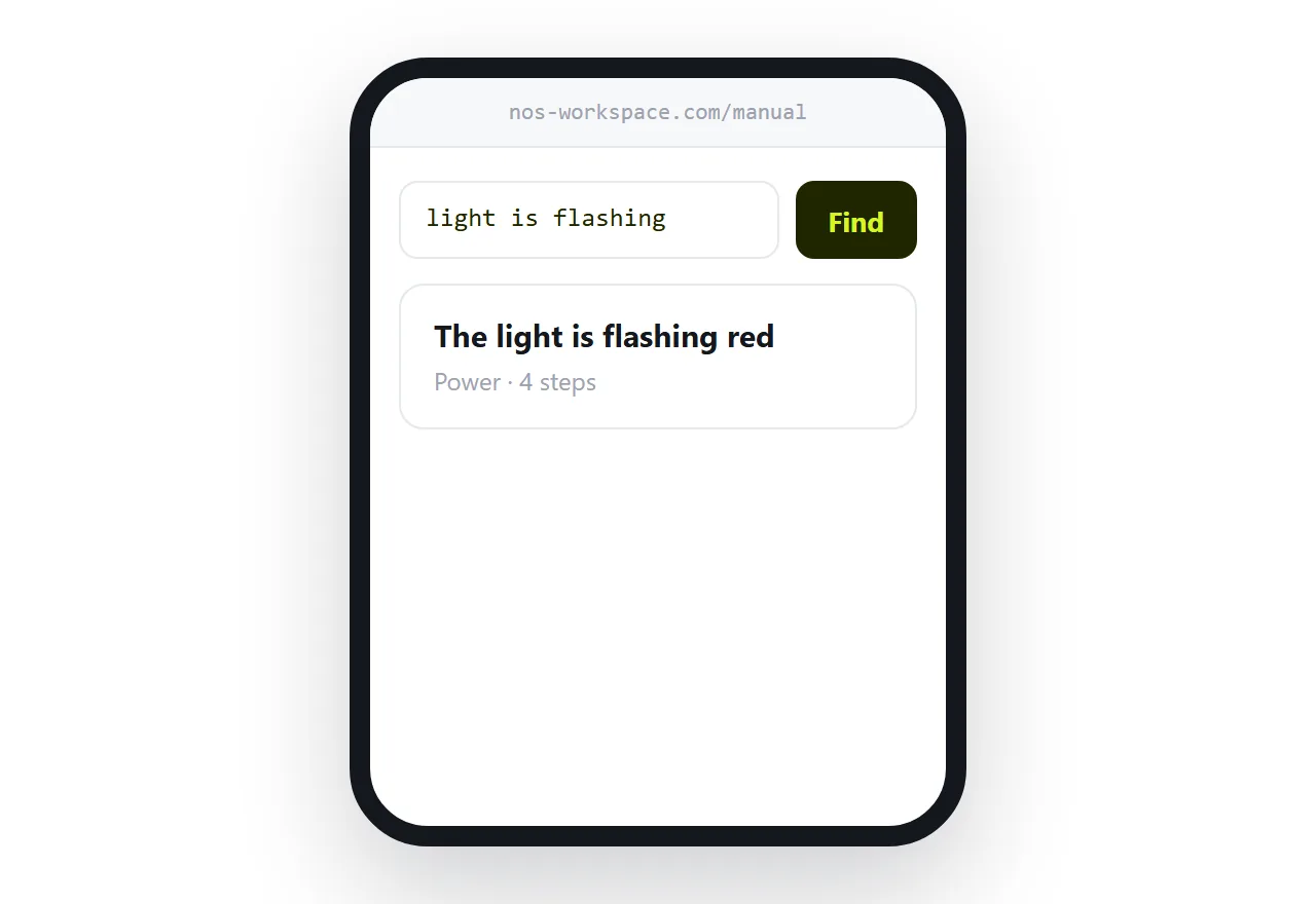
Readers arrive the other way round. They have a symptom. The light is flashing. It will not connect. The tray does not close.
A manual organised by symptom lets them find it. A manual organised by subsystem requires them to already know which subsystem is responsible, which is exactly the knowledge they lack.
Write section titles the way a reader would say the problem out loud. "The light is flashing red" beats "Status indicator reference".
One page per task
Give every task its own address.
A person searching the web for the symptom lands on the answer rather than on page thirty of a long document. A support agent can send one link rather than a manual and a page number. The reader finishes the task without scrolling past the nineteen tasks either side of it.
The contents page holds it together, with a search across everything.
| One long manual | Page per task | |
|---|---|---|
| Found in a web search | Rarely | Directly |
| Support can link to it | With a page number | An address |
| Reader finishes the task | Scrolls past everything | Lands on it |
| Updating one step | Republish | Edit one page |
| You learn what confuses people | No | From searches |
Images: one per step
The instinct is to make one careful diagram with numbered callouts covering the whole procedure.
It is harder to follow than five plain images, because the reader has to keep finding their place in the diagram between steps. On a phone it is worse, because the callout labels are too small to read.
One image per step, showing exactly what the reader should be seeing at that moment. If a step does not need an image, do not add one.
What the printed booklet is for now
The booklet in the box has two remaining jobs: getting the product working the first time, and safety information that must be present physically.
Everything else belongs at an address, because the printed version is frozen at manufacture. Firmware changes, an app is redesigned, a step becomes unnecessary, and the booklet keeps describing the old behaviour for the life of the product.
Print a code and the address on the card, and point it at a permanent address so it keeps working for as long as anyone owns the product.
The manual tells you about the product
This is the part that surprises people the first time.
The searches people run on the manual, and the pages they open most, are a direct map of where the product confuses its users. Not a survey, not a support queue with a delay, but what someone typed while holding the thing.
Two or three pages usually carry most of the traffic. Those are the places to fix the product, not just the documentation.
Closely related: How to make a house manual for guests, and How to share a transcript as a link for the adjacent problem. Publishing a horror novel online is also close.
Put it at an address
Organise by symptom, give each task a page, use one image per step, print a short card that points at the address, and read what people searched for.
Then the person with the flashing light finds the answer before they give up.