A menu is read twice on a phone: once while deciding where to eat, and once at the table. Neither of those situations tolerates a download or a zoom.
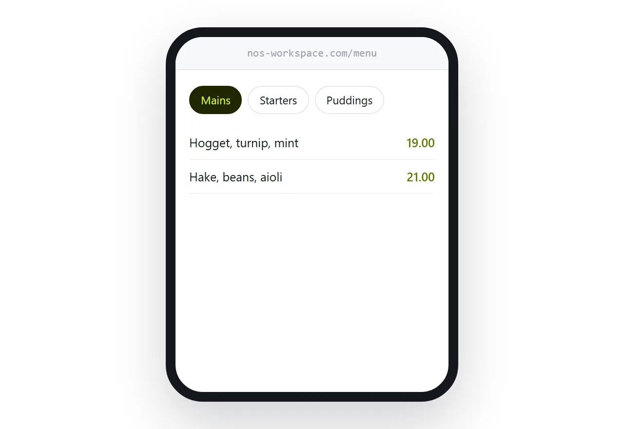
This guide covers the two reading moments, allergens, and photographs.
The first read decides where they eat
Before choosing a restaurant, people look at the menu.
That read happens on a phone, usually with two or three other places open, and it takes under a minute. What they are checking is whether there is something they want and whether the prices are in range.
A menu that takes five seconds to appear, or arrives as a document to download, loses that comparison to the restaurant whose menu opened immediately.
This is the most commercially important page a restaurant has, and it is frequently a PDF.
Sections at the top
Most people arrive knowing roughly what they want. Mains. Something vegetarian. Drinks.
So the top of the page is the section list, tappable, before any dishes. Someone looking for desserts gets there in one tap rather than scrolling past everything else.
Dietary filters are worth having if the kitchen can support them honestly.
| PDF menu | Page | |
|---|---|---|
| Time to readable | Several seconds | Under one |
| Readable without zooming | No | Yes |
| Jump to a section | No | Tap |
| Mark a dish sold out | No | During service |
| Price change | Reprint or re-upload | Edit |
Allergens
A page keeps allergen information accurate far more easily than printed cards, because updating it is an edit rather than a reprint.
Be plain about what you can guarantee. A shared kitchen cannot promise no cross-contamination, and saying so clearly is better for everyone than an implication you cannot support.
Put it where a customer with an allergy will look first, not in a footnote.
Sold out is the underrated feature
Kitchens run out. It happens most services.
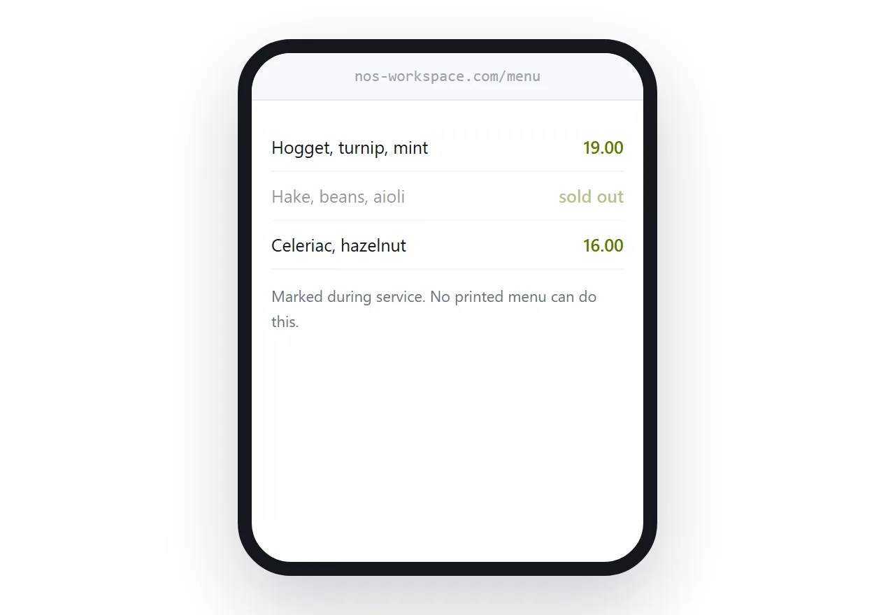
On a page, mark the dish during service. Grey it out, say sold out, leave it visible so people know it exists.
That removes the exchange where a customer chooses something, the server explains it is unavailable, and everyone restarts. Several times a night, every night.
It costs ten seconds and it is the change staff notice most.
Photographs, sparingly
A few good photographs of dishes that sell.
A photograph for every item makes the page heavy, which loses the first read, and it makes a kitchen look like a chain menu. Restaurants that photograph everything usually end up with a mix of good and poor images, and the poor ones set the impression.
Three or four strong images, and words for everything else.
The PDF, if you keep one
As a secondary download for anyone who wants it.
Not as the main version, because the main version is read on a phone by somebody comparing you with two other restaurants.
Closely related: How to host a restaurant menu, and How to put a menu at a link for the adjacent problem.
Put it at an address
Build it for a phone, put tappable sections at the top, keep allergen information honest and current, mark sold-out dishes during service, and use a few good photographs.
Then the menu is what wins the comparison rather than what loses it.