An HTML newsletter breaks in Outlook because classic Outlook for Windows lays out mail with the Microsoft Word rendering engine rather than a browser engine.
Word never had to support web layout, so a long list of ordinary CSS is simply skipped. The markup is not wrong. It is being read by something that was built for documents.
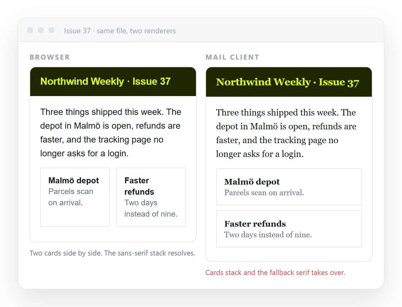
First, say which Outlook
"Outlook" covers at least four products with three rendering engines between them. A bug report without this detail cannot be acted on.
| Product | Rendering engine | Typical failure |
|---|---|---|
| Classic Outlook, Windows desktop | Microsoft Word | Ignored max-width, gaps between tables, no rounded corners |
| New Outlook for Windows | Browser engine | Close to webmail behaviour |
| Outlook for Mac | Browser engine | Generally renders like a modern client |
| Outlook on the web | Webmail | Head styles may be rewritten |
When a colleague says the issue is broken, ask which of these four they opened. Half the reported bugs are only present in the first row.
What an HTML newsletter in Outlook loses to the Word engine
The practical rule is that anything decorative may vanish, and anything structural must not depend on it.
max-widthon a table or div. Word uses the width attribute instead.border-radius. Corners arrive square.background-imageon an element, unless you add a VML fallback.box-shadow,opacityand CSS transforms.- Flexbox, grid and
position. - Some padding on non table elements.
Nothing here is required to deliver a readable issue. Treat each as a bonus for clients that support it.
Give Outlook a fixed width
Since max-width is ignored, the container needs a real width attribute that Word can read, while other clients still get the fluid behaviour.
<!--[if mso]>
<table width="600" cellpadding="0" cellspacing="0" border="0"><tr><td>
<![endif]-->
<div style="max-width:600px;margin:0 auto;">
  <!-- issue content -->
</div>
<!--[if mso]>
</td></tr></table>
<![endif]-->
The comment block is read only by Microsoft Office mail clients. Everything else treats it as an ordinary HTML comment and skips it.
The gaps between your tables
A frequent complaint is thin white lines appearing between stacked blocks that sit flush in a browser.
Three causes, usually together:
cellpaddingandcellspacingare not set to0on every table.- The table lacks
style="border-collapse:collapse;". - An image inside a cell is still inline, leaving a descender gap below it.
Set all three. Images want style="display:block;" and an explicit width attribute.
Fonts and sizes
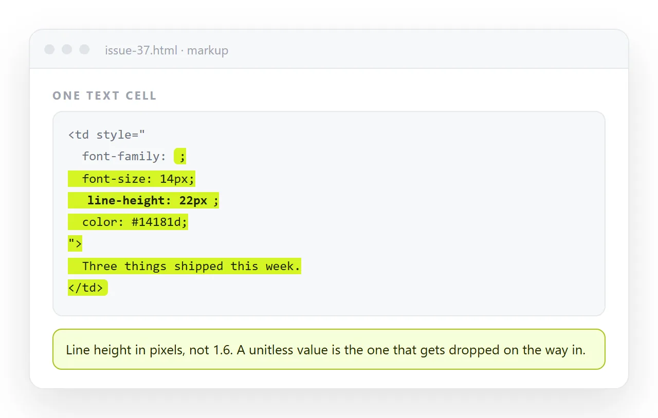
Word substitutes fonts more aggressively than browsers do. Declare a full stack on every text cell, ending in a generic family.
Line height is safer in pixels than as a unitless multiplier. Some Outlook builds also scale at high display settings, which is another reason to keep font sizes moderate rather than tiny.
Buttons that keep their shape
A styled link is the fragile version. The dependable version puts the colour on a table cell, so the button exists even when the link styling is dropped.
<table cellpadding="0" cellspacing="0" border="0">
  <tr>
    <td align="center" bgcolor="#1a5fd0"
        style="padding:12px 24px;font-family:Arial,sans-serif;">
      <a href="https://example.com"
         style="color:#ffffff;text-decoration:none;font-size:16px;">
        Read the issue
      </a>
    </td>
  </tr>
</table>
Note bgcolor alongside the style. The attribute is honoured where the CSS is not.
Reporting an Outlook bug usefully
Half the time lost on these problems is spent working out what was actually seen.
Ask for four things: which Outlook, which operating system, whether images were allowed, and a screenshot at full size rather than a phone photo of a monitor.
Then reproduce it yourself before changing anything. A layout that only one person sees is often a display scaling setting or a client side rule, not the markup.
Test the actual client
There is no substitute. Send the issue to a real mailbox in each engine you care about, and check it with images blocked as well as allowed.
Before that, check the file stands alone. Open it in the HTML file opener, which has never seen your project folder. Anything that disappears there was reaching for a neighbouring file and will fail for readers too.
Publish the reference version
The awkward part of an Outlook bug report is agreeing on what the issue is supposed to look like. Screenshots pasted into a chat lose detail and cannot be compared at real size.
Paste the issue HTML into a NOS document and create a share link. The page renders the same for everyone who opens it, so the reference and the reported problem sit next to each other at full size.
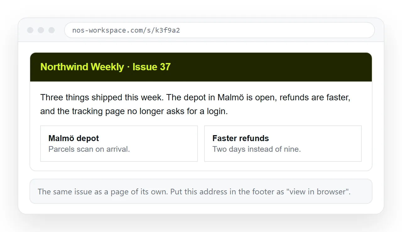
The link also serves as the view in browser target in the issue header, which is the escape hatch for any reader whose client mangled the layout.
What not to chase
Some differences are not worth engineering around.
| Difference | Worth fixing | Why |
|---|---|---|
| Layout collapses or overflows | Yes | The issue becomes unreadable |
| Cell gaps and white lines | Yes | Looks broken, cheap to fix |
| Square corners instead of rounded | No | Decoration only |
| Missing background image | Usually not | Set a background colour and move on |
| Slight font substitution | No | Readers do not notice |
Spending a day matching pixel for pixel across engines is effort taken from the issue itself. Keep the structure sound, let the decoration degrade, and give every reader a link to the web version.
For the issue structure itself, see HTML email newsletter. For the base markup rules, see HTML email template and inline CSS.