A good HTML report template does two jobs: it fixes the order of the sections, and it makes every figure checkable. Generated reports are strong on the first and weak on the second, because the prose is fluent and fluency reads as authority.
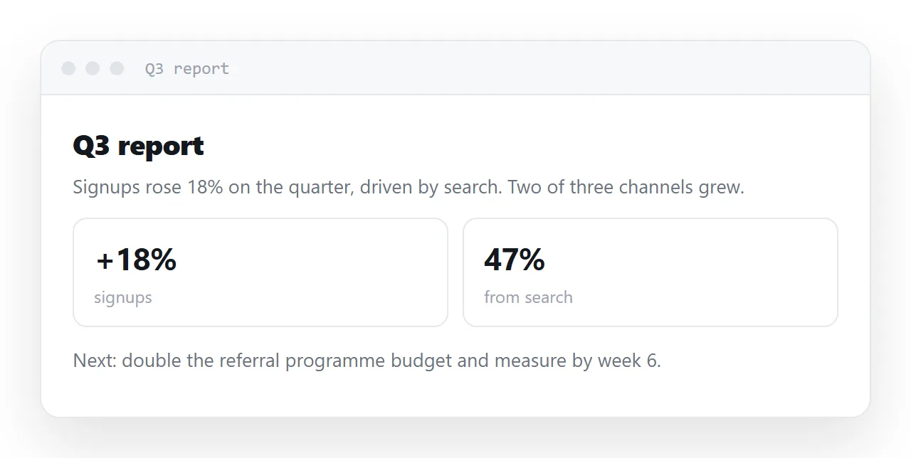
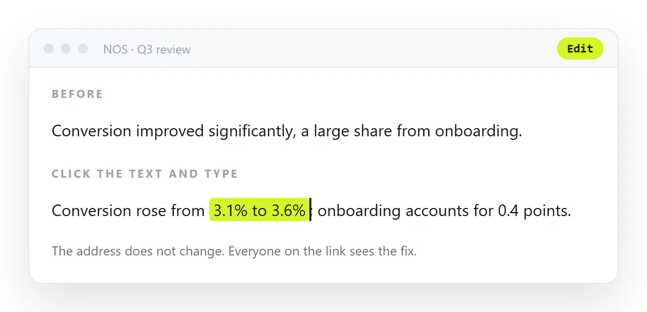
A sentence like "conversion improved to 4.2%, driven largely by the onboarding change" has a figure, a direction and a cause, and all three may have been constructed because a sentence of that shape usually contains them.
This guide covers the structure worth reusing, the number rule, the phrases to strike, and the four steps to send the report as one address.
A generated report is a genuine time saving on structure and layout, and a genuine hazard on content. The hazard is specific: the prose is fluent, and fluency reads as authority.
The number problem an HTML report template has to solve
If you did not supply a figure, it was invented. Not estimated from data you cannot see — constructed because a sentence of that shape usually contains a number of roughly that size.
And it will read exactly like a measurement: "Conversion improved to 4.2%, driven largely by the onboarding change." That sentence has a figure, a direction and a cause. All three may be fabrications, and none of it looks like guesswork.
So the rule is unconditional: every figure you did not supply is a placeholder until you have replaced it.
How to reduce it at the source
Here is the data. [paste]

Write the report using only these figures. Do not estimate, extrapolate
or infer any number that is not above. If something is not in the data,
write "not measured" rather than filling it in.

Every percentage must show its base, e.g. "4.2% (54 of 1,284)".
The "not measured" instruction is the useful one. Given a gap, the default behaviour is to fill it; given permission to leave it empty, you get an empty space you can see.
Note that this reduces invention — it does not eliminate it. Check each figure against your source regardless.
Structure worth asking for
Conclusion first
The order that feels rigorous — background, method, data, conclusion — is the order that loses readers. Findings at the top, method below for anyone who wants to check, detail last.
Anchored headings
<h2 id="findings">What we found</h2>
Readers look for their section. Anchors also let you send someone a link straight to the paragraph that concerns them, which is the single most useful thing a report-as-a-page does.
Add scroll-margin-top to headings if the page has a sticky header, or the anchor lands with the heading hidden behind it.
A summary box that can stand alone
Three or four bullets at the top, each a complete claim with its number. Most readers will read only this, so it has to be the report in miniature rather than a teaser.
Language to strike out
Generated reports drift towards phrasing that sounds analytical and commits to nothing. Worth a search-and-remove pass:
| Generated phrasing | Why it fails | Replace with |
|---|---|---|
| "significantly improved" | No number | "rose from 3.6% to 4.2%" |
| "leverage our strengths" | Says nothing | The specific action |
| "data suggests" | Which data | "in the 1,284 signups measured" |
| "industry-leading" | Unverifiable | Delete |
| "a large share" | A magnitude with no number | The count, or "not measured" |
The pattern: replace anything that gestures at magnitude with the magnitude, or delete it.
The one-minute audit
Read only the numbers. Skip the sentences and move from figure to figure with the source open beside you: does each one appear in the source, does its base appear next to it, does its period match.
Then read only the causes: every "driven by", "because" and "as a result of" is a claim you either established or did not. This takes a minute for a two-page report and catches the errors that fluent prose hides.
Then keep it correct
A report is the document type most damaged by the file model. Six recipients, two corrections, one forward, and there are four versions circulating with a different number in each.
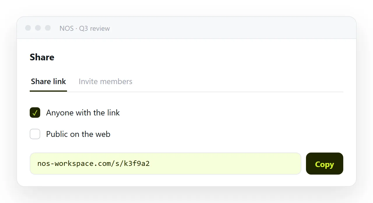
Put it at one address and send the link. In NOS the pasted report renders exactly as written and its text — including every figure — is clickable text. The colleague who spots the wrong base number fixes it, the link everybody holds is the corrected report, and there is no "please discard the earlier version" email.
That also removes the worst version of the invented-number problem: when you find one after sending, you correct one page rather than trying to recall six copies.
Where invention shows up
| Element | Risk | What to do |
|---|---|---|
| A headline percentage | High | Verify against your source |
| A comparison to last period | High | Verify; the direction may be invented too |
| A named cause for a change | Highest | Delete unless you established it |
| A base number | Medium | Verify — the ratio depends on it |
| A date or period | Medium | Check it matches your data |
| Section structure | None | Keep it; this is what generation is good for |
The third row is the one to be strictest about. A sentence attributing a rise to a specific cause is an analytical claim, and generated prose will produce one whenever the shape of the sentence calls for it.
After the numbers are right
Publish it at one address rather than attaching it. A report sent as a file becomes four versions within a week, and the version someone quotes back at you is rarely the corrected one — see turning a report into a link.
Keeping the source next to the report
The check above only works if the source is at hand. Put a link to it in the appendix of the page: the spreadsheet, the query, the export, at a stable address.
Then the next person who questions a figure can follow the link instead of asking you, and the next quarter's report starts from the same source rather than from memory.
Sending the report: 4 steps
- Supply the data and forbid estimates in the prompt. Paste the figures, say "use only these", and say "write not measured for anything not in the data". You get visible gaps instead of invisible inventions.
- Check every number and every cause against the source. Figure, comparison, base, period, named cause. The cause is the one to be strictest about; delete it unless you established it.
- Strike the phrases that gesture at magnitude. "Significantly", "a large share", "industry-leading". Replace each with the number, or delete it.
- Paste it into a NOS document and send one link. Share, then Share link, then Create link. When a figure turns out wrong after sending, you correct one page rather than recalling six copies. Turning HTML into a link is this step.