Every element has a classList property. It holds the element's class names and has five methods you will use daily: add, remove, toggle, replace and contains. Each one changes or checks a single name and leaves the other classes where they are.
const box = document.querySelector('.box');
box.classList.add('round');        // class="box round"
box.classList.remove('round');     // class="box"
box.classList.toggle('dark');      // adds if missing, removes if present
box.classList.contains('dark');    // true or false
Try each call below. The line under the box shows the live class attribute, and the box changes because the stylesheet has a rule for each class.
<!doctype html>
<html lang="en">
<head>
<meta charset="utf-8">
<meta name="viewport" content="width=device-width, initial-scale=1">
<title>classList console</title>
<style>
  body { margin: 0; padding: 14px; font-family: system-ui, sans-serif; background: #f4f5f7; color: #1d2330; }
  /* every look lives in CSS; JavaScript only switches class names */
  .box {
    width: 150px; height: 90px; margin: 6px auto 10px;
    display: grid; place-items: center; font-weight: 700;
    background: #dbe4f0; color: #1d2330; border-radius: 4px;
    transition: background .3s, color .3s, border-radius .3s, transform .3s, box-shadow .3s;
  }
  .box.round { border-radius: 45px; }
  .box.dark  { background: #1d2330; color: #fff; }
  .box.big   { transform: scale(1.12); }
  .box.blue  { box-shadow: 0 0 0 4px #2563eb; }
  .box.green { box-shadow: 0 0 0 4px #16a34a; }
  code { font: 13px ui-monospace, Consolas, monospace; }
  .attr { text-align: center; margin: 12px 0 10px; font-size: 13px; }
  .attr code { background: #fff; border: 1px solid #d5d9e0; border-radius: 6px; padding: 3px 7px; }
  .btns { display: grid; grid-template-columns: repeat(auto-fill, minmax(165px, 1fr)); gap: 6px; }
  button { font: 12.5px ui-monospace, Consolas, monospace; padding: 7px 6px; border: 1px solid #c9cdd4; border-radius: 7px; background: #fff; color: #1d2330; cursor: pointer; text-align: left; }
  button:hover { border-color: #2563eb; }
  .try { display: flex; gap: 6px; margin-top: 8px; }
  .try input { flex: 1; min-width: 0; font: 13px ui-monospace, Consolas, monospace; padding: 6px 8px; border: 1px solid #c9cdd4; border-radius: 7px; }
  .try button { flex: none; }
  #out { margin-top: 8px; font: 12.5px ui-monospace, Consolas, monospace; background: #fff; border: 1px solid #d5d9e0; border-radius: 7px; padding: 7px 9px; min-height: 18px; overflow-wrap: anywhere; }
  #out.err { color: #b42318; border-color: #f3c3bb; background: #fff7f5; }
</style>
</head>
<body>
<div class="box blue" id="box">box</div>
<div class="attr">class="<code id="attr"></code>"</div>

<div class="btns">
  <button data-run="add">add('round')</button>
  <button data-run="remove">remove('round')</button>
  <button data-run="toggle">toggle('dark')</button>
  <button data-run="forceOn">toggle('big', true)</button>
  <button data-run="forceOff">toggle('big', false)</button>
  <button data-run="replace">replace('blue', 'green')</button>
  <button data-run="contains">contains('dark')</button>
  <button data-run="addMany">add('round', 'dark', 'big')</button>
</div>
<div class="try">
  <input id="name" value="is active" aria-label="Class name to add">
  <button id="addName">add(name)</button>
</div>
<div id="out"></div>

<script>
  const box = document.getElementById('box');
  const attr = document.getElementById('attr');
  const out = document.getElementById('out');

  function show(text, isError) {
    out.textContent = text;
    out.classList.toggle('err', isError);  // force: true adds, false removes
    attr.textContent = box.className;      // the live class attribute
  }

  const calls = {
    add:      (c) => c.add('round'),
    remove:   (c) => c.remove('round'),
    toggle:   (c) => c.toggle('dark'),
    forceOn:  (c) => c.toggle('big', true),
    forceOff: (c) => c.toggle('big', false),
    replace:  (c) => c.replace('blue', 'green'),
    contains: (c) => c.contains('dark'),
    addMany:  (c) => c.add('round', 'dark', 'big'),
  };

  document.querySelectorAll('[data-run]').forEach((btn) => {
    btn.addEventListener('click', () => {
      const result = calls[btn.dataset.run](box.classList);
      show(btn.textContent + ' returned ' + result, false);
    });
  });

  document.getElementById('addName').addEventListener('click', () => {
    const name = document.getElementById('name').value;
    try {
      box.classList.add(name);
      show("add('" + name + "') worked", false);
    } catch (err) {
      show(err.name + ': ' + err.message, true);  // a space in the name throws
    }
  });

  show('Press a button. The return value shows here.', false);
</script>
</body>
</html>
What each method does and returns
All five methods work on the same list. Two of them return nothing, and three return a boolean you can use straight away.
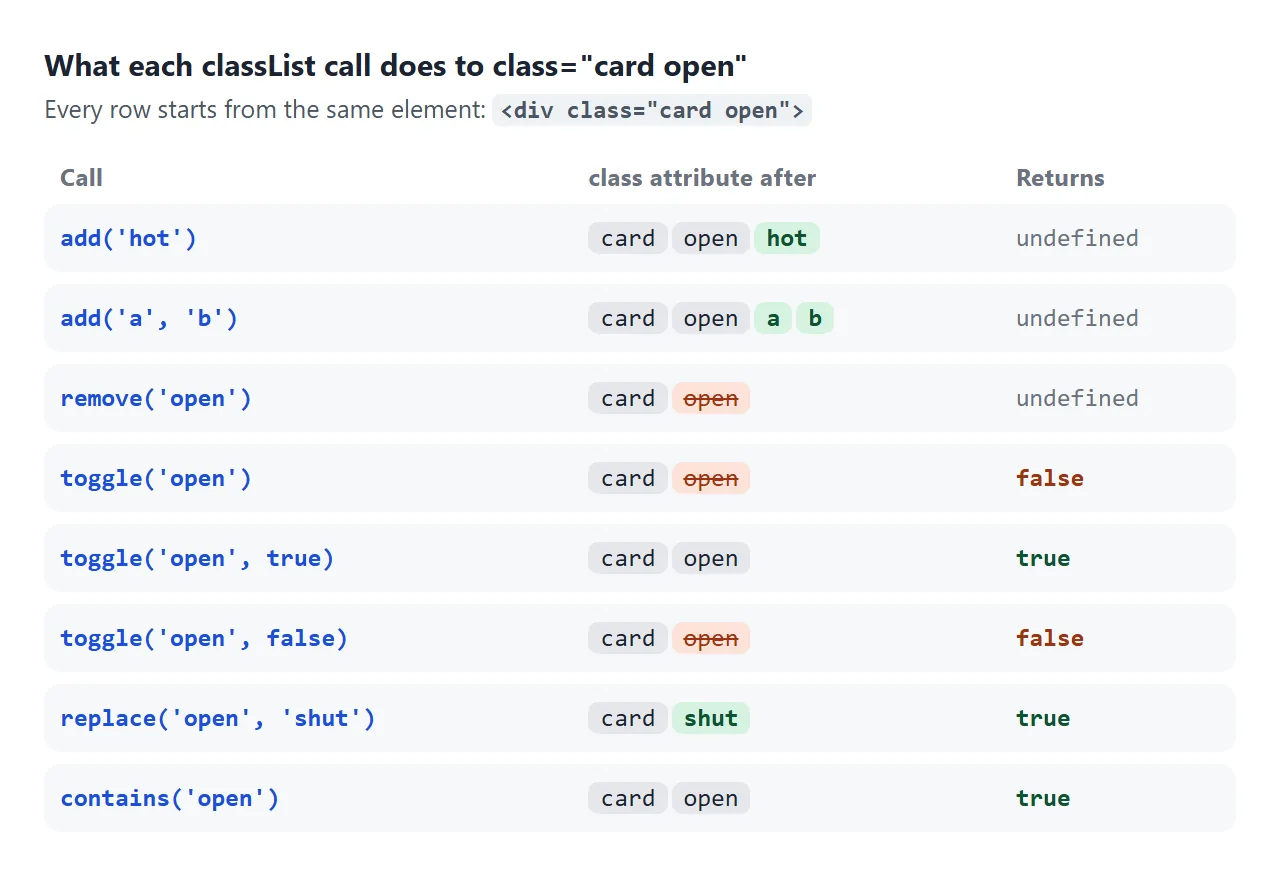
| Method | What it does | Returns |
|---|---|---|
add(name, ...) |
Adds each name that is not already there | undefined |
remove(name, ...) |
Removes each name that is there | undefined |
toggle(name) |
Adds it if missing, removes it if present | true if now present |
toggle(name, force) |
Adds when force is true, removes when false |
force |
replace(old, new) |
Swaps old for new in the same position |
true if old was there |
contains(name) |
Checks only | true or false |
A class appears at most once. Adding round twice leaves one round, and removing a class that is not there is simply ignored.
add and remove take any number of arguments, so several classes change in one call. Each argument is one class name:
card.classList.add('featured', 'wide', 'new');
card.classList.remove('wide', 'new');

const names = ['a', 'b'];
card.classList.add(...names);      // spread an array
What does not work is one string with spaces. classList.add('featured wide') throws a DOMException named InvalidCharacterError, because a space would make it two names. An empty string throws a SyntaxError. contains('a b') does not throw, it just returns false.
toggle and its force argument
Plain toggle('dark') flips the class. That is right for a button that switches something on and off.
It goes wrong when the code runs twice for one action, or when the page and the class drift apart, because a flip from the wrong starting point lands on the wrong state.
The second argument removes that guesswork. toggle(name, true) can only add and toggle(name, false) can only remove, so you can pass a condition:
// the class follows the condition, whatever state it was in
header.classList.toggle('is-stuck', window.scrollY > 0);
input.classList.toggle('invalid', input.value === '');
toggle also returns the new state, which saves a separate contains call. The accordion further down uses that return value to set aria-expanded.
className vs classList
className is the class attribute as one string. Reading it is fine. Assigning to it replaces the whole string, so every class the element had is gone.
<!doctype html>
<html lang="en">
<head>
<meta charset="utf-8">
<meta name="viewport" content="width=device-width, initial-scale=1">
<title>className vs classList</title>
<style>
  body { margin: 0; padding: 14px; font-family: system-ui, sans-serif; background: #f4f5f7; color: #1d2330;
         display: grid; grid-template-columns: 1fr 1fr; gap: 10px; }
  .lane { background: #fff; border: 1px solid #e1e4ea; border-radius: 10px; padding: 10px; min-width: 0; }
  h3 { margin: 0 0 8px; font: 700 12.5px ui-monospace, Consolas, monospace; }
  .card { padding: 12px 10px; border-radius: 8px; border: 2px solid #d5d9e0; font-size: 14px; transition: all .25s; }
  .card.featured { border-color: #f59e0b; background: #fffbeb; }
  .card.wide     { letter-spacing: .06em; }
  .card.done     { text-decoration: line-through; color: #6b7280; }
  .attr { margin: 8px 0; font: 12px ui-monospace, Consolas, monospace; color: #374151; overflow-wrap: anywhere; min-height: 32px; }
  button { font: 12.5px system-ui, sans-serif; padding: 7px 8px; border: 1px solid #c9cdd4; border-radius: 7px; background: #fff; color: #1d2330; cursor: pointer; width: 100%; margin-top: 4px; }
</style>
</head>
<body>
<div class="lane">
  <h3>className = 'done'</h3>
  <div class="card featured wide" id="a">Invoice 1042</div>
  <div class="attr" id="aAttr"></div>
  <button id="aBtn">Mark done</button>
  <button class="reset">Reset</button>
</div>
<div class="lane">
  <h3>classList.add('done')</h3>
  <div class="card featured wide" id="b">Invoice 1042</div>
  <div class="attr" id="bAttr"></div>
  <button id="bBtn">Mark done</button>
  <button class="reset">Reset</button>
</div>

<script>
  const a = document.getElementById('a');
  const b = document.getElementById('b');

  function render() {
    document.getElementById('aAttr').textContent = 'class="' + a.className + '"';
    document.getElementById('bAttr').textContent = 'class="' + b.className + '"';
  }

  // className is the whole string: assigning it replaces every class
  document.getElementById('aBtn').addEventListener('click', () => {
    a.className = 'done';
    render();
  });

  // classList changes one class and keeps the rest
  document.getElementById('bBtn').addEventListener('click', () => {
    b.classList.add('done');
    render();
  });

  document.querySelectorAll('.reset').forEach((btn) => {
    btn.addEventListener('click', () => {
      a.className = 'card featured wide';
      b.className = 'card featured wide';
      render();
    });
  });

  render();
</script>
</body>
</html>
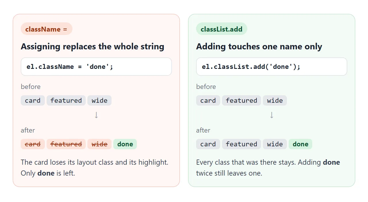
The left card loses featured, so its orange border and background disappear, and card too.
In real pages the lost classes often come from somewhere else: a layout class in the HTML, a class another script added. Use className only when you mean to set the complete list, such as a reset.
Toggle classes instead of setting inline styles
You can change looks with el.style.opacity = '1', but then the design lives in the script. Each state needs several style lines, and inline styles outrank normal stylesheet rules, so later CSS cannot easily change them.
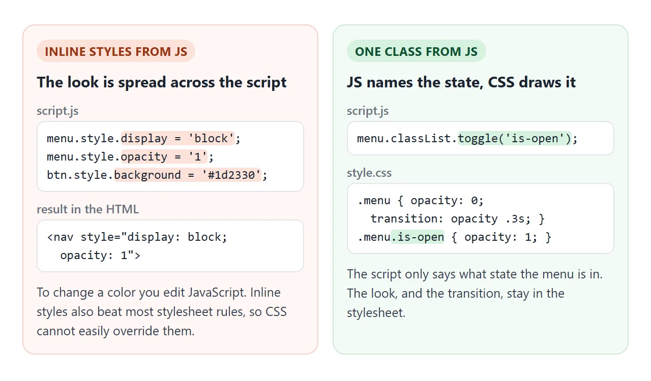
With a class, JavaScript only names the state. Colours, sizes and animations stay in the stylesheet, and a designer can change them without reading the script. CSS variables combine well with this: a class can switch a whole set of custom properties at once.
The same split makes animation easy. A CSS transition runs whenever a property's computed value changes, and adding or removing a class is such a change. That makes class toggles the simplest way to animate:
.panel { opacity: 0; transition: opacity .25s; }
.panel.is-active { opacity: 1; }
One case catches people. If you create an element, insert it and add the class in the same step, the browser never saw the starting state, so the element appears at the end state with no animation.
Make the browser compute the starting state first. Read a layout property such as el.offsetWidth before adding the class, or add the class after two animation frames: a requestAnimationFrame call nested inside another.
A finished example: tabs and an FAQ accordion
Both widgets below run on class toggles. The CSS draws the active tab, fades panels in and out, and opens each answer with a height transition. The script is about fifteen lines.
<!doctype html>
<html lang="en">
<head>
<meta charset="utf-8">
<meta name="viewport" content="width=device-width, initial-scale=1">
<title>Tabs and FAQ with classList</title>
<style>
  body { margin: 0; padding: 14px; font-family: system-ui, sans-serif; background: #f4f5f7; color: #1d2330; }
  h2 { font-size: 15px; margin: 0 0 8px; }

  /* Tabs: the active tab and panel carry .is-active */
  .tabs { background: #fff; border: 1px solid #e1e4ea; border-radius: 10px; overflow: hidden; margin-bottom: 16px; }
  .tablist { display: flex; border-bottom: 1px solid #e1e4ea; }
  .tab { flex: 1; padding: 10px 6px; border: 0; background: none; font: 600 13.5px system-ui, sans-serif;
         color: #5b6270; cursor: pointer; border-bottom: 3px solid transparent; transition: color .2s, border-color .2s; }
  .tab.is-active { color: #1d4ed8; border-bottom-color: #2563eb; }
  .panels { display: grid; }
  .panel { grid-area: 1 / 1; padding: 12px 14px; font-size: 14px; line-height: 1.5;
           opacity: 0; visibility: hidden; transform: translateY(6px);
           transition: opacity .25s, transform .25s, visibility .25s; }
  .panel.is-active { opacity: 1; visibility: visible; transform: none; }

  /* Accordion: .is-open on the item opens its answer */
  .faq { background: #fff; border: 1px solid #e1e4ea; border-radius: 10px; }
  .item + .item { border-top: 1px solid #e1e4ea; }
  .q { width: 100%; display: flex; justify-content: space-between; gap: 10px; text-align: left;
       padding: 11px 14px; border: 0; background: none; font: 600 14px system-ui, sans-serif; color: #1d2330; cursor: pointer; }
  .q::after { content: "+"; font-size: 18px; line-height: 1; transition: transform .25s; }
  .item.is-open .q::after { transform: rotate(45deg); }
  .a { display: grid; grid-template-rows: 0fr; transition: grid-template-rows .3s; }
  .item.is-open .a { grid-template-rows: 1fr; }
  .a > div { overflow: hidden; padding: 0 14px; font-size: 13.5px; line-height: 1.5; color: #374151; }
  .a p { margin: 0 0 11px; }
</style>
</head>
<body>
<h2>Plans</h2>
<div class="tabs">
  <div class="tablist" role="tablist">
    <button class="tab is-active" role="tab" aria-selected="true" aria-controls="p1" id="t1">Free</button>
    <button class="tab" role="tab" aria-selected="false" aria-controls="p2" id="t2">Team</button>
    <button class="tab" role="tab" aria-selected="false" aria-controls="p3" id="t3">Business</button>
  </div>
  <div class="panels">
    <div class="panel is-active" role="tabpanel" id="p1" aria-labelledby="t1">One user, three projects, community support.</div>
    <div class="panel" role="tabpanel" id="p2" aria-labelledby="t2">Up to ten users, shared folders and comment threads.</div>
    <div class="panel" role="tabpanel" id="p3" aria-labelledby="t3">Unlimited users, single sign-on and an uptime agreement.</div>
  </div>
</div>

<h2>FAQ</h2>
<div class="faq">
  <div class="item">
    <button class="q" aria-expanded="false" aria-controls="a1">Can I switch plans later?</button>
    <div class="a" id="a1"><div><p>Yes. The change applies from the next billing day.</p></div></div>
  </div>
  <div class="item">
    <button class="q" aria-expanded="false" aria-controls="a2">Is there a trial?</button>
    <div class="a" id="a2"><div><p>Team and Business both start with fourteen free days.</p></div></div>
  </div>
  <div class="item">
    <button class="q" aria-expanded="false" aria-controls="a3">How do I cancel?</button>
    <div class="a" id="a3"><div><p>Open Settings, then Billing, and press Cancel plan.</p></div></div>
  </div>
</div>

<script>
  // Tabs: one tab and one panel are active at a time
  const tabs = document.querySelectorAll('.tab');
  tabs.forEach((tab) => {
    tab.addEventListener('click', () => {
      tabs.forEach((t) => {
        const on = t === tab;
        t.classList.toggle('is-active', on);
        t.setAttribute('aria-selected', on);
        document.getElementById(t.getAttribute('aria-controls')).classList.toggle('is-active', on);
      });
    });
  });

  // Accordion: each question opens or closes its own answer
  document.querySelectorAll('.q').forEach((q) => {
    q.addEventListener('click', () => {
      const open = q.parentElement.classList.toggle('is-open');  // returns the new state
      q.setAttribute('aria-expanded', open);
    });
  });
</script>
</body>
</html>
- Tabs: on click, loop over all tabs and call
toggle('is-active', t === tab). The force argument turns off every other tab in the same line. - Accordion:
toggle('is-open')on the item returns the new state, which goes straight intoaria-expanded. - Height animation: the answer animates
grid-template-rowsfrom0frto1fr. Animating to height auto explains the trick.
Elements are found with querySelector and the clicks come from addEventListener. If you do not need scripts at all, tabs without JavaScript covers the CSS-only route.
Classes, data attributes or aria for state
A class is not the only place to keep state. Attributes work too, and CSS can select them:
button[aria-expanded="true"] + .answer { display: block; }
.card[data-state="loading"] { opacity: .5; }
- Classes suit on/off states that are only about looks:
is-open,is-active,dark. data-statesuits a value with more than two options, such as idle, loading and error. Read and write it withel.dataset.state.aria-expanded,aria-selecteddescribe the state to screen readers. You need them on interactive widgets anyway, so styling from them keeps one source of truth.
When it does not work
| What you see | Cause | Fix |
|---|---|---|
| Other classes vanish after your change | el.className = 'x' replaced the whole list |
Use classList.add('x') |
InvalidCharacterError in the console |
A class name contains a space | Pass separate arguments |
toggle leaves the wrong state |
The flip ran twice or started from the wrong state | Pass the force argument |
| Class is added but nothing changes | A more specific rule or an inline style wins | Match or raise the selector, remove the inline style |
Cannot read properties of null (reading 'classList') |
The script ran before the element existed, or the selector found nothing | Put the script at the end of body, or use defer |
| New element shows up without its transition | Class added in the same step as insertion | Read offsetWidth or wait two animation frames first |
For the specificity case, compare the selectors. A rule like #nav .menu { opacity: 0 } beats .menu.is-open { opacity: 1 } because of the id.
Write #nav .menu.is-open instead, or drop the id from the first rule. The DOM guide shows how to check what the browser actually applied.
Share it as a link
Class toggles are easiest to judge when you can click them. A screenshot of a tab bar shows one state, and an .html attachment may open as plain code on the other person's phone.
To send the working version, paste the page into a NOS document and choose Create share link. HTML to link walks through it.
The page renders as written and its scripts run, so the people you send it to can switch tabs and open answers themselves. If you change the code later, the same link shows the new version.