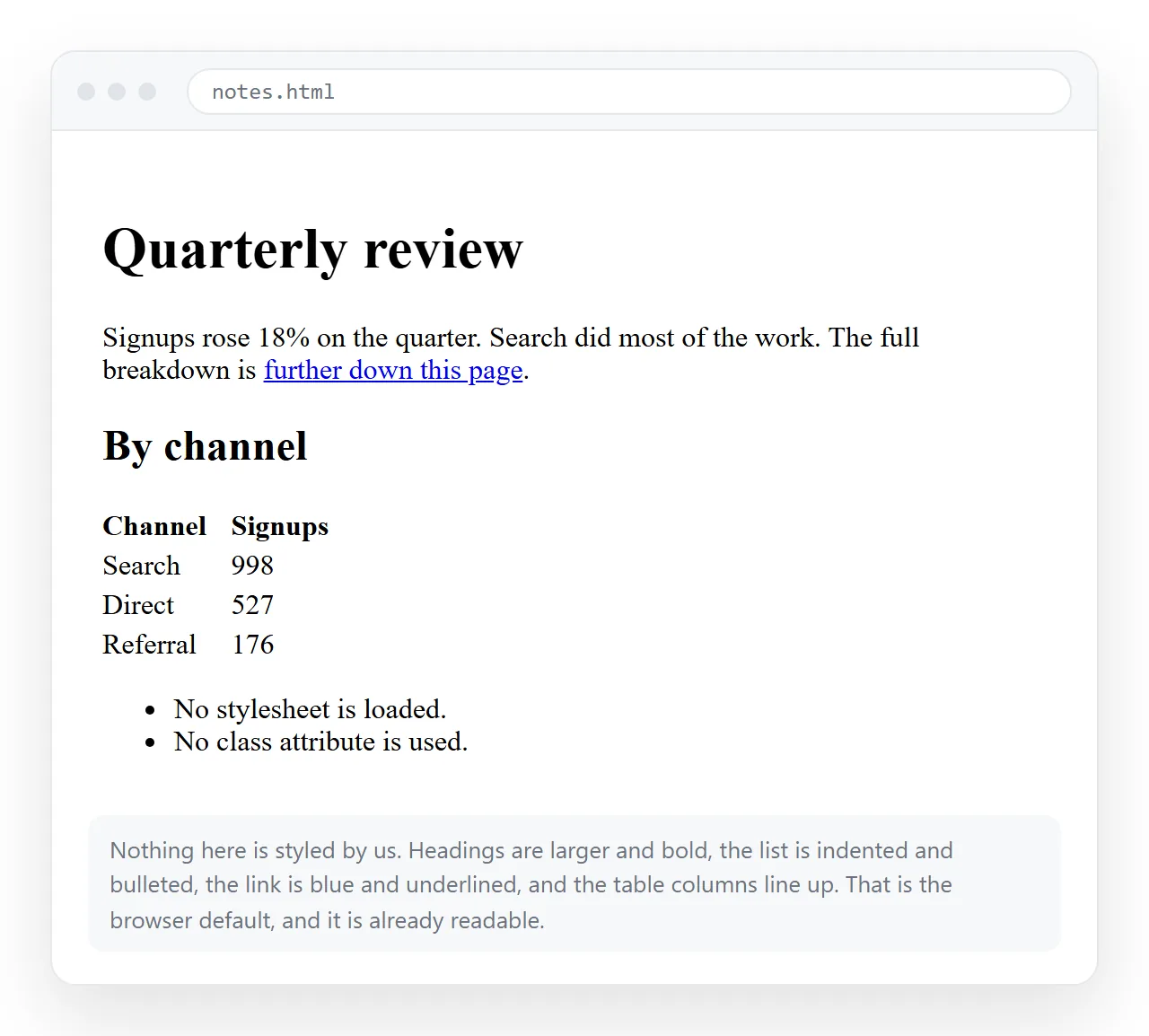
HTML projects without CSS are pages that rely entirely on the browser's default stylesheet, and they are readable from the first line because that default already handles headings, lists, tables and links.
<!doctype html>
<html lang="en">
<meta charset="utf-8">
<meta name="viewport" content="width=device-width,initial-scale=1">
<title>Q3 numbers</title>
<h1>Q3 numbers</h1>
<p>Revenue was up on Q2. Detail below.</p>
Five lines, and it is a real page. Two of them are non-negotiable even here: the charset line, or accented characters break, and the viewport line, or it is unreadable on a phone.
Nine projects
| Project | Main tags | What it teaches |
|---|---|---|
| Weekly status page | h2, ul, table |
Headings as structure, not size |
| Reference table | thead, th scope, caption |
Table semantics |
| FAQ page | details, summary |
Interaction with no script |
| Link directory | nav, ul, a |
Grouping and naming links |
| Recipe or runbook | ol, code, kbd |
Ordered steps and literal text |
| Intake form | label, required, pattern |
Native validation |
| Glossary | dl, dt, dd |
The tag everyone forgets |
| Changelog | h2, time, ul |
Dates machines can read |
| Photo index | figure, figcaption, loading |
Captions and lazy loading |
Each one is an afternoon at most, and each produces something you would actually send to a colleague.
Pick by what you already have to write, not by what looks like a good exercise. A runbook you keep re-explaining in chat is a better first project than a fictional portfolio, because you will notice immediately when it is wrong.
The order in the table is roughly by difficulty. The first three need no attributes beyond href and scope. The last three introduce validation, definition lists and figures, which are where most people find a tag they had never used.
Three of them in detail
The reference table. This is the best first project because tables are where structure pays off immediately.
<table>
  <caption>Support hours by region</caption>
  <thead>
    <tr><th scope="col">Region</th><th scope="col">Opens</th><th scope="col">Closes</th></tr>
  </thead>
  <tbody>
    <tr><th scope="row">Seoul</th><td>09:00</td><td>18:00</td></tr>
  </tbody>
</table>
scope is what lets a screen reader say "Seoul, opens, 09:00" instead of reading a grid of numbers. caption names the table without inventing a heading.
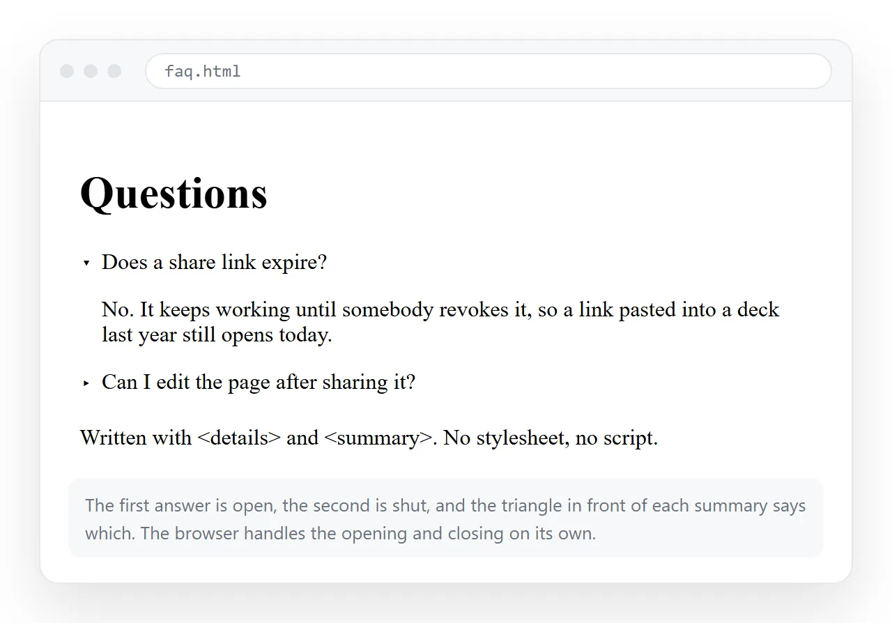
The FAQ page. <details> and <summary> give you collapsible answers with no script and no stylesheet.
<details>
  <summary>Do I need an account?</summary>
  <p>No. The tools run in the browser.</p>
</details>
The glossary. <dl> exists exactly for term and definition pairs, and almost nobody uses it.
<dl>
  <dt>Unlisted link</dt>
  <dd>An address that works for anyone holding it but is not listed anywhere.</dd>
</dl>
Why the constraint helps
Three reasons, and the first is the real one.
Bad structure is visible immediately. With no styling, a page that skips from h1 to h4, or uses a table for layout, looks confusing rather than merely inelegant. CSS would have covered that up.
It matches how the page will actually be read. Reader modes, screen readers, search engine snippets and email clients all strip or ignore much of your styling. What survives is the structure.
It is faster. The time goes into wording, headings and the table, which is where the value is.
There is a fourth reason that only shows up later. A page with no stylesheet has nothing to maintain, so it still looks exactly as intended three years on.
Styled pages decay. A font stops loading, a framework version moves, a colour no longer matches the brand. Default styling has none of those dependencies, which is why documentation and reference pages survive on it.
The trade is real, though, and worth stating plainly. The page will look dated, and for anything customer-facing that reads as neglect rather than restraint. Internal pages are where the constraint pays.
The rules that still apply
Skipping CSS does not mean skipping everything.
- Include the viewport meta tag. It is markup, not styling, and without it phones render the page at desktop width.
- One
<h1>, thenh2andh3in order. Do not pick a level for its size. - Give every input a
<label>tied byfor. - Write real
alttext, which matters more when there is no visual context. Alt text covers it. - Put a
<title>in. It is the browser tab and the preview card.
When to add the first CSS
Not never. The point is to add it where the default genuinely fails, which is a short list:
<style>
  body { max-width: 70ch; margin: 2rem auto; padding: 0 1rem; line-height: 1.6; }
  td, th { padding: 4px 10px; }
</style>
Line length is the one real weakness of default styling, since text runs the full window width. Six lines fix it, and the page still has no design to maintain. Inline CSS explains why it goes in the file.
Table padding is the second. Browser defaults set none, so dense tables run together and become hard to scan across.
Everything past those two is preference rather than legibility. That is a useful line to hold, because it keeps the page from turning into a design project you then have to maintain.
Sending the finished page
A plain page has the same distribution problem as a styled one. The file is not the page.
Paste the HTML into a NOS document and it renders as written at an address of its own. Share, then Share link, then Create link, and send one line.
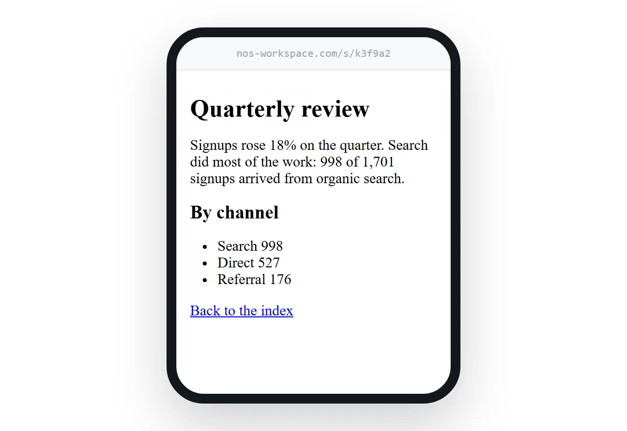
The address does not change when the content does, so a changelog or a status page can be updated in place rather than resent. Turning HTML into a link is that step by itself.
To see the page as a stranger would, open it in the HTML file opener first. If it looks the same there as on your machine, it is genuinely self-contained.
For projects that go beyond default styling, cool things to do with HTML lists the tags worth learning next.