The cool things to do with HTML are mostly tags rather than libraries: dialogs, collapsible panels, editable cells, drawing and validation are all in the markup already.

Interaction without a single line of script
| What you want | The tag that does it | Script needed |
|---|---|---|
| Collapsible section | <details> and <summary> |
None |
| Modal dialog | <dialog> |
One line to open it |
| Tooltip | title, or CSS ::after |
None |
| Required fields and format checks | required, pattern, type |
None |
| Progress and gauges | <progress>, <meter> |
None |
| Editable text in place | contenteditable |
Only to save it |
| Native date picker | <input type="date"> |
None |
| Lazy-loaded images | loading="lazy" |
None |
Eight rows, no dependencies, and every one of them works in a file you open by double-clicking.
Two things follow from that list. The first is that a large share of "we need a framework for this" turns out to be a tag nobody checked for.
The second is that these behaviours are consistent. A native dialog traps focus correctly, a native date picker matches the reader's locale, and native validation messages arrive already translated. Hand-built versions rarely manage all three.
None of it rules out a framework. It moves the point at which one starts paying for itself, which is usually when several screens share state rather than when a panel needs to open.
Panels, dialogs and editable text
Collapsible sections
<details> is the whole accordion.
<details>
  <summary>Assumptions behind these numbers</summary>
  <p>Excludes cancelled orders and internal test accounts.</p>
</details>
Add open to start expanded. Give several of them the same name attribute and they behave as an accordion where opening one closes the rest.
This is the single most useful tag for long internal documents. Detail that would otherwise be cut goes in a panel, and the page stays scannable.
A real modal dialog
<dialog id="d">
  <p>Delete this row?</p>
  <form method="dialog"><button>Cancel</button></form>
</dialog>
<button onclick="d.showModal()">Delete</button>
showModal() gives you the backdrop, the focus trap and Escape-to-close without writing any of them. method="dialog" on a form inside closes it on submit.
Editable tables
Add contenteditable to cells and the page becomes a small spreadsheet. Typing changes the rendered value, and a short script can total a column on input.
The editable HTML table tool is this, ready to use. Contenteditable covers the attribute itself.
Drawing and validating in the markup
Drawing, with no image file
SVG is markup, so shapes, sparklines and diagrams live in the same file as the text.
<svg width="120" height="30" viewBox="0 0 120 30">
  <polyline points="0,25 20,18 40,20 60,8 80,12 100,4 120,6"
            fill="none" stroke="#3b6cf0" stroke-width="2"/>
</svg>
That is a sparkline in one element. It scales without blurring, it can be styled with CSS, and it costs no extra request. SVG in HTML has more.

Form validation the browser runs for you
<input type="email" required>
<input type="text" pattern="[0-9]{4}" title="Four digits">
<input type="number" min="1" max="99" step="1">
The browser blocks submission and shows its own message, translated into the reader's language. You can style the states with :invalid and :user-invalid.
Appearance the reader controls
Dark mode that follows the reader
<style>
  :root { color-scheme: light dark; }
  @media (prefers-color-scheme: dark) {
    body { background: #12151c; color: #e6e8ec; }
  }
</style>
Two rules and the page matches whatever the device is set to. Dark mode CSS covers the details, including form controls.
Print that is not an accident
A print stylesheet decides what a PDF export looks like: hide navigation, force page breaks before sections, show link addresses in brackets.
<style media="print">
  nav, .no-print { display: none; }
  h2 { break-before: page; }
</style>
That turns the same page into a decent handout. Print stylesheets go further.
Layout that reflows by itself
<div style="display:grid; grid-template-columns:repeat(auto-fit,minmax(220px,1fr)); gap:16px">
One line, and cards rearrange from three columns to one as the window narrows, with no media query. CSS grid explains the parts.
Long pages that stay readable
Sticky table headers
<style> thead th { position: sticky; top: 0; background: #fff; } </style>
Two properties, and a long table stays readable while scrolling. The background is required, otherwise rows show through.
Anchor links that become a table of contents
Give headings ids and link to them with #. Add scroll-behavior: smooth and scroll-margin-top so the heading does not hide under a sticky bar.
Video and audio with no player library
<video controls> and <audio controls> give you a native player. Add poster for a still frame and playsinline so phones do not force fullscreen.
The native player is not only less work. It inherits the reader's playback speed, captions preference and keyboard shortcuts, which a custom player has to reimplement and usually does not.
Pages that survive being moved
A page that works offline
Embed images as data URIs, inline the CSS, and the file carries everything it needs. That is the self-contained HTML pattern, and it is what makes a single file survive being moved.

Getting any of this in front of someone
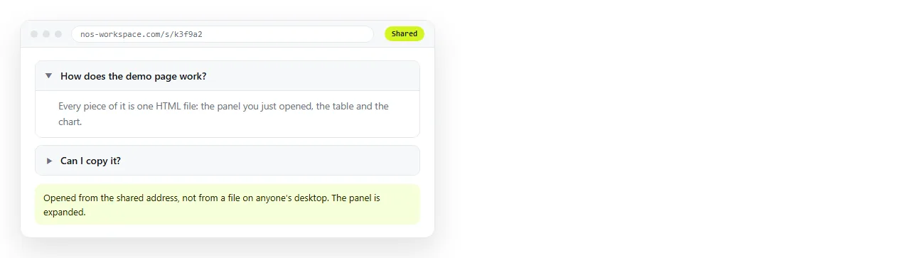
Every item on this list dies in a screenshot. The panel does not open, the dialog does not appear, the sparkline is a picture of a sparkline.
Paste the HTML into a NOS document and it renders as written, at an address of its own. Share, then Share link, then Create link, and send the line.
The words in the document stay clickable, so correcting a number later does not mean regenerating a file. Turning HTML into a link is that step, and single HTML file apps covers building something larger out of these pieces.