Attach the picture, ask for one complete HTML file, and read the reply as a first draft rather than a conversion.
A copilot generate html from image request returns markup that follows the layout in the picture. Fonts, spacing and any pictures inside the design are left for you to supply.
That is the honest shape of the job. Structure arrives close to right. Detail arrives approximate.
What to ask for
The wording of the request decides how much fixing follows. Four things belong in it every time.
- One self-contained HTML file. Inline CSS in a
<style>block, no external stylesheet. Otherwise the page reaches for a file you do not have. - A
<title>and the viewport line.<meta name="viewport" content="width=device-width,initial-scale=1">. Without it the page is unreadable on a phone. - Real text, not placeholder text. If the picture has your copy in it, say to transcribe what is visible instead of substituting filler.
- A note about what the picture does not show. Hover states, the narrow layout, and anything below the fold. Say what you want there, or you get a guess.
Add one line about the picture itself. Telling it this is a dashboard header, or a pricing table, or an email layout, changes which markup it reaches for.
Can Copilot generate HTML from image files of any kind?
It reads what is in the picture, so the quality of the picture sets the ceiling. A few practical differences.
| Source picture | How it usually goes | Watch for |
|---|---|---|
| Full width PNG screenshot | Closest result | Nothing unusual |
| Design tool export | Close, with clean edges | Layers flattened, so no state information |
| Phone photo of a monitor | Rough | Skew, glare, colours read wrong |
| Hand drawn wireframe | Structure only | Every font and colour invented |
| Collage of several screens | Confused | One page built from mixed layouts |
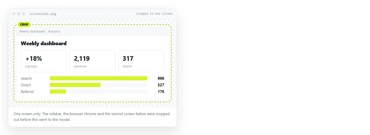
Send one screen per request. A collage asks the model to decide which parts belong to the same page, and that decision is usually wrong.
The six steps
- Crop the image to one screen. Remove the browser chrome, the desktop behind it and any second window.
- Attach it and describe the output. The four items above, in one paragraph. Say self-contained, say inline CSS.
- Take the whole code block. From
<!DOCTYPE html>to</html>. Saving a fragment is the most common reason a page opens with no styling at all. - Render it somewhere neutral. Paste it into a NOS document, or open the saved file in the HTML file opener. Either shows you the page without your own folder quietly supplying anything.
- Fix the four usual gaps. Listed in the next section.
- Create the share link. Share, then Share link, then Create link. Unlisted by default, so only people with the link can open it.
What usually needs fixing
Four gaps, in the order they tend to show up.
Fonts. The model names a font family it read from the shapes of the letters. If that font is not installed and not fetched, the browser substitutes another and every line length changes.
Decide whether to load a web font or accept a system stack, then set it once. If a named font still does not appear, the file is either not reachable or not referenced under the name the CSS uses.
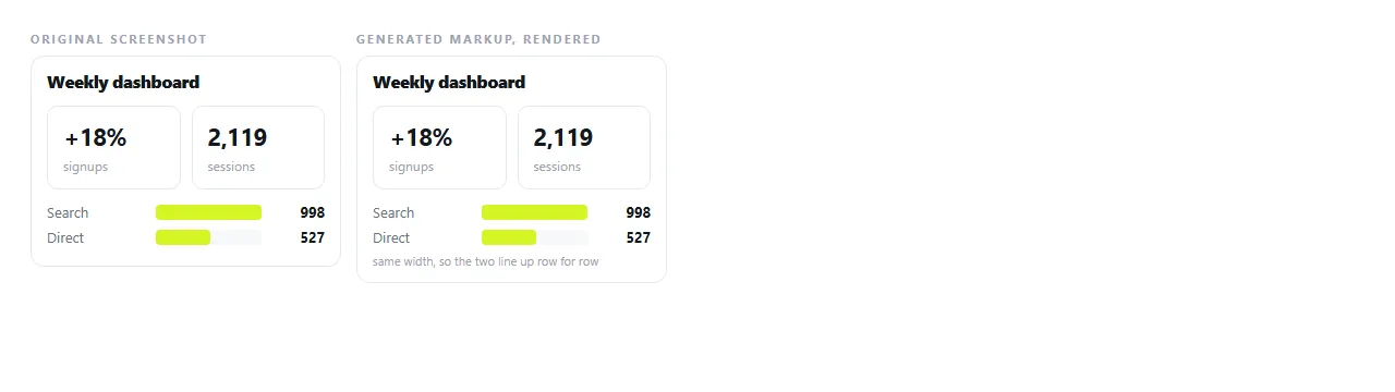
Spacing. Padding and gaps come back as round numbers that look right at one width and drift at others. Compare the generated page and the picture at the same window width before you change anything, then adjust the container spacing rather than each block.
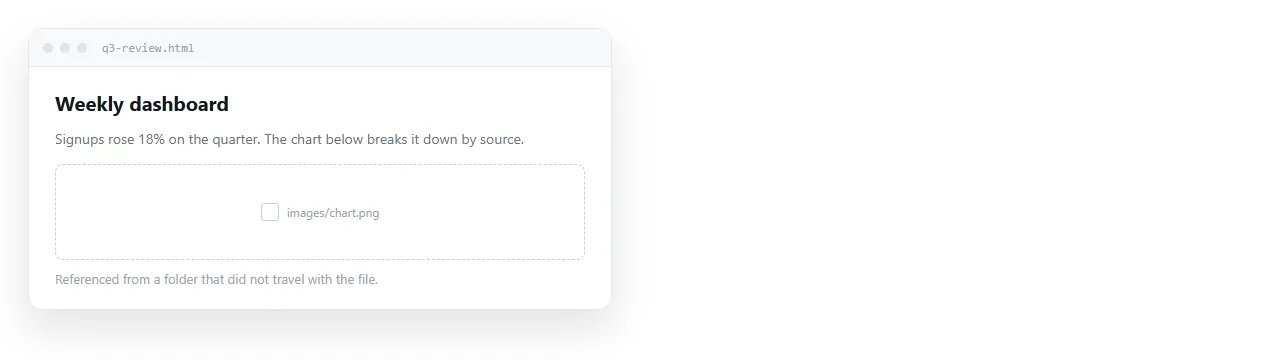
Images referenced but not included. You get tags pointing at file names that do not exist. This is expected. The model can describe a picture, not attach one.
Supply the files next to the page, point the tags at full addresses, or embed them as data URIs. Images not showing covers which of the three fits your case.
Colours. Read from pixels, so a compressed screenshot yields values that are near but not equal to your brand colours. Paste the real hex values in once and the page is correct for good.
Checking the result
Two comparisons catch most of it, and they take about a minute.
Put the generated page and the original picture side by side at the same width. Look at heading sizes, then column widths, then the space between blocks. Colours last, because they are the quickest to correct and the easiest to be distracted by.
Then narrow the window to phone width. A desktop screenshot says nothing about the small screen, so whatever happens there was invented. If the columns do not stack, say so in a follow up request and ask for a media query that handles narrow screens.
| Check | What you are looking for |
|---|---|
| Same width, side by side | Heading scale and column widths |
| Narrow window | Whether columns stack or overflow |
| Fresh browser window | Styles and images surviving outside your folder |
| Page title in the tab | A <title> that is not "Document" |
Correcting the page without another prompt
Once the layout is right, most later changes are words and numbers. Going back to the chat for those means regenerating a page you already approved, and the new version rarely matches the old one exactly.
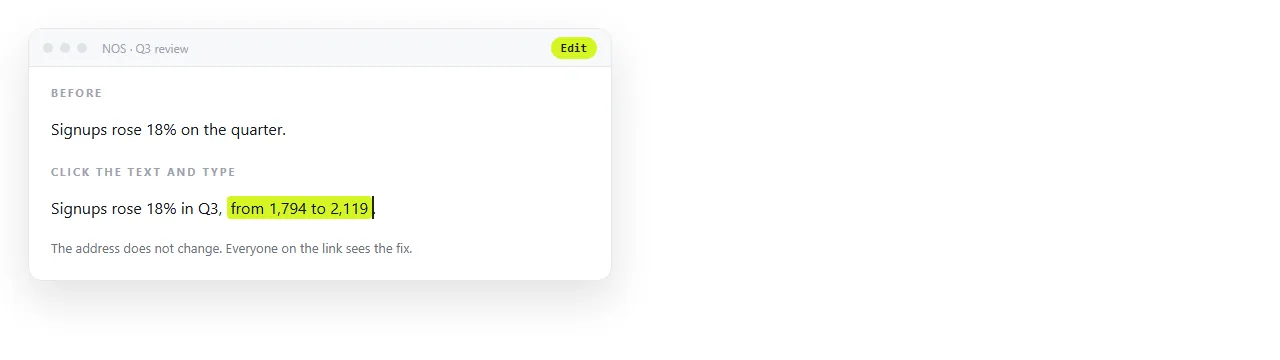
In a NOS document the pasted markup renders as written, and the text stays clickable, so a wrong figure is a click and a retype. The address does not change when the content does, which matters if you already sent the link.
Structural changes are different. For those, keep your copy of the markup, paste it back into the chat with the picture, and describe the change. Fixing AI generated HTML covers the edits that are faster by hand than by prompt.
Sending it on
The result of this work is a page, and a page travels as an address. Sending the .html file means trusting mail filters, file associations and whatever the reader's phone does with a download.
Paste the markup into a document, create the link, and send one line of text. Turning HTML into a link is that step by itself.
The free plan covers three documents, enough to put a first draft in front of the person who asked for it.