The <style> element holds CSS for the page it sits in. Put it in the <head>, write normal CSS rules between the tags, and they apply to every matching element in the document:
<head>
  <style>
    .note { color: #c2410c; }
  </style>
</head>
The page can have several style blocks. They all feed one cascade, so when two rules set the same property on the same element, something has to decide. Try it: swap the blocks, raise one selector's specificity, add an inline style.
<!doctype html>
<html lang="en">
<head>
<meta charset="utf-8">
<meta name="viewport" content="width=device-width, initial-scale=1">
<title>Which style wins?</title>
<style>
  /* page layout only */
  body { margin: 0; padding: 14px; font-family: system-ui, sans-serif; background: #f4f5f7; color: #1d2330; }
  #target { margin: 0 0 12px; padding: 14px; border-radius: 10px; background: #fff; font-size: 22px; font-weight: 700; }
  .controls { display: flex; flex-wrap: wrap; gap: 8px; margin-bottom: 12px; }
  button { font: inherit; font-size: 14px; padding: 8px 12px; border-radius: 8px; border: 1px solid #c9cdd4; background: #fff; cursor: pointer; }
  button[aria-pressed="true"] { background: #1d2330; color: #fff; border-color: #1d2330; }
  pre { margin: 0 0 10px; padding: 10px; border-radius: 8px; background: #1d2330; color: #e5e7eb; font-size: 13px; white-space: pre-wrap; }
  #why { margin: 0; font-size: 14px; line-height: 1.45; }
</style>
<style id="styleA">.note { color: #2563eb; }</style>
<style id="styleB">.note { color: #c2410c; }</style>
</head>
<body>
<p class="note" id="target">Which colour am I?</p>

<div class="controls">
  <button id="swap">Swap the two blocks</button>
  <button id="specific" aria-pressed="false">A uses p.note</button>
  <button id="inline" aria-pressed="false">Add style="color: green"</button>
</div>

<pre id="order"></pre>
<p id="why"></p>

<script>
  const head = document.head;
  const A = document.getElementById('styleA');
  const B = document.getElementById('styleB');
  const target = document.getElementById('target');
  const names = { '#2563eb': 'blue (A)', '#c2410c': 'orange (B)', 'green': 'green (inline)' };

  // Moving a style element changes its place in the cascade
  document.getElementById('swap').addEventListener('click', () => {
    const first = [...head.querySelectorAll('#styleA, #styleB')][0];
    head.appendChild(first);  // the first block becomes the last one
    show();
  });

  // Editing a style element's text re-parses its rules
  document.getElementById('specific').addEventListener('click', (e) => {
    const on = e.target.getAttribute('aria-pressed') !== 'true';
    e.target.setAttribute('aria-pressed', on);
    A.textContent = (on ? 'p.note' : '.note') + ' { color: #2563eb; }';
    show();
  });

  document.getElementById('inline').addEventListener('click', (e) => {
    const on = e.target.getAttribute('aria-pressed') !== 'true';
    e.target.setAttribute('aria-pressed', on);
    if (on) target.style.color = 'green'; else target.removeAttribute('style');
    show();
  });

  function show() {
    const blocks = [...head.querySelectorAll('#styleA, #styleB')];
    document.getElementById('order').textContent = blocks
      .map((s) => '<style id="' + s.id + '">' + s.textContent + '</style>').join('\n');

    const aFirst = blocks[0] === A;
    const specific = A.textContent.startsWith('p.note');
    let why;
    if (target.style.color) {
      why = 'The style attribute wins. It beats every selector in every style block.';
    } else if (specific) {
      why = 'A wins. p.note (one class + one tag) is more specific than .note (one class), so order does not matter.';
    } else {
      why = 'Same selector, same specificity, so the block that comes later wins: ' + (aFirst ? 'B' : 'A') + '.';
    }
    // Read the colour the browser actually used
    const rgb = getComputedStyle(target).color;
    const hex = { 'rgb(37, 99, 235)': '#2563eb', 'rgb(194, 65, 12)': '#c2410c', 'rgb(0, 128, 0)': 'green' }[rgb];
    document.getElementById('why').textContent = 'Now: ' + (names[hex] || rgb) + '. ' + why;
  }
  show();
</script>
</body>
</html>
Where to put the style tag
The head is the right place. The HTML standard lists <style> as head content, and a style block there is read before the body is drawn, so the first paint is already styled.
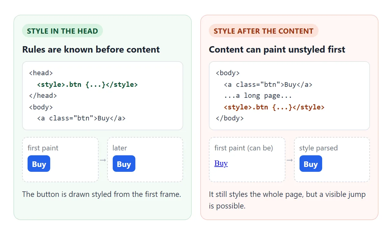
A <style> in the body still works in browsers. Its rules apply to the whole page, including elements above it.
The costs are a validator warning and a possible flash: content above the block can be painted with default styles and then jump when the rules arrive.
The head tag guide shows the full head order. The short version: charset and viewport first, then the style block.
Order decides ties
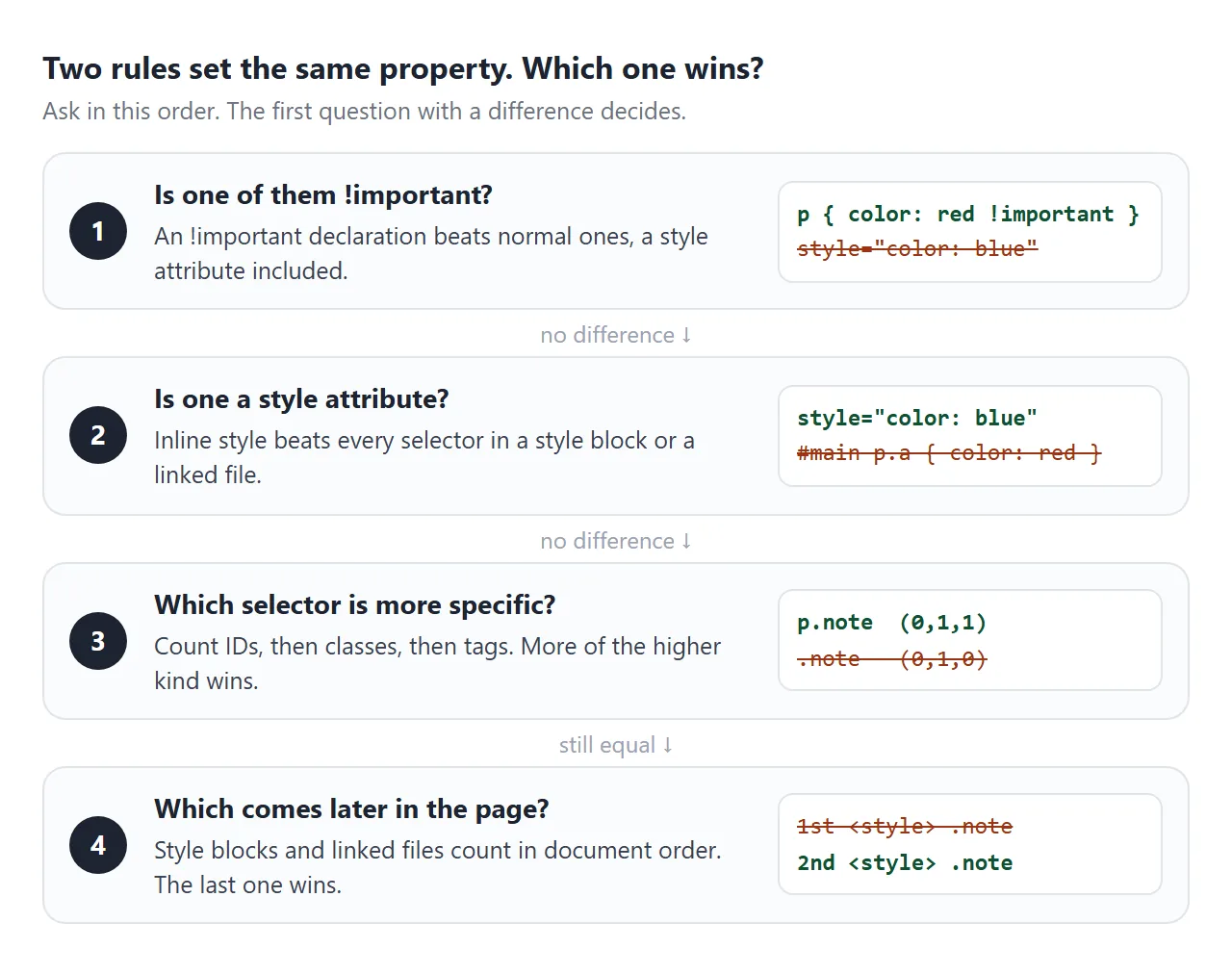
Every style block and every <link rel="stylesheet"> counts in the order it appears in the document. When two rules have the same specificity and neither is !important, the later one wins.
That is what the Swap button in the first example does. Moving a block to the end with appendChild makes its rules later, and the colour flips without any rule changing.
The practical habit: put general rules first and overrides after them. If you add a stylesheet from a library, put your own block after it.
Specificity in one minute
Order only matters when specificity is equal. Specificity is a count of what the selector uses, compared from left to right:
| Selector | IDs | Classes, attributes, pseudo-classes | Tags |
|---|---|---|---|
p |
0 | 0 | 1 |
.note |
0 | 1 | 0 |
p.note |
0 | 1 | 1 |
#main .note |
1 | 1 | 0 |
One ID outranks any number of classes, and one class outranks any number of tags. A style attribute beats all of these. An !important declaration in a style block beats a normal style attribute.
When you are fighting a rule, raising specificity a little, or moving your block later, is easier to maintain than adding !important.
style tag vs style attribute vs a CSS file
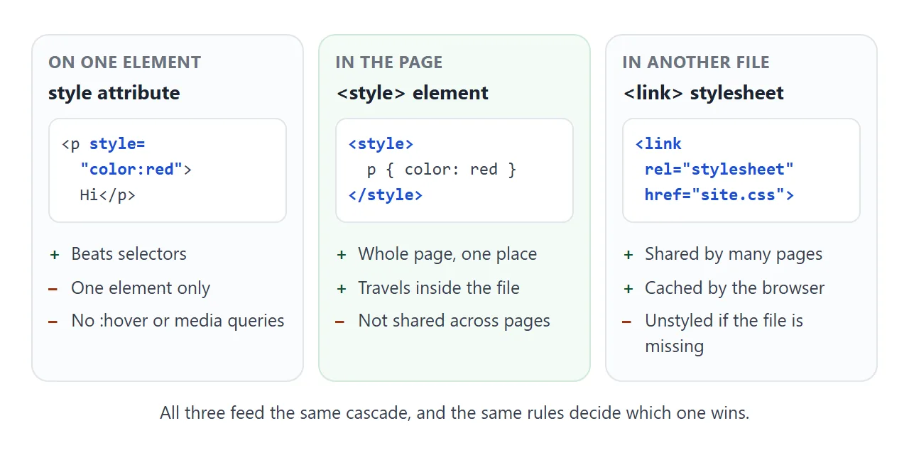
There are three places to write CSS, and all three end up in the same cascade.
<style> element |
style attribute |
<link> to a .css file |
|
|---|---|---|---|
| Reaches | Any element on the page | Only its own element | Any element on every page that links it |
| Selectors, :hover, media queries | Yes | No | Yes |
| Travels with the HTML file | Yes | Yes | No, the file must be reachable |
| Cached separately | No | No | Yes |
The attribute is right for a value computed per element; inline CSS covers the cases.
A linked file suits a site of many pages; external stylesheets weighs that choice. For one page you send to someone, a style block is the one that cannot go missing.
The media attribute
A media attribute limits the whole block to a media query. Without it, the block applies everywhere, the same as media="all".
<style media="(max-width: 500px)">
  .cards { grid-template-columns: 1fr; }
</style>
This is the same as wrapping the rules in @media (max-width: 500px) { ... }. Pick whichever reads better. A media="print" block is a handy home for print-only rules.
<!doctype html>
<html lang="en">
<head>
<meta charset="utf-8">
<meta name="viewport" content="width=device-width, initial-scale=1">
<title>The media attribute on style</title>
<style>
body { margin: 0; padding: 14px; font-family: system-ui, sans-serif; background: #f4f5f7; color: #1d2330; }
.cards { display: grid; grid-template-columns: repeat(3, 1fr); gap: 8px; margin-bottom: 12px; }
.cards div { padding: 14px 8px; border-radius: 8px; background: #fff; text-align: center; font-size: 14px; }
.controls { display: flex; flex-wrap: wrap; gap: 6px; margin-bottom: 10px; }
button { font: inherit; font-size: 13px; padding: 7px 10px; border-radius: 8px; border: 1px solid #c9cdd4; background: #fff; cursor: pointer; }
button[aria-pressed="true"] { background: #1d2330; color: #fff; border-color: #1d2330; }
code { font-size: 13px; }
#status { margin: 0; padding: 10px; border-radius: 8px; font-size: 14px; line-height: 1.5; }
#status.on { background: #d6f2df; } #status.off { background: #fde2da; }
</style>
<!-- These rules only apply while the media query matches -->
<style id="narrow" media="(max-width: 500px)">
.cards { grid-template-columns: 1fr; }
.cards div { background: #1d2330; color: #fff; }
</style>
</head>
<body>
<div class="cards"><div>One</div><div>Two</div><div>Three</div></div>
<div class="controls">
<button data-media="(max-width: 500px)">(max-width: 500px)</button>
<button data-media="(min-width: 501px)">(min-width: 501px)</button>
<button data-media="print">print</button>
<button data-media="all">all</button>
</div>
<p id="status"></p>
<script>
const narrow = document.getElementById('narrow');
const status = document.getElementById('status');
document.querySelectorAll('[data-media]').forEach((btn) => {
btn.addEventListener('click', () => {
narrow.media = btn.dataset.media; // same as setAttribute('media', ...)
show();
});
});
function show() {
const applies = matchMedia(narrow.media).matches;
status.className = applies ? 'on' : 'off';
status.innerHTML = 'This frame is <b>' + innerWidth + 'px</b> wide.<br>' +
'<code><style media="' + narrow.media + '"></code> ' +
(applies ? 'matches, so its rules apply: one dark column.' : 'does not match, so its rules are ignored.');
document.querySelectorAll('[data-media]').forEach((b) =>
b.setAttribute('aria-pressed', b.dataset.media === narrow.media));
}
addEventListener('resize', show); // re-check when the frame changes width
show();
</script>
</body>
</html>
On a phone, the frame is narrower than 500px, so the first button matches. On a wide screen it does not. The media query guide goes further into breakpoints.
Changing a style element with JavaScript
A style element is an ordinary DOM node, so a script can change it three ways:
- Replace its text. Set
textContentand the browser re-reads the rules. Good for a theme switch. - Change its media. Setting
mediato"all"makes a print-only block apply on screen, which gives a print preview. - Add or remove the element.
document.createElement('style')does nothing until you append it to the document..remove()takes its rules away.
<!doctype html>
<html lang="en">
<head>
<meta charset="utf-8">
<meta name="viewport" content="width=device-width, initial-scale=1">
<title>Theme switcher with a style element</title>
<style>
  /* Base styles read the theme colours from variables */
  body { margin: 0; padding: 14px; font-family: system-ui, sans-serif;
         background: var(--bg); color: var(--text); transition: background .2s, color .2s; }
  .toolbar { display: flex; flex-wrap: wrap; gap: 6px; margin-bottom: 12px; }
  button { font: inherit; font-size: 13px; padding: 7px 11px; border-radius: 8px; cursor: pointer;
           border: 1px solid var(--line); background: var(--card); color: var(--text); }
  button[aria-pressed="true"] { outline: 2px solid var(--accent); }
  .card { padding: 14px 16px; border-radius: 12px; background: var(--card); border: 1px solid var(--line); }
  .card h2 { margin: 0 0 6px; font-size: 19px; color: var(--accent); }
  .card p { margin: 0 0 10px; line-height: 1.5; font-size: 15px; }
  .no-print { font-size: 13px; opacity: .8; }
  pre { margin: 12px 0 0; padding: 10px; border-radius: 8px; font-size: 12px; white-space: pre-wrap;
        background: #1d2330; color: #e5e7eb; }
</style>

<!-- The theme lives in its own block. JavaScript swaps its text. -->
<style id="theme">:root { --bg: #f4f5f7; --card: #fff; --text: #1d2330; --line: #d5d9e0; --accent: #2563eb; }</style>

<!-- Print-only rules. Preview switches media to "all" -->
<style id="print" media="print">
  body { background: #fff; color: #000; }
  .toolbar button:not(#preview), .no-print, pre { display: none; }
  .card { border: 0; padding: 0; }
  .card h2 { color: #000; }
  @media print { #preview { display: none; } }  /* on real paper, hide the last button too */
</style>
</head>
<body>
<div class="toolbar">
  <button data-theme="light" aria-pressed="true">Light</button>
  <button data-theme="dark">Dark</button>
  <button data-theme="sepia">Sepia</button>
  <button id="preview" aria-pressed="false">Print preview</button>
  <button id="big" aria-pressed="false">Bigger text</button>
</div>

<div class="card">
  <h2>Quarterly notes</h2>
  <p>Every colour on this page comes from five variables. Changing the text of one style element restyles all of it.</p>
  <p class="no-print">This line and the buttons are hidden when printing.</p>
</div>

<pre id="css"></pre>

<script>
  const themes = {
    light: ':root { --bg: #f4f5f7; --card: #fff; --text: #1d2330; --line: #d5d9e0; --accent: #2563eb; }',
    dark:  ':root { --bg: #111827; --card: #1f2937; --text: #e5e7eb; --line: #374151; --accent: #60a5fa; }',
    sepia: ':root { --bg: #f3ead8; --card: #fbf5e9; --text: #3f3222; --line: #d9c9a8; --accent: #9a3412; }',
  };
  const theme = document.getElementById('theme');
  const print = document.getElementById('print');
  const out = document.getElementById('css');

  // 1) Swap the theme: replace the text of one style element
  document.querySelectorAll('[data-theme]').forEach((btn) => {
    btn.addEventListener('click', () => {
      theme.textContent = themes[btn.dataset.theme];
      document.querySelectorAll('[data-theme]').forEach((b) => b.setAttribute('aria-pressed', b === btn));
      out.textContent = '<style id="theme">' + theme.textContent + '</style>';
    });
  });

  // 2) Print preview: let the print-only block apply on screen too
  document.getElementById('preview').addEventListener('click', (e) => {
    print.media = print.media === 'print' ? 'all' : 'print';
    e.target.textContent = print.media === 'all' ? 'Exit preview' : 'Print preview';
  });

  // 3) Add or remove a whole style element
  let extra = null;
  document.getElementById('big').addEventListener('click', (e) => {
    if (extra) { extra.remove(); extra = null; }   // removing it removes its rules
    else {
      extra = document.createElement('style');
      extra.textContent = '.card p { font-size: 19px; }';
      document.head.append(extra);                 // rules apply only once it is in the document
    }
    e.target.setAttribute('aria-pressed', !!extra);
  });

  out.textContent = '<style id="theme">' + theme.textContent + '</style>';
</script>
</body>
</html>
The themes here only redefine five CSS variables, so every rule that uses var(--accent) updates at once. For following the system setting instead of a button, see dark mode in CSS.
Two quirks of the text inside
The content of <style> is raw text, not HTML. Character references are not decoded, so & inside a CSS string stays five characters. Selectors like a > b need no escaping.
The one sequence you cannot write is the closing tag. The HTML parser ends the element at the first </style>, even inside a CSS string or comment:
/* This ends the style element early */
.x::after { content: "</style>"; }

/* Escape a character with CSS instead */
.x::after { content: "<\/style>"; }
Some sites also send a Content Security Policy with a style-src rule that blocks inline styles. There, style blocks and style attributes are ignored unless the policy allows them. The Content Security Policy guide explains the header.
When it does not work
| What you see | Cause | Fix |
|---|---|---|
| A rule is ignored, another colour shows | A later block or a more specific selector sets the same property | Check the order and specificity, or inspect the element to see which rule won |
| A rule is ignored on one element only | A style attribute on it overrides the block |
Remove the attribute or move that value into the block |
| The page flashes unstyled, then jumps | The style block sits after the content | Move it into the head |
| One property fails, the rest of the rule works | A typo invalidates only that declaration | Fix the property name or value; check for a missing semicolon before it |
| Everything after a point is unstyled, CSS shows as text | </style> inside a CSS string or comment closed the element |
Write <\/style> in the string |
| A style made in JavaScript has no effect | The element was created but never added to the document | document.head.append(el) |
| Styles work locally, not on one site | The site's Content Security Policy blocks inline styles | Follow that site's policy |
Share it as a link
A page built on a style block is already one self-contained file, which makes it easy to send. An .html attachment may still open as plain code on a phone, and a screenshot cannot switch themes.
To send the working version, paste the page into a NOS document and choose Create share link. HTML to link walks through it.
The page renders as written and its scripts run, so the people you send it to can press the theme buttons themselves. If you change the code later, the same link shows the new version.