This prompt produces an HTML dashboard template as one self-contained file, with every figure in a single DATA object, obviously fake sample numbers marked as such, cards that stack on a phone, and bars that need no charting library.
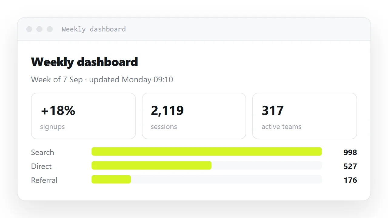
Each line in the prompt is there because of something that had to be fixed by hand without it. Copy it, keep it somewhere you can paste from, and change only the data section.
This guide gives the prompt, the reasoning for each part, what a prompt cannot do, and the four steps from the generated file to a dashboard people open every week.
This is the prompt, then the reasoning for each part. Keep it somewhere you can paste from.
The prompt behind the HTML dashboard template
Build one complete, self-contained HTML dashboard file.

STRUCTURE
- doctype, html lang="en", head with charset, viewport, descriptive title
- all CSS in one <style> tag in head; all JS in one <script> before </body>
- no external libraries, fonts, stylesheets or images

DATA
- put every figure in a single DATA object at the top of the script
- render the cards and bars from DATA, not from hard-coded markup
- use obviously fake sample numbers and put "SAMPLE DATA" in the page

LAYOUT
- KPI cards: display grid, repeat(auto-fit, minmax(170px, 1fr)), gap 10px
- bar rows: grid with a 130px label column, a flexible track, a 62px value
- bars are divs with display:block and a width percentage — no chart library
- readable at 360px wide with no sideways scrolling

CONTENT RULES
- a dated line at the top: "Figures through <date>"
- every percentage shows its base: "4.2% (54 of 1,284)"
- every change shows its comparison: "+12.4% vs last week"

STYLE
- system font stack: -apple-system, "Segoe UI", Roboto, sans-serif
- numbers: text-align right, font-variant-numeric: tabular-nums
- one accent colour, hairline borders, no drop shadows
Why each part is there
"One complete, self-contained file"
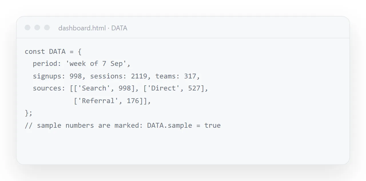
Without it you get a fragment — a <div> and a style block, no doctype — which renders as unstyled text anywhere outside the chat. And you get outside dependencies, which is the difference between a page that works in five years and one that works until an address changes. See self-contained HTML.
"Every figure in a single DATA object"
<script>
  var DATA = {
    asOf: '12 Sep 2026',
    cards: [
      { label: 'Signups', value: 1284, delta: '+12.4% vs last week' },
      { label: 'Active teams', value: 317, delta: '+6 new' },
    ],
    sources: [
      { name: 'Search', value: 998 },
      { name: 'Direct', value: 527 },
    ],
  };
</script>
This is the single highest-value constraint. Next week's update is one object to edit rather than fourteen numbers scattered through the markup, and you cannot miss one.
"Obviously fake sample numbers, marked SAMPLE"
Generated figures are plausible by construction, and plausible figures survive review and get quoted in meetings. Numbers that are visibly samples cannot make that journey.
"repeat(auto-fit, minmax(170px, 1fr))"
Four cards on a laptop, one on a phone, with no media query. Without specifying it you commonly get a fixed four-column grid, which forces sideways scrolling on a phone. See CSS grid.
"Bars are divs with display:block"
A bar built from a span does not appear, because inline elements ignore width and height — and nothing reports an error, so you get a chart with no bars and no explanation. Naming display: block prevents the most confusing failure in the whole exercise.
"Every percentage shows its base"
4.2% cannot be checked. 4.2% (54 of 1,284) can. A dashboard whose numbers cannot be checked does not get argued with, which sounds convenient and means it is not being used.
"System font stack"
No font download, so no delay, no fallback flash, and nothing to go wrong offline. It also looks native, which most readers read as quality. See web fonts.
"Tabular numbers"
Every digit the same width, so a column of figures forms a straight edge and magnitudes are comparable without reading them.
"No drop shadows"
Generated dashboards default to heavy shadows and rounded cards everywhere, which reads as a template. Hairline borders and one accent colour look deliberate.
Changing the prompt for your own dashboard
Keep the STRUCTURE, LAYOUT and STYLE blocks as they are; they are the parts that fail without instruction.
Change DATA to name your own cards and sources, and add one line under CONTENT RULES for anything specific to your report, such as "show revenue in EUR with no decimals" or "the comparison period is the same week last year".
Keep the prompt to one screen. Past that, later lines get ignored more often.
What the prompt cannot do
It cannot make the numbers right. No instruction prevents invention — see AI-generated dashboards for the checks that catch it. Treat every figure you did not supply as a placeholder.
After it renders
Check it in the HTML viewer at full width and at phone width, replace the DATA object with your figures, then publish it and send the link.
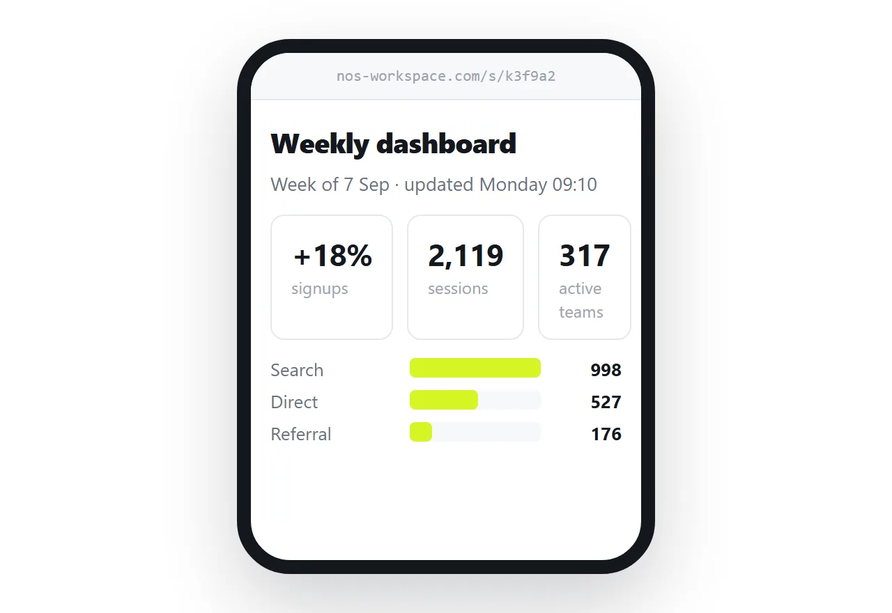
In NOS the pasted dashboard renders exactly as written and its numbers are clickable text, so the weekly update is typing over them — no regeneration, and the link you sent stays current.
What the prompt cannot fix
| Problem | Can a prompt prevent it |
|---|---|
| Fixed column counts | Yes |
| Missing viewport line | Yes |
| Outside dependencies | Yes |
| Bars with no height | Yes |
| Invented figures | No |
| A metric defined differently from your own reporting | No |
| Percentages whose base you have not stated | Partly |
The two hard noes are why the prompt asks for obviously fake numbers and a SAMPLE marker. Everything a prompt can do is layout; the content still has to be checked line by line — see AI-generated dashboards.
Keeping it after the first use
Do not regenerate the same dashboard weekly. Generation is not deterministic, so each version differs slightly and your readers see four layouts for one report.
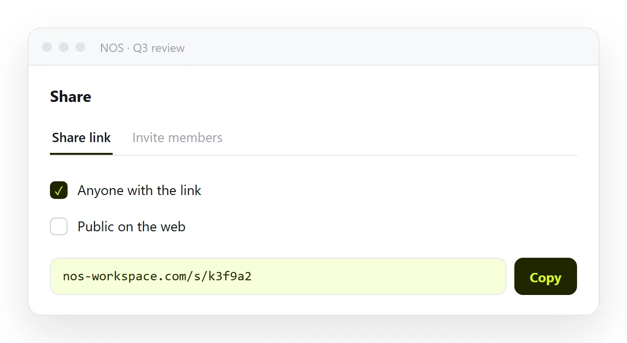
Keep the first good one as a template, edit the DATA object, and republish. The link stays the same, so a channel tab or a bookmark keeps working.
From the prompt to a weekly dashboard: 4 steps
- Paste the prompt and add your data section. Keep every constraint. Put your real figures in the
DATAobject, or leave the SAMPLE marker on until you do. - Check it at two widths. In the HTML viewer, full width and 360px. Cards should stack into one column; bars should be visible, which they are not if the assistant used a
span. - Paste it into a NOS document and copy the share link. Share, then Share link, then Create link. Pin the address in the channel or as a tab. Turning HTML into a link is this step.
- Update DATA weekly instead of regenerating. Generation is not deterministic, so a regenerated dashboard is a slightly different dashboard. Keep the first good one, type over the figures, and the link stays the same.