A wedding page is read twice: carefully when the invitation arrives, and frantically on the morning by somebody parked outside a village hall with one bar of signal.
The second read is the one to design for.
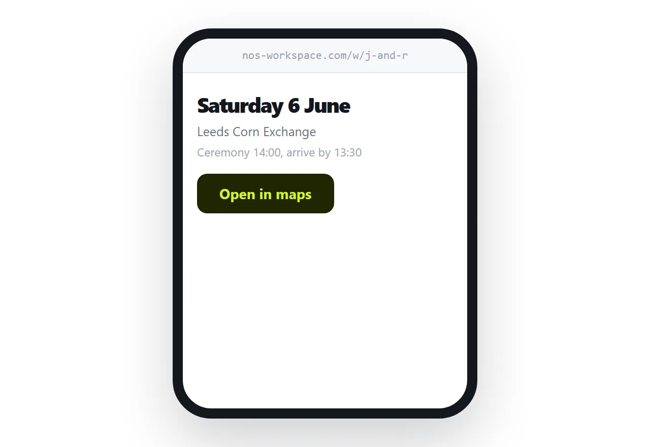
This guide covers the six questions, changes, and signal.
The six questions
They arrive individually, by message, over several months.
What time. Ceremony start, and whether to arrive earlier.
Where exactly. With a map link, not just a name. Rural venues are regularly mis-found.
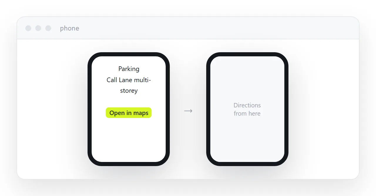
Where to park. The single most asked question and the one most often left off.
What to wear. Guests worry about this more than couples expect. Say something, even if it is that anything is fine.
Are children invited. Say it plainly. Ambiguity here produces awkward conversations.
Where to stay. Two or three options with rough prices.
Answer all six explicitly and the messages mostly stop.
The address goes on the invitation
Print the address on the card rather than printing every detail.
Then when the shuttle time changes, the venue moves a ceremony indoors, or a hotel block fills, you edit the page. Every guest holding a card is still correct.
Printing the details themselves means a change requires contacting a hundred people individually, and half of them will be working from the card anyway.
| Everything on the card | Address on the card | |
|---|---|---|
| Time change | Contact everyone | Edit the page |
| Venue detail added | Not possible | Edit the page |
| Guest checks on the day | Finds the card | Opens a link |
| Cost of a change | Reprint or messages | Nothing |
Design for the car park
The morning read is a phone, outdoors, in a hurry, often with poor reception.
So the top of the page carries the time, the venue name, and a map link. Nothing above them. Large enough to read at arm's length in daylight.
Everything else below: the schedule, the accommodation, the gift information, the story of how you met.
Keep the page light. Wedding venues are frequently in places with bad reception, and a page heavy with photographs does not load there. Put the practical information as text near the top so it appears first.
Replies
A form is easier than counting messages across four channels.
Name, attending or not, dietary requirements. Three fields.
Resist adding song requests, meal choices and questions about arrival times to the same form. Each extra field reduces completion, and you can ask the people who are coming later.
Chase non-responders by message. There is always a group who will never fill in a form, and they are not being difficult.
Keep the basics on paper
Not every guest will open a link, particularly older relatives.
Print the date, the time and the venue on the card as well. The address carries the detail and the changes; the card still works on its own for the essentials.
Two neighbouring cases are worth a look: Wedding invitation HTML and An HTML invitation template that guests open on a phone.
Put it at an address
Time and venue at the top with a map link, the address printed on the invitation, all six questions answered, the page kept light, and the basics still on the card.
Then the guest in the car park at ten to two finds what they need.