A simple HTML resume is a single file with plain markup and a short style block, and no dependency on anything beside it. That is what makes it open correctly on someone else's machine.
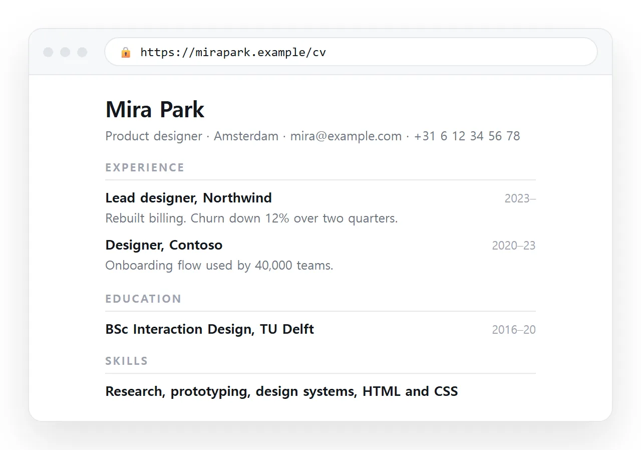
Complexity in a resume page is almost always the cause of its failures. Frameworks add files that get left behind, and elaborate layouts break in print.
The whole head section
Five lines, and none of them point outside the file.
<!doctype html>
<meta charset="utf-8">
<meta name="viewport" content="width=device-width,initial-scale=1">
<title>Ji-woo Park, Backend Engineer</title>
<style> /* about thirty lines, below */ </style>
The doctype keeps the browser in standards mode. Leave it out and spacing behaves differently across browsers for no reason you will enjoy diagnosing.
The viewport line is what makes the page readable on a phone, which is where most recruiters open a link.
The body structure
Headings and lists. Nothing else is required.
<h1>Ji-woo Park</h1>
<p class="meta">Backend Engineer, Seoul, ji.woo@example.com</p>

<h2>Experience</h2>
<div class="role">
  <h3>Senior Engineer, Company <span>2023 to present</span></h3>
  <ul><li>Cut checkout latency from 900 ms to 210 ms.</li></ul>
</div>
Use real heading levels rather than styled <div> elements. Semantic HTML gives you correct screen reader navigation and clean print breaks without extra work.
The CSS, in full
body { max-width: 46em; margin: 2rem auto; padding: 0 1rem;
       font: 16px/1.55 system-ui, sans-serif; color: #1a1a1a }
h1 { font-size: 1.6rem; margin-bottom: .2rem }
h2 { font-size: 1.05rem; text-transform: uppercase; letter-spacing: .06em;
     border-bottom: 1px solid #ddd; padding-bottom: .3rem; margin-top: 2rem }
h3 { font-size: 1rem; display: flex; justify-content: space-between }
h3 span { font-weight: 400; color: #666 }
ul { padding-left: 1.1rem } li { margin: .25rem 0 }
.meta { color: #555 }
.role { page-break-inside: avoid }
@media print { body { margin: 0; max-width: none } a { color: #000; text-decoration: none } }
That is the entire design. A measured column, a readable line height, and a rule so a role never splits across a page break.
Keeping it in an inline style block rather than an external stylesheet is deliberate. One file has nothing to lose in transit.
What to leave out
| Common addition | Why to skip it |
|---|---|
| Icon font or icon set | Extra file, fails silently, adds nothing readable |
| Proficiency bars | No agreed scale, so they carry no information |
| Photo | Extra asset to embed, and unwelcome in several markets |
| Two column sidebar | Breaks in print and needs a media query to stack |
| Web font | One more thing to fail; system fonts render instantly |
| Framework CSS | Files that must travel with the page |
Each of these is a decision to carry a dependency in exchange for decoration. On a resume the trade is rarely worth it.
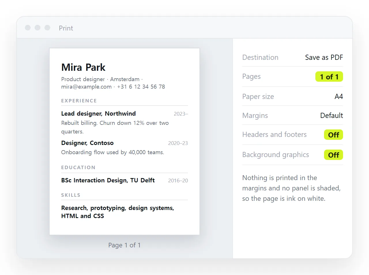
Print to PDF and look at two things. Whether any role block is split across the break, and whether the page fits the count you intend.
If a role splits, the page-break-inside: avoid rule is missing from that element. If the page runs long, tighten the bullets rather than the font size. A print stylesheet covers the rest.
Sharing it
- Open the file somewhere neutral. The HTML file opener has never seen your folder, so anything missing appears at once.
- Paste the HTML into a document. It renders as a page of its own and the words stay clickable.
- Create the share link. Share, then Share link, then Create link. Unlisted by default.
- Put that line in cover notes and profile fields.
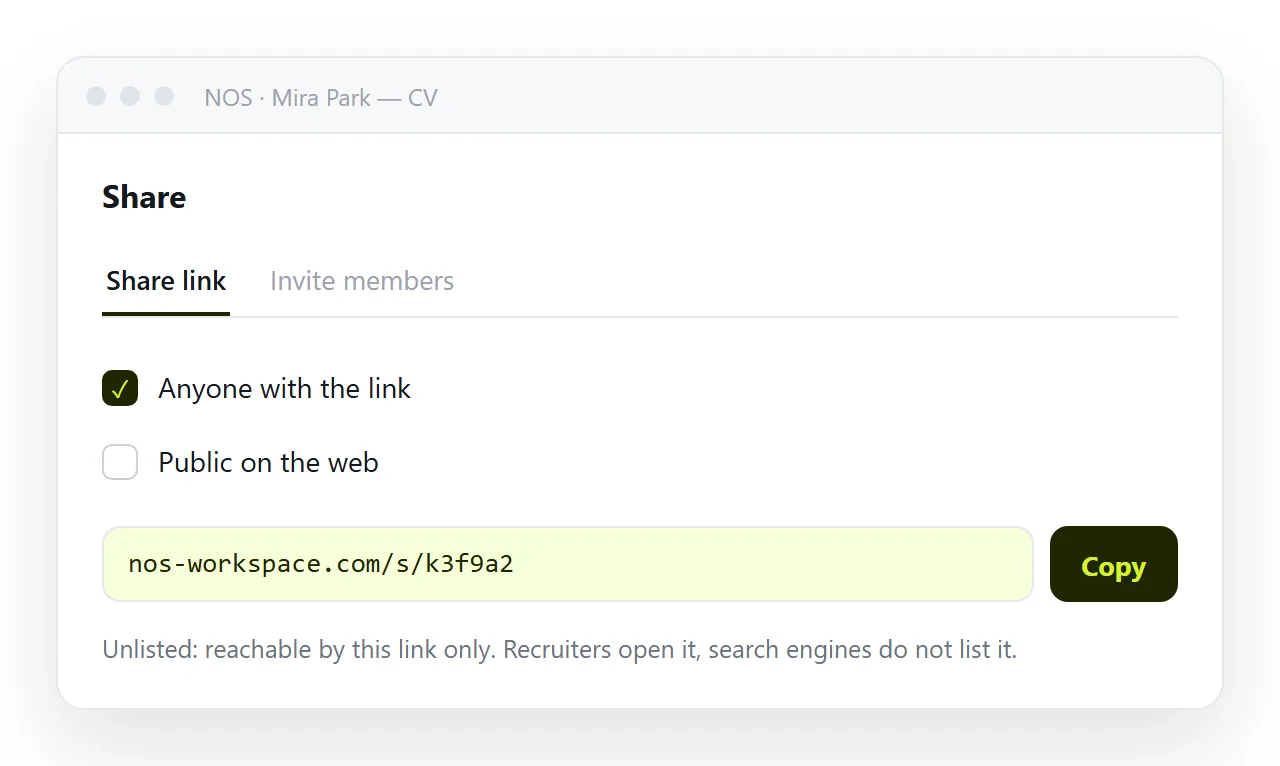
Keep a PDF export as well. Application systems want a file upload, and the link is for the humans, which is how a resume link and a file divide the work.
Why a simple HTML resume wins here
A resume is read for about twenty seconds by someone doing three things at once. Nothing on the page should compete with the sentences.
The plain version also survives every environment it lands in: a phone browser, a print dialog, a PDF converter, a text extraction tool. Elaborate ones survive some of those.
When you need more, such as linked work samples or a dark theme, add it to this base rather than starting from a template. The fuller HTML resume guide covers those additions, and self-contained HTML covers keeping them inside the one file.
Adapting it, and checks before you send
The plain version is easy to tailor because there is nothing structural to rearrange.
Keep one document as the base and copy it when a role is worth a specific version. Change the role line under your name, reorder the experience bullets, and leave everything else alone.
Each copy gets its own address, so you can tell which version you sent where. That is more useful than it sounds three weeks into a search.
- Open the link on a phone. Most first reads happen there.
- Print to PDF and confirm the page count and the break positions.
- Check every link on the page opens something that exists.
- Read the first screen alone and ask whether it says what you do.
- Confirm the title carries your name, since it becomes the browser tab and the preview card.
Add complexity only when it carries information. A dark theme, a skills matrix as a real table, or linked work samples all pay for themselves.
Animation, scroll effects and a large hero image do not. They cost load time and print badly, and the reader is scanning rather than browsing.
The base above stays underneath either way, which is the point of starting plain.